R(ggplot2)による棒グラフのあれこれです。
ライブラリを読み込み
R
library(ggplot2)
library(dplyr)
基本
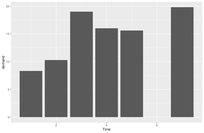
geom_colを呼び出します。xおよびyにカラムを指定します。
縦棒グラフ
R
ggplot(BOD, aes(x=Time, y=demand)) +
  geom_col()
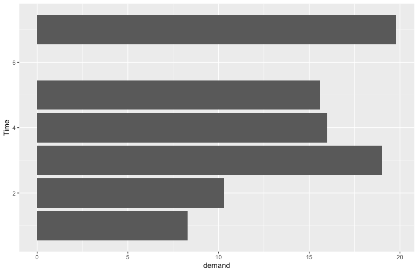
横棒グラフ
R
ggplot(BOD, aes(x=demand, y=Time)) +
  geom_col()
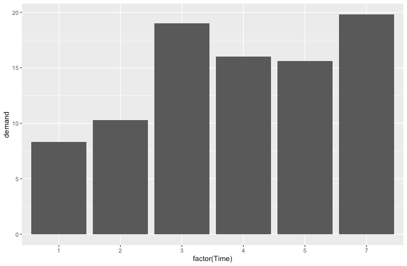
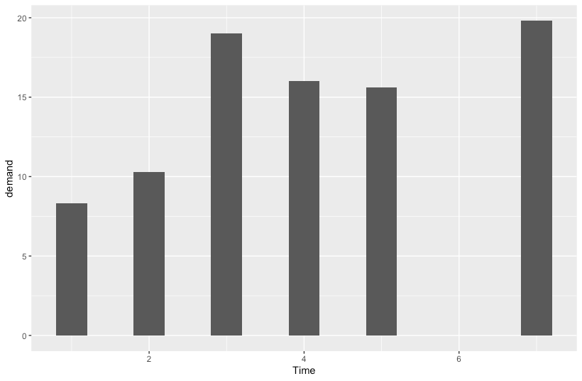
(参考)連続値とカテゴリによるx軸の違い
上記は、Timeが連続値で、かつ'Time==6'のエントリが存在しないため、該当する棒は歯抜けとなります。
Timeをカテゴリ値に変換することで、'Time==6'の描画対象ではなくなります。
R
ggplot(BOD, aes(x=factor(Time), y=demand)) +
  geom_col()
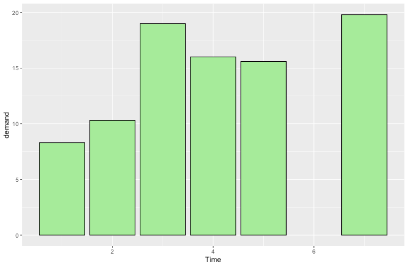
色を指定する
枠線と塗りつぶしを指定
R
ggplot(BOD, aes(x=Time, y=demand)) +
  geom_col(fill="lightgreen", colour="black")
棒のサイズを調整する
R
ggplot(BOD, aes(x=Time, y=demand)) +
  geom_col(width=0.4)
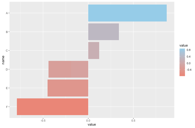
カラーパレットでグラデーションを指定
R
df <- data.frame(
  name=c("A", "B", "C", "D", "D", "E", "F"),
  value=c(0.87, 0.34, 0.12, -0.19, -0.25, -0.45, -0.79))

ggplot(df, aes(x=value, y=name, fill=value)) +
  geom_col() +
  scale_y_discrete(limits = rev(levels(df$name))) +
  scale_fill_gradient(high="skyblue", low="salmon")
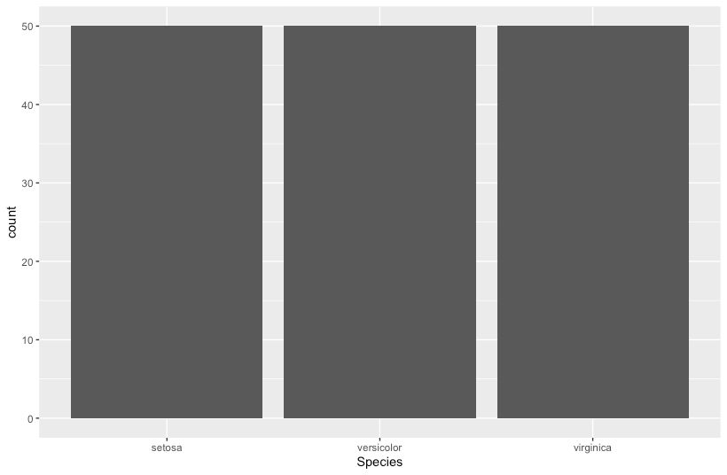
データの個数を数える棒グラフ
geom_bar()を呼び出します。yには何も指定しません。
R
ggplot(iris, aes(x=Species)) +
  geom_bar()
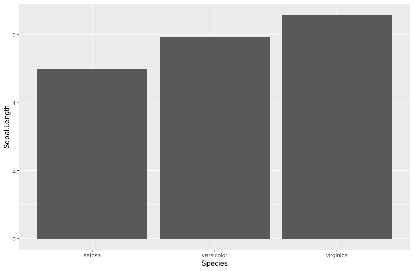
データの平均値を示す棒グラフ
stat_summary()を呼び出し、平均値を計算します。
R
ggplot(iris, aes(x=Species, y=Sepal.Length)) +
  stat_summary(fun = mean, geom = "bar")
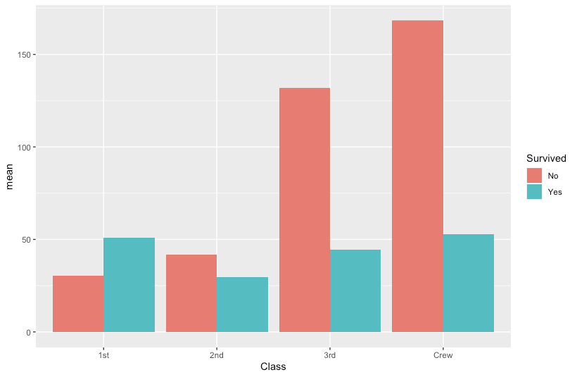
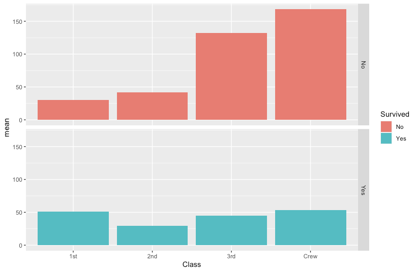
変数でグループ化して描画する
- データ準備
R
df <- data.frame(Titanic) %>%
  group_by(Survived, Class) %>%
  summarize(n=n(), mean=mean(Freq))
それぞれを独立して描く
R
ggplot(df, aes(x=Class, y=mean, fill=Survived)) +
  geom_col(position="dodge")
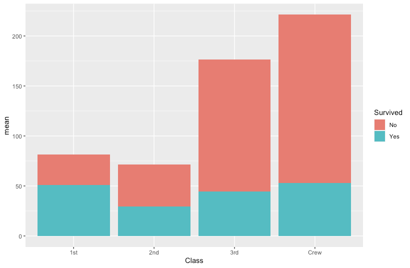
積み上げて描く
R
ggplot(df, aes(x=Class, y=mean, fill=Survived)) +
  geom_col(position="stack")
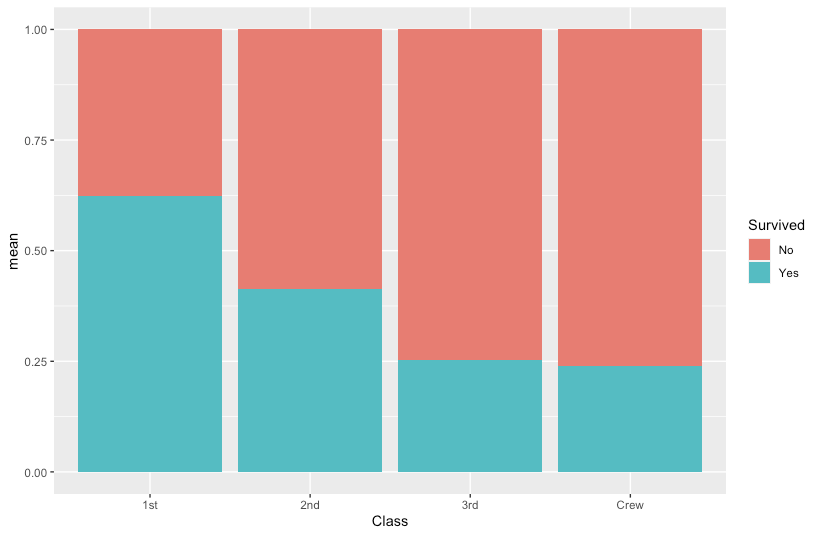
割合で描く
R
ggplot(df, aes(x=Class, y=mean, fill=Survived)) +
  geom_col(position="fill")
複数グラフに分けて描く
R
ggplot(df, aes(x=Class, y=mean, fill=Survived)) +
  geom_col() +
  facet_grid(Survived~ .)
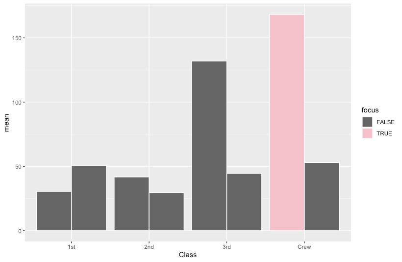
特定の棒だけ異なる色にする
R
df <- mutate(df, focus=ifelse((Class == "Crew") & (Survived == "No"), T, F))

ggplot(df, aes(x=Class, y=mean, group=Survived, fill=focus)) +
  geom_col(position="dodge", colour="white") +
  scale_fill_manual(values=c("grey40", "pink"))
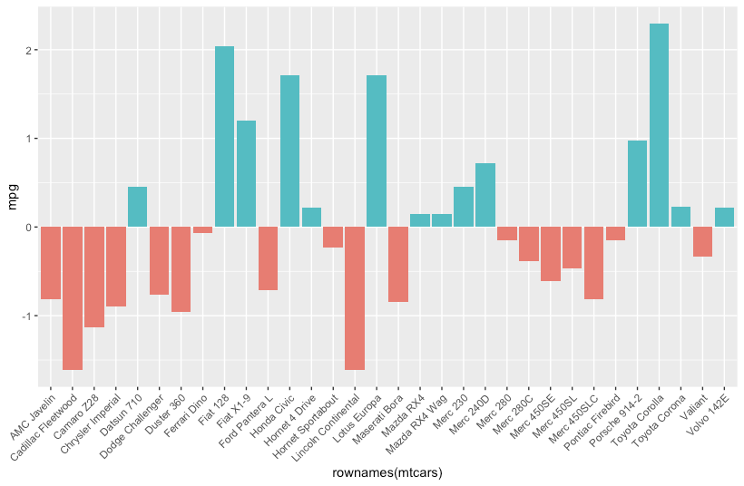
正負で分岐させた色を塗る
R
df <- mtcars %>%
  scale() %>%
  data.frame() %>%
  mutate(positive=mpg>0)

ggplot(df, aes(x=rownames(mtcars), y=mpg, fill=positive)) +
  geom_col() +
  theme(axis.text.x = element_text(angle = 45, hjust = 1))
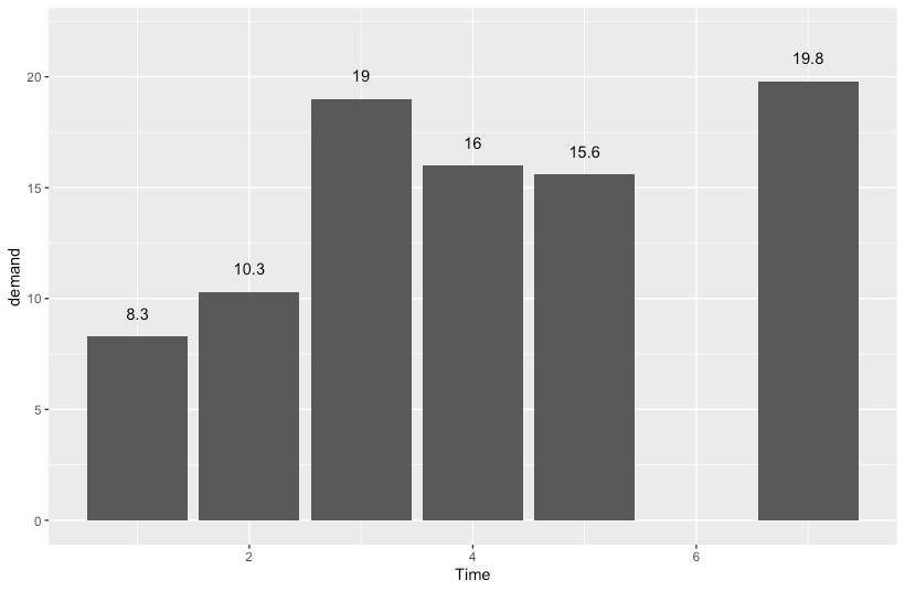
棒ごとのラベルを付加する
R
ggplot(BOD, aes(x=Time, y=demand)) +
  geom_col() +
  ylim(0,22) + # これを入れないとラベルがグラフ(上)をはみ出してしまう
  geom_text(aes(label=demand), vjust=-1.5)