はじめに
Vuforia Studioでは、よく使うウィジェットに、スライダーウィジェットがある。そのスライダーウィジェットのスタイルの変更例を備忘録としておく。
前提
Vuforia Studioで、ARコンテンツを独力で作成できる人が対象。
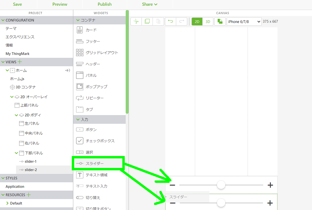
スライダーを配置する
スライダーウィジェットをドラッグ&ドロップで 2Dキャンパスの下部パネルに配置する。スタイル確認用に2つ配置しておく。
個々のスライダーのスタイルを変更する
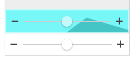
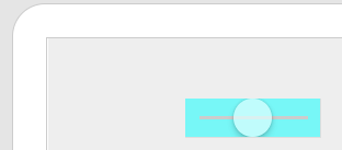
色を変更する(背景色)
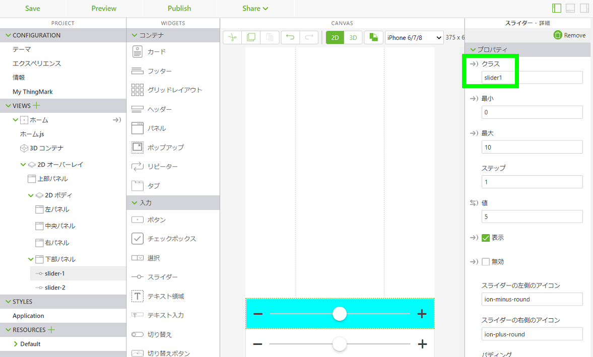
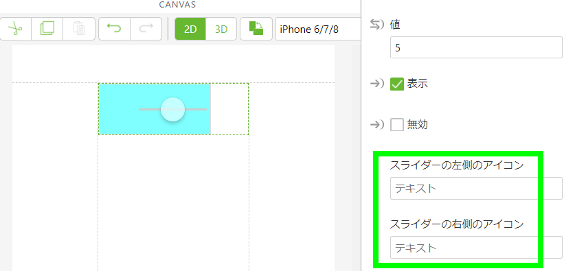
画面左の「アプリケーション」をクリックしてスタイル編集を開き、以下のコードを追加する。
// スライダーウィジェットのスタイル設定
.slider1 {
  background: rgba(0, 255, 255, 1.0); // 背景色
}
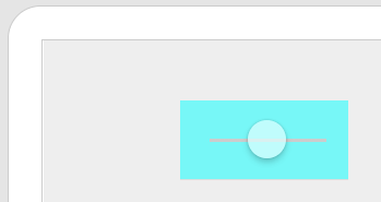
そして、スライダーウィジェットのクラスにこの「slider1 」を入力して保存する。これで背景色が変わる。
rgbaの a の透明度を 0.5 にして半透明にしてみる。
// スライダーウィジェットのスタイル設定
.slider1 {
  background: rgba(0, 255, 255, 0.5); // 背景色
}
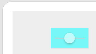
プレビューで見ると、半透明になっている。
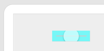
色を変更する(つまみ部分)
スタイルに、以下のようにつまみ部分の設定を追加すると、つまみ部分の色を変更できる。
// スライダーウィジェットのスタイル設定
.slider1 {
  background: rgba(0, 255, 255, 0.5); // 背景色

  input[type=range]::-webkit-slider-thumb { // つまみ部分
    background: rgba(224, 255, 255, 0.7); // つまみの色
  }
}
色を変更する(枠を追加する)
スタイルに、以下のように borderスタイル設定を追加すると、指定色で枠を追加できる。
// スライダーウィジェットのスタイル設定
.slider1 {
  background: rgba(0, 255, 255, 0.5); // 背景色
  border-width: 4px; // 枠幅
  border-style: solid; // 枠線
  border-color: rgba(224, 255, 255, 0.7); // 枠の色

  input[type=range]::-webkit-slider-thumb { // つまみ部分
    background: rgba(224, 255, 255, 0.7); // つまみの色
  }
}
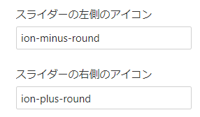
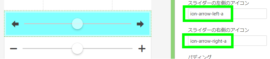
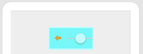
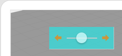
左右のアイコンを変更する
スライダーのアイコンは、左側のアイコン、右側のアイコン、のそれぞれを設定できる。
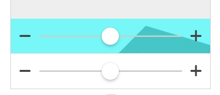
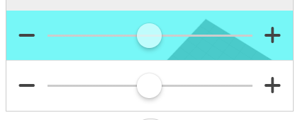
例えば、左側アイコンに「ion-arrow-left-a」、右側アイコンに「ion-arrow-right-a」を入力して保存すると、図のように左向き矢印、右向き矢印が表示される。スライダーを 3D などの座標値にバインドして水平移動させる場合に使えそうだ。
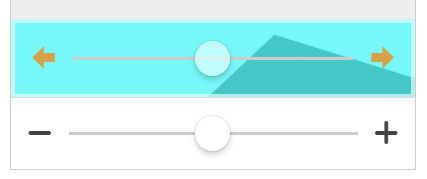
尚、このアイコンは色の変更ができる。スタイルに、以下のようにアイコンの色を設定する。
// スライダーウィジェットのスタイル設定
.slider1 {
  background: rgba(0, 255, 255, 0.5); // 背景色
  border-width: 4px; // 枠幅
  border-style: solid; // 枠線
  border-color: rgba(224, 255, 255, 0.7); // 枠の色

  input[type=range]::-webkit-slider-thumb { // つまみ部分
    background: rgba(224, 255, 255, 0.7); // つまみの色
  }

  i.icon{ // 左右アイコン
    color: rgba(255, 127, 0, 0.7); // アイコンの色
  }
}
尚、例えば以下のように、使用しているアイコンを指定して、個別にスタイルを設定することも可能。
  i.icon.ion-arrow-left-a{ // 指定アイコン
    color: red; // アイコンの色
  }
  i.icon.ion-arrow-right-a{ // 指定アイコン
    color: green; // アイコンの色
  }
どのようなアイコンが利用できるかは、ioniconのページ で確認できる。
サイズを変更する(幅)
今度は、スライダーのサイズを変更してみる。まずは幅から。スライダーの幅で時々求められるのが、幅を小さくしたいケース。例えば、iphoneの縦画面でスライダーウィジェットを中央パネルにドラッグ&ドロップで配置や移動してみると、右端が見えなくなってしまう。
では、width 値をスタイル設定に追加してみる。
// スライダーウィジェットのスタイル設定
.slider1 {
  background: rgba(0, 255, 255, 0.5); // 背景色
  border-width: 4px; // 枠幅
  border-style: solid; // 枠線
  border-color: rgba(224, 255, 255, 0.7); // 枠の色
  width: 50%; // 幅

  input[type=range]::-webkit-slider-thumb { // つまみ部分
    background: rgba(224, 255, 255, 0.7); // つまみの色
  }

  i.icon{ // 左右アイコン
    color: rgba(255, 127, 0, 0.7); // アイコンの色
  }
}
さらに右端が見えなくなってしまった。最小幅の制約がありそうだ。
先ほどは幅を %値で指定したが、次は、170px と指定してみる。画面縦だと右端が見れないので、画面横に向きを変えてみる。枠 borderはコメントアウトして無しにしておく。
// スライダーウィジェットのスタイル設定
.slider1 {
  background: rgba(0, 255, 255, 0.5); // 背景色
  //border-width: 4px; // 枠幅
  //border-style: solid; // 枠線
  //border-color: rgba(224, 255, 255, 0.7); // 枠の色
  width: 170px; // 幅

  input[type=range]::-webkit-slider-thumb { // つまみ部分
    background: rgba(224, 255, 255, 0.7); // つまみの色
  }

  i.icon{ // 左右アイコン
    color: rgba(255, 127, 0, 0.7); // アイコンの色
  }
}
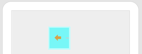
最小幅は大体 170px のようだ。
つまみの左右へのスライド移動は必要なので、幅を小さくするために、左側のアイコンと右側のアイコンの指定欄を空にして左右アイコンを取り除くことにする。幅は二つのアイコン分が減るので 130px として仮設定する。
// スライダーウィジェットのスタイル設定
.slider1 {
  background: rgba(0, 255, 255, 0.5); // 背景色
  //border-width: 4px; // 枠幅
  //border-style: solid; // 枠線
  //border-color: rgba(224, 255, 255, 0.7); // 枠の色
  width: 130px; // 幅

  input[type=range]::-webkit-slider-thumb { // つまみ部分
    background: rgba(224, 255, 255, 0.7); // つまみの色
  }

  i.icon{ // 左右アイコン
    color: rgba(255, 127, 0, 0.7); // アイコンの色
  }
}
アイコン指定を無しにしても幅が残っている。そこで、左右アイコンに対して min-width を設定して変更する。
// スライダーウィジェットのスタイル設定
.slider1 {
  background: rgba(0, 255, 255, 0.5); // 背景色
  //border-width: 4px; // 枠幅
  //border-style: solid; // 枠線
  //border-color: rgba(224, 255, 255, 0.7); // 枠の色
  width: 130px; // 幅

  input[type=range]::-webkit-slider-thumb { // つまみ部分
    background: rgba(224, 255, 255, 0.7); // つまみの色
  }

  i.icon{ // 左右アイコン
    color: rgba(255, 127, 0, 0.7); // アイコンの色
    min-width: 0px; // アイコンの最小幅
  }
}
アイコン部分の余白が無くなった。
さらに、padding(枠内余白)を 0px にして、幅値を小さくしてみる。
// スライダーウィジェットのスタイル設定
.slider1 {
  background: rgba(0, 255, 255, 0.5); // 背景色
  //border-width: 4px; // 枠幅
  //border-style: solid; // 枠線
  //border-color: rgba(224, 255, 255, 0.7); // 枠の色
  width: 100px; // 幅
  padding: 0px; // 枠内余白

  input[type=range]::-webkit-slider-thumb { // つまみ部分
    background: rgba(224, 255, 255, 0.7); // つまみの色
  }

  i.icon{ // 左右アイコン
    color: rgba(255, 127, 0, 0.7); // アイコンの色
    min-width: 0px; // アイコンの最小幅
  }
}
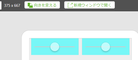
左右アイコンと枠内余白(padding)を取り除けば、最小幅は 100px 程度まではできそうだ。
画面幅が広くないスマホの縦画面でも、幅を width: 100px; と固定すれば、三つを横並びにできる。
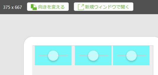
幅指定をしない場合は、二つ横並び表示することが可能だ。尚、三つも二つも横並び表示するために、グリッドアウトレイアウトを使用している。
サイズを変更する(高さ)
スタイルに高さ height を設定すれば、高さを変更できる。
// スライダーウィジェットのスタイル設定
.slider1 {
  background: rgba(0, 255, 255, 0.5); // 背景色
  //border-width: 4px; // 枠幅
  //border-style: solid; // 枠線
  //border-color: rgba(224, 255, 255, 0.7); // 枠の色
  width: 100px; // 幅
  padding: 0px; // 枠内余白
  height: 30px; // 高さ

  input[type=range]::-webkit-slider-thumb { // つまみ部分
    background: rgba(224, 255, 255, 0.7); // つまみの色
  }

  i.icon{ // 左右アイコン
    color: rgba(255, 127, 0, 0.7); // アイコンの色
    min-width: 0px; // アイコンの最小幅
  }
}
サイズを変更する(つまみ)
つまみのスタイル設定に、幅と高さを追加する。
// スライダーウィジェットのスタイル設定
.slider1 {
  background: rgba(0, 255, 255, 0.5); // 背景色
  //border-width: 4px; // 枠幅
  //border-style: solid; // 枠線
  //border-color: rgba(224, 255, 255, 0.7); // 枠の色
  width: 100px; // 幅
  padding: 0px; // 枠内余白
  height: 30px; // 高さ

  input[type=range]::-webkit-slider-thumb { // つまみ部分
    background: rgba(224, 255, 255, 0.7); // つまみの色
    width: 40px; //  つまみの幅(元は 28px)
    height: 40px; // つまみの高さ(元は 28px)
  }

  i.icon{ // 左右アイコン
    color: rgba(255, 127, 0, 0.7); // アイコンの色
    min-width: 0px; // アイコンの最小幅
  }
}
つまみの大きさを変更できた。縦に比べてつまみが大きい場合は、上下がカットされる。
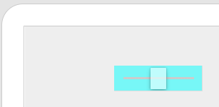
形を変更する(つまみの形)
つまみはデフォルトが丸だが、丸みの設定(border-radius)を変更することで、方形にすることができる。尚、高さはスライダー高さより少し小さい 24pxとし、幅はつまみを縦長にするために幅よりも少し小さい 18px としてみる。
// スライダーウィジェットのスタイル設定
.slider1 {
  background: rgba(0, 255, 255, 0.5); // 背景色
  //border-width: 4px; // 枠幅
  //border-style: solid; // 枠線
  //border-color: rgba(224, 255, 255, 0.7); // 枠の色
  width: 100px; // 幅
  padding: 0px; // 枠内余白
  height: 30px; // 高さ

  input[type=range]::-webkit-slider-thumb { // つまみ部分
    background: rgba(224, 255, 255, 0.7); // つまみの色
    width: 18px; //  つまみの幅(元は 28px)
    height: 24px; // つまみの高さ(元は 28px)
    border-radius: 1px; // つまみの角の設定(元は 100%)
  }

  i.icon{ // 左右アイコン
    color: rgba(255, 127, 0, 0.7); // アイコンの色
    min-width: 0px; // アイコンの最小幅
  }
}
おぉ、つまみが方形になった!
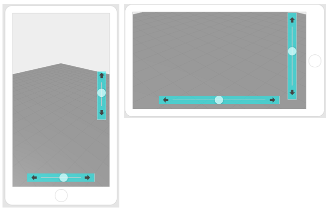
縦スライダーで色、アイコン、サイズの変更
Vuforia Studio CSS備忘録:2D画面上の指定位置に縦スライダーを表示 を参考にして、今回の色、アイコン、サイズ変更を適用してみる。以下のスタイルを追加する。
// スライダーウィジェットのスタイル設定
.slider2 {
  background: rgba(0, 255, 255, 0.5); // 背景色
  width: 50%;
  height: 30px; // 高さ

  // 縦スライダー化
  position:  fixed;
  top: 50%;
  left: 50%;
  margin-top: -30px; // 横スライダーで位置基準を少し上に移動
  transform: rotate(-90deg); // 左に90度回転する
  margin-left: 17%; // -25%で中心。負値の追加で左へ。正値の追加で右へ。

  input[type=range]::-webkit-slider-thumb { // つまみ部分
    background: rgba(224, 255, 255, 0.7); // つまみの色
  }
}

// スライダーウィジェットのスタイル設定
.slider3 {
  background: rgba(0, 255, 255, 0.5); // 背景色
  width: 100%;
  height: 30px; // 高さ

  input[type=range]::-webkit-slider-thumb { // つまみ部分
    background: rgba(224, 255, 255, 0.7); // つまみの色
  }
}
縦にするスライダーウィジェットのクラスを「slider2」、横のままのスライダーウィジェットのクラスを「slider3」にする。
横のスライダーウィジェットの幅 widthは 100%としておき、グリッドレイアウトウィジェットの列(column)の幅に従うようにした。グリッドレイアウトウィジェットには列を3つ作成してスライダーウィジェットは中央の列に配置。左右の列には幅を 15%ずつ設定した。
アイコンは、両方とも左側アイコンに「ion-arrow-left-a」、右側アイコンに「ion-arrow-right-a」を指定した。縦スライダー化で90度回転すると、アイコンも90度回転した。
結果は、以下の画面。
おわりに
コンテンツの作成工数を考えると、デフォルトのスライダーのままで使えるのであれば、それが最もよい。しかし、画面サイズの制約、色合いの関係、半透明にして背後も見えるようにする、などでスライダーのスタイルの変更が必要な場面はある。その場合には、この備忘録を参考に設定できるだろう。