はじめに
この記事は Elixirアドベントカレンダーのシリーズ4の9日目の記事です
Tailwind実装のUIコンポーネントライブラリの DaisyUIのインストールと
ナビゲーションヘッダーとボトムタブナビゲーションを実装していきます
UIコンポーネントライブラリの選定
PhoenixではデフォルトでCSSフレームワークでTailwindCSSが採用されています
ですが、PhoenixのCoreComponentとTailwindでUIを実装するのは大変なので、
UIコンポーネントライブラリを使用して、そのコストを抑えることができます
ですが、UIコンポーネントの選定は気をつけることがあって、
ReactやVue,SveltなどJSのフレームワークの上で動かすものが多くヒットするので
Tailwind単体で動いて、JSを使用していないもの、またはLiveViewに対応している物を選ぶ必要があります
JSを使用していないものを選ぶのは、LiveViewでUI制御を行うときに干渉してしまうため調整が面倒だからです
Tailwind単体で動いて、JSを使用していないもの
こちらは2種類あります
- tailwindのユーティリティクラスだけで作成した実装サンプル集
- applyでcssのクラス的にまとめたコンポーネント集
大半は1です。実装の時にこのUIどう実装するのかがわかるので、参考にするのにも大変良いです
ですがこれだと、記述がどうしても多くなってしまいますので
いい感じにまとめてくれている2を心情的には使いたいのですが、該当するものはほとんどなく
いい感じに揃っているのはこちらです
今回はこれを使用します
LiveViewに対応している物を選ぶ必要があります
一応LiveViewの文脈に沿ってくれるライブラリは提供しているのですが、
重厚そうなので今回は見送ります
ライトに使えて、ライトに改修できる方が楽なので
実装例は結構あるので参考にすると良いかもしれません
ではライブラリをインストールします
JSのライブラリをインストールするときは assetsに移動する必要があるので注意が必要です
cd assets
npm i daisyui
インストールしたら、pluginsに requireを追加します
module.exports = {
  content: ["./js/**/*.js", "../lib/*_web.ex", "../lib/*_web/**/*.*ex"],
  theme: {...},
  plugins: [
    require("@tailwindcss/forms"),
+   require("daisyui"),
    ...
  ],
インストール後は run_mixのコメントアウトしたnpm installの箇所の修正を忘れないようにしましょう
- # tailwindのみの場合コメントアウト
- #if [ ! -d "assets/node_modules" ]; then
- #  cd assets && npm i && cd ..
- #fi
+ if [ ! -d "assets/node_modules" ]; then
+   cd assets && npm i && cd ..
+ fi
これでDaisyUIが使用可能になりました
ナビゲーションヘッダーの実装
全体で共通して表示するナビゲーションヘッダーコンポーネントを作成します
最初に不要なデフォルトのヘッダーを削除します
- <header class="px-4 sm:px-6 lg:px-8">
- <div class="flex items-center justify-between border-b border-zinc-100 py-3 text-sm">
- <div class="flex items-center gap-4">
- <a href="/">
- <img src={~p"/images/logo.svg"} width="36" />
- </a>
- <p class="bg-brand/5 text-brand rounded-full px-2 font-medium leading-6">
- v<%= Application.spec(:phoenix, :vsn) %>
- </p>
- </div>
- <div class="flex items-center gap-4 font-semibold leading-6 text-zinc-900">
- <a href="https://twitter.com/elixirphoenix" class="hover:text-zinc-700">
- @elixirphoenix
- </a>
- <a href="https://github.com/phoenixframework/phoenix" class="hover:text-zinc-700">
- GitHub
- </a>
- <a
- href="https://hexdocs.pm/phoenix/overview.html"
- class="rounded-lg bg-zinc-100 px-2 py-1 hover:bg-zinc-200/80"
- >
- Get Started <span aria-hidden="true">→</span>
- </a>
- </div>
- </div>
- </header>
<main class="px-4 py-20 sm:px-6 lg:px-8">
<div class="mx-auto max-w-2xl">
<.flash_group flash={@flash} />
<%= @inner_content %>
</div>
</main>
UIコンポーネントはこちらを使います
コンポーネントファイルを作成してそこに記載します
今回作るコンポーネントはPhoenix.Componentを使用して、ステートレスなコンポーネントで与えられた引数の値を表示するだけのコンポーネントになります
状態をもたせる(ステートフル)なコンポーネントはPhoenix.LiveComponentを作成します
通常のComponentは <.link>...<./link>といったふうに使用できますが
LiveComponentは <.live_component /> 内でモジュールを指定し、ID属性が必須になります
では navigation.exというファイルを作成してコンポーネントを実装しましょう
defmodule BookshelfWeb.Navigation do
  use Phoenix.Component

  attr(:title, :string, default: "")

  slot(:back, doc: "add back navigation within .link component")
  slot(:actions, doc: "add action navigation such as add, edit and etc... within .link component")

  def gheader(assigns) do
    ~H"""
    <div class="fixed navbar bg-orange-300 text-white w-full z-10 top-0 left-0">
      <div class="navbar-start">
        <span :if={@back != []} class="normal-case text-xl">
          <%= render_slot(@back) %>
        </span>
      </div>
      <div class="navbar-center">
        <span class="normal-case text-4xl">
          <%= @title %>
        </span>
      </div>
      <div class="navbar-end">
        <span :if={@actions != []} class="normal-case text-xl">
          <%= render_slot(@actions) %>
        </span>
      </div>
    </div>
    """
  end
end
CoreComponentと名前衝突を防ぐためにコンポーネント名をgheaderとしています
attrとslotの2つの要素が関数の上に記載されています
- attrは呼び出し元で設定できるパラメータです、デフォルト値や必須フラグ、ドキュメントを含めることができます
- slotはslotに指定した名前で
:tagで囲んだ要素を渡すことによってrender_slotの箇所にレンダリングされます
頻繁に使用するコンポーネントは一々importするのが面倒なので
bookshelf_web.exで他のと一緒に読み込んでもらうようにします
defmodule BookshelfWeb
...
  defp html_helpers do
    quote do
      # HTML escaping functionality
      import Phoenix.HTML
      # Core UI components and translation
      import BookshelfWeb.CoreComponents
      import BookshelfWeb.Gettext
+     import BookshelfWeb.Navigation

      # Shortcut for generating JS commands
      alias Phoenix.LiveView.JS

      # Routes generation with the ~p sigil
      unquote(verified_routes())
    end
  end

...
end
では実際にindex.exとshow.exで使用してみましょう
+ <.gheader title="Shleves">
+   <:actions>
+     <.link patch={~p"/shelves/new"}>
+         <.icon name="hero-plus-solid" class="h-6 w-6 mr-4" />
+     </.link>
+   </:actions>
+ </.gheader>

- <.header>
-  Listing Shelves
-  <:actions>
-    <.link patch={~p"/shelves/new"}>
-      <.button>New Shelf</.button>
-    </.link>
-  </:actions>
- </.header>
...
もとからある.headerを消して先程作成した.gheaderを追加します
右側のアクション領域に新規作成用のボタンを付けます
CoreComponentに.iconがありそこからheroiconsを使えるので +(plus)を表示します
命名規則は hero-[icon名]-[solid or outline]となってます
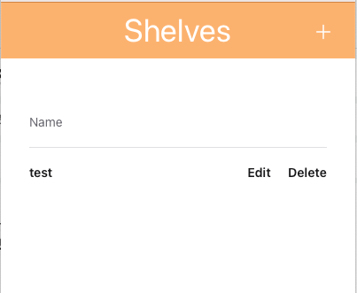
表示はこんな感じになります
show.exにも追加しましょう
+ <.gheader title={@shelf.name}>
+  <:back>
+    <.link navigate={~p"/shelves"}>
+      <.icon name="hero-chevron-left-solid" class="h-6 w-6"/>
+    </.link>
+  </:back>

+  <:actions>
+    <.link patch={~p"/shelves/#{@shelf}/show/edit"} phx-click={JS.push_focus()}>
+      <.icon name="hero-pencil-square-solid" class="h-6 w-6 mr-4" />
+    </.link>
+  </:actions>
+ </.gheader>

- <.header>
-  Shelf <%= @shelf.id %>
-  <:subtitle>This is a shelf record from your database.</:subtitle>
-  <:actions>
-    <.link patch={~p"/shelves/#{@shelf}/show/edit"} phx-click={JS.push_focus()}>
-      <.button>Edit shelf</.button>
-    </.link>
-  </:actions>
- </.header>

<.list>
  <:item title="Name"><%= @shelf.name %></:item>
</.list>

- <.back navigate={~p"/shelves"}>Back to shelves</.back>
...
戻るボタンは chevron-leftを設定します

こんな感じになります
ボトムタブナビゲーションの実装
本棚一覧の他に本検索画面と機能を分けるボトムタブナビゲーションを作ります
コンポーネントはこちらを使います
defmodule BookshelfWeb.Navigation do
  use Phoenix.Component

+ import BookshelfWeb.CoreComponents
  ...
  # 以下追加
  attr(:title, :string, default: "")

  def bottom_tab(assigns) do
    ~H"""
    <div class="btm-nav">
      <%= for {title, icon ,path} <- links() do %>
        <a href={path} class={if @title == title, do: "active", else: ""}>
          <button>
            <.icon name={icon} class="w-5 h-5" />
            <p class="btm-nav-label"><%= title %></p>
          </button>
        </a>
      <% end %>
    </div>
    """
  end

  defp links() do
    [
      {"Shelf", "hero-book-open-solid", "/shelves"},
      {"Search", "hero-magnifying-glass-solid", "/search"},
      {"Setting", "hero-cog-6-tooth-solid", "/settings"}
    ]
  end
end
linksで定義したリンクでタブを作成し、ページのタイトルと同じタブをアクティブ状態にします
早速使ってみましょう
コンテンツ部分とモーダルの間あたりにいれます、今回は.tableの下になります
...
<.table
  id="shelves"
  rows={@streams.shelves}
  row_click={fn {_id, shelf} -> JS.navigate(~p"/shelves/#{shelf}") end}
>
  ...
</.table>

+ <.bottom_tab title="Shelf" />

...
<.list>
  <:item title="Name"><%= @shelf.name %></:item>
</.list>

<.bottom_tab title="Shelf" />
...

最後に
UIコンポーネントライブラリの選定と、ヘッダーナビゲーション、ボトムタブナビゲーションについて解説しました
次は本棚と登録する本の関連付けを行います