1. 概要
Reactを大規模に利用することが難しい場合、少しだけReactを取り入れてみて、徐々に適用範囲を広げていくのが良いです。
Reactでは既存のページに部分的に利用することが可能であり、今回はその方法について説明します。
2. 前提条件
作業日時
- 2020/3/5
ソフトウェアのバージョン
| ソフトウェア | バージョン |
|---|---|
| webpack | 4.42.0 |
| babel | 7.8.6 |
| ts-loader | 6.2.1 |
| react | 16.13.0 |
| react-dom | 16.13.0 |
| typescript | 3.8.3 |
3. シンプルな利用方法
3.1. 環境の準備
create-react-appは利用せず、自分でWebpack等の設定ファイルを準備する。
最初に yarn init で package.json を作成し、その後、必要なパッケージをインストールする。
webpack、babel、typescriptの他にhtml確認用のwebpack-dev-serverをインストールする。
$ yarn init
$ yarn add -D webpack webpack-cli webpack-dev-server html-webpack-plugin
$ yarn add -D @babel/core babel-loader @babel/preset-env @babel/preset-react @babel/register
$ yarn add -D typescript ts-loader
React関連もインストールする。
$ yarn add react react-dom
$ yarn add -D @types/react @types/react-dom
$ yarn add @material-ui/core @material-ui/icons
3.2.設定ファイルの作成
3.2.1.Webpackの設定ファイル
webpackのコンフィグファイルを作成します。
$ touch webpack.config.js
設定ファイルには以下のように記述します。
エントリポイントはindex.jsxで、出力ファイルはbundle.jsにしています。
require('@babel/register'); // development.jsでES6を使えるようにする

const path = require('path')

const src  = path.resolve(__dirname, 'src');
const dist = path.resolve(__dirname, 'dist');

module.exports = {
  mode: 'development',
//  mode: "production",

  entry: src + '/index.jsx',
  output: {
    path: dist,
    filename: 'bundle.js'
  },
  module: {
    rules: [
      {
        test: /\.jsx$/,
        exclude: /node_modules/,
        use: [
            {
              loader: "babel-loader", // Babel を利用する
              options: { // Babel のオプションを指定する
                presets: [
                  "@babel/preset-env", // プリセットを指定することで、ES2020 を ES5 に変換
                  "@babel/react" // React の JSX を解釈
                ]
              }
            }
          ]
      }
    ]
  },
  resolve: {
    extensions: ['.js', '.jsx']
  },
  plugins: []
}
3.2.2. Typescriptの設定
Typescriptの設定ファイルも作成します。
{
  "compilerOptions": {
    "sourceMap": true,
    "target": "es5",  /* tsを書くときにどのversionのESが対象か: 'ES3' (default), 'ES5', 'ES2015', 'ES2016', 'ES2017','ES2018' or 'ESNEXT'. */
    "module": "es2015" /* どのversionのESを生成するか: 'none', 'commonjs', 'amd', 'system', 'umd', 'es2015', or 'ESNext'. */

    /* Strict Type-Checking Options */
    "strict": true,                        /* すべての strict タイプ・オプション(noImplicitAny, strictNullChecks, noImplicitThis(thisの型チェック), alwaysStrict(strictモードのjs出力)) を 有効化する */
    "noImplicitAny": true,                 /* any型の使用不可 */
    "strictNullChecks": true,              /* nullable型以外でnullを許容しない */

    /* Additional Checks */
    "noUnusedLocals": true,                /* 未使用の変数を許容しない */
    "noUnusedParameters": true,            /* 未使用の変数を許容しない */
    "noImplicitReturns": true,             /* メソッド内で返り値の型があっているかをチェック */

    /* Module Resolution Options */
    "moduleResolution": "node",            /* http://js.studio-kingdom.com/typescript/handbook/module_resolution 参照 */
    "esModuleInterop": true                /* ESModuleと同じ動作をする. */
  }
}
3.3. サンプルの作成
3.3.1. HTML に DOM コンテナを追加する
Reactを追加したい HTML ファイルを用意します。
React で描画したい箇所に空の <div> 要素を追加し、ユニークな id 属性を指定します。また、 <script src="bundle.js" charset="utf-8"></script> を追加し、React コンポーネントのJavascriptを読み込みます。
これで、後から <div> 要素にReact コンポーネントを描画する準備ができました。
<!doctype html>
<html lang="en">

<head>
    <meta charset="utf-8" />
    <meta name="viewport" content="width=device-width,initial-scale=1" />
    <meta name="theme-color" content="#000000" />
    <meta name="description" content="Web site created using create-react-app" />
    <title>React App</title>
</head>

<body><noscript>You need to enable JavaScript to run this app.</noscript>
    <div id="app" />
</body>
<script src="bundle.js" charset="utf-8"></script>
</html>
3.3.2. Reactコンポーネントを作成する
次にReactコンポーネントを作成します。
import React from 'react';
import {render} from 'react-dom';

function App() {
    return (
      <div>
      <h1>Hello React!</h1>
      </div>);
}

render(<App/>, document.getElementById('app'));
3.3.3. ビルド
Webpackを使って上記のコードをビルドします。
成功すれば、 dist/bundle.js が生成されます。
$ ./node_modules/.bin/webpack
webpack-dev-serverを起動して、ブラウザからlocalhost:8080にアクセスしてみます。
Hello React! と表示されれば成功です。
$ ./node_modules/.bin/webpack-dev-server
4. 複数のコンポーネントを利用する方法
先程のサンプルでは一つのRreactコンポーネントを利用しただけですが、次はReactコンポーネントを利用する方法について説明します。
4.1. 設定ファイルの修正
複数のファイルを一度に生成できるように、 webpack.config.js を修正します。
entry に複数のコンポーネントを列挙します。また、output の filename を [name].bundle.jsとすることで、それぞれ別のファイルが出力されるようにします。
require('@babel/register'); // development.jsでES6を使えるようにする

const path = require('path')

const src = path.resolve(__dirname, 'src');
const dist = path.resolve(__dirname, 'dist');

module.exports = {
    mode: 'development',
    //  mode: "production",

    entry: {
        appbar: src + '/index.tsx',
       content: src + '/content.tsx'
      },

    output: {
        path: dist,
        filename: '[name].bundle.js'
    },
    module: {
        rules: [
            {
                // 拡張子 .ts の場合
                test: /\.tsx?$/,
                exclude: /node_modules/,
                // TypeScript をコンパイルする
                use: [
                    // 下から順に処理される
                    {
                        loader: "babel-loader",
                        // Babel のオプションを指定する
                        options: {
                            presets: [
                                // プリセットを指定することで、ES2020 を ES5 に変換
                                "@babel/preset-env",
                                // React の JSX を解釈
                                "@babel/react"
                            ]
                        }
                    },
                    { loader: "ts-loader" }
                ],
            }
        ]
    },
    resolve: {
        extensions: ['.ts', '.tsx', '.js', '.jsx']
    },
    plugins: []
};
4.2. サンプルアプリの作成
htmlファイルと、ヘッダとコンテンツのReactコンポーネントの3つのファイルを作成します。
最初にヘッダ部分の描画用のReactコンポーネントを作成する。
<StylesProvider> はMaterial-UIで自動生成するクラス名が重複しないようにするため、 createGenerateClassName での衝突を避けるためのプリフィックス等の指定を行う。
import React from 'react';
import ReactDOM, { render } from 'react-dom';
import { makeStyles, createStyles, Theme } from '@material-ui/core/styles';
import { StylesProvider, createGenerateClassName } from '@material-ui/core/styles';


import {
  AppBar,
  Toolbar,
  Typography,
  IconButton,
  Avatar
} from '@material-ui/core';

import red from '@material-ui/core/colors/red';

// Material-UIアイコン取得
import NotificationImportantIcon from '@material-ui/icons/NotificationImportant';
import MenuIcon from "@material-ui/icons/Menu";

const generateClassName = createGenerateClassName({
  productionPrefix: 'a',
  seed: 'appbar', // classNameが重複しないようにするために設定
});

// スタイルを適用する
const useStyles = makeStyles((theme: Theme) =>
  createStyles({
    headerLogo: {
      color: "inherit",
      marginRight: 20,
    },
    headerTitleStyle: {
      flexGrow: 1,
      color: "inherit",
    },
    menuButton: {
      color: "inherit",
      padding: '8px',
    },
    avatar: {
      margin: '8px',
      backgroundColor: red[500],
    }
  }),
);


function MyAppBar() {
  // CSSを適用する。
  const classes = useStyles();

  return (
    <StylesProvider generateClassName={generateClassName}>
    <div>
      <AppBar position='static' aria-label="Global Navi">
        <Toolbar>
          <Typography className={classes.headerLogo} variant="subtitle1">My Sample App</Typography>
          <Typography className={classes.headerTitleStyle} variant="subtitle1" >Material UI test</Typography>
          <NotificationImportantIcon></NotificationImportantIcon>
          <IconButton className={classes.menuButton} aria-label="Menu">
            <Avatar className={classes.avatar}></Avatar>
          </IconButton>
          <IconButton aria-label="SideMenu">
            <MenuIcon />
          </IconButton>
        </Toolbar>
      </AppBar>
    </div>
    </StylesProvider>
  )
}

ReactDOM.render(<MyAppBar />, document.getElementById('appbar'));
次にコンテンツ部分の描画用のReactコンポーネントを作成する。
import React from 'react';
import ReactDOM, { render } from 'react-dom';
import { makeStyles, createStyles, Theme } from '@material-ui/core/styles';
import { StylesProvider, createGenerateClassName } from '@material-ui/core/styles';

import {
  Typography,
  IconButton,
  Avatar,
  Paper,
  Tab,
  Tabs,
  Box,
  Card,
  CardHeader,
  CardMedia,
  CardContent
} from '@material-ui/core';

import red from '@material-ui/core/colors/red';

// Material-UIアイコン取得
import MoreVertIcon from '@material-ui/icons/MoreVert';

const generateClassName = createGenerateClassName({
  productionPrefix: 'b',
  seed: 'content', // classNameが重複しないようにするために設定
});

// スタイルを適用する
const useStyles = makeStyles((theme: Theme) =>
  createStyles({
    avatar: {
      margin: '8px',
      backgroundColor: red[500],
    },
    card: {
      textAlign: 'center',
      maxWidth: 400,
    },
    media: {
      height: 0,
      paddingTop: '56.25%', // 16:9
    },
    actions: {
      display: 'flex',
    },
    expand: {
      transform: 'rotate(0deg)',
      marginLeft: 'auto',
      transition: theme.transitions.create('transform', {
        duration: theme.transitions.duration.shortest,
      }),
    },
    expandOpen: {
      transform: 'rotate(180deg)',
    },
  }),
);


interface TabPanelProps {
  children?: React.ReactNode;
  index: any;
  value: any;
}

function TabPanel(props: TabPanelProps) {
  const { children, value, index, ...other } = props;

  return (
    <Typography
      component="div"
      role="tabpanel"
      hidden={value !== index}
      id={`simple-tabpanel-${index}`}
      aria-labelledby={`simple-tab-${index}`}
      {...other}
    >
      {value === index && <Box p={3}>{children}</Box>}
    </Typography>
  );
}

function Content() {
  // CSSを適用する。
  const classes = useStyles();
  const [value, setValue] = React.useState(0);

  const handleChange = (event: React.ChangeEvent<{}>, newValue: number) => {
    setValue(newValue);
  };

  return (
    <StylesProvider generateClassName={generateClassName}>
    <div>
      <Paper square>
        <Tabs
          value={value}
          indicatorColor="primary"
          textColor="primary"
          onChange={handleChange}
          variant="scrollable"
          scrollButtons="auto"
          aria-label="scrollable auto tabs example"
        >
          <Tab label="TOP" />
          <Tab label="お買い物" />
          <Tab label="ファッション" />
          <Tab label="グルメ" />
          <Tab label="おでかけ" />
          <Tab label="スポーツ" />
          <Tab label="映画・ドラマ" />
        </Tabs>

        <TabPanel value={value} index={0}>
          <Card className={classes.card}>
            <CardHeader
              avatar={<Avatar aria-label="Recipe" className={classes.avatar}>R</Avatar>}
              action={
                <IconButton>
                  <MoreVertIcon />
                </IconButton>
              }
              title="キットカット4種セット(毎日のナッツ&クランベリー[パウチ36g/ルビー パウチ31g]"
              subheader="2020年3月5日"
            />
            <CardMedia className={classes.media} image="/img/paella.jpg" title="Paella dish"/>
            <CardContent><Typography component="p">カードの説明</Typography></CardContent>
            </Card>
        </TabPanel>
          <TabPanel value={value} index={1}>
            Item Two
        </TabPanel>
          <TabPanel value={value} index={2}>
            Item Three
        </TabPanel>
        <TabPanel value={value} index={3}>
            Item Four
        </TabPanel>
        <TabPanel value={value} index={4}>
            Item Five
        </TabPanel>
        <TabPanel value={value} index={5}>
            Item Six
        </TabPanel>
        <TabPanel value={value} index={6}>
            Item Seven
        </TabPanel>
      </Paper>
    </div>
    </StylesProvider>
      )
    }

ReactDOM.render(<Content />, document.getElementById('content'));
最後にhtmlファイルを作成する。
ヘッダとコンテンツ用のReactコンポーネントを読み込むため、Reactを描画する
appbar.bundle.jsとcontent.bundle.jsのJavascriptを読み込む。
<!doctype html>
<html lang="en">

<head>
    <meta charset="utf-8" />
    <meta name="viewport" content="width=device-width,initial-scale=1" />
    <meta name="theme-color" content="#000000" />
    <meta name="description" content="Web site created using create-react-app" />
    <title>React App</title>
</head>

<body><noscript>You need to enable JavaScript to run this app.</noscript>
    <header>
        <h1>ページタイトル<h1>
    </header>
    <div id="appbar"></div>
    <div id="content"></div>
    <script src="appbar.bundle.js" charset="utf-8"></script>
    <script src="content.bundle.js" charset="utf-8"></script>
    <footer>
        <nav>
            <a href="index.html">トップページ</a>
            <a href="about.html">このサイトについて</a>
        </nav>
        <p>Copyright 2020</p>
    </footer>
</body>

</html>
4.3. ビルドする
ビルドして、サーバーで表示します。
$ ./node_modules/.bin/webpack
$ ./node_modules/.bin/webpack-dev-server
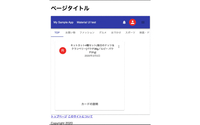
以下の画面が表示されたら成功です。
5. 最後に
今回は既存のhtmlにReactを部分的に利用する方法について説明しました。
既に運用しているサービスがある場合、全面的なSPA化は困難ですが、部分的に置換えていくことで、徐々にReactに移行していくことが可能だと思います。
次回はRechartsを利用したデータの可視化について説明します。
6. 関連記事
Reactに関する記事です。
- 第1回 2020年版 Node.js+Reactのインストール
- 第2回 2020年版 ReactのMaterial UI V4の使い方について
- 第3回 2020年版 React+Firebaseでアプリを作成する
- 第5回 2020年版 ReactのRechartsで新型コロナウイルス感染症対策サイトのデータを可視化する
- 第6回 2020年版 React+Firebaseで画像のアップロード(その1)
- 第7回 2020年版 React+Firebaseで画像のアップロード(その2)
- 第8回 2020年版 React+Firebaseで画像のアップロード(その3)
- 第9回 2020年版 ReactにStoryshotsを導入する