やりたいこと
サポートベクトルマシンを作ってみる。
やってみた感想としては、libsvmのまま使ったほうが使いやすいかも?
コード
'''
Created on 2019/05/15
@author: tatsunidas
'''
import numpy as np
import matplotlib.pyplot as plt
from matplotlib.colors import ListedColormap
from sklearn import svm
from sklearn.model_selection import train_test_split
from sklearn.preprocessing import StandardScaler
import pandas as pd
import seaborn as sns # used for plot interactive graph.
#データの読み込み
from sklearn.datasets import load_breast_cancer
dataset = load_breast_cancer()
df = pd.DataFrame(data=dataset.data, columns=dataset.feature_names)
# トレーニングデータとテストデータに分割
# 乱数を制御するパラメータ random_state は None にすると毎回異なるデータを生成する
X, X_test, y, y_test = train_test_split(dataset.data, dataset.target, test_size=0.2, random_state=None)
print(X.shape)
# データの標準化処理
sc = StandardScaler()
sc.fit(X)
X = sc.transform(X)
X_test = sc.transform(X_test)
# fit the model
h = .02 # step size in the mesh
# we create an instance of SVM and fit out data. We do not scale our
# data since we want to plot the support vectors
svc = svm.SVC(kernel='linear', C=1.).fit(X, y)#One-vs-One
lin_svc = svm.LinearSVC(C=1., tol=2e-03).fit(X, y)#One-vs-All
rbf_svc = svm.NuSVC(kernel='rbf', gamma='auto').fit(X, y)
# polyのみdegreeをオプションで使える。チューニングは難しい
poly_svc = svm.NuSVC(kernel='poly', gamma='auto', degree=3,decision_function_shape='ovr', nu=0.05).fit(X, y)
#show accuracy
print('score :: 1 svc, 2 lin_svc, 3 rbf_svc, 4 poly_svc')
for j, clf in enumerate((svc, lin_svc, rbf_svc, poly_svc)):
print(str(j+1))
print('正解率(train):{:.3f}'.format(clf.score(X,y)))
print('正解率(test):{:.3f}'.format(clf.score(X_test,y_test)))
'''
graphを作ってみる
'''
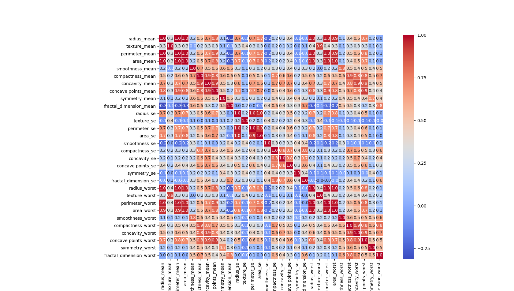
#相関を見てみる
df = pd.DataFrame(data=dataset.data, columns=dataset.feature_names)
corr = df.corr() # .corr is used to find corelation
f,ax = plt.subplots(figsize=(20, 20))
sns.heatmap(corr, cbar = True, square = True, annot = True, fmt= '.1f',
xticklabels= True, yticklabels= True
,cmap="coolwarm", linewidths=.5, ax=ax);
plt.show()
#最初の2つの特徴を使って境界を描画してみる
# create a mesh to plot in
x_min, x_max = X[:, 0].min() - 1, X[:, 0].max() + 1
y_min, y_max = X[:, 1].min() - 1, X[:, 1].max() + 1
xx, yy = np.meshgrid(np.arange(x_min, x_max, h),
np.arange(y_min, y_max, h))
# title for the plots
titles = ['SVC with linear kernel',
'LinearSVC (linear kernel)',
'SVC with RBF kernel',
'SVC with polynomial kernel']
plt.figure(figsize=(10,12))
for j, clf in enumerate((svc, lin_svc, rbf_svc, poly_svc)):
# Plot the decision boundary by assigning a color to each point in the mesh
plt.subplot(2, 2, j + 1)
plt.subplots_adjust(wspace=0.4, hspace=0.4)
pre_pred = np.array([xx.ravel(), yy.ravel()] + [np.repeat(0, xx.ravel().size) for _ in range(28)]).T
print(pre_pred.shape)
pred = clf.predict(pre_pred)
Z = pred.reshape(xx.shape)
decf = clf.decision_function(pre_pred).reshape(xx.shape)
# Put the result into a color plot
# decision func
plt.contourf(xx, yy, decf,alpha=1.0, cmap="RdYlGn", levels=np.linspace(decf.min(), decf.max(), 100))
# boundary (これを使うときは一行上の plt.contourf(xx, yy, decf...をコメントアウトして)
# plt.contourf(xx, yy, Z, cmap=plt.cm.get_cmap('RdBu_r'), alpha=0.6)
# Ploting the training points
plt.scatter(X[:, 0], X[:, 1], c=y, cmap=plt.cm.get_cmap('RdBu_r'))
plt.xlabel(dataset.feature_names[0],size=20)
plt.ylabel(dataset.feature_names[1],size=20)
plt.xlim(xx.min(), xx.max())
plt.ylim(yy.min(), yy.max())
plt.xticks(())
plt.yticks(())
plt.title(titles[j],size=20);
plt.show()
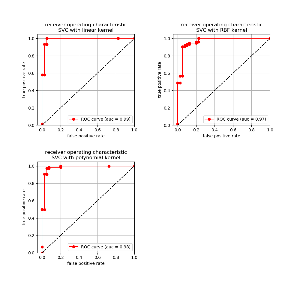
# 5/17 added
# ROC curve(ロックカーブ)
titles = ['SVC with linear kernel',
# 'LinearSVC (linear kernel)', # proba関数がない。予測を取得したいだけなのでpredict関数でもOKと思う。
'SVC with RBF kernel',
'SVC with polynomial kernel']
plt.figure(figsize=(10,12))
for j, clf in enumerate((svc, rbf_svc, poly_svc)):# exclude lin_svc
# Plot each ROC curve
plt.subplot(2, 2, j + 1)
plt.subplots_adjust(wspace=0.4, hspace=0.4)
#予測確率を取得
pred = clf.predict_proba(X_test)[:,1]
#偽陽性率と真陽性率の算出
fpr, tpr, thretholds = roc_curve(y_test,pred)
# aucの算出
# auc = auc(fpr,tpr)
auc = roc_auc_score(y_test, pred)
# Ploting ROC
plt.plot(fpr, tpr,label='ROC curve (auc = %.2f)'%(auc), marker='o', color='red')
plt.plot([0,1],[0,1], color = 'black',linestyle='--')
plt.xlabel('false positive rate')
plt.ylabel('true positive rate')
plt.xlim(-0.05, 1.0)
plt.ylim(0.0, 1.05)
plt.title('receiver operating characteristic'+'\n'+ titles[j]);
plt.legend()
plt.grid()
plt.show()
結果
(455, 30)#形状の確認用
score :: 1 svc, 2 lin_svc, 3 rbf_svc, 4 poly_svc
1
正解率(train):0.987
正解率(test):0.991
2
正解率(train):0.989
正解率(test):0.982
3
正解率(train):0.947
正解率(test):0.965
4
正解率(train):0.998
正解率(test):0.974
(175616, 30)
(175616, 30)
(175616, 30)
(175616, 30)
途中で描画するグラフ
データセット内の特徴相関図
最初の2つの特徴を使って描画した境界面
(polyはチューニングが難しい。)
ROC curve
参考文献やURL
https://qiita.com/kazuki_hayakawa/items/18b7017da9a6f73eba77
https://scikit-learn.org/stable/modules/generated/sklearn.svm.NuSVC.html
https://www.kaggle.com/rcfreitas/python-ml-breast-cancer-diagnostic-data-set
https://ameblo.jp/cognitive-solution/entry-12290094948.html
https://scikit-learn.org/stable/auto_examples/svm/plot_svm_nonlinear.html#sphx-glr-auto-examples-svm-plot-svm-nonlinear-py
https://www.kaggle.com/selener/breast-cancer-diagnosis/notebook
https://stackoverflow.com/questions/45384185/what-is-the-difference-between-linearsvc-and-svckernel-linear/45390526
https://www.kaggle.com/sachin1512/breast-cancer-dataset/downloads/breast-cancer-dataset.zip/1
https://archive.ics.uci.edu/ml/datasets/breast+cancer+wisconsin+(original)