Library
import numpy as np
import matplotlib.pyplot as plt
%matplotlib inline

from scipy import signal
Example 1
chordList = [(262, 330, 392),  # C(ドミソ)
             (294, 370, 440),  # D(レファ#ラ)
             (330, 415, 494),  # E(ミソ#シ)
             (349, 440, 523),  # F(ファラド)
             (392, 494, 587),  # G(ソシレ)
             (440, 554, 659),  # A(ラド#ミ)
             (494, 622, 740)]  # B(シレ#ファ#)

# freqList = chordList[0]
freqList = [250, 2000, 3750]

A = 0.25
freqList = chordList[1]
fs = 8000.0
length = 1

data = []
amp = float(A) / len(freqList)
# [-1.0, 1.0]の小数値が入った波を作成
for n in range(int(length * fs)):  # nはサンプルインデックス
  s = 0.0
  for f in freqList:
      s += amp * np.sin(2 * np.pi * f * n / fs)
  # 振幅が大きい時はクリッピング
  if s > 1.0:  s = 1.0
  if s < -1.0: s = -1.0
  data.append(s)
# [-32768, 32767]の整数値に変換
# data = [int(x * 32767.0) for x in data]

plt.figure(figsize=(10, 3))
plt.plot(data[:300])
plt.show()
Example 2
# 簡単な信号の作成(正弦波 + ノイズ)
N = 128 # サンプル数
dt = 0.01 # サンプリング周期(sec)
freq = 4 # 周波数(10Hz)
amp = 1 # 振幅

t = np.arange(0, N*dt, dt) # 時間軸
f = amp * np.sin(2*np.pi*freq*t) + np.random.randn(N)*0.3 # 信号

# 高速フーリエ変換(FFT)
F = np.fft.fft(f)
F_abs = np.abs(F) # 複素数を絶対値に変換
F_abs_amp = F_abs / N * 2 # 振幅をもとの信号に揃える(交流成分2倍)
F_abs_amp[0] = F_abs_amp[0] / 2 # 振幅をもとの信号に揃える(直流成分非2倍)

# 周波数軸のデータ作成
fq = np.linspace(0, 1.0/dt, N) # 周波数軸 linspace(開始,終了,分割数)

# フィルタリング①(周波数でカット)******
F2 = np.copy(F) # FFT結果コピー
fc = 10 # カットオフ(周波数)
F2[(fq > fc)] = 0 # カットオフを超える周波数のデータをゼロにする(ノイズ除去)
F2_abs = np.abs(F2) # FFTの複素数結果を絶対値に変換
F2_abs_amp = F2_abs / N * 2 # 振幅をもとの信号に揃える(交流成分2倍)
F2_abs_amp[0] = F2_abs_amp[0] / 2 # 振幅をもとの信号に揃える(直流成分非2倍)
F2_ifft = np.fft.ifft(F2) # IFFT
F2_ifft_real = F2_ifft.real * 2 # 実数部の取得、振幅を元スケールに戻す

# フィルタリング②(振幅強度でカット)******
F3 = np.copy(F) # FFT結果コピー
ac = 0.2 # 振幅強度の閾値
F3[(F_abs_amp < ac)] = 0 # 振幅が閾値未満はゼロにする(ノイズ除去)
F3_abs = np.abs(F3)# 複素数を絶対値に変換
F3_abs_amp = F3_abs / N * 2 # 交流成分はデータ数で割って2倍
F3_abs_amp[0] = F3_abs_amp[0] / 2 # 直流成分(今回は扱わないけど)は2倍不要
F3_ifft = np.fft.ifft(F3) # IFFT
F3_ifft_real = F3_ifft.real # 実数部の取得

# グラフ表示
fig = plt.figure(figsize=(7, 7))

# グラフ表示
# オリジナル信号
fig.add_subplot(321)
plt.xlabel('time(sec)', fontsize=14)
plt.ylabel('signal', fontsize=14)
plt.plot(t, f)

# オリジナル信号 ->FFT
fig.add_subplot(322)
plt.xlabel('freqency(Hz)', fontsize=14)
plt.ylabel('amplitude', fontsize=14)
plt.plot(fq, F_abs_amp)

# オリジナル信号 ->FFT ->周波数filter ->IFFT
fig.add_subplot(323)
plt.xlabel('time(sec)', fontsize=14)
plt.ylabel('signal(freq.filter)', fontsize=14)
plt.plot(t, F2_ifft_real)

# オリジナル信号 ->FFT ->周波数filter
fig.add_subplot(324)
plt.xlabel('freqency(Hz)', fontsize=14)
plt.ylabel('amplitude(freq.filter)', fontsize=14)
# plt.vlines(x=[10], ymin=0, ymax=1, colors='r', linestyles='dashed')
plt.fill_between([10 ,100], [0, 0], [1, 1], color='g', alpha=0.2)
plt.plot(fq, F2_abs_amp)

# オリジナル信号 ->FFT ->振幅強度filter ->IFFT
fig.add_subplot(325)
plt.xlabel('time(sec)', fontsize=14)
plt.ylabel('signal(amp.filter)', fontsize=14)
plt.plot(t, F3_ifft_real)

# オリジナル信号 ->FFT ->振幅強度filter
fig.add_subplot(326)
plt.xlabel('freqency(Hz)', fontsize=14)
plt.ylabel('amplitude(amp.filter)', fontsize=14)
# plt.hlines(y=[0.2], xmin=0, xmax=100, colors='r', linestyles='dashed')
plt.fill_between([0 ,100], [0, 0], [0.2, 0.2], color='g', alpha=0.2)
plt.plot(fq, F3_abs_amp)

plt.tight_layout()
Example 3
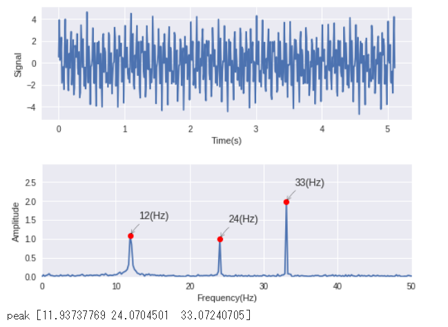
np.random.seed(0) # 乱数seed固定

N = 512 # サンプル数
dt = 0.01 # サンプリング間隔
fq1, fq2 , fq3 = 12, 24, 33 # 周波数
amp1, amp2, amp3 = 1.5, 1, 2 # 振幅

t = np.arange(0, N*dt, dt) # 時間軸
# 時間信号作成
f = amp1*np.sin(2*np.pi*fq1*t)
f += amp2*np.sin(2*np.pi*fq2*t)
f += amp3*np.sin(2*np.pi*fq3*t)
f += np.random.randn(N)*0.3 # ノイズ
freq = np.linspace(0, 1.0/dt, N) # 周波数軸

# 高速フーリエ変換
F = np.fft.fft(f)

F_abs = np.abs(F) # 複素数 ->絶対値に変換
# 振幅を元の信号のスケールに揃える
F_abs = F_abs / (N/2) # 交流成分
F_abs[0] = F_abs[0] / 2 # 直流成分

# グラフ表示(時間軸)
plt.figure(figsize=(8,6))

plt.subplot(211)
plt.plot(t, f)
plt.xlabel('Time(s)')
plt.ylabel('Signal')

# FFTデータからピークを自動検出
maximal_idx = signal.argrelmax(F_abs, order=1)[0] # ピーク(極大値)のインデックス取得
# ピーク検出感度調整もどき、後半側(ナイキスト超)と閾値より小さい振幅ピークを除外
peak_cut = 0.3 # ピーク閾値
maximal_idx = maximal_idx[(F_abs[maximal_idx] > peak_cut) & (maximal_idx <= N/2)]

# グラフ表示(周波数軸)
plt.subplot(212)
plt.xlabel('Frequency(Hz)')
plt.ylabel('Amplitude')

plt.axis([0,1.0/dt/2,0,max(F_abs)*1.5])
plt.plot(freq, F_abs)
plt.plot(freq[maximal_idx], F_abs[maximal_idx],'ro')

# グラフにピークの周波数をテキストで表示
for i in range(len(maximal_idx)):
    plt.annotate('{0:.0f}(Hz)'.format(np.round(freq[maximal_idx[i]])),
                 xy=(freq[maximal_idx[i]], F_abs[maximal_idx[i]]),
                 xytext=(10, 20),
                 textcoords='offset points',
                 arrowprops=dict(arrowstyle="->",connectionstyle="arc3,rad=.2")
                )

plt.subplots_adjust(hspace=0.4)
plt.show()
print('peak', freq[maximal_idx])
Example 4
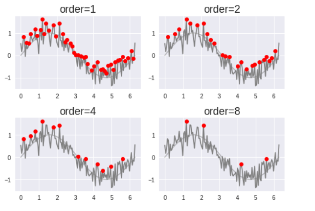
np.random.seed(0) # 乱数seed固定

N = 128 # データ数
x = np.linspace(0, 2*np.pi, N) # x軸
y = np.sin(x) # 正弦波
y_add_noise = y + np.random.randn(N)*0.3 # 正弦波+ノイズ(ピーク検出テスト用)

order_list = [1, 2, 4, 8]
axes_count = 4 # グラフの個数

fig = plt.figure(figsize=(7,5))

for i in range(axes_count):

    # ピーク検出
    maximal_idx = signal.argrelmax(y_add_noise, order=order_list[i]) # 極大値インデックス取得

    fig.add_subplot(2, 2, i+1)
    plt.title('order={}'.format(order_list[i]), fontsize=18)
    plt.plot(x, y,'r',label='sin(x)', c='gray', alpha=0.5) # 正弦波
    plt.plot(x, y_add_noise,label='sin(x)+noise', c='gray') # 正弦波+ノイズ

    plt.plot(x[maximal_idx],y_add_noise[maximal_idx],'ro',label='peak_maximal') # 極大点プロット

plt.tight_layout()
Example 5
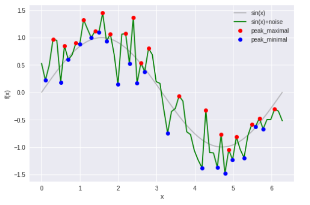
np.random.seed(0) # 乱数seed固定

N = 64 # データ数
x = np.linspace(0, 2*np.pi, N) # x軸
y = np.sin(x) # 正弦波
y_add_noise = y + np.random.randn(N)*0.3 # 正弦波+ノイズ(ピーク検出テスト用)

# ピーク検出
maximal_idx = signal.argrelmax(y_add_noise, order=1) # 極大値インデックス取得
minimal_idx = signal.argrelmin(y_add_noise, order=1) # 極小値インデックス取得

plt.plot(x, y,'r',label='sin(x)', c='gray', alpha=0.5) # 正弦波
plt.plot(x, y_add_noise,label='sin(x)+noise', c='g') # 正弦波+ノイズ

plt.plot(x[maximal_idx],y_add_noise[maximal_idx],'ro',label='peak_maximal') # 極大点プロット
plt.plot(x[minimal_idx],y_add_noise[minimal_idx],'bo',label='peak_minimal') # 極小点プロット
plt.xlabel('x')
plt.ylabel('f(x)')
plt.legend()
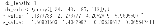
# 極大値情報の表示例
print('idx_length:', len(maximal_idx)) # peakの検出数
print('idx_value:', maximal_idx) # peakのindex
print('x_value:', x[maximal_idx]) # peakのx値
print('y_value:', y_add_noise[maximal_idx]) #peakのy値
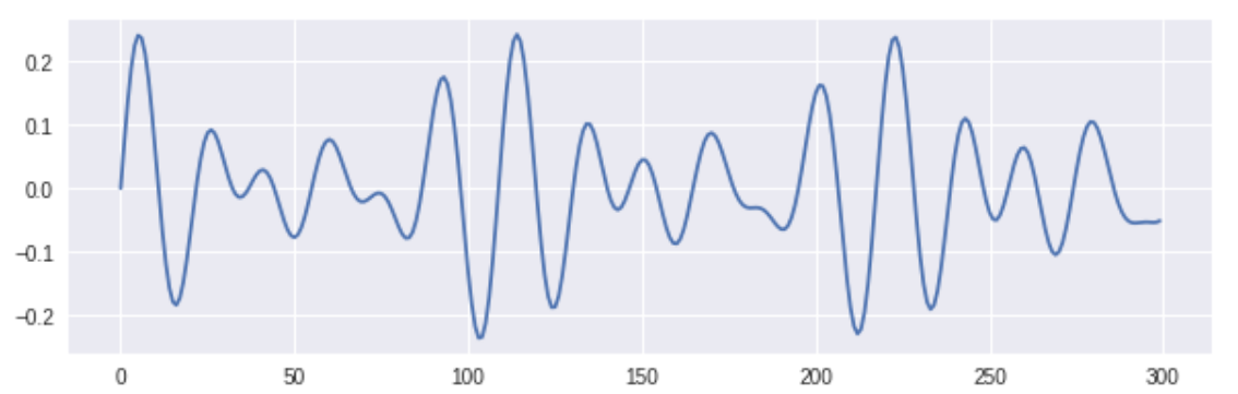
Example 6
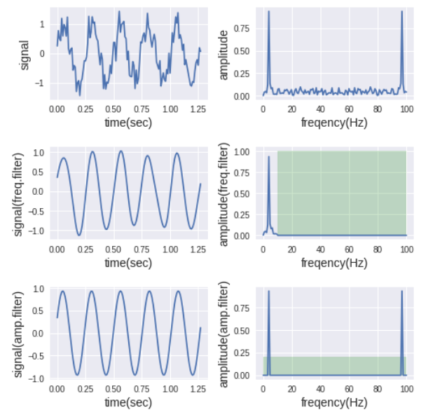
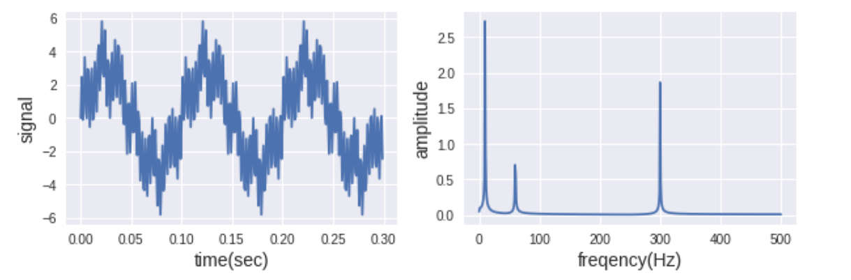
N = 1024            # サンプル数
dt = 0.001          # サンプリング周期 [s]
f1, f2, f3 = 10, 60, 300 # 周波数 [Hz]

t = np.arange(0, N*dt, dt) # 時間 [s]
f = 3.0*np.sin(2*np.pi*f1*t) + 1.0*np.sin(2*np.pi*f2*t) + 2.0*np.sin(2*np.pi*f3*t) # 信号

# 高速フーリエ変換(FFT)
F = np.fft.fft(f)
F_abs = np.abs(F) # 複素数を絶対値に変換
F_abs_amp = F_abs / N * 2 # 振幅をもとの信号に揃える(交流成分2倍)
F_abs_amp[0] = F_abs_amp[0] / 2 # 振幅をもとの信号に揃える(直流成分非2倍)

# 周波数軸のデータ作成
fq = np.linspace(0, 1.0/dt, N) # 周波数軸 linspace(開始,終了,分割数)

# plt.figure(figsize=(5, 3))
# plt.xlabel('time(sec)', fontsize=14)
# plt.ylabel('signal', fontsize=14)
# plt.plot(t[:300], f[:300])
# plt.show()

# グラフ表示
fig = plt.figure(figsize=(10, 3))

# オリジナル信号
fig.add_subplot(121)
plt.xlabel('time(sec)', fontsize=14)
plt.ylabel('signal', fontsize=14)
plt.plot(t[:300], f[:300])

# オリジナル信号 ->FFT
fig.add_subplot(122)
plt.xlabel('frequency(Hz)', fontsize=14)
plt.ylabel('amplitude', fontsize=14)
plt.plot(fq[:int(N/2)+1], F_abs_amp[:int(N/2)+1])

plt.show()
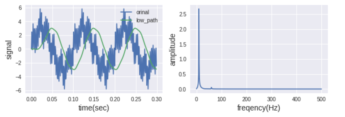
filter1 = signal.firwin(numtaps=51, cutoff=40, fs=1/dt)
y1 = signal.lfilter(filter1, 1, f)

F1 = np.fft.fft(y1)
Amp1 = np.abs(F1/(N/2))

# グラフ表示
fig = plt.figure(figsize=(10, 3))

# オリジナル信号
fig.add_subplot(121)
plt.xlabel('time(sec)', fontsize=14)
plt.ylabel('signal', fontsize=14)
plt.plot(t[:300], f[:300], label='orinal')
plt.plot(t[:300], y1[:300], label='low_path')
plt.legend(loc='best')

# オリジナル信号 ->FFT
fig.add_subplot(122)
plt.xlabel('frequency(Hz)', fontsize=14)
plt.ylabel('amplitude', fontsize=14)
plt.plot(fq[:int(N/2)+1], Amp1[:int(N/2)+1])

plt.show()
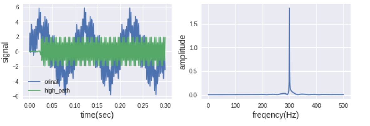
filter2 = signal.firwin(numtaps=51, cutoff=100, fs=1/dt, pass_zero=False)
y2 = signal.lfilter(filter2, 1, f)

F2 = np.fft.fft(y2)
Amp2 = np.abs(F2/(N/2))

# グラフ表示
fig = plt.figure(figsize=(10, 3))

# オリジナル信号
fig.add_subplot(121)
plt.xlabel('time(sec)', fontsize=14)
plt.ylabel('signal', fontsize=14)
plt.plot(t[:300], f[:300], label='orinal')
plt.plot(t[:300], y2[:300], label='high_path')
plt.legend(loc='best')

# オリジナル信号 ->FFT
fig.add_subplot(122)
plt.xlabel('frequency(Hz)', fontsize=14)
plt.ylabel('amplitude', fontsize=14)
plt.plot(fq[:int(N/2)+1], Amp2[:int(N/2)+1])

plt.show()
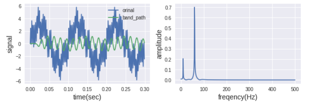
filter3 = signal.firwin(numtaps=51, cutoff=[30, 100], fs=1/dt, pass_zero=False)
y3 = signal.lfilter(filter3, 1, f)

F3 = np.fft.fft(y3)
Amp3 = np.abs(F3/(N/2))

# グラフ表示
fig = plt.figure(figsize=(10, 3))

# オリジナル信号
fig.add_subplot(121)
plt.xlabel('time(sec)', fontsize=14)
plt.ylabel('signal', fontsize=14)
plt.plot(t[:300], f[:300], label='orinal')
plt.plot(t[:300], y3[:300], label='band_path')
plt.legend(loc='best')

# オリジナル信号 ->FFT
fig.add_subplot(122)
plt.xlabel('frequency(Hz)', fontsize=14)
plt.ylabel('amplitude', fontsize=14)
plt.plot(fq[:int(N/2)+1], Amp3[:int(N/2)+1])

plt.show()
Example 7
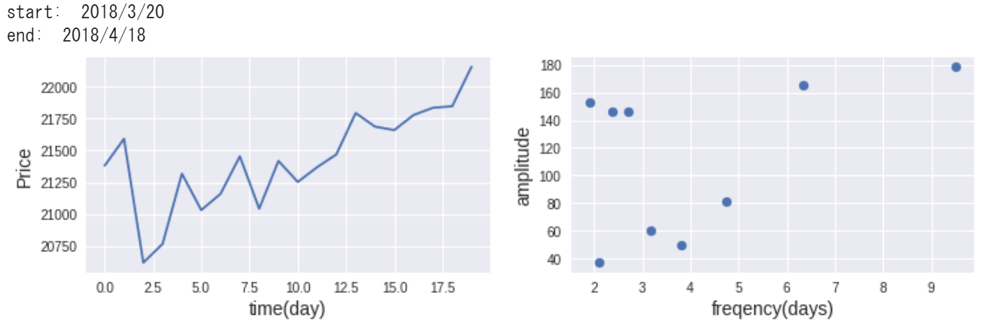
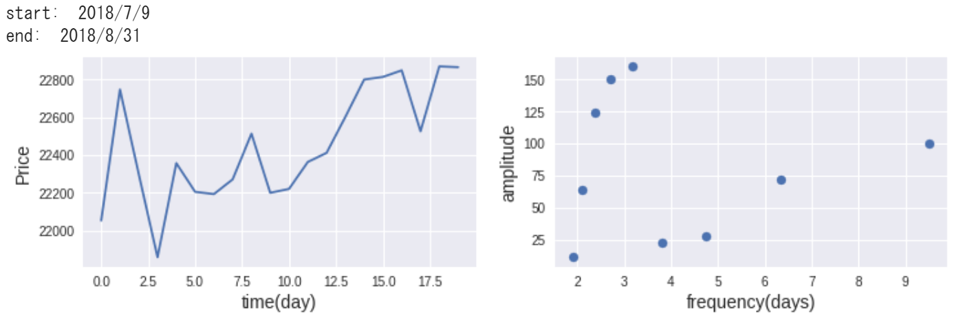
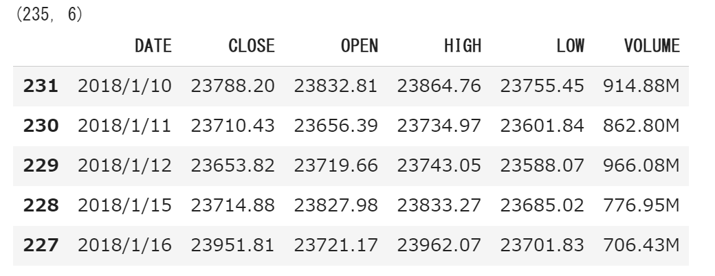
df_data = df_data.sort_values('DATE', ascending=True)

print (df_data.shape)
df_data.head()
s = np.random.randint(len(df_data)-20)
f = df_data['CLOSE'].values[s:s+20]
# f

dates = df_data['DATE'].values[s:s+20]

N = len(f)            # サンプル数
dt = 1          # サンプリング周期 [day]

t = np.arange(0, N*dt, dt) # 時間 [s]

# 高速フーリエ変換(FFT)
F = np.fft.fft(f)
F_abs = np.abs(F) # 複素数を絶対値に変換
F_abs_amp = F_abs / N * 2 # 振幅をもとの信号に揃える(交流成分2倍)
F_abs_amp[0] = F_abs_amp[0] / 2 # 振幅をもとの信号に揃える(直流成分非2倍)

# 周波数軸のデータ作成
fq = np.linspace(0, 1.0/dt, N) # 周波数軸 linspace(開始,終了,分割数)

# plt.figure(figsize=(5, 3))
# plt.xlabel('time(sec)', fontsize=14)
# plt.ylabel('signal', fontsize=14)
# plt.plot(t[:300], f[:300])
# plt.show()

print ('start: ', dates[0])
print ('end: ', dates[-1])

# グラフ表示
fig = plt.figure(figsize=(12, 3))

# オリジナル信号
fig.add_subplot(121)
plt.xlabel('time(day)', fontsize=14)
plt.ylabel('Price', fontsize=14)
plt.plot(t[:300], f[:300])

# オリジナル信号 ->FFT
fig.add_subplot(122)
# plt.xlabel('frequency(Hz)', fontsize=14)
# plt.ylabel('amplitude', fontsize=14)
# plt.plot(fq[1:int(N/2)+1], F_abs_amp[1:int(N/2)+1])

t = 1.0 / (fq[:int(N/2)+1] + 1e-10)
plt.xlabel('frequency(days)', fontsize=14)
plt.ylabel('amplitude', fontsize=14)
plt.scatter(t[2:], F_abs_amp[2:int(N/2)+1])

plt.show()