概要
Jetpack Composeの実用的な使い方を知ることができる動画で、すごく色んな部分で面白かったです。
https://github.com/android/compose-samples にそれぞれのサンプルがあります。
Theming
Make the easy things easy and the hard things possible というのを大きく語っていました。Colorからダークテーマ対応までは Make the easy things easy にあたるようです。
color、typography、shapeを定義して作る
MaterialTheme(
  colors = ...
  typography = ...
  shapes = ...
) {
}
Color
Material color stytemのクラスで作る。
val colors = Colors(
  primary = ...
  primaryVariant = ...
他にもデフォルトやベースラインのカラーパレットから作るビルダー関数もある。
これを使うと変更したい色だけ変更して作ることができる
val colors = lightColors(
  primary = ...
  secondary = ...
複数のテーマがあるサンプルアプリのOwlではこのビルダー関数を使って何個もテーマを作っている。
Typography
Material Themeによってデフォルトが定義されている。
何もカスタマイズしたくなければ。そのまま使える。
val typography = Typography()
以下のようにTextStyleを使ってカスタマイズができる。
val typography = Typography(
  h1 = TextStyle(
    fontFamily = Rubik,
    fontSize = 96.sp,
    fontWeight = FontWeight.Bold,
    lineHeight = 120.sp
  )
Shape
small, medium, largeのサイズのコンポーネントのshapeを定義する。
val shapes = Shapes(
  small = ...
  medium = ...
  large = ...
角丸だとこう。
small = RoundedCornerShape(size = 4.dp)
左上をカットするにはこう。
small = CutCornerShape(topLeft = 16.dp)
テーマの推奨される適応方法
以下のようにしておいて、アプリ内で横断して使えるようにすることができる。
@Compose
fun YellowTheme(
  content: @Composable () -> Unit
) {
  MaterialTheme(
    colors = YellowLightColors,
    ...
  )
}
以下のようにすることで画面の一部だけテーマを変えることができる。
fun CourseDetails(...) {
  PinkTheme {
    ...
    BlueTheme {
      RelatedCourses(...)
    }
  }
}
テーマの要素の使い方
型安全にそれぞれの要素にアクセスして利用できる。
Text(
  text = ...
  style = MaterialTheme.typography.subtitle1,
  color = MaterialTheme.colors.(ここで保管が出る)
)
色をコピーして利用することも簡単にできるので、色をハードコードしてしまうことを防げ、複数のテーマをサポートすることに役立つ。
val background =
MaterialTheme.colors.onSurface.copy(
  alpha = 0.2f
)
Surface(color = background) {...}
smart default
バックグラウンドの色を設定するとそれに対応するコンテンツの色が勝手につく。例えば以下ではcolor = primaryを設定しているので、コンテンツの色は勝手にonPrimaryの色になる。
同様にFloatingActionButtonなどでもこの仕組は利用できる。
Surface(color = MaterialTheme.colors.primary) {
  // ここでのデフォルトカラーは `onPrimary` になる。
}
(動画外):動画とは関係なくちょっと気になったので調べてみましたが、以下のようにcontentColorが作られるようです。
@Composable
fun Surface(
    modifier: Modifier = Modifier,
    shape: Shape = RectangleShape,
    color: Color = MaterialTheme.colors.surface,
    contentColor: Color = contentColorFor(color),
...)

@Composable
fun contentColorFor(color: Color) =
    MaterialTheme.colors.contentColorFor(color).useOrElse { contentColor() }
また以下のようにAmbientでcontentColorが配られることで利用できるようです。 (ambientについてはこちら )
Providers(ContentColorAmbient provides contentColor, children = content)
ダークテーマ対応
isSystemInDarkTheme()を使って分けるだけ。簡単!
@Composable
fun PinkTheme(
  darkTheme: Boolean = isSystemInDarkTheme(),
  content: @Composable () -> Unit
) {
  if (darkTheme) PinkDarkColors else PinkLightColors
...
(動画外)isSystemInDarkTheme()の中ではこんな感じで判定している。
@Composable
fun isSystemInDarkTheme(): Boolean {
    val configuration = ConfigurationAmbient.current
    return (configuration.uiMode and Configuration.UI_MODE_NIGHT_MASK) == Configuration
        .UI_MODE_NIGHT_YES
}
ダイナミックテーマ
ここからは Make the easy things easy and the hard things possible の the hard things possibleにあたる部分です。
ここではダイナミックテーマのサンプルとしてJetcasterというアプリの例で、画像から色を取得してそれをテーマとして使う例。
既存のPaletteライブラリを使って画像からdominantColorを取得して、それを使っている。
これでアニメーションもできる。(軽く書いているけどすごい。。)
val currentImage = ...
val palette = // Paletteライブラリを使って画像からpaletteを取得
val dominantColor = // paletteからdominant colorを取得

val colors = MaterialTheme.colors.copy(
  primary = animate(dominantColor),
)

MaterialTheme(colors = colors) {
  content()
}
Layout
- Colum: 縦に並べる
- Row: 横に並べる
- Stack: 要素同士を上に重ねる (背景と上に乗るものみたいな)
- ConstraintLayout: Androidエンジニアにはおなじみの制約でレイアウトするレイアウト
Modifierでクリックやpadding、toggleable、verticalScroll()、zoomable()なども使える。すごい。
カスタムレイアウトを作るには @Composable fun Layout()の使い方。
これを作るにはどうすればよいか。Layoutブロック使うとカスタムレイアウトを作れる
https://youtu.be/DDd6IOlH3io?t=869 より
長くなってしまったのでこの詳細は以下Qiitaに切り出しました。見てみてください。 
https://qiita.com/takahirom/items/c6625cbc7ebdda49de2f
Animation
シンプルなアニメーション
アニメーションなしでの書き方
val radius = if (selected) 28.dp else 0.dp
val shape = RoundedCornerShape(topLeft = radius)
Surface(
  shape = shape
...
アニメーションありでの書き方
変更したい値でanimte()を使うだけ。
val radius = animate(if (selected) 28.dp else 0.dp)
val shape = RoundedCornerShape(topLeft = radius)
Surface(
  shape = shape
...
シンプルな例を実装してみました。 ( https://github.com/takahirom/jetpack-compose-animation-sample )

@Composable
fun SimpleAnimation() {
    // 値を保持させている。変更されたときにrecomposeされる。
    var isRightState by remember { mutableStateOf(false) }
  // ここでanimate()を使う。animateは前回の値を持っており、それとの変更でアニメーションが走る。
    val leftMarginSize = animate(if (isRightState) 200.dp else 50.dp)
    Row(
        Modifier.fillMaxWidth()
    ) {
        Spacer(Modifier.width(leftMarginSize))
        Surface(
            color = Color.Green,
            modifier = Modifier.size(100.dp)
                .clickable(onClick = {
                    isRightState = !isRightState
                }),
        ) {}
    }
}
Transition
https://github.com/android/compose-samples/blob/34a75fb3672622a3fb0e6a78adc88bbc2886c28f/Owl/app/src/main/java/com/example/owl/ui/onboarding/Onboarding.kt#L156 にサンプルがあるのですが、
少し複雑なので、かんたんなサンプルを用意しました。
https://github.com/takahirom/jetpack-compose-animation-sample

// 状態を表すenumを用意する
private enum class BoxSelectedState {
    Selected, Unselected
}

// 変化させたい値のPropKeyを用意する (変数を大文字から始めているのはCompose内部のコードを真似ています)
private val LeftMargin = DpPropKey()
private val BoxColor = ColorPropKey()
private val ShapeCornerPropKey = DpPropKey()

// transitionDefinitionでtransitionDefinitionを定義する
private val BoxTransitionDefinition = transitionDefinition<BoxSelectedState> {
    state(BoxSelectedState.Selected) {
     // それぞれの状態ごとの値を設定する
        this[LeftMargin] = 50.dp
        this[BoxColor] = Color.Green
        this[ShapeCornerPropKey] = 0.dp
    }
    state(BoxSelectedState.Unselected) {
        this[LeftMargin] = 200.dp
        this[BoxColor] = Color.Red
        this[ShapeCornerPropKey] = 24.dp
    }
    // これはなくても動く、durationなどを設定したり、keyframe{} で進捗度が0.5のときにどれなどの設定もできる
    transition {
        LeftMargin using tween(durationMillis = 1000)
        BoxColor using tween(durationMillis = 2000)
        ShapeCornerPropKey using tween(durationMillis = 2000)
    }
}

@Composable
fun BoxTransitionAnimation() {
    var selectedState by remember { mutableStateOf(BoxSelectedState.Selected) }

    val transitionState = transition(
        definition = BoxTransitionDefinition,
        toState = selectedState
    )

    Row(
        Modifier.fillMaxWidth()
    ) {
        Spacer(Modifier.width(transitionState[LeftMargin]))
        Surface(
            // transitionState[]でアクセスする
            color = transitionState[BoxColor],
            shape = RoundedCornerShape(transitionState[ShapeCornerPropKey]),
            modifier = Modifier.size(100.dp)
                .clickable(onClick = {
                    selectedState = when (selectedState) {
                        BoxSelectedState.Selected -> BoxSelectedState.Unselected
                        BoxSelectedState.Unselected -> BoxSelectedState.Selected
                    }
                }),
        ) {}
    }
}
今後Android Studioにアニメーションのinspectorが追加される
今後のcanaryで以下のようにアニメーションをキーフレームで見られるような機能が追加されるみたい。
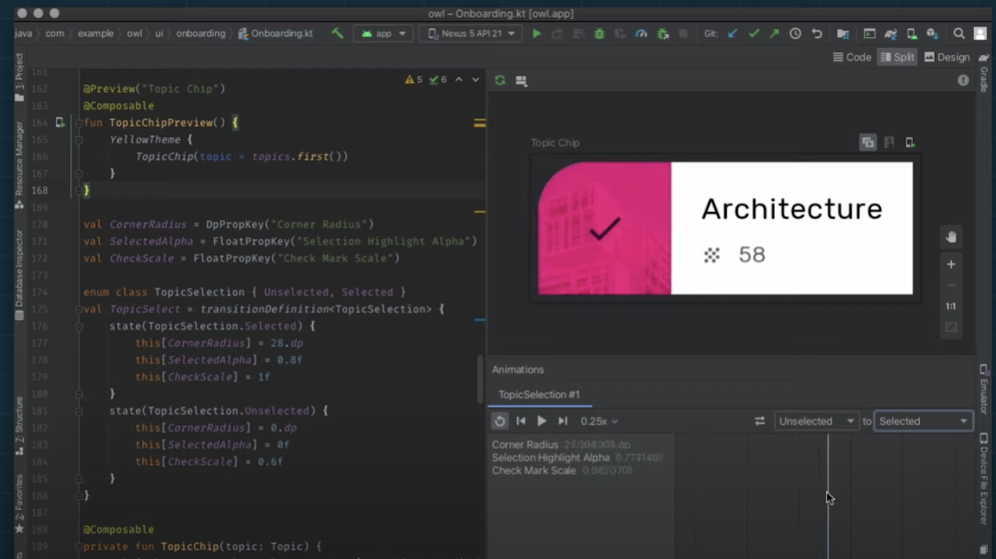
https://www.youtube.com/watch?v=DDd6IOlH3io より
アニメーションをスクショを撮ってテストできる
clockTestRuleというのにアクセスして、時間を操作でき、またスクショの比較などもできるので、それを使ってアニメーションのテストが可能なようです。
    private fun compareTimeScreenshot(timeMs: Long, goldenName: String) {
        // Start with a paused clock
        composeTestRule.clockTestRule.pauseClock()

        // Start the unit under test
        showAnimatedCircle()

        // Advance clock (keeping it paused)
        composeTestRule.clockTestRule.advanceClock(timeMs) // 時間を操作する

        // Take screenshot and compare with golden image in androidTest/assets
        assertScreenshotMatchesGolden(goldenName, onRoot()) // 保存されている画像とスクショを比較する
    }
まとめ
アニメーションの記述の容易さのように簡単なことは簡単にできてすごく書きやすいと感じました。
また難しいことも、カスタムのレイアウトが簡単に作れたり、Transitionの途中でスクショを撮って比較してテストとかこれまで考えられなかったのですが、そのようなことが可能になっているなどとても拡張性も高いと感じました。