現在、VuetifyというVue.jsのコンポーネントライブラリを実験的に利用しています。
標準でも豊富なUIライブラリが準備されておりとても役に立っています。
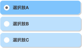
いくつかの入力コンポーネントを利用していますが、縦に選択肢が並ぶセレクトボックスを利用したいニーズがあり(※こんなイメージ)
vuetifyのライブラリにはイメージにピッタリ当てはまるものが無かったためセレクトボタンコンポーネントを作ってみました。
(v-btn-toggleというものがイメージに近しかったのですが、スタイルシートを当てないと縦に並ぶものが作れず・・~~スタイルシートが不得意なので(いいわけ)~~どうしてもvutifyのプロパティだけで作りたかったのです。もはや意地ですww)
それで、できたのがこちら↓
VBtnSelect.js
// 特約選択欄:1セレクトボックス
Vue.component('v-btn-select', {
    // event: change (変更された)
	props: {
        value: Array,
        // ボタンのスタイルに関する
        large: Boolean,             // 大きいサイズのボタン(default:false)
        outline: Boolean,           // アウトラインボタン(default:false)
        column: Boolean,            // フレックス方向を列に設定(default:false)
        colorDefault: String,       // 未選択時のカラー(default:'')
        colorSelected: String,      // 選択時のカラー(default:'green lighten-4')
        iconDefault: String,        // 未選択時のアイコン(default:'')
        iconSelected: String,       // 選択時のアイコン(default:'')
        iconColorDefault: String,   // 未選択時のアイコンカラー(default:'')
        iconColorSelected: String,  // 選択時のアイコンカラー(default:'green')
        // ボタンの挙動に関する
        multiple: Boolean,          // 複数選択(default:false)
        mandatory: Boolean,         // 必須選択(default:false)
        options: Array,             // 選択項目(default:OK/NG)
	},
	data: function(){
        return {
            // 初期値
            mySelector: this.value ,
            // ボタンのスタイルに関する
            myLarge:                (this.large === '' || typeof this.large === 'undefined')                            ? false             : this.large,
            myOutline:              (this.outline === '' || typeof this.outline === 'undefined')                        ? false             : this.outline,
            myColumn:               (this.column === '' || typeof this.column === 'undefined')                          ? false             : this.column,
            myColorDefault:         (this.colorDefault === '' || typeof this.colorDefault === 'undefined')              ? ''                : this.colorDefault,
            myColorSelected:        (this.colorSelected === '' || typeof this.colorSelected === 'undefined')            ? 'green lighten-4' : this.colorSelected,
            myIconDefault:          (this.iconDefault === '' || typeof this.iconDefault === 'undefined')                ? ''                : this.iconDefault,
            myIconSelected:         (this.iconSelected === '' || typeof this.iconSelected === 'undefined')              ? ''                : this.iconSelected,
            myIconColorDefault:     (this.iconColorDefault === '' || typeof this.iconColorDefault === 'undefined')      ? ''                : this.iconColorDefault,
            myIconColorSelected:    (this.iconColorSelected === '' || typeof this.iconColorSelected === 'undefined')    ? 'green'           : this.iconColorSelected,
            // ボタンの挙動に関する
            myMultiple:     (this.multiple === '' || typeof this.multiple === 'undefined')      ? false : this.multiple,
            myMandatory:    (this.mandatory === '' || typeof this.mandatory === 'undefined')    ? false : this.mandatory,
            myOptions:      (this.options === '' || typeof this.options === 'undefined')        ? [
                {text: 'OK', value: 'ok', disabled: false},
                {text: 'NO', value: 'no', disabled: false},
            ]: this.options,
        }
	},
    template: `
        <v-layout
            :column="myColumn"
            wrap>
            <v-btn v-for="(o, index) in myOptions" :key="index"
                :large="myLarge"
                :outline="myOutline"
                :color="$_isSelect(index) ? myColorSelected : myColorDefault"
                :disabled="o.disabled"
                block
                @click="$_click(index)">
                <v-icon
                    v-show="myIconDefault !== ''"
                    :color="$_isSelect(index) ? myIconColorSelected : myIconColorDefault"
                    left
                >{{ $_isSelect(index) ? myIconSelected : myIconDefault }}</v-icon>
                <v-spacer ></v-spacer>
                <span v-html="o.text"></span>
                <v-spacer></v-spacer>
                <v-icon v-show="myIconDefault !== '' && column" left ></v-icon>
            </v-btn>
        </v-layout>
	`,
	methods: {
        $_isSelect: function(i){
            // ▪️Todo -> クリックされる度に呼び出しされるためパフォーマス悪化になる。

            var ret = this.mySelector.indexOf(this.myOptions[i].value) >= 0;
            console.log('$_isSelect:' + this.myOptions[i].text + ':' + ret);
            return ret;
        },
        $_click: function(i){
            console.log('$_select');
            if(this.myMultiple){
                // 複数選択
                if (this.$_isSelect(i)){
                    if (this.myMandatory && this.mySelector.length === 1) return
                    this.mySelector.splice(this.mySelector.indexOf(this.myOptions[i].value), 1);
                }else{
                    this.mySelector.push(this.myOptions[i].value);
                }
            }else{
                // 単一選択
                if (this.$_isSelect(i)){
                    if (this.myMandatory && this.mySelector.length === 1) return
                    this.mySelector.splice(this.mySelector.indexOf(this.myOptions[i].value), 1);
                }else{
                    this.mySelector = [];
                    this.mySelector.push(this.myOptions[i].value);
                }
            }
            console.log(this.mySelector);
            this.$emit('input', this.mySelector);
            this.$emit('change');
        },
    },
	watch: {
		value: function (newValue, oldValue) {
            this.mySelector = newValue;
        },
	},
})
- 本家Vuetifyのv-btnをラップして作っています。ローカルスコープ内で選択値を保持しボタンがクリックイベントを拾って選択値を動的に変更しています。
- 実用性を考えてv-btnで利用できるいくつかのプロパティを適用できるようにしました。
(挙動面:複数選択/必須選択/チェンジイベント、スタイル面:カラー/アイコン/配置方向など)
使い方
-
冒頭でもお伝えした通り、Vue.jsのコンポーネントライブラリVuetifyを利用するため前提として以下のファイルを読み込む必要があります。
- vue.js:
https://cdn.jsdelivr.net/npm/vue/dist/vue.js - vuetify:
https://cdn.jsdelivr.net/npm/vuetify/dist/vuetify.js - vutifyのCSS:
https://cdn.jsdelivr.net/npm/vuetify/dist/vuetify.min.css - vutifyのプラグインアイコン:
https://fonts.googleapis.com/css?family=Roboto:300,400,500,700|Material+Icons - 今回作ったVBtnSelect.js
- vue.js:
-
利用元からは
v-btn-selectタグで記述し、コンポーネントと紐つける選択値をv-modelでバインドすればすぐ使えます。このときコンポーネントと紐つける値はArray型とする必要があります。
main.html
<!DOCTYPE html>
<html>
    <head>
        <link href='https://fonts.googleapis.com/css?family=Roboto:300,400,500,700|Material+Icons' rel="stylesheet">
        <link href="https://cdn.jsdelivr.net/npm/vuetify/dist/vuetify.min.css" rel="stylesheet">
        <script src="https://cdn.jsdelivr.net/npm/vue/dist/vue.js"></script>
        <script src="https://cdn.jsdelivr.net/npm/vuetify/dist/vuetify.js"></script>
        <script src="VBtnSelect.js"></script>
    </head>
    <body>
        <div id="app">
            <v-btn-select
                v-model="selector"
                :options="options"
            ></v-btn-select>
        </div>
    </body>
    <script src="main.js"></script>
</html>
main.js
var vm = new Vue({
    el: '#app',
    data: {
        // 選択値
        selector: [],
        // 選択項目
        options: [
            { text: 'Apple', value: 'Apple', disabled: false },
            { text: 'Lemon', value: 'Lemon', disabled: false },
            { text: 'Banana', value: 'Banana', disabled: false },
        ],
    },
});
またいくつかのプロパティを用意していますので、これらのサンプルは最下段のcodepenを参考にしてください。
// ボタンのスタイルに関する
large               // 大きいサイズのボタン(default:false)
column              // フレックス方向を列に設定(default:false)
iconColorDefault    // 未選択時のカラー(default:'')
colorSelected       // 選択時のカラー(default:'green lighten-4')
iconColorDefault    // 未選択時のアイコン(default:'')
iconSelected        // 選択時のアイコン(default:'')
iconColorDefault    // 未選択時のアイコンカラー(default:'')
iconColorSelected   // 選択時のアイコンカラー(default:'green')
// ボタンの挙動に関する
multiple            // 複数選択(default:false)
mandatory           // 必須選択(default:false)
options             // 選択項目(default:OK/NG)
See the Pen WgdGev by t-kajihara (@t-kajihara) on CodePen.
注意点
- ボタンクリックされる度に
$_isSelectが呼び出しされるため効率が悪くパフォーマンスが悪いと思っています。プロトタイプ開発なのでこの辺は気にしてません。 - 単一選択
multiple=falseの場合、単一の値を返すのが正しいですが、このコンポーネントでは要素1の配列を呼び出し元へ返します。呼び出し元ではvar seletedValue = selector[0]などとし、上記のことを意識する必要があります。 - ボタンのテキストが長い場合自動的に折り返しされません。テキストを適切に改行し
largeプロパティを利用してください。