はじめに
機械学習の勉強を始めたVBAユーザです。
Pythonの Matplotlib の matplotlib.pyplot では、複数のグラフを自動的にいい感じに重ねて描いてくれます。
R で同じことをしようとするとうまくいかなかったので、調べてみました。
目次
Rでグラフの重ね描き
簡単な例(折れ線グラフの重ね描き)
例えば、Matplotlibの Usage Guide に1次関数、2次関数、3次関数を重ね描きした例があります。Pythonではこのように簡単に描けます。
import matplotlib.pyplot as plt
import numpy as np
x = np.linspace(0, 2, 100)
y1 = x**1
y2 = x**2
y3 = x**3
# pyplot-style
plt.figure()
plt.plot(x, y1, label='linear')
plt.plot(x, y2, label='quadratic')
plt.plot(x, y3, label='cubic')
plt.xlabel('x label')
plt.ylabel('y label')
plt.title('Simple Plot')
plt.legend()
plt.show()
# object-oriented (OO) style
fig, ax = plt.subplots() # Create a figure and an axes.
ax.plot(x, y1, label='linear') # Plot some data on the axes.
ax.plot(x, y2, label='quadratic') # Plot more data on the axes...
ax.plot(x, y3, label='cubic') # ... and some more.
ax.set_xlabel('x label') # Add an x-label to the axes.
ax.set_ylabel('y label') # Add a y-label to the axes.
ax.set_title('Simple Plot') # Add a title to the axes.
ax.legend() # Add a legend.
plt.show()

これと同じことを R でしようとすると、R標準のplot()関数では(重ねて描いてくれず)別々のグラフになってしまいます。
そこで、Rでグラフを重ね描きする方法を調べてみました。
参考:
- http://cse.naro.affrc.go.jp/takezawa/r-tips/r.html
- https://stats.biopapyrus.jp/r/
- https://heavywatal.github.io/rstats/ggplot2.html
- https://www.jaysong.net/ggplot_intro1/
- https://mickey24.hatenablog.com/entry/20110223/ggplot2_qplot
- https://qiita.com/awakia/items/79ddc9d7887aecd203d1
1. Rの標準パッケージを用いる場合
(1) グラフを重ねる
Rの標準パッケージの作図関数には、高水準作図関数と低水準作図関数があります(このほかに、対話的作図関数というのもあります(参照)が今回は使いません。)。
- 高水準作図関数:(グラフ部分だけでなく)座標軸も含めたグラフ全体を描くもの
(例)plot(),curve(),hist(),barplot(),pie(),boxplot()等 - 低水準作図関数:(高水準作図関数が描いた座標軸上に)グラフの各要素だけを追加で描くもの
(例)points(),lines(),abline(),text(),polygon(),box(),title(),axis(),legend()等
(1-1) 高水準作図関数の作図を重ねて描く
高水準作図関数の作図を重ねる方法は2つあります。
ただし、高水準作図関数は座標軸も含めたグラフ全体を作図するので、重ねると座標軸も重ねて描かれてしまいます。そこで、2つ目以降は座標軸などのグラフ部分以外の要素は表示しないようにする必要があります。また、座標軸がずれている場合はそろえる必要もあります。
- (1-1a) 高水準作図関数で描いた図を
par(new=T)で重ね合わせる - (1-1b) 高水準作図関数の引数に
add=Tを入れて重ね合わせる
順に説明します。
(1-1a) 高水準作図関数で描いた図をpar(new=T)で重ね合わせる
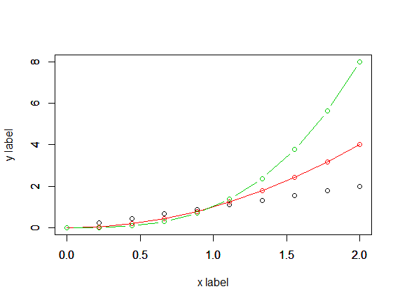
高水準作図関数plot(x, y)で描いたグラフを重ねてみます。(なお、plot(x, y)は、type="l"("l"はエル)で折れ線グラフになり、colで色を指定できます。)
x <- seq(0, 2, len=100)
x
y1 <- x^1
y2 <- x^2
y3 <- x^3
plot(x=x, y=y1, type="l", col=1)
plot(x=x, y=y2, type="l", col=2)
plot(x=x, y=y3, type="l", col=3)


 別々のグラフになって重なりません。
これらを`par(new=T)`で重ねます。
別々のグラフになって重なりません。
これらを`par(new=T)`で重ねます。
plot(x=x, y=y1, type="l", col=1)
par(new=T)
plot(x=x, y=y2, type="l", col=2)
par(new=T)
plot(x=x, y=y3, type="l", col=3)
 これでは高水準作図関数の結果(座標軸も含めて)を単純に重ね合わせているだけなので、このままでは座標軸が合っていません。軸のラベルも重なって見にくくなっています。
そこで、3つの軸の範囲(`xlim`, `ylim`)を同じ範囲に指定し、軸のラベルについては2つ目以降は表示しない(`ann=F`)ようにします。
これでは高水準作図関数の結果(座標軸も含めて)を単純に重ね合わせているだけなので、このままでは座標軸が合っていません。軸のラベルも重なって見にくくなっています。
そこで、3つの軸の範囲(`xlim`, `ylim`)を同じ範囲に指定し、軸のラベルについては2つ目以降は表示しない(`ann=F`)ようにします。
plot(x=x, y=y1, type="l", col=1, xlim=c(0,2), ylim=c(0,8))
par(new=T)
plot(x=x, y=y2, type="l", col=2, xlim=c(0,2), ylim=c(0,8))
par(new=T)
plot(x=x, y=y3, type="l", col=3, xlim=c(0,2), ylim=c(0,8))

plot(x=x, y=y1, type="l", col=1, xlim=c(0,2), ylim=c(0,8))
par(new=T)
plot(x=x, y=y2, type="l", col=2, xlim=c(0,2), ylim=c(0,8), ann=F)
par(new=T)
plot(x=x, y=y3, type="l", col=3, xlim=c(0,2), ylim=c(0,8), ann=F)
 これで軸は最初の1番目のグラフだけになり、2番目以降は同じ座標系上でグラフのみ描いています。
Pythonの結果と合わせるために、これに凡例、タイトルを追加します。
plot(x=x, y=y1, type="l", col=1, xlim=c(0,2), ylim=c(0,8), xlab="x label", ylab="y label")
par(new=T)
plot(x=x, y=y2, type="l", col=2, xlim=c(0,2), ylim=c(0,8), ann=F)
par(new=T)
plot(x=x, y=y3, type="l", col=3, xlim=c(0,2), ylim=c(0,8), ann=F)
# legend(x=0, y=8, legend=c("linear", "quadratic", "cubic"), lty=1, col=1:3)
legend("topleft", legend=c("linear", "quadratic", "cubic"), lty=1, col=1:3)
title("Simple Plot")

なお、この例からわかるように、Rの凡例は、低水準作図関数のlegend()で別途描き入れているだけなので、グラフ部分と連動していません。ですので、こういう嘘の凡例も入れられてしまいます(色がずれている)。
plot(x=x, y=y1, type="l", col=1, xlim=c(0,2), ylim=c(0,8), xlab="x label", ylab="y label")
par(new=T)
plot(x=x, y=y2, type="l", col=2, xlim=c(0,2), ylim=c(0,8), ann=F)
par(new=T)
plot(x=x, y=y3, type="l", col=3, xlim=c(0,2), ylim=c(0,8), ann=F)
legend("topleft", legend=c("linear", "quadratic", "cubic"), lty=1, col=c(2,3,1))
title("Simple Plot")

また、plot(x, y)のtypeは"l"の他にも指定できます。
-
"l":折れ線 -
"p":点 -
"o":点と折れ線(点と折れ線が重なる) -
"b":点と折れ線(点と折れ線が重ならない) -
"c":折れ線(点と折れ線が重ならない) -
"h":縦線(horizontal line) -
"s":階段関数(step function)(左側の値に基づく) -
"S":階段関数(step function)(右側の値に基づく) -
"n":グラフをプロットしない(座標軸のみ描く)
x <- seq(0, 2, len=10)
plot(x=x, y=x^1, type="p", col=1, xlim=c(0,2), ylim=c(0,8), xlab="x label", ylab="y label")
par(new=T)
plot(x=x, y=x^2, type="o", col=2, xlim=c(0,2), ylim=c(0,8), ann=F)
par(new=T)
plot(x=x, y=x^3, type="b", col=3, xlim=c(0,2), ylim=c(0,8), ann=F)

plot(x=x, y=x^3, type="c", col=3, xlim=c(0,2), ylim=c(0,8), xlab="x label", ylab="y label")
par(new=T)
plot(x=x, y=x^3, type="h", col=3, xlim=c(0,2), ylim=c(0,8), ann=F)
par(new=T)
plot(x=x, y=x^3, type="p", col=3, xlim=c(0,2), ylim=c(0,8), xlab="x label", ylab="y label")
par(new=T)
plot(x=x, y=x^3, type="s", col=1, xlim=c(0,2), ylim=c(0,8), ann=F)
par(new=T)
plot(x=x, y=x^3, type="S", col=2, xlim=c(0,2), ylim=c(0,8), ann=F)

(1-1b) 高水準作図関数の引数にadd=Tを入れて重ね合わせる
高水準作図関数の中でaddを引数に持つものはadd=Tとすることで2本目以降のグラフを重ねられます。
高水準作図関数plot(関数, xmin, xmax)は引数add=Tを使えます。(上の (1-1a) の例のplot(x, y)は引数add=Tを使えません。)
まず、1本目のグラフは(座標軸も込みで)描いて、そこに軸なしで2本目以降のグラフを追加します。
x <- seq(0, 2, len=100)
x
f1 <- function(x) x^1
f2 <- function(x) x^2
f3 <- function(x) x^3
plot(f1, type="l", col=1, xlim=c(0,2), ylim=c(0,8), xlab="x label", ylab="y label")
plot(f2, type="l", col=2, xlim=c(0,2), ylim=c(0,8), ann=F, add=T)
plot(f3, type="l", col=3, xlim=c(0,2), ylim=c(0,8), ann=F, add=T)
legend("topleft", legend=c("linear", "quadratic", "cubic"), lty=1, col=1:3)
title("Simple Plot")
高水準作図関数curve(関数, from, to)も引数add=Tを使えます。
3本のグラフのうち3次式が一番範囲が広くなるので、3次式のグラフを先に描いて、そこに1次式と2次式のグラフを追加します。
curve(x^3, from=0, to=2, col=3, xlab="x label", ylab="y label")
curve(x^1, from=0, to=2, col=1, add=T)
curve(x^2, from=0, to=2, col=2, add=T)
legend("topleft", legend=c("linear", "quadratic", "cubic"), lty=1, col=1:3)
title("Simple Plot")

curve(f3, from=0, to=2, col=3, xlab="x label", ylab="y label")
curve(f2, from=0, to=2, col=1, add=T)
curve(f1, from=0, to=2, col=2, add=T)
legend("topleft", legend=c("linear", "quadratic", "cubic"), lty=1, col=1:3)
title("Simple Plot")
(1-2) 高水準作図関数の作図に低水準作図関数の作図を重ねて描く
高水準作図関数で1本目のグラフを座標軸込みで描いて、そこに低水準作図関数で2本目以降のグラフ(グラフのみ)を追加します。
高水準作図関数のplot()のtype="l"(折れ線グラフ)にあたる低水準作図関数にlines(x, y)があります。
3本のグラフのうち3次式が一番範囲が広くなるので、3次式のグラフをplot()で(座標軸込みで)描いて、そこに1次式と2次式のグラフをlines()で追加します。
凡例については、(1-1) と同様です。
plot(x=x, y=y3, type="l", col=3, xlab="x label", ylab="y label")
lines(x=x, y=y1, col=1)
lines(x=x, y=y2, col=2)
legend("topleft", legend=c("linear", "quadratic", "cubic"), lty=1, col=1:3)
title("Simple Plot")

plot(x=x, y=y3, type="n", xlab="x label", ylab="y label")
lines(x=x, y=y1, col=1)
lines(x=x, y=y2, col=2)
lines(x=x, y=y3, col=3)
legend("topleft", legend=c("linear", "quadratic", "cubic"), lty=1, col=1:3)
title("Simple Plot")
この方法は、高水準作図関数が描いた座標軸上に低水準作図関数の作図を重ねるだけなので簡単です。ただし、すでに描かれている座標軸は変わらないので、はみ出した部分は描かれません。
plot(x=x, y=y1, type="l", col=1, xlab="x label", ylab="y label")
lines(x=x, y=y2, col=2)
lines(x=x, y=y3, col=3)
legend("topleft", legend=c("linear", "quadratic", "cubic"), lty=1, col=1:3)
title("Simple Plot")
 このように1次式のグラフを先に描くと、2次式、3次式のグラフがはみ出してしまいます(範囲を指定すればよいですが。)。
(2) データを重ねる
この方法は、複数のグラフを重ねて描くというよりは、1つのグラフを色分けして描くという方法です。
y1~y3は長さ100の3本のベクトルでしたが、それらを重ねて、長さ300の1本のベクトルyyにします。対応するxも3つ重ねて長さ300の1本のベクトルxxにします。さらに、色分けに使うベクトルzzも用意します。これらを使って、1回だけplot()関数でプロットします。
x <- seq(0, 2, len=100)
y1 <- x^1
y2 <- x^2
y3 <- x^3
xx <- c(x, x, x)
length(xx) # 300
yy <- c(y1, y2, y3)
length(yy) # 300
zz <- c(rep(1, length(x)), rep(2, length(x)), rep(3, length(x)))
length(zz) # 300
plot(xx, yy, type="p", col=zz)
legend("topleft", legend=c("linear", "quadratic", "cubic"), pch=1, col=1:3)
title("Simple Plot")

ss <- c(rep("linear", length(x)), rep("quadratic", length(x)), rep("cubic", length(x)))
length(ss) # 300
ff <- factor(ss, levels=c("linear", "quadratic", "cubic"))
length(ff) # 300
plot(xx, yy, type="p", col=ff)
legend("topleft", legend=c("linear", "quadratic", "cubic"), pch=1, col=1:3)
title("Simple Plot")

色分けは、ifelse()関数を使ってもできます(使い方は、ExcelのIF関数と同じ感じです。)。
plot(x=xx, y=yy, col=ifelse(ss=="linear", 1, 2))

plot(x=xx, y=yy, col=ifelse(ss=="linear", 1, ifelse(ss=="quadratic", 2, 3)))
なお、点プロットの場合は色分けできますが、折れ線の場合は途中で色分けができないようです(この例では、全体が最初の色(col=1(黒))になってます。)。
plot(xx, yy, type="l", col=ff)
legend("topleft", legend=c("linear", "quadratic", "cubic"), lty=1, col=1:3)
title("Simple Plot")

2. ggplot2を用いる場合
Rのパッケージggplot2を使った方法です。
2.1 qplot()
ggplot2のqplot()を使った方法です。
上の 1. (2) と同様に、重ねたデータに対して用います。この方法では、1. のlegend()で凡例を入れる方法と違って、自動的にグラフと連動した凡例が入ります。
library(ggplot2)

x <- seq(0, 2, len=100)
y1 <- x^1
y2 <- x^2
y3 <- x^3
xx <- c(x, x, x)
length(xx) # 300
yy <- c(y1, y2, y3)
length(yy) # 300
ss <- c(rep("linear", 100), rep("quadratic", 100), rep("cubic", 100))
length(ss) # 300
ff <- factor(ss, levels=c("linear", "quadratic", "cubic"))
length(ff) # 300
qplot(x=xx, y=yy, col=ss, geom="point")

qplot(x=xx, y=yy, col=ff, geom="point")

qplot()では、グラフは自動的に色分けされ、そのグラフの色と連動した凡例が自動的に入りますが、これは凡例というよりは、座標軸の表示です。
3次元のデータを横軸(x軸)、縦軸(y軸)、奥行き軸(z軸)の代わりに色軸(col)を指定しています。3次元目の軸としては、色軸の他に形軸(shape)、大きさ軸(size)等も指定できます。
3次元目の軸(z軸)は、文字列でも因子(factor)でもカテゴリー変数として色分けしてくれます。
カテゴリーでなくて数値にすると、こんな感じになります(縦軸、横軸には座標の目盛りが表示されるように、色軸には座標の目盛りの代わりにカラーバーが表示されます。)。
zz <- c(rep(1, 100), rep(2, 100), rep(3, 100))
length(zz) # 300
qplot(x=xx, y=yy, col=zz, geom = "point")

qplot()では、上の 1. (2) と違って、点プロットだけでなく折れ線プロットでも色分けできます。
qplot(x=xx, y=yy, col=ff, geom="line")

qplot(x=xx, y=yy, col=ff, geom="line", main="Simple Plot")

qplot(x=xx, y=yy, col=ff, geom="line",
      xlab="x label", ylab="y label", main="Simple Plot")

2.2 ggplot()
ggplot2のggplot()を使った方法です。
ggplot()でキャンバスを用意して、そこにgeom_line()等でレイヤーを次々に重ねていく感じでグラフを描きます(+ geom_line()等、+で足していきます。)。
aes()の中に座標軸となる変数を指定します(この例では、x軸にxx、y軸にyy、色軸にffを指定しています。)。
library(ggplot2)

x <- seq(0, 2, len=100)
y1 <- x^1
y2 <- x^2
y3 <- x^3
s1 <- rep("linear", 100)
s2 <- rep("quadratic", 100)
s3 <- rep("cubic", 100)
xx <- c(x, x, x)
yy <- c(y1, y2, y3)
ss <- c(s1, s2, s3)
ff <- factor(ss, levels=c("linear", "quadratic", "cubic"))

ggplot() +
  geom_line(aes(x=xx, y=yy, col=ff))

ggplot() +
  geom_line(aes(x=xx, y=yy, col=ff)) +
  guides(color=guide_legend(title="")) +
  labs(title="Simple Plot", x="x label", y="y label")

ggplot()は、本来はデータフレームに対して使います。
df <- data.frame(xx, yy, ff)
df
ggplot(data=df, aes(x=xx, y=yy, col=ff)) +
  geom_line()

ggplot(data=df) +
  geom_line(aes(x=xx, y=yy, col=ff))

ggplot() +
  geom_line(data=df, aes(x=xx, y=yy, col=ff))

ggplot(data=df, aes(x=xx, y=yy, col=ff)) +
  geom_line() +
  labs(title="Simple Plot", x="x label", y="y label")

ggplot(data=df, aes(x=xx, y=yy, col=ff)) +
  geom_line() +
  guides(color=guide_legend(title="")) +
  labs(title="Simple Plot", x="x label", y="y label")
また、このようにも使えます。aes()で座標軸を設定するということがわかっていれば、どのように書いても同じようなことをやっているとわかります。
ggplot() +
  geom_line(aes(x=x, y=y1, col=s1)) +
  geom_line(aes(x=x, y=y2, col=s2)) +
  geom_line(aes(x=x, y=y3, col=s3))

ggplot() +
  geom_line(aes(x=x, y=y1, col="linear")) +
  geom_line(aes(x=x, y=y2, col="quadratic")) +
  geom_line(aes(x=x, y=y3, col="cubic"))

ggplot() +
  geom_line(aes(x=x, y=y1, col="linear")) +
  geom_line(aes(x=x, y=y2, col="quadratic")) +
  geom_line(aes(x=x, y=y3, col="cubic")) +
  guides(color=guide_legend(title="")) +
  labs(title="Simple Plot", x="x label", y="y label")

df1 <- data.frame(x=x, y=y1, s="linear")
df2 <- data.frame(x=x, y=y2, s="quadratic")
df3 <- data.frame(x=x, y=y3, s="cubic")
ggplot() +
  geom_line(data=df1, aes(x=x, y=y, col=s)) +
  geom_line(data=df2, aes(x=x, y=y, col=s)) +
  geom_line(data=df3, aes(x=x, y=y, col=s))

df <- rbind(df1, df2, df3)
ggplot(data=df, aes(x=x, y=y, col=s)) +
  geom_line()

df123 <- data.frame(x, y1, y2, y3, s1, s2, s3)
df123
ggplot(data=df123) +
  geom_line(aes(x=x, y=y1, col=s1)) +
  geom_line(aes(x=x, y=y2, col=s2)) +
  geom_line(aes(x=x, y=y3, col=s3))
他の例(サインカーブの重ね描き)
サインカーブを4つ重ねたグラフです。
import matplotlib.pyplot as plt
import numpy as np

t = np.linspace(0, 2*np.pi, 100)

# pyplot-style
plt.figure()
plt.plot(t, np.sin(1*t), linestyle='-',  label='sin(t)')
plt.plot(t, np.sin(2*t), linestyle='--', label='sin(2t)')
plt.plot(t, np.sin(3*t), linestyle=':',  label='sin(3t)')
plt.plot(t, np.sin(4*t), linestyle='-.', label='sin(4t)')
plt.xlabel('t')
plt.ylabel('')
plt.title('Sine curves')
# plt.legend(loc='upper right')
plt.legend(title='curves', bbox_to_anchor=(1, 1))
plt.show()

# object-oriented (OO) style
fig, ax = plt.subplots()
ax.plot(t, np.sin(1*t), linestyle='-',  label='sin(t)')
ax.plot(t, np.sin(2*t), linestyle='--', label='sin(2t)')
ax.plot(t, np.sin(3*t), linestyle=':',  label='sin(3t)')
ax.plot(t, np.sin(4*t), linestyle='-.', label='sin(4t)')
ax.set_xlabel('t')
ax.set_ylabel('')
ax.set_title('Sine curves')
ax.legend(title='curves', bbox_to_anchor=(1, 1))
plt.show()

これをRで描いてみます。
R標準
t <- seq(0, 2*pi, len=100)
plot(t, sin(1*t), type="l", lty=1, col=1, xlab="t", ylab="")
par(new=T)
plot(t, sin(2*t), type="l", lty=2, col=2, ann=F)
par(new=T)
plot(t, sin(3*t), type="l", lty=3, col=3, ann=F)
par(new=T)
plot(t, sin(4*t), type="l", lty=4, col=4, ann=F)
legend("topright", title="curves",
       legend=c("sin(t)","sin(2t)","sin(3t)","sin(4t)"),
       lty=1:4, col=1:4, cex=0.8)
title("Sine curves")

plot(t, sin(1*t), type="n", xlab="t", ylab="")
f1 <- function(x) sin(1*x)
f2 <- function(x) sin(2*x)
f3 <- function(x) sin(3*x)
f4 <- function(x) sin(4*x)
plot(f1, xlim=c(0,2*pi), type="l", lty=1, col=1, ann=F, add=T)
plot(f2, xlim=c(0,2*pi), type="l", lty=2, col=2, ann=F, add=T)
plot(f3, xlim=c(0,2*pi), type="l", lty=3, col=3, ann=F, add=T)
plot(f4, xlim=c(0,2*pi), type="l", lty=4, col=4, ann=F, add=T)
legend("topright", title="curves",
       legend=c("sin(t)","sin(2t)","sin(3t)","sin(4t)"),
       lty=1:4, col=1:4, cex=0.8)
title("Sine curves")

plot(t, sin(1*t), type="n", xlab="t", ylab="")
curve(f1, from=0, to=2*pi, type="l", lty=1, col=1, ann=F, add=T)
curve(f2, from=0, to=2*pi, type="l", lty=2, col=2, ann=F, add=T)
curve(f3, from=0, to=2*pi, type="l", lty=3, col=3, ann=F, add=T)
curve(f4, from=0, to=2*pi, type="l", lty=4, col=4, ann=F, add=T)
legend("topright", title="curves",
       legend=c("sin(t)","sin(2t)","sin(3t)","sin(4t)"),
       lty=1:4, col=1:4, cex=0.8)
title("Sine curves")

plot(x=t, y=sin(1*t), type="n", xlab="t", ylab="")
lines(x=t, y=sin(1*t), type="l", lty=1, col=1)
lines(x=t, y=sin(2*t), type="l", lty=2, col=2)
lines(x=t, y=sin(3*t), type="l", lty=3, col=3)
lines(x=t, y=sin(4*t), type="l", lty=4, col=4)
legend("topright", title="curves",
       legend=c("sin(t)","sin(2t)","sin(3t)","sin(4t)"),
       lty=1:4, col=1:4, cex=0.8)
title("Sine curves")

plot(x=t, y=sin(t), type="l", lty=1, col=1, xlab="t", ylab="")
lines(x=t, y=sin(2*t), type="l", lty=2, col=2)
lines(x=t, y=sin(3*t), type="l", lty=3, col=3)
lines(x=t, y=sin(4*t), type="l", lty=4, col=4)
legend("topright", title="curves",
       legend=c("sin(t)","sin(2t)","sin(3t)","sin(4t)"),
       lty=1:4, col=1:4, cex=0.8)
title("Sine curves")

qplot()
library(ggplot2)

t <- seq(0, 2*pi, len=100)
tt <- rep(t, 4)
length(tt) # 400
y1 <- sin(1*t)
y2 <- sin(2*t)
y3 <- sin(3*t)
y4 <- sin(4*t)
yy <- c(y1, y2, y3, y4)
length(yy) # 400
z1 <- rep("sin(1t)", 100)
z2 <- rep("sin(2t)", 100)
z3 <- rep("sin(3t)", 100)
z4 <- rep("sin(4t)", 100)
zz <- c(z1, z2, z3, z4)
length(zz) # 400
qplot(x=tt, y=yy, col=zz, geom="line")
qplot(x=tt, y=yy, col=zz, linetype=zz, geom="line")
qplot(x=tt, y=yy, col=zz, linetype=zz, geom="line",
      xlab="t", ylab="", main="Sine curves")

qplot(x=tt, y=yy, col=zz, geom=c("line", "point"))

df <- data.frame(t=tt, y=yy, z=zz)
qplot(data=df, x=t, y=y, col=z, linetype=z, geom="line",
      xlab="t", ylab="", main="Sine curves")
ggplot()
ggplot() +
  geom_line(aes(x=t, y=sin(1*t), col="sin(1t)")) +
  geom_line(aes(x=t, y=sin(2*t), col="sin(2t)")) +
  geom_line(aes(x=t, y=sin(3*t), col="sin(3t)")) +
  geom_line(aes(x=t, y=sin(4*t), col="sin(4t)"))

ggplot() +
  geom_line(aes(x=t, y=sin(1*t), col="sin(1t)", linetype="sin(1t)")) +
  geom_line(aes(x=t, y=sin(2*t), col="sin(2t)", linetype="sin(2t)")) +
  geom_line(aes(x=t, y=sin(3*t), col="sin(3t)", linetype="sin(3t)")) +
  geom_line(aes(x=t, y=sin(4*t), col="sin(4t)", linetype="sin(4t)"))

ggplot() +
  geom_line(aes(x=t, y=sin(1*t), col="sin(1t)", linetype="sin(1t)")) +
  geom_line(aes(x=t, y=sin(2*t), col="sin(2t)", linetype="sin(2t)")) +
  geom_line(aes(x=t, y=sin(3*t), col="sin(3t)", linetype="sin(3t)")) +
  geom_line(aes(x=t, y=sin(4*t), col="sin(4t)", linetype="sin(4t)")) +
  labs(title="Sine curves", x="t", y="")

df1 <- data.frame(t=t, y=sin(1*t), z="sin(1t)")
df2 <- data.frame(t=t, y=sin(2*t), z="sin(2t)")
df3 <- data.frame(t=t, y=sin(3*t), z="sin(3t)")
df4 <- data.frame(t=t, y=sin(4*t), z="sin(4t)")
ggplot() +
  geom_line(data=df1, aes(x=t, y=y, col=z, linetype=z)) +
  geom_line(data=df2, aes(x=t, y=y, col=z, linetype=z)) +
  geom_line(data=df3, aes(x=t, y=y, col=z, linetype=z)) +
  geom_line(data=df4, aes(x=t, y=y, col=z, linetype=z)) +
  guides(color=guide_legend(title="curves"), linetype=guide_legend(title="curves")) +
  labs(title="Sine curves", x="t", y="")

df <- rbind(df1, df2, df3, df4)
ggplot(data=df, aes(x=t, y=y, col=z)) +
  geom_line()

ggplot(data=df, aes(x=t, y=y, col=z, linetype=z)) +
  geom_line()

ggplot(data=df, aes(x=t, y=y, col=z, linetype=z)) +
  geom_line() +
  guides(color=guide_legend(title="curves"), linetype=guide_legend(title="curves")) +
  labs(title="Sine curves", x="t", y="")

ggplot(data=df, aes(x=t, y=y, col=z, shape=z)) +
  geom_line() +
  geom_point()

ヒストグラムの重ね描き
2つの正規分布のグラフの重ね合わせです。
m1, s1 = 0, 1
m2, s2 = 2, 1
N = 1000
r1 = norm.rvs(m1, s1, size=N, random_state=1)
r2 = norm.rvs(m2, s2, size=N, random_state=2)

# pyplot-style
plt.figure()
plt.hist(r1, bins=50, alpha=0.5, label='N({},{})'.format(m1, s1))
plt.hist(r2, bins=50, alpha=0.5, label='N({},{})'.format(m2, s2))
plt.xlabel('')
plt.ylabel('')
plt.title('Histograms of N({},{}), N({},{})'.format(m1, s1, m2, s2))
plt.legend()
plt.show()

# object-oriented (OO) style
fig, ax = plt.subplots()
ax.hist(r1, bins=50, alpha=0.5, label='N({},{})'.format(m1, s1))
ax.hist(r2, bins=50, alpha=0.5, label='N({},{})'.format(m2, s2))
ax.set_xlabel('')
ax.set_ylabel('')
ax.set_title('Histograms of N({},{}), N({},{})'.format(m1, s1, m2, s2))
ax.legend()
plt.show()
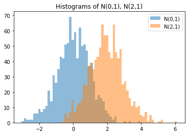
これをRで描いてみます。
R標準
m1 <- 0
s1 <- 1
m2 <- 2
s2 <- 1
N <- 1000
set.seed(1)
r1 <- rnorm(n=N, mean=m1, sd=s1)
set.seed(2)
r2 <- rnorm(n=N, mean=m2, sd=s2)
hist(r1, breaks=50, col=rgb(0,0,1,alpha=0.5), ann=F, xlim=c(-3,6))
hist(r2, breaks=50, col=rgb(1,0,0,alpha=0.5), ann=F, add=T)
title("Histograms of N(0,1), N(2,1)")

qplot()
library(ggplot2)

rr <- c(r1, r2)
length(rr) # 2000
z1 <- rep("N(0,1)", 1000)
z2 <- rep("N(2,1)", 1000)
zz <- c(z1, z2)
length(zz) # 2000
qplot(x=rr, col=zz, fill=zz, geom="histogram", bins=50) # 積み上げ
ggplot()
library(ggplot2)

ggplot() +
  geom_histogram(aes(x=rr, col=zz, fill=zz), position="stack", bins=50) # 積み上げ

ggplot() +
  geom_histogram(aes(x=rr, col=zz, fill=zz), position="identity", bins=50, alpha=0.2) # 重ね合わせ

ggplot() +
  geom_histogram(aes(x=rr, col=zz, fill=zz), position="identity", bins=50, alpha=0.2) +
  guides(color=guide_legend(title=""), fill=guide_legend(title="")) +
  # guides(col="none", fill="none") +
  labs(title="Histograms of N(0,1), N(2,1)", x="", y="")

ggplot() +
  geom_histogram(aes(x=r1, col="N(0,1)", fill="N(0,1)"), alpha=0.2, bins=50) +
  geom_histogram(aes(x=r2, col="N(2,1)", fill="N(2,1)"), alpha=0.2, bins=50) +
  guides(color=guide_legend(title=""), fill=guide_legend(title="")) +
  # ggtitle("Histograms of N(0,1), N(2,1)") +
  # xlab("") +
  # ylab("") +
  labs(title="Histograms of N(0,1), N(2,1)", x="", y="")

df1 <- data.frame(r=r1, z="N(0,1)")
df2 <- data.frame(r=r2, z="N(2,1)")
df <- rbind(df1, df2)
ggplot(data=df, aes(r, col=z, fill=z)) +
  geom_histogram(position="stack", bins=50, alpha=0.2) # 積み上げ
ggplot(data=df, aes(r, col=z, fill=z)) +
  geom_histogram(position="identity", bins=50, alpha=0.2) # 重ね合わせ
ggplot(data=df, aes(r, col=z, fill=z)) +
  geom_histogram(position="identity", bins=50, alpha=0.2) +
  labs(title="Histograms of N(0,1), N(2,1)", x="", y="")

df12 <- data.frame(r1, r2, z1, z2)
df12
ggplot(data=df12) +
  geom_histogram(aes(x=r1, col=z1, fill=z1), position="identity", bins=50, alpha=0.2) +
  geom_histogram(aes(x=r2, col=z2, fill=z2), position="identity", bins=50, alpha=0.2) +
  guides(color=guide_legend(title=""), fill=guide_legend(title="")) +
  labs(title="Histograms of N(0,1), N(2,1)", x="", y="")

ヒストグラムと折れ線グラフの重ね描き
標準正規分布に従う乱数のヒストグラムに確率密度関数のグラフを重ねたものです。
m, s = 0, 1
N = 1000
r = norm.rvs(m, s, size=N, random_state=0)
x = np.arange(-3, 3, 0.1)
y = norm.pdf(x, m, s)

# pyplot-style
plt.figure()
plt.hist(r, bins=50, density=True, label='histgram') # 全体を1に正規化
plt.plot(x, y, linestyle='--', linewidth=2, label='pdf')
plt.xlabel('rv')
plt.ylabel('Probability density')
plt.title('Histogram of N({},{})'.format(m, s))
plt.legend()
plt.show()

# object-oriented (OO) style
fig, ax = plt.subplots()
ax.hist(r, bins=50, density=True, label='histgram') # 全体を1に正規化
ax.plot(x, y, linestyle='--', linewidth=2, label='pdf')
ax.set_xlabel('rv')
ax.set_ylabel('Probability density')
ax.set_title('Histogram of N({},{})'.format(m, s))
ax.legend()
plt.show()

これをRで描いてみます。
R標準
m <- 0
s <- 1
N <- 1000
set.seed(0)
r <- rnorm(n=N, mean=m, sd=s)
x <- seq(min(r), max(r), len=50)
y <- dnorm(x, mean=m, sd=s)
hist(r, breaks=50, prob=T, xlab="rv", ylab="Probability density", main="")
lines(x=x, y=y, ann=F, col="red", lty=2)
title("Histogram of N(0,1)")

qplot()
library(ggplot2)

qplot(x=r, y=..count.., geom = "histogram", bins=50)
qplot(x=r, y=stat(count), geom = "histogram", bins=50)

qplot(x=r, geom = "histogram", bins=50)
qplot(x=r, geom = "histogram", binwidth=0.1)

qplot(x=r, y=..count.., geom = "histogram", bins=50)
qplot(x=r, y=..density.., geom = "histogram", bins=50)
qplot(x=r, y=stat(count), geom = "histogram", bins=50)
qplot(x=r, y=stat(density), geom = "histogram", bins=50)

qplot(x=r, y=..density.., geom = "histogram", bins=50) +
  geom_line(aes(x=x, y=y), col="red", lty=2)

qplot(x=r, y=..density.., geom = "histogram", bins=50) +
  geom_line(aes(x=x, y=y), col="red", lty=2) +
  labs(title="Histogram of N(0,1)", x="rv", y="Probability density")
ggplot()
library(ggplot2)

ggplot() +
  geom_histogram(aes(r), bins=50)
ggplot() +
  geom_histogram(aes(x=r, y=..density..), bins=50) +
  geom_line(aes(x=x, y=y), col="red")
ggplot() +
  geom_histogram(aes(x=r, y=..density..), bins=50) +
  geom_density(aes(r)) +
  geom_line(aes(x=x, y=y), col="red")

ggplot() +
  geom_histogram(aes(x=r, y=..density.., col="histogram"), bins=50) +
  geom_line(aes(x=x, y=y, col="pdf"))

ggplot() +
  geom_histogram(aes(x=r, y=..density.., col="histogram", fill="histogram"), alpha=0.5, bins=50) +
  geom_line(aes(x=x, y=y, col="pdf"))

ggplot() +
  geom_histogram(aes(x=r, y=..density.., col="histogram", fill="histogram"), alpha=0.5, bins=50) +
  geom_line(aes(x=x, y=y, col="pdf")) +
  guides(col="none", fill="none")

ggplot() +
  geom_histogram(aes(x=r, y=..density.., col="histogram", fill="histogram"), alpha=0.5, bins=50) +
  geom_line(aes(x=x, y=y, col="pdf")) +
  guides(col="none", fill="none") +
  ggtitle("Histogram of N(0,1)") +
  xlab("rv") +
  ylab("Probability density") +
  labs(title="Histogram of N(0,1)", x="rv", y="Probability density")

df <- data.frame(r=r)
ggplot(data=df) +
  geom_histogram(aes(r), bins=50)
ggplot(data=df) +
  geom_histogram(aes(x=r, y=..density..), bins=50)
ggplot(data=df) +
  geom_histogram(aes(x=r, y=..density..), bins=50) +
  geom_density(aes(r)) +
  geom_line(data=data.frame(x=x,y=y), aes(x=x, y=y), col="red")

参考
- Python
- R