Matplotlibを使ってJupyter Notebook上でヒストグラムや散布図を表示させる方法です。
この記事の内容は、以下の記事に従って準備したJupyter Notebookの環境で試しています。
Jupyter NotebookをDockerを使って簡単にインストールし起動(nbextensions、Scalaにも対応) - Qiita
この環境でブラウザで8888番ポートにアクセスして、Jupyter Notebookを使うことができます。右上のボタンのNew > Python3をたどると新しいノートを開けます。
ヒストグラム・散布図については以下の記事参照。
ヒストグラム・散布図をJupyter Notebook上で表示する - Qiita
データ準備
1列目がx、2列目がy軸を想定したサンプルデータを2つ用意しました。
0,100
1,110
2,108
4,120
6,124
0,90
1,95
2,99
3,104
4,108
5,111
6,115
Jupyter Notebookを開いて、各種importです。
%matplotlib inline
import numpy as np
import pandas as pd
import matplotlib.pyplot as plt
データを読み込みます。
df1 = pd.read_csv("test1.csv", names=["x", "y"])
df2 = pd.read_csv("test2.csv", names=["x", "y"])
dfはPandasのDataFrameのオブジェクトになります。
CSVからの読み込みとDataFrameの扱いについては以前の記事参照。
DataFrameに対する基本操作を試す - Qiita
CSVファイルのデータを折れ線グラフに
plt.plot(df1["x"], df1["y"])
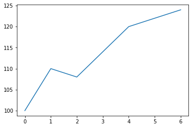
df1["x"]、df1["y"]はPandasのSeriesのオブジェクトで、plt.plotに渡せるようです。
matplotlib.pyplot.plot — Matplotlib 3.1.1 documentation
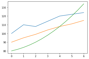
2つのグラフを重ねることもできます。
fig = plt.figure()
ax1 = fig.add_subplot(111)
ax1.plot(df1["x"], df1["y"])
ax1.plot(df2["x"], df2["y"])

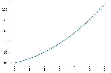
任意の関数をグラフに
y = x^2 + 3x + 80
という関数のグラフを書いてみます。
x3 = np.linspace(0, 6, 13)
y3 = x3 * x3 + 3.0 * x3 + 80.0
plt.plot(x3, y3)
np.linspace(0, 6, 7)は0 , 0.5, 1 , 1.5, 2 , 2.5, 3 , 3.5, 4 , 4.5, 5 , 5.5, 6 という要素を持つNumPyのndarrayという配列を返します。0と6を両端にして全部で13個の数値を均等に並べた配列です。
numpy.linspace — NumPy v1.17 Manual
ndarrayに四則演算を施すと同じ要素数のndarrayになるので、x3 * x3 + 3.0 * x3 + 80.0も7個の数値を含むndarrayになります。
xとyをそれぞれ配列にしてplt.plotに渡せばCSVデータと同じようにグラフにできます。plt.plotには先ほどはPandasのSeriesを渡していましたが、NumPyのndarrayも渡せるようです。
CSVファイルのデータと重ねての表示もできます。
fig = plt.figure()
ax1 = fig.add_subplot(111)
ax1.plot(df1["x"], df1["y"])
ax1.plot(df2["x"], df2["y"])
ax1.plot(x3, y3)
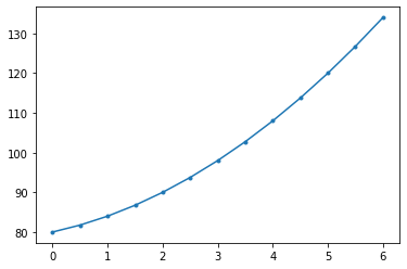
オプション
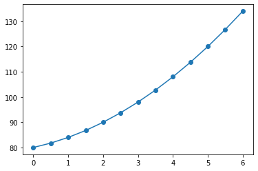
plotにmarkerという引数を渡すと、データの点の形を指定できます。
x3 = np.linspace(0, 6, 13)
y3 = x3 * x3 + 3.0 * x3 + 80.0
plt.plot(x3, y3, marker=".")
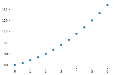
x3 = np.linspace(0, 6, 13)
y3 = x3 * x3 + 3.0 * x3 + 80.0
plt.plot(x3, y3, marker="o")
markerに指定できる文字列は以下のレファレンスを参照。
matplotlib.markers — Matplotlib 3.1.1 documentation
linewidthという引数で先の幅を指定できます。0を指定すると線なしになります。
x3 = np.linspace(0, 6, 13)
y3 = x3 * x3 + 3.0 * x3 + 80.0
plt.plot(x3, y3, marker="o", linewidth=0)
その他のオプションも以下のレファレンスに載っています。
matplotlib.pyplot.plot — Matplotlib 3.1.1 documentation
以上。