概要
各画面で使用するLabelやEntryなどのコントロールに対して、文字サイズ、余白、色などを全画面で同じスタイルに設定したい場合にいくつか方法がある。
1つはカスタムコントロールを作成する方法、もう1つはテンプレートページにスタイル定義する方法がある。
環境・前提条件
Visual Studio 2019(C#)
Xamarin.Forms 4.5.0.617
.NETStandard.Library 2.0.3
フォルダー構成は、次の記事を参照
Xamarin.Formsのフォルダー構成
カスタムコントロールで対応する場合
カスタムコントロールを使用する方法としては1つだが、コントロールの作成方法としては、xamlを使う方法と、C#のソースコードのみで対応する方法がある。
xamlで作成する場合はプロジェクトにコンテンツビューを追加してカスタマイズを行う。
共通プロジェクトのControlsフォルダーを右クリックして「追加」「新しい項目...」を選択して表示されたダイアログで、
「コンテンツビュー(C#)」を作成して名前には「CLabel.cs」を入力し、「追加」をクリック。
CLabel.xamlのソースを次にように修正する。
「x:Class」属性は環境に応じて名前空間、クラス名を正しく設定する必要がある。
今回はプロジェクトの既定の名前空間を「CustomControlTest」、名前空間を「Controls」、クラス名が「CLabel」で作成している。
<?xml version="1.0" encoding="UTF-8"?>
 <ContentView xmlns="http://xamarin.com/schemas/2014/forms"
             xmlns:x="http://schemas.microsoft.com/winfx/2009/xaml"
             xmlns:d="http://xamarin.com/schemas/2014/forms/design"
             xmlns:mc="http://schemas.openxmlformats.org/markup-compatibility/2006"
             mc:Ignorable="d"
             x:Class="CustomControlTest.Controls.CLabel">
  <ContentView.Content>
      <StackLayout HeightRequest="50">
          <Label x:Name="ThisLabel" Text="Hello Xamarin.Forms!" FontSize="26" TextColor="Black" BackgroundColor="Red" HeightRequest="50" VerticalTextAlignment="Center" />
      </StackLayout>
  </ContentView.Content>
</ContentView>
これにより、フォントサイズ、テキストの色、背景色を設定済のコントロールとしてXaml.Forms画面内で使用が可能となる。
ただ、このままだと、ラベルに表示するテキストの変更ができないため、プロパティをコードビハインドのソースに追加する。
これにより、MessageプロパティをCLabelコントロールに定義し、コントロールの利用側から設定が可能となる。
using Xamarin.Forms;
using Xamarin.Forms.Xaml;

namespace CustomeControlTest.Controls
{
    [XamlCompilation(XamlCompilationOptions.Compile)]
    public partial class CLabel : ContentView
    {
        public CLabel()
        {
            InitializeComponent();
        }

        public static readonly BindableProperty MessageProperty = BindableProperty.Create(
            "Message",
            typeof(string),
            typeof(CLabel),
            "Hello.",
            propertyChanged:(bindable, oldValue, newValue) =>
            {
                ((CLabel)bindable).Message = (string)newValue;
            },
            defaultBindingMode:BindingMode.TwoWay
         );

        public string Message
        {
            get { return (string)GetValue(MessageProperty); }
            set {
                SetValue(MessageProperty, value);
                this.ThisLabel.Text = value;
            }
        }

    }
}
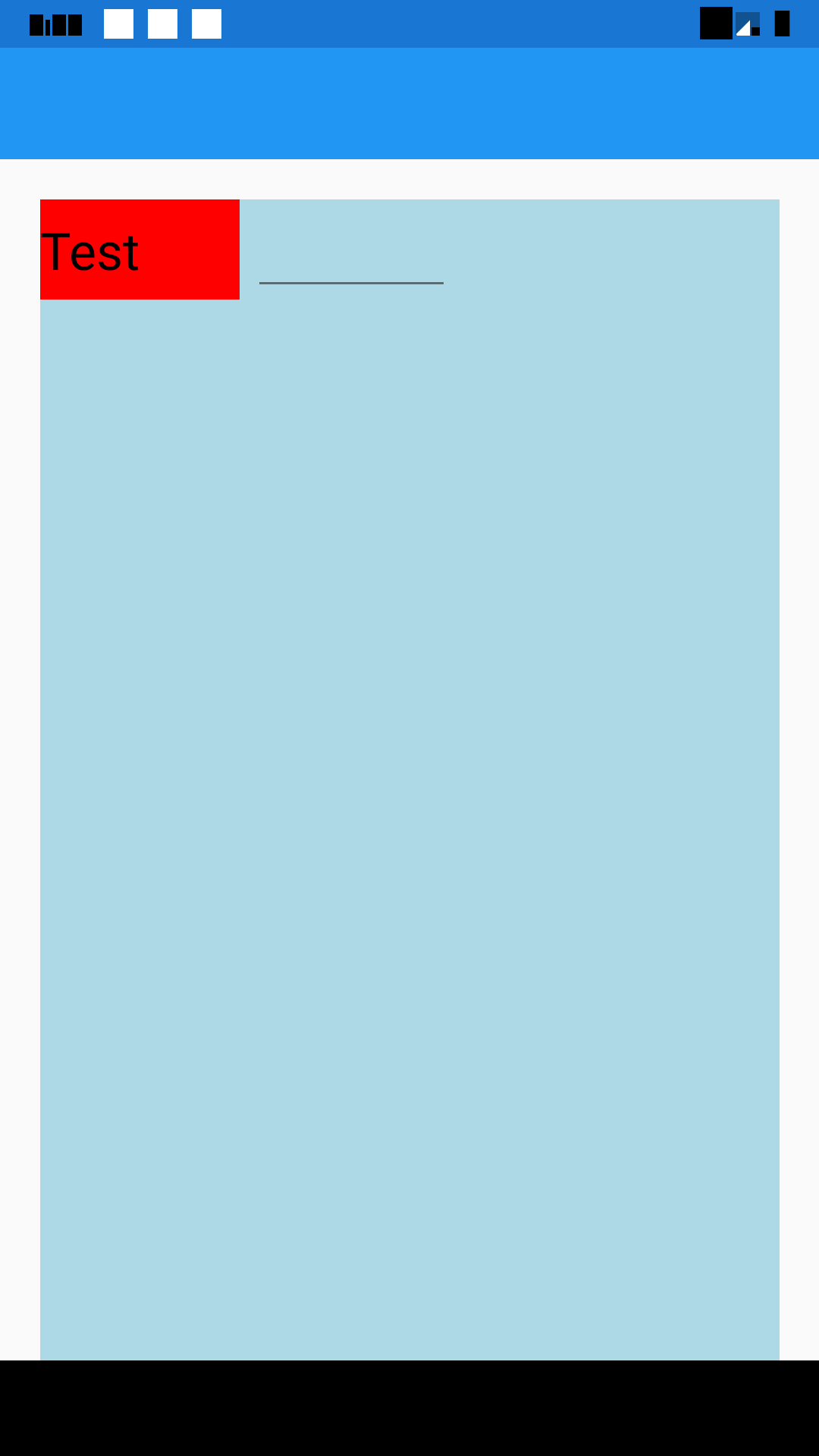
CLabelを利用する方法
MainPage.xamlで次のようにCLabelを利用します。
なお、背景色に色を付けているのは、レイアウトを検討するためにあえて付けている。
画面レイアウト実施には、Margin,Spacing,Paddingなど複数の要素や、HorizontalOptions,VerticalOptionsをうまく組み合わせてレイアウトする必要がある。この時に背景色を各コントロール毎に異なる背景色を設定することで境界線が分かりやすくなる。
<?xml version="1.0" encoding="utf-8" ?>
<ContentPage xmlns="http://xamarin.com/schemas/2014/forms"
             xmlns:x="http://schemas.microsoft.com/winfx/2009/xaml"
             xmlns:d="http://xamarin.com/schemas/2014/forms/design"
             xmlns:mc="http://schemas.openxmlformats.org/markup-compatibility/2006"
             xmlns:local="clr-namespace:CustomeControlTest.Controls"
             mc:Ignorable="d"
             x:Class="CustomeControlTest.MainPage">

    <StackLayout Margin="20, 20, 20, 0" BackgroundColor="LightBlue">
        <StackLayout Orientation="Horizontal">
            <local:CLabel x:Name="Label1"  Message="Test" WidthRequest="100" />
            <Entry WidthRequest="100"></Entry>
        </StackLayout>

    </StackLayout>

</ContentPage>
出力例
xamlを利用しないカスタムコントロール
xamlによってページを作成せずに、直接Labelクラスを継承してコントロールのカスタマイズを行う。
この方法は、Viewを使っての実装とは異なりLabelクラスのプロパティがそのまま引き継げる。
カスタムコントロールのコンストラクタ内で、Labelコントロールで設定したい既定値の設定を行う。
Controlsフォルダーを右クリックして「追加」「新しい項目...」で表示されるダイアログで「クラス」を選択し、名前に「MyLabel.cs」を入力して「追加」をクリックする。
作成されたソースを次のように修正する。
using Xamarin.Forms;

namespace CustomeControlTest.Controls
{
    public class MyLabel : Label
    {
        public MyLabel()
        {
            this.FontSize = 26;
            this.VerticalTextAlignment = TextAlignment.Center;
            this.BackgroundColor = Color.LightYellow;
        }
    }
}
MyLabelコントロールの使用方法
MainPage.xamlを次のように入力する。
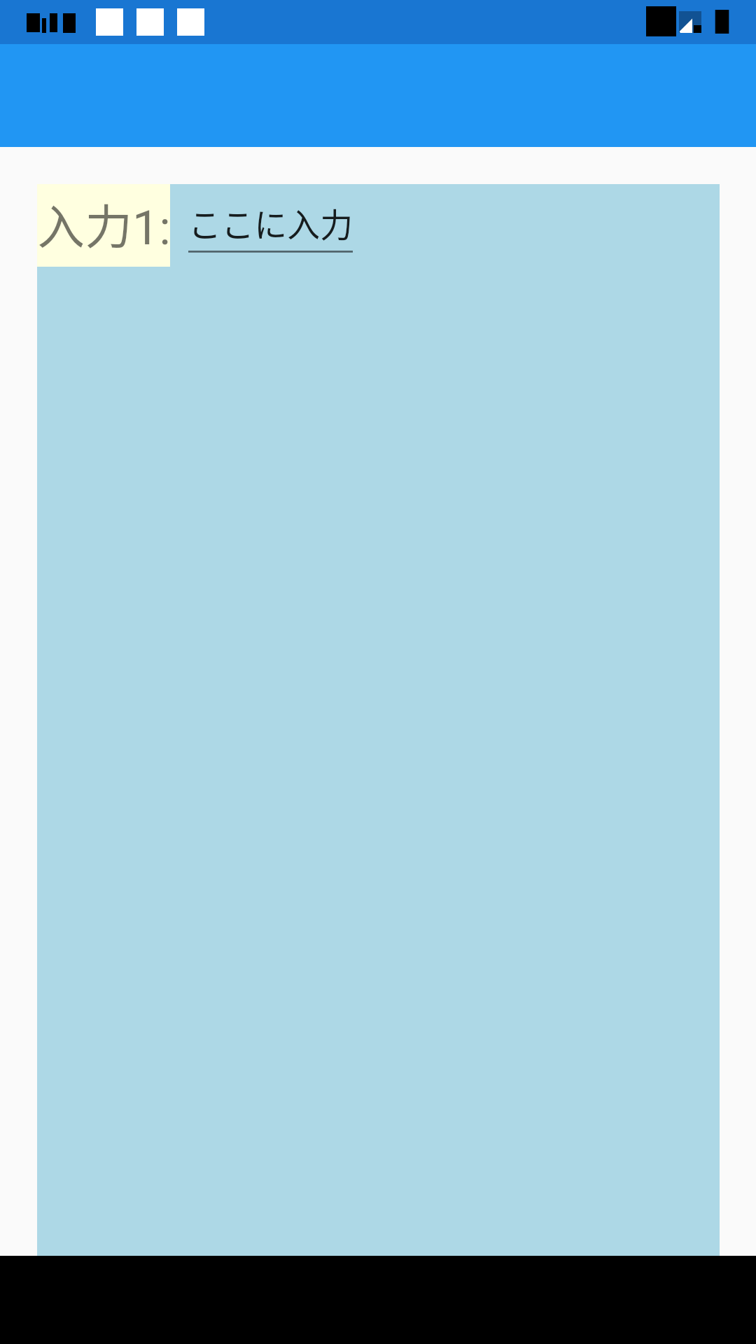
MyLabelコントロールはLabelクラスのすべてのプロパティを継承しているため「Text」プロパティをそのまま使用できる。
<?xml version="1.0" encoding="utf-8" ?>
<ContentPage xmlns="http://xamarin.com/schemas/2014/forms"
             xmlns:x="http://schemas.microsoft.com/winfx/2009/xaml"
             xmlns:d="http://xamarin.com/schemas/2014/forms/design"
             xmlns:mc="http://schemas.openxmlformats.org/markup-compatibility/2006"
             xmlns:local="clr-namespace:CustomeControlTest.Controls"
             mc:Ignorable="d"
             x:Class="CustomeControlTest.MainPage">

    <StackLayout Margin="20, 20, 20, 0" BackgroundColor="LightBlue">
        <StackLayout Orientation="Horizontal">
            <local:MyLabel Text="入力1:" />
            <Entry Text="ここに入力" />
        </StackLayout>

    </StackLayout>

</ContentPage>
実行結果