この内容は古くなっています。
2019.1.9時点の情報を以下に書きました。
install
npm i -g create-react-app
npm i -g @storybook/cli
入った事を以下コマンドで確かめる。バージョン番号が表示されればOK
> create-react-app --version
1.5.2

> getstorybook --version
3.4.1
プロジェクト作成
まずはReactプロジェクトを作成し、そこにStoryBoardを組み込みます。
storybook1プロジェクトを作成
> create-react-app storybook1

カレントフォルダを移動
> cd storybook1

Storybookを適用
> getstorybook
いったん実行します。
デバッグ開始
> npm run storybook

途中割愛
info => Using default webpack setup based on "Create React App".
webpack built dfdf294b8bcf1ea00ce9 in 22789ms
info Storybook started on => http://localhost:9009/
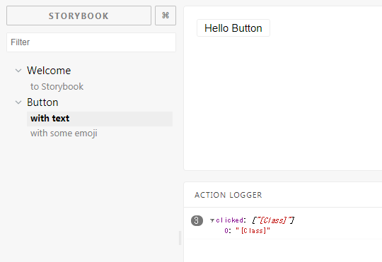
以下のような画面が出ればOK。デフォルトでButton用の画面ができています。
コンポーネント作成
基本的な設定は以下にあります。
src/stories/index.js
index.js
import React from 'react';
import { storiesOf } from '@storybook/react';
import { action } from '@storybook/addon-actions';
import { linkTo } from '@storybook/addon-links';
import { Button, Welcome } from '@storybook/react/demo';
storiesOf('Welcome', module).add('to Storybook', () => <Welcome showApp={linkTo('Button')} />);
storiesOf('Button', module)
.add('with text', () => <Button onClick={action('clicked')}>Hello Button</Button>)
.add('with some emoji', () => (
<Button onClick={action('clicked')}>
<span role="img" aria-label="so cool">
đ đ đ đŻ
</span>
</Button>
));
Custom Button を作成する
以下に存在するファイルをベースに
./node_modules/@storybook/react/src/demo/Button.js
./src/components/の下にButtonCustom.jsを作成します。
作成されるファイルパスは→になります。 ./src/components/ButtonCustom.js
↓背景色を青に、文字色を白に変えました。
ButtonCustom.js
import PropTypes from 'prop-types';
import React from 'react';
import glamorous from 'glamorous';

const ButtonCustom = glamorous(({ children, ...rest }) => <button {...rest}>{children}</button>)({
    border: '1px solid #eee',
    borderRadius: 3,
    backgroundColor: '#3498db',
    cursor: 'pointer',
    fontSize: 15,
    padding: '3px 10px',
    margin: 10,
    color: "#fff",
});


ButtonCustom.displayName = 'ButtonCustom';
ButtonCustom.propTypes = {
    children: PropTypes.node.isRequired,
    onClick: PropTypes.func,
};

export default ButtonCustom
Custom Button をカタログで使う
src/stories/index.js を編集します。
importを追加しButtonCustomを使えるようにします。
以下をimport群の下に追加します。
import ButtonCustom from '../components/ButtonCustom';
ButtonをButtonCustomに変更します。
.add('with text', () => <ButtonCustom onClick={action('clicked')}>Hello Button</ButtonCustom>)
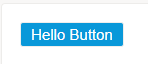
保存してブラウザをリロードします。
以下のように表示が変わればOK
Custom Button2 を作成する
./src/components/の下に3ファイル作ります
- buttons.js
- button1.js
- button2.js
buttons.js
module.exports = {
  Button1: require('./button1.js').default,
  Button2: require('./button2.js').default,
};
button1.js
import PropTypes from 'prop-types';
import React from 'react';
import glamorous from 'glamorous';
const button1 = glamorous(({ children, ...rest }) => <button {...rest}>{children}</button>)({
border: '1px solid #eee',
borderRadius: 3,
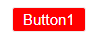
backgroundColor: '#ff0000',
cursor: 'pointer',
fontSize: 15,
padding: '3px 10px',
margin: 10,
color: "#fff",
});
button1.displayName = 'button1';
button1.propTypes = {
children: PropTypes.node.isRequired,
onClick: PropTypes.func,
};
export default button1;
button2.js
import PropTypes from 'prop-types';
import React from 'react';
import glamorous from 'glamorous';
const button2 = glamorous(({ children, ...rest }) => <button {...rest}>{children}</button>)({
border: '1px solid #eee',
borderRadius: 3,
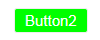
backgroundColor: '#00FF00',
cursor: 'pointer',
fontSize: 15,
padding: '3px 10px',
margin: 10,
color: "#fff",
});
button2.displayName = 'button2';
button2.propTypes = {
children: PropTypes.node.isRequired,
onClick: PropTypes.func,
};
export default button2;
src/index.js
index.js
import React from 'react';

import { storiesOf } from '@storybook/react';
import { action } from '@storybook/addon-actions';
import { linkTo } from '@storybook/addon-links';

//import { Button, Welcome } from '@storybook/react/demo';
import ButtonCustom from '../components/ButtonCustom';
import { Button1, Button2 } from '../components/buttons';

storiesOf('Welcome', module).add('to Storybook', () => <Welcome showApp={linkTo('Button')} />);

storiesOf('Button', module)
  .add('with text', () => <ButtonCustom onClick={action('clicked')}>Hello Button</ButtonCustom>)

  .add('Button1', () => <Button1 onClick={action('clicked')}>Button1</Button1>)
  .add('Button2', () => <Button2 onClick={action('clicked')}>Button2</Button2>)
結果
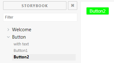
3種類のボタンが出るようになりました。
補足
importは以下のようにバラバラでの指定もOK
import Button1 from '../components/button1';
import Button2 from '../components/button2';