%matplotlib inline
import numpy as np
import scipy as sp
import pandas as pd
import matplotlib.pyplot as plt
import matplotlib.cm as cm
import seaborn as sns
from statsmodels.graphics.mosaicplot import mosaic
from itertools import product
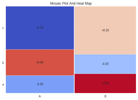
def normalize_for_color(value, ratio):
return max(min(value / ratio + 0.5, 0.99), 0.01)
data = [
['A','a',2,-0.3],
['A','b',3,0.4],
['A','c',5,-0.7],
['B','a',2,0.8],
['B','b',2,-0.2],
['B','c',5,0.1]
]
columns = ['Column1', 'Column2', 'area', 'value']
df = pd.DataFrame(data=data, columns=columns)
df['tuple'] = list(zip(df.Column1, df.Column2))
df = df.set_index('tuple')
df = df.drop(['Column1', 'Column2'], axis=1)
data_dic = df.to_dict('index')
props = lambda k: {'color': cm.coolwarm(normalize_for_color(data_dic[k].get('value'), 1.0))}
labelizer = lambda k: "{0:+.02f}".format(data_dic[k].get('value'))
mosaic(df.area, title='Mosaic Plot And Heat Map', properties=props, labelizer=labelizer, gap=0.005)
plt.show()