はじめに
HR/HM 愛好家の方々とオンライン飲みをするにあたり、自分自身がこれまで参戦してきたライブを振り返るために電子化しておこうと思い立ち、せっかくなので(?)UI5 Web Components for React を使ってシンプルな React アプリケーションを作成してみました。
SAPUI5 ネイティブではなく、UI5 Web Components を使うことのメリットなどは、以下の tami さんの記事をご参照ください。
UI5 Web Components for React の紹介
UI5 Web Components for React とは?
公式サイト上では、以下のように紹介されています。要するに、React ネイティブのように扱える UI5 Web Components ということです。
UI5 Web Components for React is a Fiori3 compliant React library built on top of the UI5 Web Components. With the help of UI5 Web Components for React, you can use UI5 Web Components as if they were native React components. In addition to that, UI5 Web Components for React is providing complex components and layouts on top of the UI5 Web Components.
UI5 Web Components とは?
では、UI5 Web Components は何かというと、公式サイト上では、以下のように紹介されています。要するに(ネイティブだと参入障壁の高い)SAPUI5 を Web Components 化することで、簡単に扱えるようにするということです。
The UI5 Web Components share fundamental UI5 qualities with others to provide enterprise-grade features, Fiori UX and themeability. The goal is to achieve an easy consumption of UI5 controls to lower the entry barrier to use UI5 controls for own applications and to avoid complexity of UI5 rendering-stack by making the consumption of the full-stack UI5 optional. In general, the UI5 Web Components are targeting for Web Developers who want to have more flexibility to use just HTML tags or arbitrary JS frameworks.
Web Components とは?
では、そもそもの Web Components は何かというと、公式サイト上では、以下のように紹介されています。要するに再利用可能でカプセル化された独自の HTML タグを提供するためのものです。
Web components are a set of web platform APIs that allow you to create new custom, reusable, encapsulated HTML tags to use in web pages and web apps.
具体例での比較
シンプルな Link を例として、SAPUI5、UI5 Web Components、UI5 Web Components for React を比較してみましょう。
まずは、SAPUI5 から。SAPUI5 はオープンテクノロジがベースになっていますが、SAP 固有のクセはあります。公式リファレンス を見ればクセが理解できると思いますが、普段 React や Vue.js をお使いの方からすると、少なくとも初見では「?」だと思います。
SAPUI5 では、MVC フレームワークに従い、ビューを XML ファイルとして定義します。Link だけでないのは、比較する上でアンフェアな気もしますが、SAPUI5 らしさを伝えるためにビュー全体を載せました。ちなみに、イベント処理等は、別のコントローラ(JavaScript ファイル)にコードします。
<mvc:View
	controllerName="sap.m.sample.Link.LinkGroup"
	xmlns:l="sap.ui.layout"
	xmlns:mvc="sap.ui.core.mvc"
	xmlns="sap.m">
	<l:VerticalLayout
		class="sapUiContentPadding"
		width="100%">
		<l:content>
			<Link
				text="Open SAP Homepage"
				target="_blank"
				href="https://www.sap.com" />
		</l:content>
	</l:VerticalLayout>
</mvc:View>
一方、Web Comoponents の場合は以下のようになります。
<ui5-link href="https://www.sap.com" target="_blank">Open SAP Homepage</ui5-link>
Web Comoponents for React の場合は以下のようになります。
<Link href="https://www.sap.com" target="_blank">Open SAP Homepage</Link>
どちらも SAPUI5 を Web Components(=再利用可能でカプセル化された独自の HTML タグ)として扱えるようになっています。確かに SAPUI5 ネイティブならではの参入障壁の高さは、軽減されていますね。
ライブ参戦記録アプリを作成する
React アプリケーションの作成
lives-in-my-life アプリケーションを作成します。色々と楽なので、UI5 Web Components for React 用のテンプレートを指定しました。
$ npx create-react-app lives-in-my-life --template @ui5/webcomponents-react
ちなみに、既存の React アプリケーションに追加する場合は、以下のコマンドを実行します。
$ npm install @ui5/webcomponents @ui5/webcomponents-react @ui5/webcomponents-fiori --save
React アプリケーションの確認(テンプレート)
@ui5/webcomponents-react テンプレートによって生成されたアプリケーションを実行してみます。
$ npm start
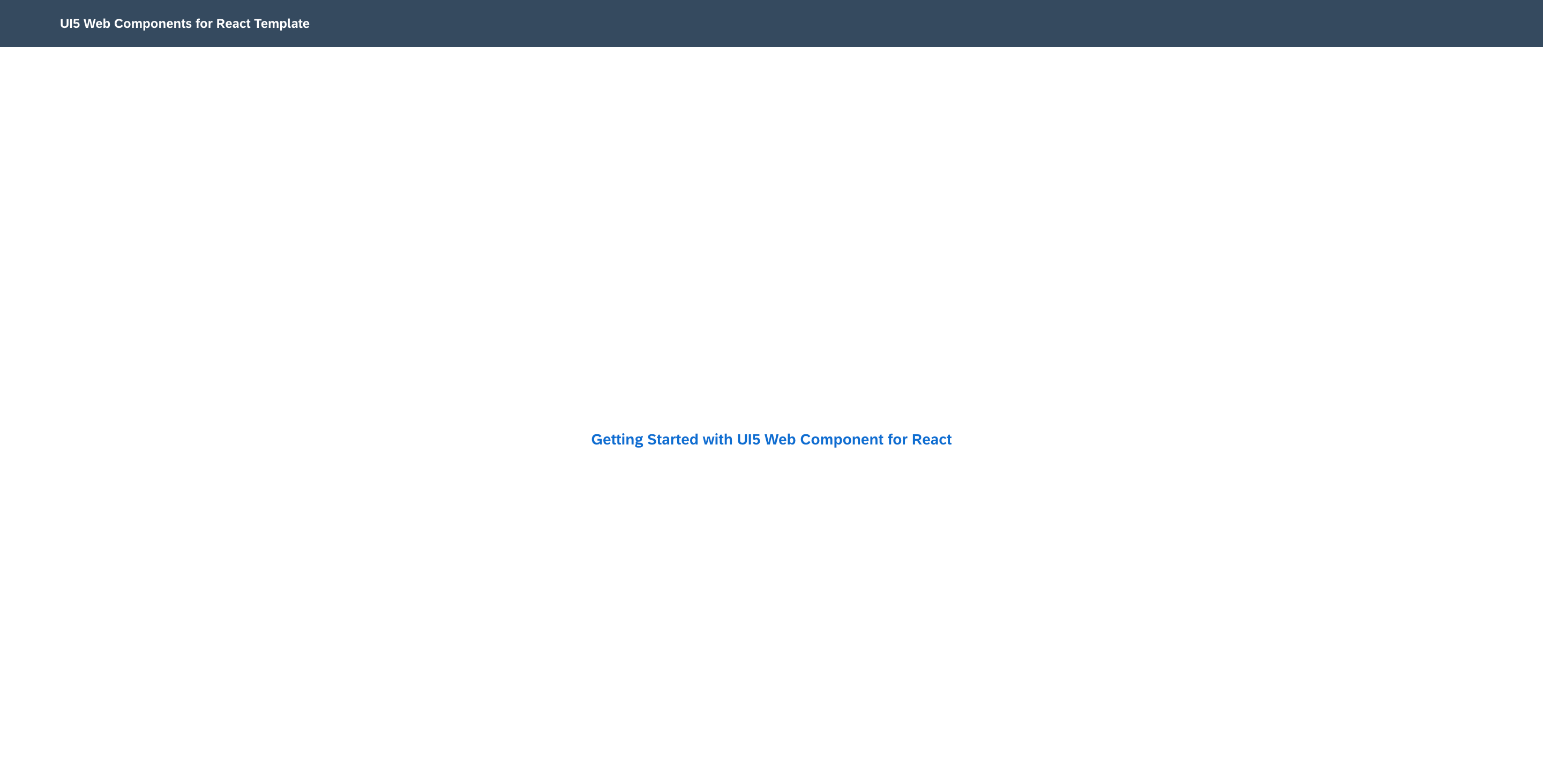
生成直後のアプリケーションは以下のようなシンプルなものです。おおまかに言えば、ShellBar と Link から構成されています。
ちなみに、生成直後のソースコードは以下の通りです。
import {
  FlexBox,
  FlexBoxAlignItems,
  FlexBoxDirection,
  FlexBoxJustifyContent,
  Link,
  LinkDesign,
  ShellBar,
  ThemeProvider
} from '@ui5/webcomponents-react';
import React from 'react';
import './App.css';

function App() {
  return (
    <ThemeProvider>
      <ShellBar primaryTitle="UI5 Web Components for React Template" />
      <FlexBox
        style={{ width: '100%', height: '100vh' }}
        direction={FlexBoxDirection.Column}
        justifyContent={FlexBoxJustifyContent.Center}
        alignItems={FlexBoxAlignItems.Center}
      >
        <Link href="https://sap.github.io/ui5-webcomponents-react/" target="_blank" design={LinkDesign.Emphasized}>
          Getting Started with UI5 Web Component for React
        </Link>
      </FlexBox>
    </ThemeProvider>
  );
}

export default App;
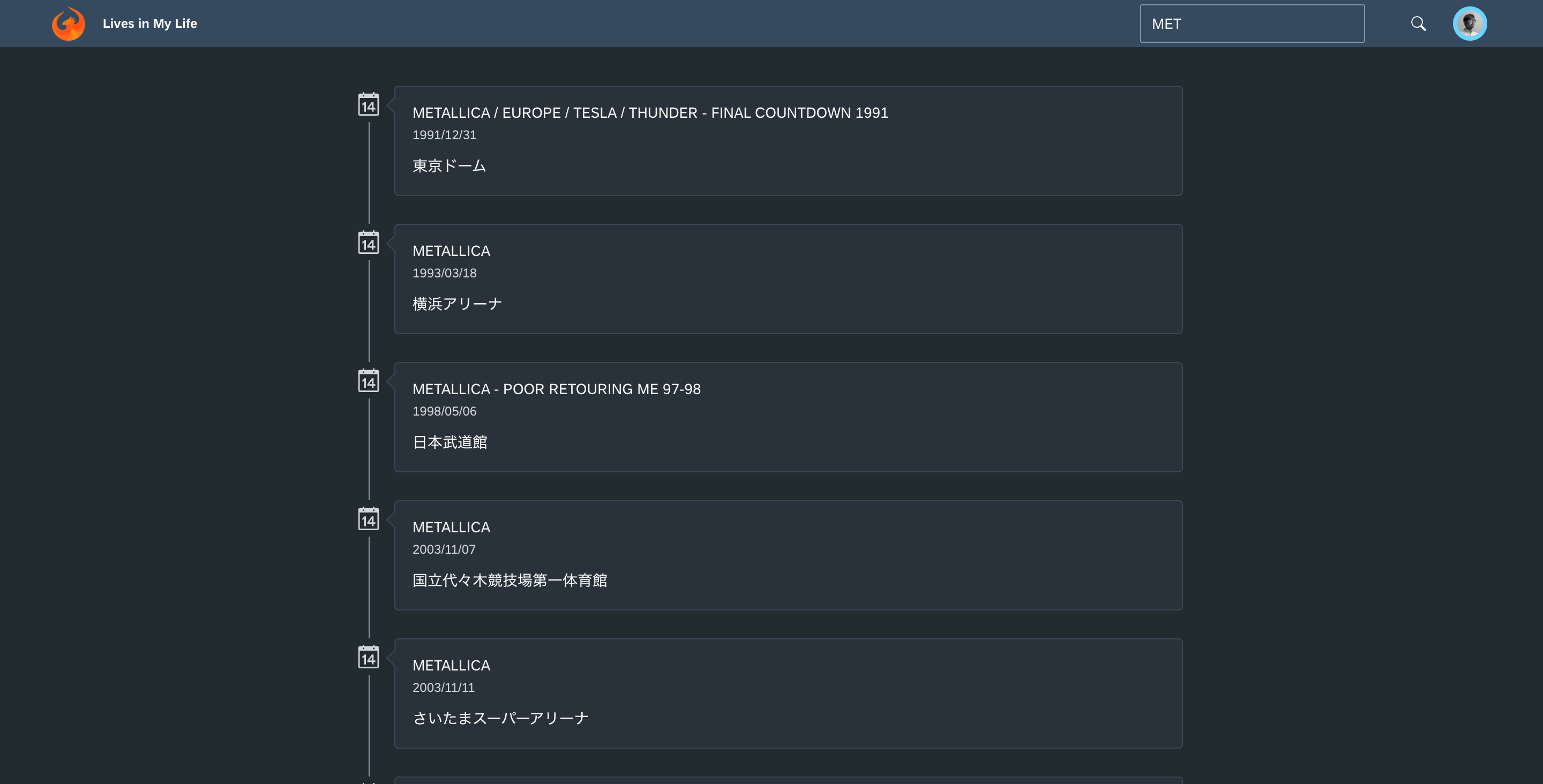
ライブ参戦記録アプリの実装
テンプレートで生成された初期アプリケーションに対して、主に以下の変更を加えました。
-
ShellBarに検索ボックスを追加(参戦ライブを絞り込み) -
Timelineを追加(参戦ライブを表示)
以下の変更は、おまけみたいなものです。
-
ShellBarにロゴを追加 -
ShellBarのタイトルを変更 -
ShellBarにプロファイル画像を追加
実行結果は以下の通りです。せっかくなのでダークテーマを指定してみました。UI テーマは sap-ui-theme URL パラメータによって動的に切り替えることが可能ですが、以下のコードでは sap_fiori_3_dark を固定セットしています。
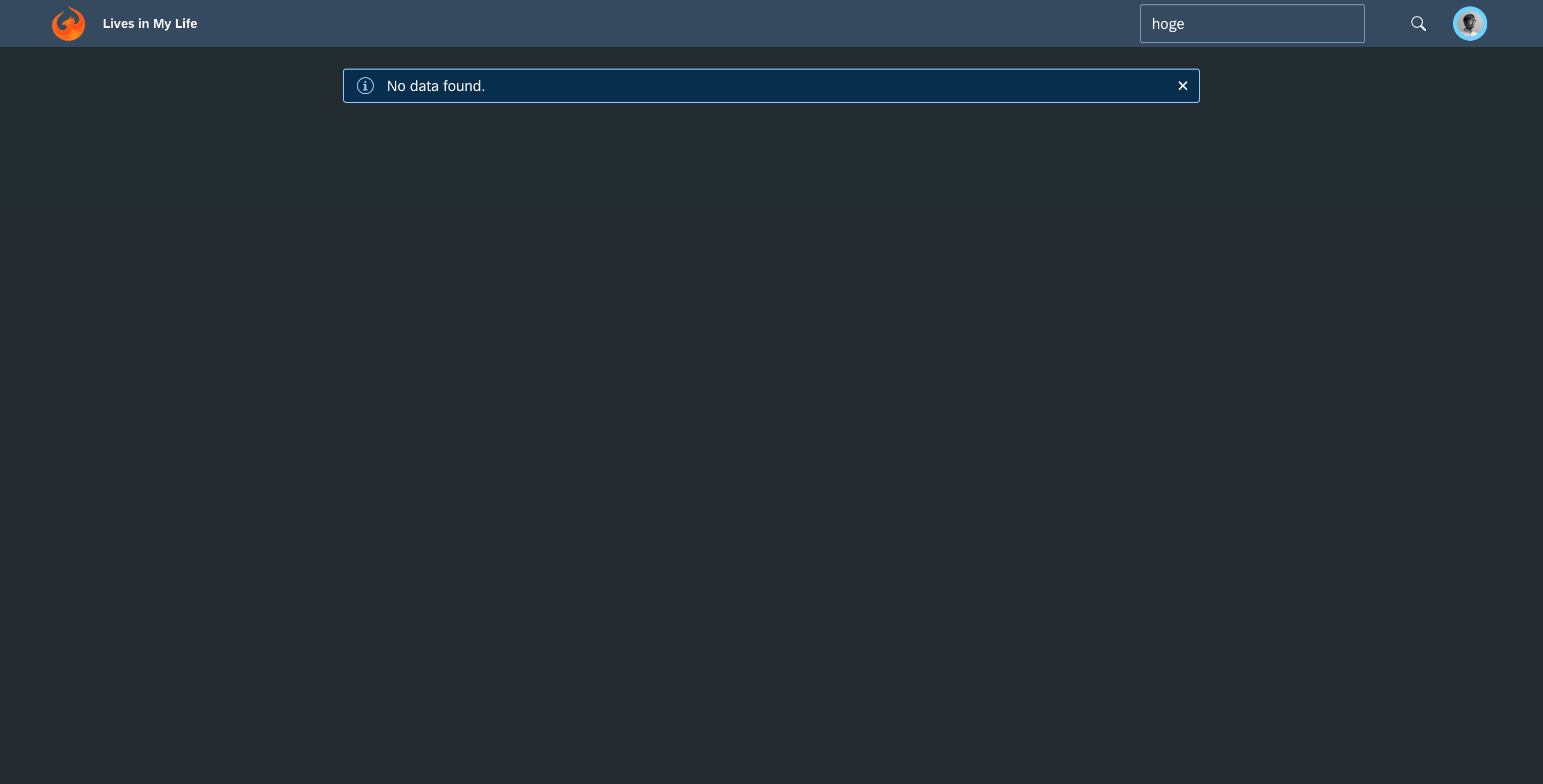
検索結果がないときは、MessageStrip でその旨のメッセージを表示するようにしました。
ちなみに、変更後のソースコードは以下の通りです。JSON 直書きだったり、日付データが yyyy/MM/dd 形式だったり、i18n 対応していなかったり、コード分割を検討していなかったり、色々と考えるべきことはありますが、お手軽な初期バージョンとして晒します。
import {
  Avatar,
  FlexBox,
  FlexBoxAlignItems,
  FlexBoxDirection,
  FlexBoxJustifyContent,
  Input,
  MessageStrip,
  ShellBar,
  ThemeProvider,
  Timeline,
  TimelineItem
} from '@ui5/webcomponents-react';
import React from 'react';
import './App.css';
import '@ui5/webcomponents/dist/Assets.js';
import '@ui5/webcomponents-react/dist/Assets.js';
import '@ui5/webcomponents-fiori/dist/Assets.js'; // Only if using the @ui5/webcomponents-fiori package
import '@ui5/webcomponents-icons/dist/Assets.js'; // Only if using the @ui5/webcomponents-icons package
import { setTheme } from "@ui5/webcomponents-base/dist/config/Theme.js";
setTheme("sap_fiori_3_dark");

const LIVES = [
  { "date": "1991/12/31", "title": "METALLICA / EUROPE / TESLA / THUNDER - FINAL COUNTDOWN 1991", "venue": "東京ドーム" },
  /* (以下、省略) */
];

class LiveTimeline extends React.Component {
  render() {
    const filteredLives = LIVES.filter((element) => {
      return (element.date + element.title + element.venue).toLocaleLowerCase().indexOf(
        this.props.filterText.toLowerCase()) > -1;
    });

    if (filteredLives.length > 0) {
      return (
        <Timeline className="Lives-timeline">
          {filteredLives.map((element, index) => {
            return (
              <TimelineItem
                key={index}
                icon="calendar"
                itemName={element.title}
                subtitleText={element.date}
              >
                <div>{element.venue}</div>
              </TimelineItem>
            );
          })}
        </Timeline>
      );
    } else {
      return (
        <MessageStrip className="Lives-timeline">No data found.</MessageStrip>
      );
    }
  }
}

class LiveToolbar extends React.Component {
  handleFilterTextChange = (e) => {
    this.props.onFilterTextChange(e.target.value);
  }

  render() {
    return (
      <ShellBar
        primaryTitle="Lives in My Life"
        logo={<img alt="SAPUI5 Logo" src="https://sap.github.io/ui5-webcomponents/assets/images/ui5.png" />}
        profile={<Avatar image="https://avatars0.githubusercontent.com/u/25473342?s=400&u=b399ebf80c62121616c0435bed3f3c39b4fc9c9b&v=4" />}
        searchField={
          <Input
            value={this.props.filterText}
            placeholder="Please input ..."
            onInput={this.handleFilterTextChange}
          />
        }
      />
    );
  }
}

class App extends React.Component {
  constructor(props) {
    super(props);
    this.state = {
      filterText: ''
    };
  }

  handleFilterTextChange = (filterText) => {
    this.setState({
      filterText: filterText
    });
  }

  render() {
    return (
      <ThemeProvider>
        <FlexBox
          style={{ width: '100%', height: '100%' }}
          direction={FlexBoxDirection.Column}
          justifyContent={FlexBoxJustifyContent.Center}
          alignItems={FlexBoxAlignItems.Center}
        >
          <LiveToolbar
            filterText={this.state.filterText}
            onFilterTextChange={this.handleFilterTextChange}
          />
          <LiveTimeline
            filterText={this.state.filterText}
          />
        </FlexBox>
      </ThemeProvider>
    );
  }
}

export default App;
さいごに
エンタープライズアプリケーションの世界では、どのような UI テーマ(デザイン)を採用すべきか悩みどころですが、少なくとも SAP は Fiori という答えを用意してくれています。2013 年にリリースされた Fiori は、単なるモダン Web フレームワークではなく、SAP の統一的・横断的な UX として進化を遂げてきました。「Fiori にしておけば間違いない」というのは、(エンタープライズアプリケーションの世界では)大きな魅力です。機会があれば、積極的に採用していきたいと思います。
ところで、最近では電子チケット化が進んでいますが、90 年代は当然ながら紙文化でしたので、手元に保管されていたチケットの半券と薄れゆく記憶を頼りにデータとして復元しました。半券はないが参戦した確信があるものについては、一緒に参戦した友人から半券のエビデンスを送ってもらうなど、この復元作業が一番大変だった気がします。一日も早くコロナが収束し、参戦ライブのリスト要素が追加できる日がくることを、心の底から祈っています。