昨日の続きでFlexboxを説明します。flex, flexDirection, flexWrapは昨日のエントリを参照してください。
Flexbox
下記のコンポーネントを前提とします。
var styles = StyleSheet.create({
  container: {
    flex: 1,
    backgroundColor: 'blue',
  },
  item1: {
    backgroundColor: 'gray',
    padding: 20,
  },
  item2: {
    backgroundColor: 'orange',
    padding: 20
  },
  item3: {
    backgroundColor: 'pink',
    padding: 20
  }
});
justifyContentプロパティ
親コンポーント内の子コンポーネントの配置を決めます。
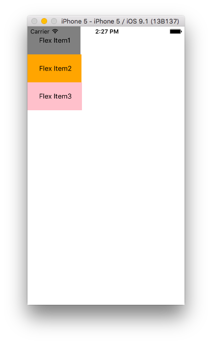
flex-start(デフォルト)
子コンポーネントを先頭から配置します。
var styles = StyleSheet.create({
  container: {
    flex: 1,
    backgroundColor: 'blue',
    justifyContent: 'flex-start' //追加
  },
  item1: {
    backgroundColor: 'gray',
    padding: 20,
  },
  item2: {
    backgroundColor: 'orange',
    padding: 20
  },
  item3: {
    backgroundColor: 'pink',
    padding: 20
  }
});

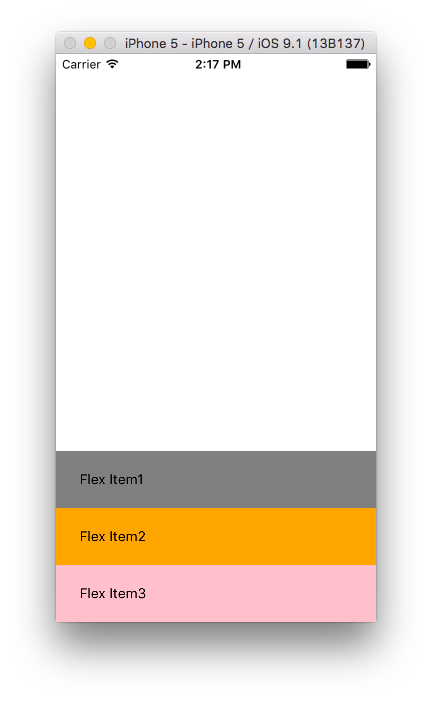
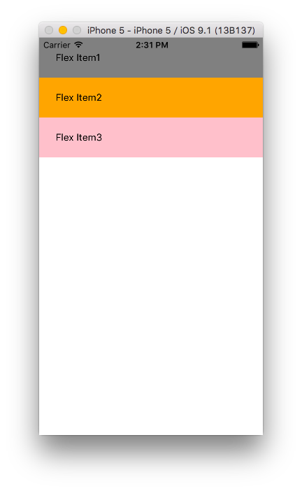
flex-end
子コンポーネントを後ろから配置します。
var styles = StyleSheet.create({
  container: {
    flex: 1,
    backgroundColor: 'white',
    justifyContent: 'flex-end'
  },
  item1: {
    backgroundColor: 'gray',
    padding: 20,
  },
  item2: {
    backgroundColor: 'orange',
    padding: 20
  },
  item3: {
    backgroundColor: 'pink',
    padding: 20
  }
});
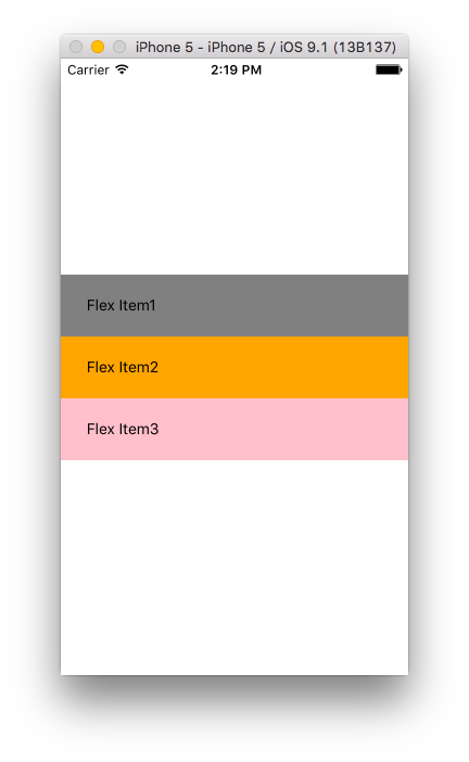
center
子コンポーネントを真ん中に配置します。
var styles = StyleSheet.create({
  container: {
    flex: 1,
    backgroundColor: 'white',
    justifyContent: 'center'
  },
  item1: {
    backgroundColor: 'gray',
    padding: 20,
  },
  item2: {
    backgroundColor: 'orange',
    padding: 20
  },
  item3: {
    backgroundColor: 'pink',
    padding: 20
  }
});
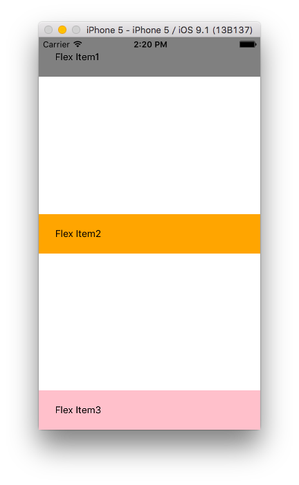
space-between
子コンポーネントを先頭と最後に配置し、均等なスペースを他の子コンポーネントの間に挟みます。
var styles = StyleSheet.create({
  container: {
    flex: 1,
    backgroundColor: 'white',
    justifyContent: 'space-between'
  },
  item1: {
    backgroundColor: 'gray',
    padding: 20,
  },
  item2: {
    backgroundColor: 'orange',
    padding: 20
  },
  item3: {
    backgroundColor: 'pink',
    padding: 20
  }
});
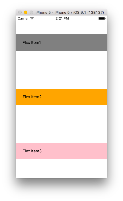
space-around
各子コンポーネントの均等なスペースを先頭の前、最後の後に加えた配置です。
var styles = StyleSheet.create({
  container: {
    flex: 1,
    backgroundColor: 'white',
    justifyContent:  'space-around',
  },
  item1: {
    backgroundColor: 'gray',
    padding: 20,
  },
  item2: {
    backgroundColor: 'orange',
    padding: 20
  },
  item3: {
    backgroundColor: 'pink',
    padding: 20
  }
});
alignItems
stretch(デフォルト)
子コンポーネントを伸ばして配置します。
var styles = StyleSheet.create({
  container: {
    flex: 1,
    backgroundColor: 'white',
    alignItems: 'stretch'
  },
  item1: {
    backgroundColor: 'gray',
    padding: 20,
  },
  item2: {
    backgroundColor: 'orange',
    padding: 20
  },
  item3: {
    backgroundColor: 'pink',
    padding: 20
  }
});
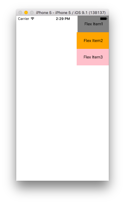
flex-start
子コンポーネントを先頭から配置します。
var styles = StyleSheet.create({
  container: {
    flex: 1,
    backgroundColor: 'white',
    alignItems: 'flex-start'
  },
  item1: {
    backgroundColor: 'gray',
    padding: 20,
  },
  item2: {
    backgroundColor: 'orange',
    padding: 20
  },
  item3: {
    backgroundColor: 'pink',
    padding: 20
  }
});
flex-end
子コンポーネントを後ろに配置します。
var styles = StyleSheet.create({
  container: {
    flex: 1,
    backgroundColor: 'white',
    alignItems: 'flex-end'
  },
  item1: {
    backgroundColor: 'gray',
    padding: 20,
  },
  item2: {
    backgroundColor: 'orange',
    padding: 20
  },
  item3: {
    backgroundColor: 'pink',
    padding: 20
  }
});
center
子コンポーネントを真ん中に配置します。
var styles = StyleSheet.create({
  container: {
    flex: 1,
    backgroundColor: 'white',
    alignItems: 'center'
  },
  item1: {
    backgroundColor: 'gray',
    padding: 20,
  },
  item2: {
    backgroundColor: 'orange',
    padding: 20
  },
  item3: {
    backgroundColor: 'pink',
    padding: 20
  }
});
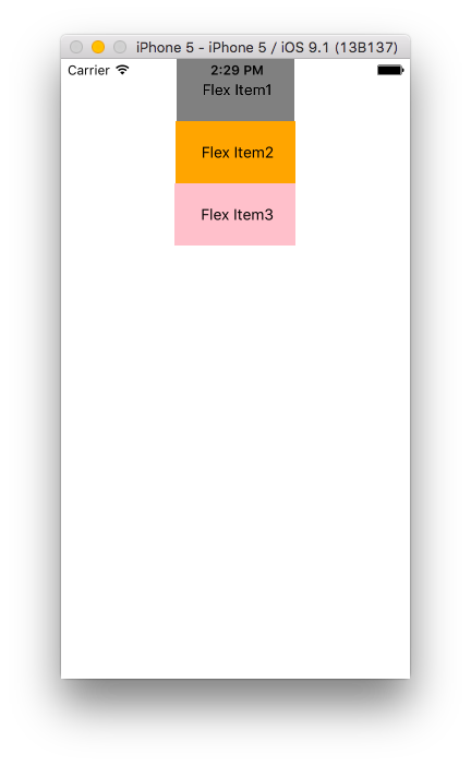
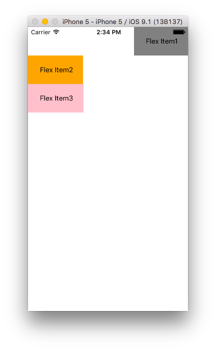
alignSelf
alignSelfはalignItemsで配置したものを子コンポーネント側で上書きします。
したがって、alignItemsと同じ値を設定します。
var styles = StyleSheet.create({
  container: {
    flex: 1,
    backgroundColor: 'white',
    alignItems: 'flex-start',
  },
  item1: {
    backgroundColor: 'gray',
    padding: 20,
    alignSelf: 'flex-end' //追加
  },
  item2: {
    backgroundColor: 'orange',
    padding: 20
  },
  item3: {
    backgroundColor: 'pink',
    padding: 20
  }
});
このように全体をalignItems: 'flex-start' で定義したものをItem1のみflex-endにしたい場合に`alignSelf: 'flex-end'をItem1に指定します。
以上、React Nativeのスタイルシートで悩むポイントのFlexboxについて動きを見てきました。
明日は、開発していく上で必要不可欠なFluxアーキテクチャを見ていきます。