React Nativeのアプリはスタイルシートで各コンポーネントの配置、色、フォント等のデザインを決めていきます。Webプログラマなら体に染みついているpadding等を使うので、すぐに慣れると思います。 公式ドキュメントから一覧を見ることができますが、border系は下記のようになります。注意点として、ハイフン(-)で単語を区切るんではなくCamelCaseになっていることです。
borderColor string
borderTopColor string
borderRightColor string
borderBottomColor string
borderLeftColor string
borderRadius number
borderTopLeftRadius number
borderTopRightRadius number
borderBottomLeftRadius number
borderBottomRightRadius number
borderStyle enum('solid', 'dotted', 'dashed')
borderWidth number
borderTopWidth number
borderRightWidth number
borderBottomWidth number
borderLeftWidth number
このような馴染みのものなら直感的に記述していけるのですが、あまり馴染みのないFlexboxの記法を用いて配置を行う必要があるので、Flexboxを取り扱います。
Flexbox
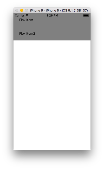
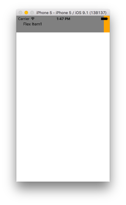
下記のようなコンポーネントを前提に話を進めていきます。
  render: function() {
    return (
      <View style={styles.container}>
        <View style={styles.item1}>
          <Text> Flex Item1</Text>
        </View>
        <View style={styles.item2}>
          <Text> Flex Item2</Text>
        </View>
      </View>
    );
  }
flexプロパティ
おそらく一番最初にハマるのがこのプロパティでしょう。振る舞いがfacebookにより定義されているようです。
var styles = StyleSheet.create({
  container: {
    backgroundColor: 'blue',
  },
  item1: {
    backgroundColor: 'gray',
    padding: 20
  },
  item2: {
    backgroundColor: 'gray',
    padding: 20
  }
});
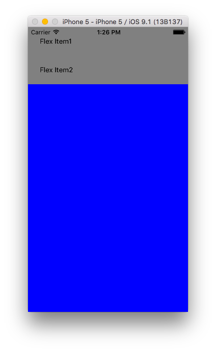
上記のようなスタイルシートにflex:1をContainerに追加するとそのコンポーネントが全体に広がります。青のコンポーンネントが全体になっているのがわかると思います。
var styles = StyleSheet.create({
  container: {
    flex: 1, // 追加
    backgroundColor: 'blue',
  },
  item1: {
    backgroundColor: 'gray',
    padding: 20
  },
  item2: {
    backgroundColor: 'gray',
    padding: 20
  }
});
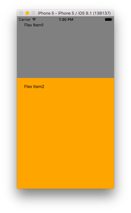
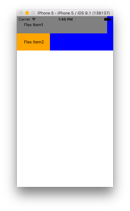
また同一コンポーネント内でflexを下記のように指定すると、
var styles = StyleSheet.create({
  container: {
    flex: 1,
    backgroundColor: 'blue',
  },
  item1: {
    flex: 1, // 追加
    backgroundColor: 'gray',
    padding: 20
  },
  item2: {
    flex: 2, // 追加
    backgroundColor: 'orange',
    padding: 20
  }
});
item1の高さ: item2の高さ = 1 : 2の割合かつ全体に広がって表示されます。
flexDirectionプロパティ
container側の要素でこ要素の配置の縦横を決めます。
columnは縦並び(デフォルト)
var styles = StyleSheet.create({
  container: {
    flex: 1,
    flexDirection: 'column', // 追加。デフォルトはcolumnなので変化なし。
    backgroundColor: 'blue',
  },
  item1: {
    flex: 1,
    backgroundColor: 'gray',
    padding: 20
  },
  item2: {
    flex: 2,
    backgroundColor: 'orange',
    padding: 20
  }
});
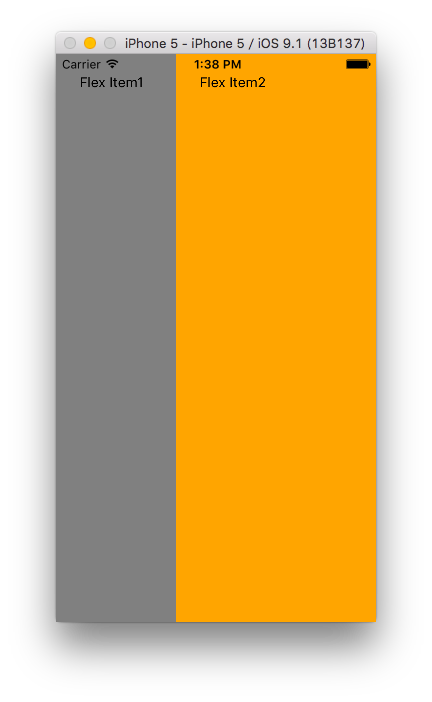
rowで横並び
var styles = StyleSheet.create({
  container: {
    flex: 1,
    flexDirection: 'row', // 追加
    backgroundColor: 'blue',
  },
  item1: {
    flex: 1,
    backgroundColor: 'gray',
    padding: 20
  },
  item2: {
    flex: 2,
    backgroundColor: 'orange',
    padding: 20
  }
});
flexWrapプロパティ
Container側(親側)の要素です。コンポーネントが入りきらなかった場合の回り込みの設定になります。
nowrap(デフォルト)
var styles = StyleSheet.create({
  container: {
    flexDirection: 'row',
    backgroundColor: 'blue',
    flexWrap: 'nowrap', // デフォルト。回り込みなし。
  },
  item1: {
    backgroundColor: 'gray',
    padding: 20,
    width: 300,
  },
  item2: {
    backgroundColor: 'orange',
    padding: 20
  }
});
wrapは回り込ませる。
var styles = StyleSheet.create({
  container: {
    flexDirection: 'row',
    backgroundColor: 'blue',
    flexWrap: 'wrap',
  },
  item1: {
    backgroundColor: 'gray',
    padding: 20,
    width: 300,
  },
  item2: {
    backgroundColor: 'orange',
    padding: 20
  }
});
少し長くなってきたので、明日part2で残りのFlexboxの説明をします。