記事の目的
線形回帰を最小二乗法で解いた結果と最尤法で解いた結果が一致することに触れた記事は色々あるが、それを理解してさらに実装できるようになるとどう応用できるのかイメージしにくいのではないかと思ったので。
線形回帰を最尤法で解く実装(Keras on TensorFlow)と応用例を簡単に示してみる。
実行環境
Python 3.6
TensorFlow 1.12
TensorFlow Probability 0.5
最小二乗法
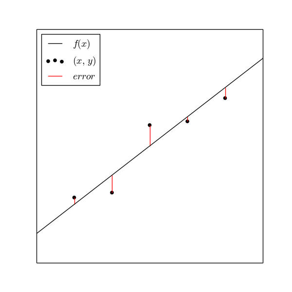
直線$y=f(x)$からデータ点$(x,y)$までの縦の長さ(赤い線)が最小になるように$f(x)$を決めるのが最小二乗法。
正確には
$$\sum_{i=1}^{n}\left(y_{i}-f(x_{i})\right)^{2}$$
を最小にする。
import numpy as np
import matplotlib.pyplot as plt
from matplotlib.figure import figaspect

np.random.seed(1234)

x_min, x_max = -3, 3
coef = 2
sigma = 1


def f(x): return coef * x


x = np.arange(x_min + 1, x_max)
residual = np.random.normal(scale=sigma, size=x.size)
y = f(x) + residual

fig = plt.figure(figsize=figaspect(1))
ax = fig.gca()
ax.plot((x_min, x_max), (f(x_min), f(x_max)), c='k', label='$f(x)$')
ax.scatter(x, y, c='k', label=r'$(x,\ y)$')
ax.vlines(x, f(x), y, color='r', label='$error$')
ax.legend(loc='upper left')
plt.setp(ax, xlim=(x_min, x_max), xticks=(), yticks=())
plt.show()
最尤法
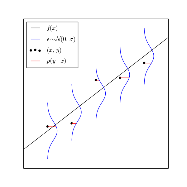
直線$y=f(x)$と正規分布(青い線)に従う誤差$\epsilon$を考える。データ点$(x,y)$が$f(x)+\epsilon$から再現される確率/確率密度$p(y\ |\ x)$を考える。この確率(密度)を尤度といい、尤度(赤い線の長さ)が最大になるように$f(x)$を決めるのが最尤法。
正確には
$$\prod_{i=1}^{n}p\left(y_{i}|x_{i}\right)$$
を最大にする。
import numpy as np
from scipy.stats import norm
import matplotlib.pyplot as plt
from matplotlib.figure import figaspect

np.random.seed(1234)

x_min, x_max = -3, 3
coef = 2
sigma = 1


def f(x): return coef * x


x = np.arange(x_min + 1, x_max)
y_hat = f(x)
residual = np.random.normal(scale=sigma, size=x.size)
y = y_hat + residual
error = np.linspace(- sigma * 3, sigma * 3, 100).reshape((-1, 1))
dist = norm(scale=sigma)

fig = plt.figure(figsize=figaspect(1))
ax = fig.gca()
ax.plot((x_min, x_max), (f(x_min), f(x_max)), c='k', label='$f(x)$')
ax.scatter(x, y, c='k', label=r'$(x,\ y)$')
lines = ax.plot(x + dist.pdf(error), y_hat + error, c='b')
plt.setp(lines[0], label=r'$\epsilon \sim \mathcal{N}( 0,\ \sigma )$')
ax.hlines(y, x, x + dist.pdf(residual), color='r', label=r'$p(y\ |\ x)$')
ax.legend(loc='upper left')
plt.setp(ax, xlim=(x_min, x_max), xticks=(), yticks=())
plt.show()
コード
TensorFlow Probabilityをインストール。(なくても確率密度関数を自分で書くなら不要)
$ pip install tensorflow-probability
実際のコードは以下の通り。
初心者向けにKerasでやってみたけど、正直ここのように生TensorFlowのほうが楽かな。損失関数に予測値と正解ラベル以外渡せないので、ネットワーク内で負の対数尤度を計算して、損失関数はその値をそのまま利用。出力は予測用と損失関数用で2つ用意。
$\sigma$を正にするため、変数は$log\sigma$にして、指数関数を通す。
import numpy as np
from sklearn.datasets import make_regression
import tensorflow.keras.backend as K
from tensorflow.keras import initializers
from tensorflow.keras.layers import Input, Dense, Layer
from tensorflow.keras.models import Model
import tensorflow_probability as tfp
tfd = tfp.distributions

x, y = make_regression(n_features=1, noise=10, random_state=1234)


class NegativeLogLikelihood(Layer):

    def __init__(self, output_dim, **kwargs):
        self.output_dim = output_dim
        super().__init__(**kwargs)

    def build(self, input_shape):
        self.log_sigma = self.add_weight(
            'log_sigma', shape=(1,), initializer=initializers.Zeros)
        self.sigma = K.exp(self.log_sigma)
        super().build(input_shape)

    def call(self, inputs):
        y_true = inputs[0]
        y_pred = inputs[1]
        dist = tfd.Normal(loc=y_pred, scale=self.sigma)
        return -1.0 * dist.log_prob(y_true)

    def compute_output_shape(self, input_shape):
        return (input_shape[0],)


def identity_loss(y_true, loss):
    return loss


input_x = Input(shape=(1,))
input_y = Input(shape=(1,))
out = Dense(1)(input_x)
loss = NegativeLogLikelihood(1)([input_y, out])
model = Model(inputs=[input_x, input_y], outputs=[out, loss])
model.compile(optimizer='adam', loss=identity_loss, loss_weights=[0., 1.])

model.fit([x, y.reshape((-1, 1))], [y, y], epochs=int(3e5), batch_size=y.size)
可視化
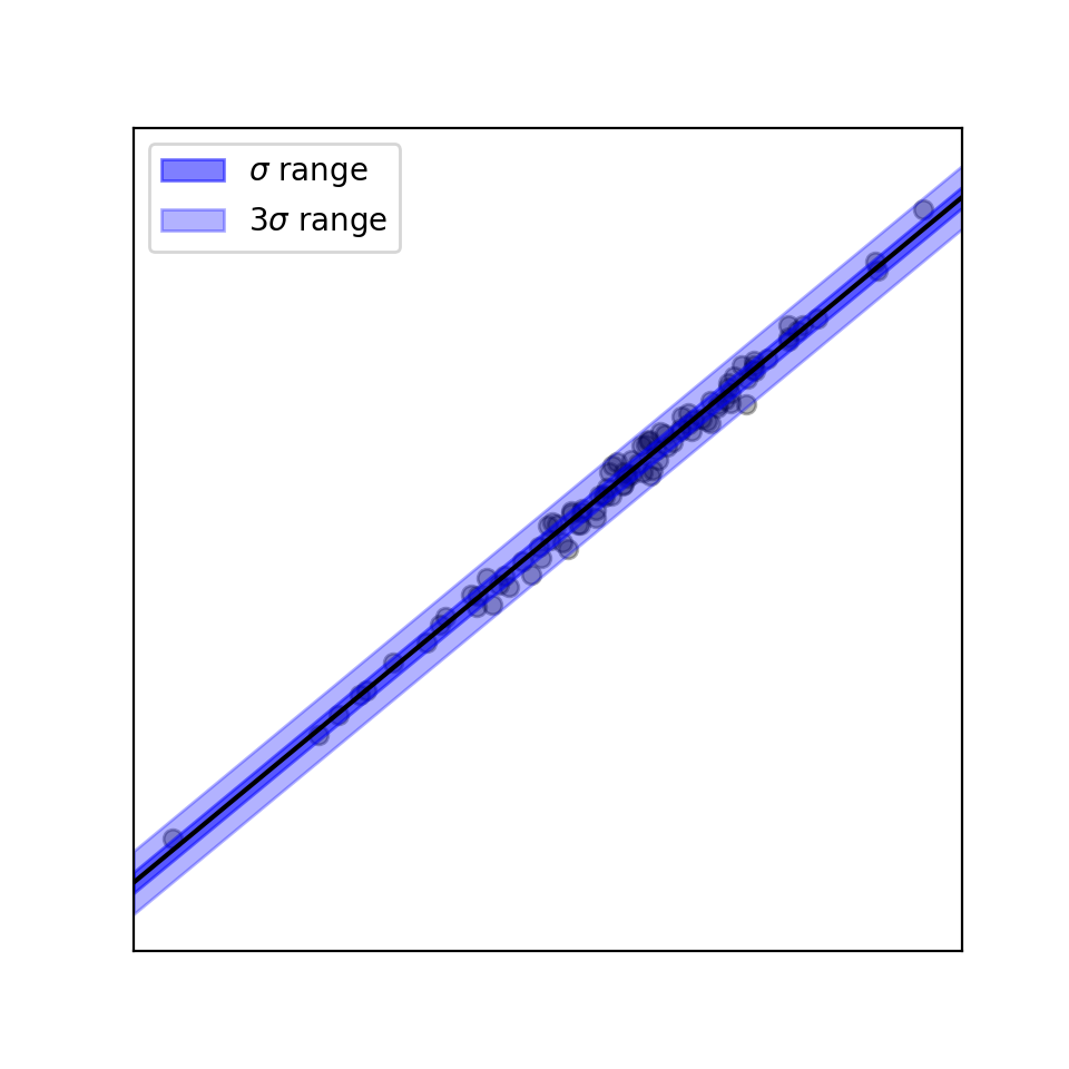
import matplotlib.pyplot as plt
from matplotlib.figure import figaspect

coef, intercept = model.layers[1].get_weights()
coef = coef.ravel()
sigma = np.exp(model.layers[-1].get_weights()).ravel()


def f(x): return coef * x + intercept


fig = plt.figure(figsize=figaspect(1))
ax = fig.gca()
ax.scatter(x, y, c='k', alpha=0.3)
xlim = np.array(ax.get_xlim())
y_hat = f(xlim)
ax.plot(xlim, y_hat, c='k')
ax.fill_between(xlim, y_hat-sigma, y_hat+sigma,
                color='b', alpha=0.5, label=r'$\sigma$ range')
ax.fill_between(xlim, y_hat-3*sigma, y_hat+3*sigma,
                color='b', alpha=0.3, label=r'$3\sigma$ range')
ax.legend()
plt.setp(ax, xlim=xlim, xticks=(), yticks=())
plt.show()
応用例
- 正規分布の部分をt分布に変えて、裾の広い分布に対応したり、少しだけ外れ値に強いロバスト回帰
- RNNなどと組み合わせてガウス過程みたいに時系列データの区間推定(予測値だけでなく、予測の信頼性≒確信度)
- RNNに分布のパラメータも予測させるので、たぶん実装はこっちのほうが楽