2変数のデータの描画
ggplot2 の第4回です。今回は2変数のデータの描画ということで、散布図、折れ線グラフなどを扱います。途中ちょっと脇道にそれてdistinct()も使ってみます。最後には回帰直線も描きます。今回もDr.Greg Martinの動画で勉強したことが中心です。
散布図
ここではデータセットOrange を利用します。Orange はRの組み込みのデータセットなので、ダウンロードすることなく利用することができます。R Documentationによると、オレンジの木の成長の記録ということで、次のような列が存在します。
> head(Orange)
  Tree  age circumference
1    1  118            30
2    1  484            58
3    1  664            87
4    1 1004           115
5    1 1231           120
6    1 1372           142
age(日数)を横軸に、circumference(周の長さ)を縦軸に散布図を描いてみます。
Orange %>%
  ggplot(aes(age, circumference)) +
  geom_point() +
  theme_bw()
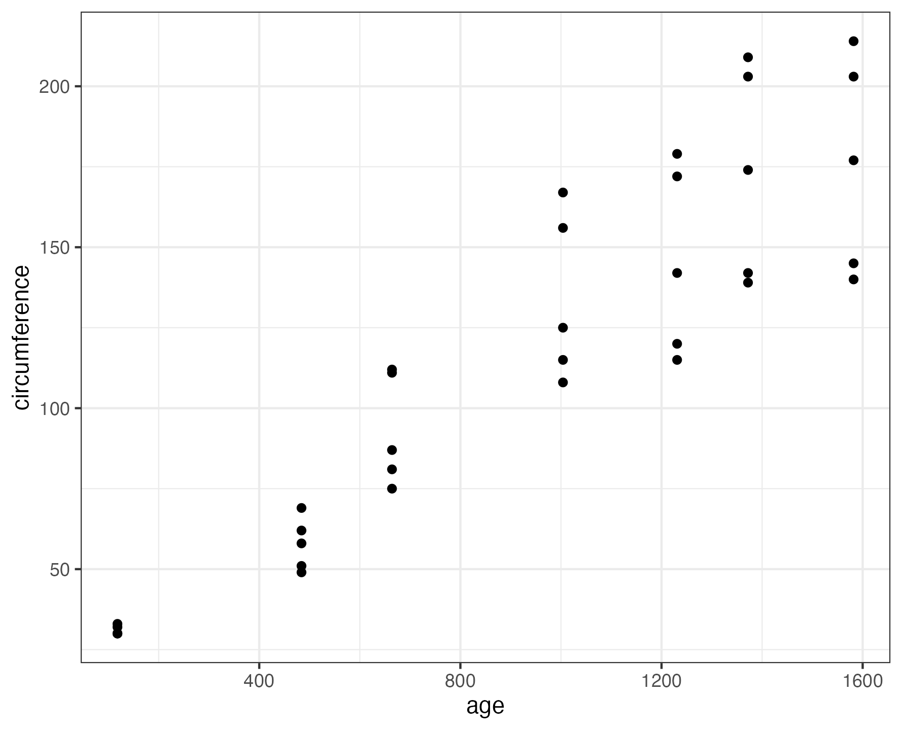
さて、ここから応用を考えていきましょう。
まず、Orangeデータセットには35行3列のデータがあります。列としては上述の通りTree、age、circumference の3つがありますが、Tree列 はどのような値を含むでしょうか?たかが35行なので、全件表示すればわかるのですが、ここでは行数の多いデータにも対応できるようにdistinct() を用いて調べます。
> library(dplyr)
> Orange %>% distinct(Tree, keep_all=FALSE)
  Tree keep_all
1    1    FALSE
2    2    FALSE
3    3    FALSE
4    4    FALSE
5    5    FALSE
ということで、1〜5の5つの値があることがわかりました。
ちなみに、distinct() は重複を除く関数です。
distinct() はライブラリdplyr に含まれます(dplyr::distinctと表します。名前空間といいます)が、dplyr はtidyverse に含まれますので、library(tidyverse) を実行していれば1行目のlibrary(dplyr) は不要となります。
distinct() の説明についてはこちら、名前空間についての説明はこちらをご覧ください。
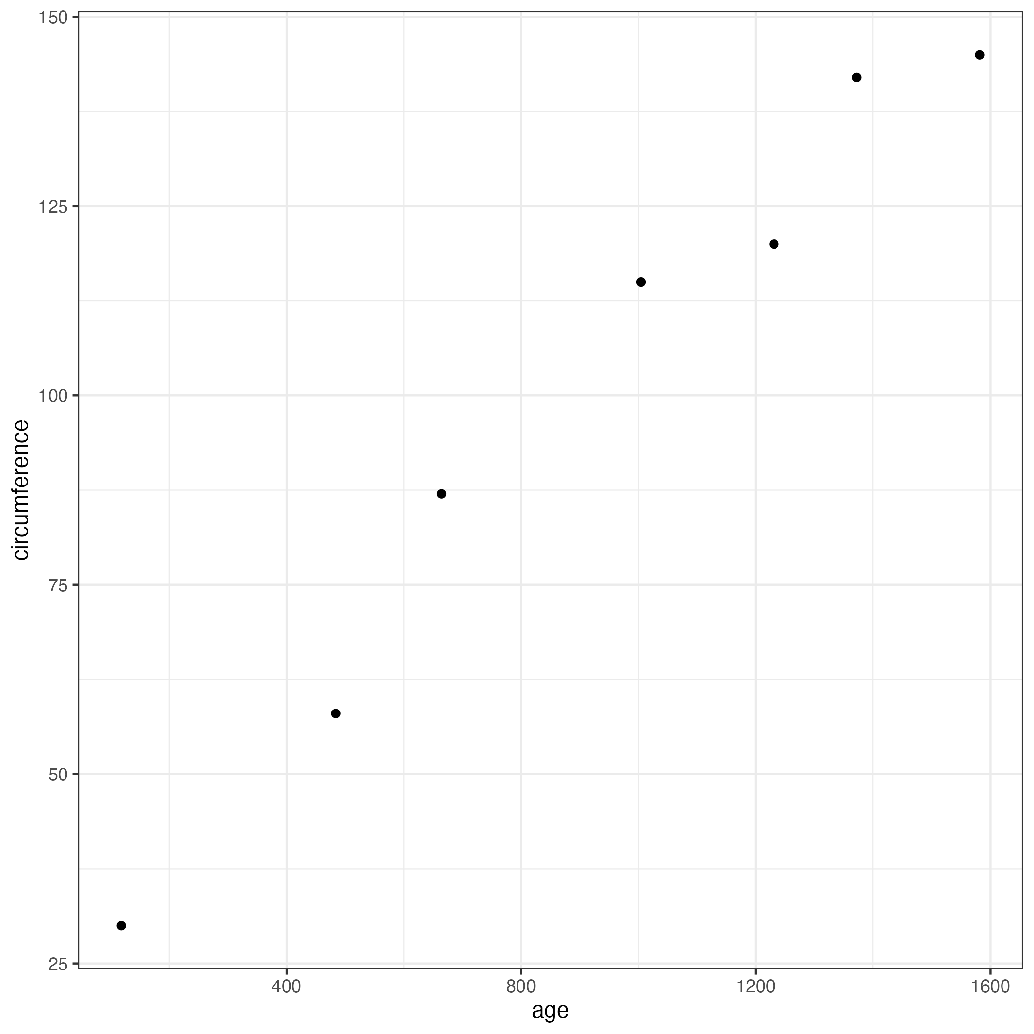
話がそれましたが本題に戻ります。上記の散布図は1〜5のすべての木を対象として描画しましたが、例えばTree=1 のデータだけを描画したければ以下のようにします。
Orange %>%
  filter(Tree == "1") %>%
  ggplot(aes(age, circumference)) +
  geom_point() +
  theme_bw()
逆に、Tree=1 以外のデータを描画するにはfilter()の行を
filter(Tree != "1") %>%
に置き換えます。
さて、このように表示すると、木によって成長の仕方がどのように相違しているのかがわかりません。facet_wrap()を用いて、木ごとに散布図を描いてみます。
Orange %>%
  ggplot(aes(age, circumference)) +
  geom_point() +
  facet_wrap(~Tree) +
  theme_bw()
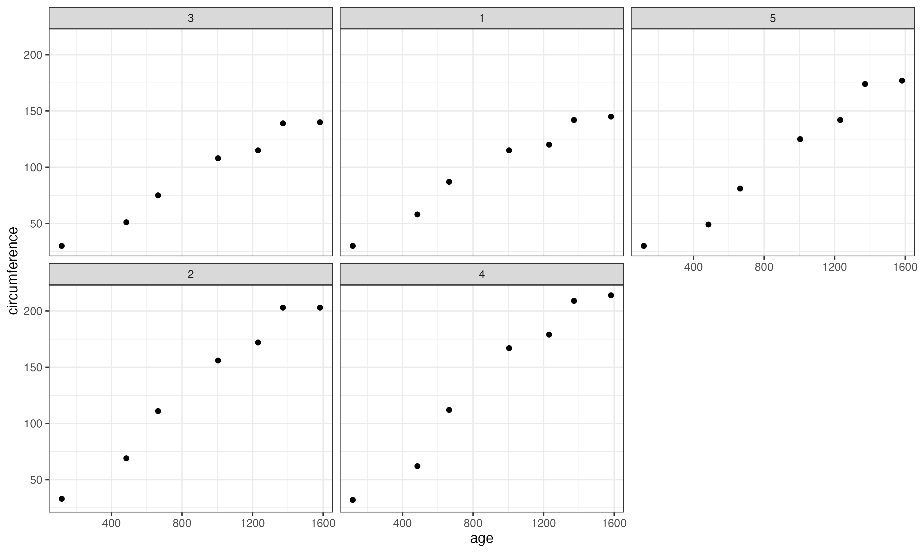
正直、イマイチでした。そこで、1枚のグラフの中に1〜5の木の幹の太さを色分けして描画してみます。
Orange %>%
  ggplot(aes(age, circumference, color=Tree)) +
  geom_point() +
  scale_color_brewer(palette="Set2") +
  theme_bw()
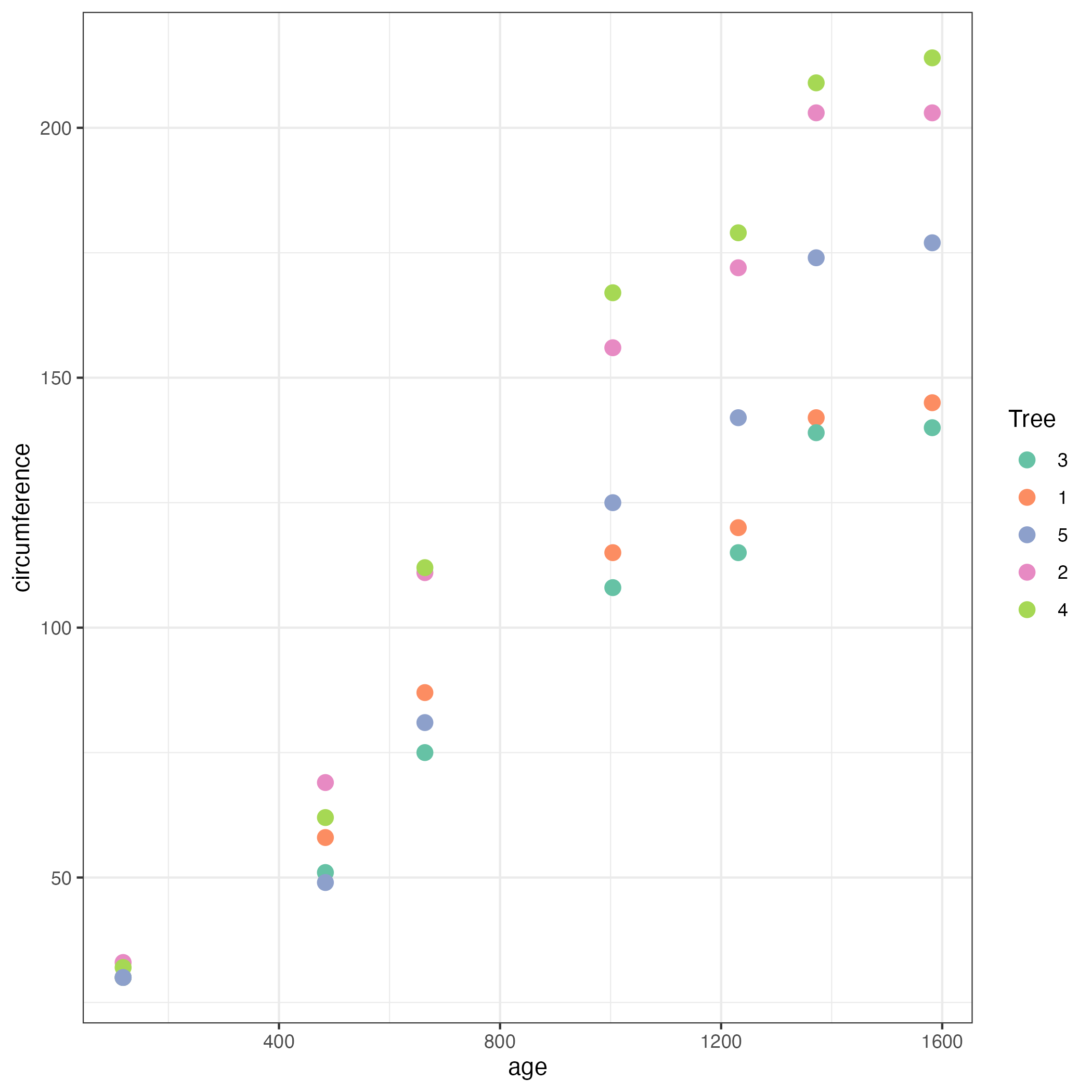
なかなか、よきではないですか?
折れ線グラフ
各木の成長具合をより明確に比較するには、折れ線グラフが適しているでしょう。
ということで、折れ線グラフを描いてみます。
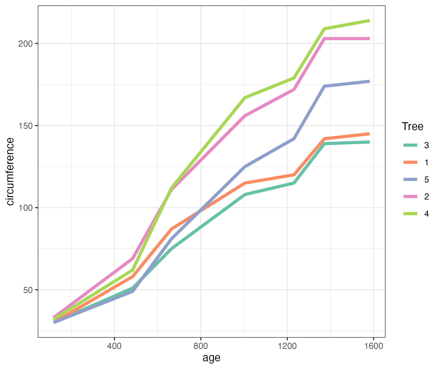
Orange %>%
  ggplot(aes(age, circumference, color=Tree)) +
  geom_line(size=1.5) +
  scale_color_brewer(palette="Set2") +
  theme_bw()
ggplot2を使えば、折れ線グラフと散布図を重ねて表示、なんてことも簡単にできてしまいます。
Orange %>%
  ggplot(aes(age, circumference, color=Tree)) +
  geom_point(size=3) +
  geom_line(size=1.5) +
  scale_color_brewer(palette="Set2") +
  theme_bw()
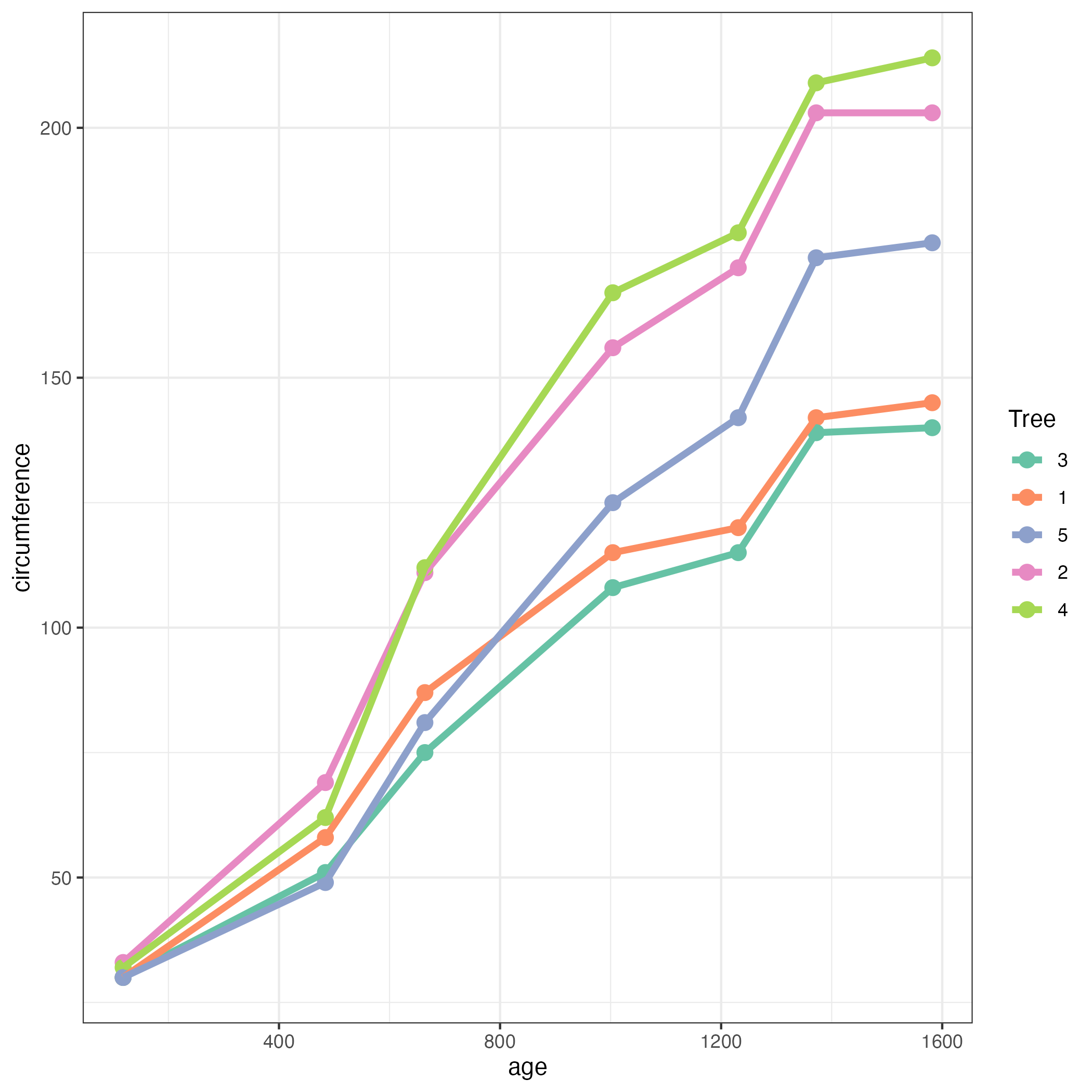
ものすごく説得力ありますよね。
あるいはこんなのはどうでしょう。各木ごとに今度は折れ線グラフを描く代わりに単回帰して回帰直線を描いてみます。
Orange %>%
  ggplot(aes(age, circumference, color=Tree)) +
  geom_point(size=3) +
  geom_smooth(method=lm, se=F) +
  scale_color_brewer(palette="Set2") +
  theme_bw()
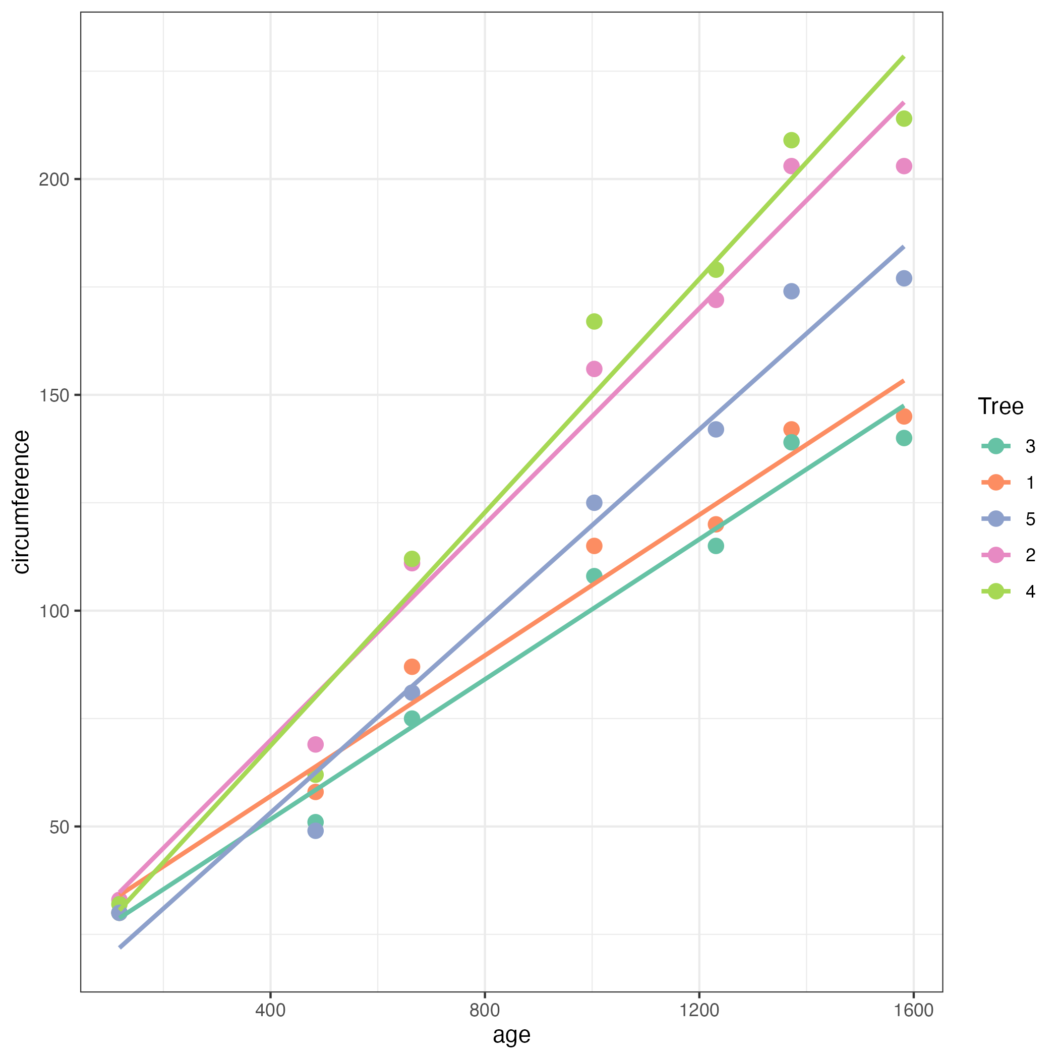
ここで
geom_smooth(method=lm, se=F)
が回帰直線を引くレイヤです。method=lm でlinear model(つまり直線で回帰)を指定し、se=F で標準誤差の表示を止めています。
どうですか?各木の成長のスピードが一目瞭然ですよね!
このようにggplot2はつよつよなんです。
参考文献
Data visualisation using ggplot with R Programming : Dr.Greg Martin の動画
Cheatsheet : (公式)チートシートです。
R Documentation : Orange データセットの説明
一所懸命に手抜きする : distinct()についての説明
Rの名前空間とスコーピング : 名前空間についての解説
トップページはこちら