前回の記事を作成した際、ボタンには種類があることに気づきました。
今回はその違いを理解すべく、以下の3種類について調べました。
Buttonandroidx.appcompat.widget.AppCompatButtoncom.google.android.material.button.MaterialButton
調べてはみたものの、自分の未熟さを痛感しながらの作業となりました。
認識が間違っている、正しい情報ではない等ありましたら、ぜひコメントをお願いいたします。
1.Button
ユーザーがタップまたはクリックしてアクションを実行できるUIコンポーネントです。
こちらが最も基本のクラスであり、Android1.0(APIレベル1)から使用することができます。
(参考:Android Developer: Button)
使用例
<Button
        android:id="@+id/button"
        android:layout_width="match_parent"
        android:layout_height="wrap_content"
        android:text="@string/button"
        app:layout_constraintStart_toStartOf="parent"
        app:layout_constraintTop_toTopOf="parent"
        />
上記コードを記述すると以下のようなボタンが表示されます。
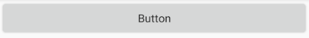
今回はButtonとして表示させるべく、テーマの継承を無効にして実装しました。
Buttonは、AppCompatテーマを継承した場合はAppCompatButtonとして、同様にMaterialComponentsテーマを継承した場合はMaterialButtonとして拡張する特徴があります。
テーマの継承の指定は、以下のようにstyleのparent属性で行います。
<resources xmlns:tools="http://schemas.android.com/tools">
    <style name="Theme.MyApplication" parent="Theme.MaterialComponents.DayNight.DarkActionBar">
        <item name="colorPrimary">@color/black</item>
        <item name="colorOnPrimary">@color/purple_200</item>
    </style>
</resources>
2.AppCompatButton
AppCompatライブラリ適用のボタンクラスであり、Buttonクラスのサブクラスです。
AppCompatとは、新しいフレームワークやメソッドなどを以前のAPIバージョンでも使えるようにするためのライブラリです。
元々はSupportLibraryというライブラリで提供されていましたが、2018年のAndroid9.0(APIレベル28)のリリース以降はAndroidXとして提供されています。(参照:Hello World, AndroidX)
※AndroidXライブラリとは、SupportLibraryを大幅に改良したものです。
2021/06/28現在、AndroidStudio(使用環境:AndroidStudio 4.1.1)で新しく作成したプロジェクトはAppCompatがデフォルトで使用できるようになっています。
AppCompatを使用するための条件
AppCompatを使用するには以下3点を満たしている必要があります。
①AndroidXが使用できるプロジェクトである
②GoogleのMavenリポジトリがプロジェクトに追加されている(参照:ビルド依存関係を追加する)
③モジュールレベルのGradleファイルにAppCompatライブラリが追加されている
上記の条件をコードで表すと以下の通りとなります。
①AndroidXが使用できるプロジェクトである
android.useAndroidX=true //trueであること
android.enableJetifier=true //trueであること
android {
    compileSdkVersion 30 //バージョンが28以上であること
}
②GoogleのMavenリポジトリがプロジェクトに追加されている
allprojects {
    repositories {
        google() //Mavenリポジトリの追加
        jcenter()
    }
}
③モジュールレベルのGradleファイルにAppCompatライブラリが追加されている
dependencies {
    implementation 'androidx.appcompat:appcompat:1.3.0' //ライブラリの追加
}
AppCompatButtonの使用例
<androidx.appcompat.widget.AppCompatButton
        android:id="@+id/appcompat_button"
        android:layout_width="match_parent"
        android:layout_height="wrap_content"
        android:text="@string/app_compat_button"
        app:layout_constraintStart_toStartOf="parent"
        app:layout_constraintTop_toBottomOf="@id/button"
        />
上記コードを記述すると以下のようなボタンが表示されます。
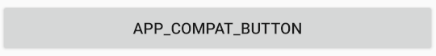
(継承するテーマとしてTheme.AppCompat.DayNight.DarkActionBarを指定した場合)
ちなみに、テーマを指定しない場合は以下のようにただのテキストのようになりますが、ボタンとしての機能は維持されています。

3. MaterialButton
マテリアルデザインが利用できるボタンクラスであり、AppCompatButtonクラスのサブクラスです。
MaterialButtonはAppCompatButtonのサブクラスであるため、下位互換などの機能はそのままに、マテリアルデザインに則っているため操作がしやすいという特徴があります。
2021/06/28現在、AndroidStudio(使用環境:AndroidStudio 4.1.1)で新しく作成したプロジェクトはMaterialComponentsがデフォルトで使用できるようになっています。
MaterialComponentsを使用するための条件
MaterialComponentsを使用するには以下3点を満たしている必要があります。
①GoogleのMavenリポジトリがプロジェクトに追加されている
②モジュールレベルのGradleファイルにMaterialComponentsのライブラリが追加されている
③compileSdkVersionが29以上である
上記の条件をコードで表すと以下の通りとなります。
①GoogleのMavenリポジトリがプロジェクトに追加されている
allprojects {
    repositories {
        google() //Mavenリポジトリの追加
        jcenter()
    }
}
②モジュールレベルのGradleファイルにMaterialコンポーネントのライブラリが追加されている
dependencies {
    implementation 'com.google.android.material:material:1.3.0' //ライブラリの追加
}
③compileSdkVersionが29以上である
android {
    compileSdkVersion 30 //29以上であること
dependencies {
    implementation 'com.google.android.material:material:1.3.0' //ライブラリの追加
}
MaterialButtonの使用例
MaterialComponentsテーマから継承する場合
以下の手順で実装していきます。
①継承するテーマを設定する
②色を設定する
③レイアウトファイルにボタンを追加する
<resources xmlns:tools="http://schemas.android.com/tools">
    <style name="Theme.MyApplication" parent="Theme.MaterialComponents.DayNight.DarkActionBar"> // ①テーマを設定
        <item name="colorPrimary">@color/black</item> // ②ボタン背景に反映される色を指定
        <item name="colorOnPrimary">@color/purple_200</item> // ②文字色に反映される色を指定
    </style>
</resources>
<?xml version="1.0" encoding="utf-8"?>
<resources>
       <color name="black">#FF000000</color>
       <color name="purple_200">#FFBB86FC</color>
</resources>
<com.google.android.material.button.MaterialButton // ③MaterialButtonを追加
        android:id="@+id/material_button"
        android:layout_width="match_parent"
        android:layout_height="wrap_content"
        android:text="@string/material"
        app:layout_constraintStart_toStartOf="parent"
        app:layout_constraintTop_toBottomOf="@id/appcompat_button"
        />
以上のコードを記述すると記述以下のようなボタンが表示されます。

ここでの注意点は、③で追加した<com.google.android.material.button.MaterialButtonはMaterialComponentsテーマでのみ使用できるという点です。
MaterialComponentsテーマ以外を継承すると以下のエラーが出ます。
Error inflating class com.google.android.material.button.MaterialButton
AppCompatテーマから継承する場合
以下を参考にAppCompatテーマを継承して MaterialComponentsテーマから継承する場合 と同じボタンの作成を試みましたが、作ることはできませんでした。
Note: Since this is the default type, you don't need to specify a style tag as long as you are using a Material Components Theme. If not, set the style to @style/Widget.MaterialComponents.Button.
Buttons – Material Components for Android
ただしマテリアルデザインのようなボタンにはなったため、参考までに記載します。
以下の手順で実装していきます。
①継承するテーマを設定する
②色を設定する
③レイアウトファイルにボタンを追加する
④style属性にMaterialコンポーネントを追加する
<resources xmlns:tools="http://schemas.android.com/tools">
    <style name="Theme.MyApplication" parent="Theme.AppCompat.DayNight.DarkActionBar"> // ①AppCompatテーマを設定
        <item name="colorPrimary">@color/black</item>
        <item name="colorOnPrimary">@color/purple_200</item> // ②文字色に反映される色を指定
<item name="textAppearanceButton">@style/TextAppearance.MaterialComponents.Button</item>
    </style>
</resources>
以下、レイアウトファイルをButtonで指定していますが、androidx.appcompat.widget.AppCompatButtonでも同じように表示されます。
<Button // ③ボタンを追加
        android:id="@+id/material_button"
        android:layout_width="match_parent"
        android:layout_height="wrap_content"
        android:text="@string/material"
        app:layout_constraintStart_toStartOf="parent"
        app:layout_constraintTop_toBottomOf="@id/appcompat_button"
        style="@style/Widget.MaterialComponents.Button" // ④Materialコンポーネントのスタイルを指定
        />
以上を記述し、以下のようなボタンが表示されました。

まとめ:ボタン種別ごとの比較
ButtonとAppCompatButton
「AppCompatテーマを継承している場合、ButtonはAppCompatButtonに拡張されるため差はない」
書き方が統一されていれば、どちらで書いても良さそうです。
AppCompatライブラリが追加されていないモジュールの場合はButtonを使うしかありませんが、今からアプリを作るのであればAppCompatライブラリを使うべきです。
ButtonとMaterialButton
「MaterialComponentsテーマを継承している場合、ButtonはMaterialButtonに拡張されるため差はない」
こちらも書き方が統一されていれば、どちらの書き方でも問題なさそうです。
com.google.android.material.button.MaterialButtonの記述がある際にMaterialComponentsテーマ以外のものから継承するとエラーが出るため、その点は注意が必要です。
AppCompatButtonとMaterialButton
「全体にマテリアルデザインを対応させたい場合はMaterialButtonを使用する」
AppCompatButtonはMaterialComponentsテーマを使用していても自動的にマテリアルデザインになるわけではありません。そのため、デザインにこだわりたいという場合はcom.google.android.material.button.MaterialButtonとしてボタンを追加する必要があるようです。ただし、レイアウトにこだわらなくても良い場合は無理にマテリアルボタンを使う必要はないと分かりました。
おわりに
以上3種類のボタンについて見てきました。
今回はボタンに焦点を当てましたが、ボタン要素はUIコンポーネントの一部であり、他の機能面や全体のテーマを総合的に見て統一を図ることが望ましいと分かりました。
今回の3種類のボタンを起点に、AppCompatやMaterialコンポーネントについても理解を深めていきたいと思います。