グリッチエフェクトってかっこよくない?
あのブラウン管に写ったジャギジャギチカチカした感じのことをグリッチエフェクトといいます。
不穏なイメージや怪しいイメージにピッタリのエフェクトですが
そんなエフェクトをCSSだけで実装していきます!
まずは完成品を

これをなんとかしてCSSでデザインしてみます。
理屈は結構簡単です。
まずは土台を作る
<!DOCTYPE html>
<html>
<head>
	<title>ノイズアニメーション</title>
	<link rel="stylesheet" type="text/css" href="style.css">
</head>
<body>
	<div id="noise_box">
		<div class="block">
			<span>9時間9人9の扉</span>
		</div>
		<div class="block">
			<span>9時間9人9の扉</span>
		</div>
		<div class="block">
			<span>9時間9人9の扉</span>
		</div>
		<div class="block">
			<span>9時間9人9の扉</span>
		</div>
		<div class="block">
			<span>9時間9人9の扉</span>
		</div>
	</div>
</body>
</html>
# noise_box{
	--noise_box_height:100px;

	position:relative;
	top:500px;
	left:500px;
	width:500px;
	height:var(--noise_box_height);
	font-size:72px;
	color:#FFFFFF;
	background:#000000;
}


.block{
	overflow:hidden;
	position:absolute;
	left:0px;
	width:100%;
	height:100%;
}
.block>span{
	display:inline-block;
	position:absolute;
	left:0px;
	width:100%;
	line-height:var(--noise_box_height);
	text-align:center;
}
実行するとこんな感じになります

一見普通のテキストですが、実際には同じテキスト5つが重なっています。
#noise_box内の.blockにposition:absoluteが掛かっているためですね。
ではこれをベースに手を加えていきます。
テキストを横に分割する
# noise_box{
	--noise_box_height:100px;

	position:relative;
	top:500px;
	left:500px;
	width:500px;
	height:var(--noise_box_height);
	font-size:72px;
	color:#FFFFFF;
	background:#000000;
}


.block{
	overflow:hidden;
	position:absolute;
	left:0px;
	width:100%;
	height:100%;
}
.block>span{
	display:inline-block;
	position:absolute;
	left:0px;
	width:100%;
	line-height:var(--noise_box_height);
	text-align:center;
}


.block:nth-child(1){
	top:calc(var(--noise_box_height) * 0);
	height:calc(var(--noise_box_height) * 0.3);
	color:#FFFFFF;
}
.block:nth-child(1)>span{
	top:calc(var(--noise_box_height) * -0);
}


.block:nth-child(2){
	top:calc(var(--noise_box_height) * 0.3);
	height:calc(var(--noise_box_height) * 0.1);
	color:#FF0000;
}
.block:nth-child(2)>span{
	top:calc(var(--noise_box_height) * -0.3);
}


.block:nth-child(3){
	top:calc(var(--noise_box_height) * 0.4);
	height:calc(var(--noise_box_height) * 0.2);
	color:#00FF00;
}
.block:nth-child(3)>span{
	top:calc(var(--noise_box_height) * -0.4);
}


.block:nth-child(4){
	top:calc(var(--noise_box_height) * 0.6);
	height:calc(var(--noise_box_height) * 0.1);
	color:#0000FF;
}
.block:nth-child(4)>span{
	top:calc(var(--noise_box_height) * -0.6);
}


.block:nth-child(5){
	top:calc(var(--noise_box_height) * 0.7);
	height:calc(var(--noise_box_height) * 0.3);
	color:#FFFFFF;
}
.block:nth-child(5)>span{
	top:calc(var(--noise_box_height) * -0.7);
}
実行するとこんな感じになります。
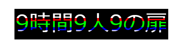
テキストが横に分割されて理解しやすいように色を付けました。
どういった仕組みかというと
5つの同じテキストの高さをそれぞれ縮めて、他の.blockの縮めた分の位置を調整して、さらに中のspanの位置を調整を調整してます。
例えば1つ目の.blockで言えば
.blockの高さを100px*0.3=30pxにして
1つ目より前の.blockの高さを考慮してtop:0pxにして
中のspanの位置をtop:0pxにします。
さらに例えば3つ目の.blockで言うなら
.blockの高さを100px*0.2=20pxにして
3つ目より前の.blockの高さ(30px+10px)を考慮してtop:40pxにして
中のspanの位置をtop:-40pxにします。
分割したそれぞれにエフェクトを掛けていく
# noise_box{
	--noise_box_height:100px;

	position:relative;
	top:500px;
	left:500px;
	width:500px;
	height:var(--noise_box_height);
	font-size:72px;
	color:#FF8800;
	background:#000000;
}


.block{
	overflow:hidden;
	position:absolute;
	left:0px;
	width:100%;
	height:100%;
}
.block>span{
	display:inline-block;
	position:absolute;
	left:0px;
	width:100%;
	line-height:var(--noise_box_height);
	text-align:center;
}
@keyframes noise_animation{
	0%{left:0px;}
	10%{left:0px;filter:none;}10.25%{left:30px;filter:hue-rotate(90deg) invert(70%);}10.5%{left:0px;filter:none;}
	70%{left:0px;filter:none;}70.25%{left:-30px;filter:hue-rotate(270deg) invert(30%);}70.5%{left:0px;filter:none;}
	100%{left:0px;}
}


.block:nth-child(1){
	top:calc(var(--noise_box_height) * 0);
	height:calc(var(--noise_box_height) * 0.3);
}
.block:nth-child(1)>span{
	top:calc(var(--noise_box_height) * -0);
	animation:noise_animation 11s linear alternate infinite;
}


.block:nth-child(2){
	top:calc(var(--noise_box_height) * 0.3);
	height:calc(var(--noise_box_height) * 0.1);
}
.block:nth-child(2)>span{
	top:calc(var(--noise_box_height) * -0.3);
	animation:noise_animation 10s linear infinite;
}


.block:nth-child(3){
	top:calc(var(--noise_box_height) * 0.4);
	height:calc(var(--noise_box_height) * 0.2);
}
.block:nth-child(3)>span{
	top:calc(var(--noise_box_height) * -0.4);
	animation:noise_animation 9s linear infinite;
}


.block:nth-child(4){
	top:calc(var(--noise_box_height) * 0.6);
	height:calc(var(--noise_box_height) * 0.1);
}
.block:nth-child(4)>span{
	top:calc(var(--noise_box_height) * -0.6);
	animation:noise_animation 11s linear reverse infinite;
}


.block:nth-child(5){
	top:calc(var(--noise_box_height) * 0.7);
	height:calc(var(--noise_box_height) * 0.3);
}
.block:nth-child(5)>span{
	top:calc(var(--noise_box_height) * -0.7);
}
実行するとこんな感じになります。
仕組みを解説すると
分割したそれぞれの.blockにanimationで動きを付けています。
グリッチエフェクトっぽくアニメーションするために
・ズレた動きをするの%を小数点単位で指定し一瞬になるようにする。
・ズレたときに色を変えるためにfilter:hue-rotate(90deg) invert(70%);などフィルターを掛ける。
・他の.blockとアニメーションが被らないようにanimation-durationやanimation-directionをバラバラに指定する。
ようにしています。
もっとリアリティを出すためにtransform:skew()なんてのも掛けても良いかもしれませんね。