はじめに
Matplotlib の colormap を使って作った図と同じ配色を、PowerPoint や Keynote で再利用したいことがあります。その際に困るのが、「この色の HEX は?」「RGB (0–255) は?」「カラーバーを離散的に N 段階で使いたい」といった点です。
この記事では、任意の Matplotlib colormap を N 段階に分割し、それぞれの色に対応する HEX / RGB を一覧表示するための、コピペで動く最小コードを紹介します。
実装コードは Google Colab こちら からも試せます。
方法
Matplotlib の colormap は「0〜1 の正規化値 → RGB」を返す関数です。
np.linspace(0, 1, N) により、index(0〜N−1)に対応する N 段階の色を取得し、それらを HEX / RGB として一覧表示します。
import numpy as np
import math
import matplotlib.pyplot as plt
import matplotlib.colors as mcolors
from matplotlib.patches import Rectangle


def plot_colormap_table(cmap_name="jet", N=8):
    """
    任意の Matplotlib colormap を N 段階に分割し,
    index・正規化値・色・HEX・RGB を一覧表示する
    """

    cmap = plt.get_cmap(cmap_name)
    values = np.linspace(0, 1, N)

    # 表示レイアウト
    cell_width = 320
    cell_height = 28
    swatch_width = 50
    margin = 20

    nrows = math.ceil(N)

    width = cell_width + 2 * margin
    height = cell_height * nrows + 2 * margin
    dpi = 72

    fig, ax = plt.subplots(figsize=(width / dpi, height / dpi), dpi=dpi)
    fig.subplots_adjust(
        margin / width,
        margin / height,
        (width - margin) / width,
        (height - margin) / height,
    )

    ax.set_xlim(0, cell_width)
    ax.set_ylim(cell_height * (nrows - 0.5), -cell_height / 2)
    ax.axis("off")

    for i, v in enumerate(values):
        y = i * cell_height
        color = cmap(v)

        hex_code = mcolors.to_hex(color)
        r, g, b = mcolors.to_rgb(color)
        r, g, b = int(r * 255), int(g * 255), int(b * 255)

        ax.add_patch(
            Rectangle(
                (0, y - 10),
                swatch_width,
                20,
                facecolor=color,
                edgecolor="0.6",
            )
        )

        ax.text(swatch_width + 8, y, f"index={i} ({v:.3f})",
                fontsize=11, va="center", ha="left")

        ax.text(swatch_width + 110, y, hex_code,
                fontsize=11, va="center", ha="left", color="gray")

        ax.text(swatch_width + 190, y, f"RGB=({r},{g},{b})",
                fontsize=11, va="center", ha="left", color="gray")

    fig.suptitle(f"{cmap_name} colormap ({N} levels)",
                 fontsize=16, y=0.98)

    return fig
使い方
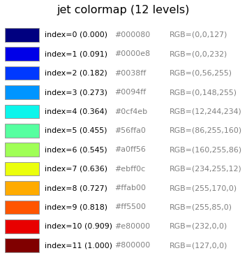
例えば、jet カラーマップを 12 段階で分割したい場合は、
cmap_name = "jet"
N = 12
fig = plot_colormap_table(cmap_name, N)
plt.tight_layout()
plt.savefig(f"{cmap_name}_{N}.pdf")
plt.show()
とするだけです。このコードを実行すると以下のように、左から順に、色パッチ、index と正規化値、HEX、RGB (0–255) が表示されます。
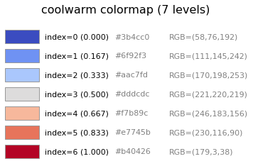
もう一つ例を挙げると、中心値を基準に上下へ伸びる発散型カラーマップ(coolwarm など)の場合は、中心の色を含められるように N を奇数にすると使いやすいことが多いです。
cmap_name = "coolwarm"
N = 7
fig = plot_colormap_table(cmap_name, N)
plt.tight_layout()
plt.savefig(f"{cmap_name}_{N}.pdf")
plt.show()
このようにすると、中央の index がカラーマップの中心(中立色)に対応し、正負や高低を対称に表現したい場合に便利です。
PDF 保存について
記事内では画像表示になりますが、コードでは PDF で保存しています。
これは、スライド作成時に色コード(HEX / RGB)をそのままコピーできるためです。
おわりに
Matplotlib の colormap は連続量として定義されていますが、発表資料や説明用の図では離散的な色が欲しい場面も多くあります。
この方法を使えば、解析で使った配色をそのままスライドに持っていくことができます(スライド内でのグラデーション作成や文字色のトーン調整など)。
ぜひご活用いただけると幸いです。