始めに
pythonを使って、様々なグラフを描画することができる、matplotlibの使い方備忘録です。簡単にプロット図を作成でき、ラベルやテキストを自由に設定できます。図中のすべての要素(ラベル、凡例、軸、色、タイトル等)を簡単に操作できます。
numpy、pandasとjupyter notebookと組み合わせて使うことをお勧めします。エクセルで行なっていたデータ整理->グラフ化が本当に簡単にできるようになります。
[python3]すぐに使えるnumpyの使い方まとめ
[python3] 非IT業務でも使える pandas の基本的な使い方
インポート
pltとしてインポートするのが慣例。
jupyter notebook内にグラフを表示するためのおまじないとして、1行追加。
import matplotlib.pyplot as plt
%matplotlib inline
pltプロット (MATLABスタイル)
まずデータの準備(numpyを使って)
import numpy as np
x = np.linspace(0, 10, 11)
# => array([ 0.,  1.,  2.,  3.,  4.,  5.,
#            6.,  7.,  8.,  9., 10.])
y = x ** 2
# => array([  0.,   1.,   4.,   9.,  16.,  25.,
#            36.,  49.,  64.,  81., 100.])
# 3つめの引数で色を指定可能。Hex codeでも可。
plt.plot(x, y, 'blue')

# X, Yラベルおよびグラフタイトルを追加
plt.xlabel('X label')
plt.ylabel('Y label')
plt.title('Title')
グラフが表示される。

複数の図形を表示
subplot()に引数として整数を渡す。行数、列数、プロットする番号。
# plt.subplot(nrows, ncols, plot_number)
plt.subplot(1, 2, 1)
plt.plot(x, y, 'r--') # redの破線
plt.subplot(1, 2, 2)
plt.plot(y, x, 'g*-') # greenの*プロット

オブジェクト指向メソッド (add_axes())
Figureオブジェクトをインスタンス化して、そのオブジェクトからメソッドや属性を呼び出す。 複数のプロットが描かれているキャンパスを扱う場合は、この方法が適している。 はじめにFigureインスタンスを作成し、それからそのキャンパスに軸(Axes)を追加していく。
オブジェクト指向メソッドで、上記MATLABスタイルと同様の図を作成してみる。
# Figureを作成 (空のキャンバス)
fig = plt.figure()
# 軸(axes)をFigureに追加する。
# [左からの距離,下からの距離、グラフの横幅、グラフの高さ]を
# 0~1の範囲で指定
ax = fig.add_axes([0.1,0.1,0.8,0.8])

# 追加した軸(axes)にプロットする
axes.plot(x, y, 'blue')
# メソッドの使うときは、頭にset_を付ける
axes.set_xlabel('X label')
axes.set_ylabel('Y label')
axes.set_title('Title')

コードは少し複雑になるが、Axesが配置される場所を制御できるので、Figureに複数の図を簡単に追加できるようになる。
複数のaxesを持つグラフ
# 空のキャンバスを作成
fig = plt.figure()
# axes を追加
ax1 = fig.add_axes([0.1,0.1,0.8,0.8]) # main axes
ax2 = fig.add_axes([0.2,0.5,0.4,0.3]) # inset axes

# Axes 1
ax1.plot(x, y, 'blue')
ax1.set_xlabel('X_axes1')
ax1.set_ylabel('Y_axes1')
ax1.set_title('Axes 1 Title')

# Insert Figure Axes 2
ax2.plot(y, x, 'red')
ax2.set_xlabel('X_axes2')
ax2.set_ylabel('Y_axes2')
ax2.set_title('Axes 2 Title');

オブジェクト指向メソッド (subplots())
plt.subplots()オブジェクトは、より柔軟にaxesを操作できる。
plt.figure()に似ているが、plt.subplots()はfigとaxesをタプルアンパッキングしている。
fig, ax = plt.subplots()

# plotに情報を追加するために、axオブジェクトを使用する。
ax.plot(x, y, 'blue')
ax.set_xlabel('X label')
ax.set_ylabel('Y lable')
ax.set_title('Title')

複数グラフを作成する
subplots()オブジェクト作成時に、グラフの行数、列数を指定することができる。これにより、axesアレイ化されるため、pythonのリストのようにイテレートすることが可能になる。
fig, axes = plt.subplots(nrows=1, ncols=2)

for ax in axes:
    ax.plot(x, y, 'blue')
    ax.set_xlabel('X label')
    ax.set_ylabel('Y label')
    ax.set_title('title')

# グラフや軸ラベルが重なることを避ける
fig.tight_layout()

Figureのサイズ、アスペクト比、DPI
matplotlibでは、Figureオブジェクトを作成する際に、アスペクト比、DPIおよびFigureサイズを 指定することが出来る。
figsize : 図の幅と高さをインチで表したタプル
dpi : 1インチあたりのドット数(1インチあたりのピクセル数)
fig, axes = plt.subplots(figsize=(12,3))

axes.plot(x, y, 'blue')
axes.set_xlabel('X label')
axes.set_ylabel('Y label')
axes.set_title('Title');

Figureの保存
# ここでも、DPIを設定したり、様々なフォーマットを拡張子で選択可能。
fig.savefig('test.png', dpi=100)
凡例、ラベル、タイトル、グリッド
それぞれ、引数でフォントサイズやカラーを選択できる。
判例は、plot時に引数として、label=''で指定することで、自動で判例を追加してくれる。凡例の位置は、引数loc=で指定。
デフォルトは、loc=0でベストな位置を自動で判定。
| loc= | 配置場所 |
|---|---|
| 0 | ベストな位置 |
| 1 | 右上 |
| 2 | 左上 |
| 3 | 左下 |
| 4 | 右下 |
| 5 | 右 |
| 6 | 中心より左 |
| 7 | 中心より右 |
| 8 | 下より中心 |
| 9 | 上より中心 |
| 10 | 中心 |
fig, ax = plt.subplots()

ax.plot(x, y, 'orange', label='label')

ax.set_xlabel('X', fontsize=10, color='red')
ax.set_ylabel('Y', fontsize=10, color='blue')

ax.grid(True)
ax.legend(loc=2)

色、線幅、線種
fig, ax = plt.subplots(figsize=(12,6))

ax.plot(x, x+1, color="red", linewidth=0.50)
ax.plot(x, x+2, color="red", linewidth=2.00)

# 様々なラインオプション ‘-.’, ‘:’
ax.plot(x, x+3, color="green", lw=3, ls='-.')
ax.plot(x, x+4, color="green", lw=3, ls=':')

# 各種マーカー  marker = '+', 'o', '*', 's', ',', '.', '1', '2', '3', '4', ...
ax.plot(x, x+5, color="blue", lw=3, ls='-', marker='+')
ax.plot(x, x+6, color="blue", lw=3, ls='--', marker='o')

# マーカーのサイズと色
ax.plot(x, x+7, color="purple", lw=1, ls='-', marker='o', markersize=8, markerfacecolor="red")
ax.plot(x, x+8, color="purple", lw=1, ls='-', marker='s', markersize=8, markerfacecolor="yellow", markeredgewidth=3, markeredgecolor="green");

style
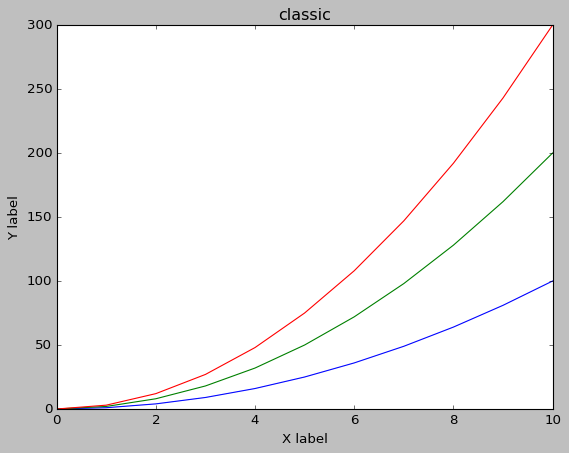
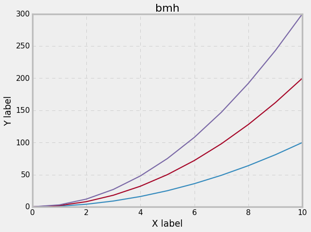
plt.style.use を利用することで、様々なスタイルのグラフを描画できる。
seabornをインストールしていると、seabornスタイルも利用できる。
# スタイルの設定
# 'seaborn-dark', 'seaborn-darkgrid', 'seaborn-ticks', 'fivethirtyeight', 'seaborn-whitegrid', 'classic', 'seaborn-talk', 'seaborn-dark-palette','seaborn-bright', 'seaborn-pastel', 'grayscale', 'seaborn-notebook','ggplot', 'seaborn-colorblind', 'seaborn-muted', 'seaborn', 'seaborn-paper','bmh', 'seaborn-white', 'dark_background', 'seaborn-poster', 'seaborn-deep'
plt.style.use('ggplot')

plt.plot(x, y)
plt.plot(x, y*2)
plt.plot(x, y*3)
plt.xlabel('X label')
plt.ylabel('Y label')
plt.title('ggplot')
・ggplot

・seaborn-dark

・classic
・bmh
・fivethirtyeight
