floatがわからなかったので
floatイマイチぴんと来ません。
ですので色いろ調べてflexboxを知りました。
flexboxって?
flexboxは要素を横並びにするために使います。縦並びもできます。
めちゃくちゃ簡単に横並びが実現できました。
使い方
横並びにしたい要素を子要素として、その親要素のcssにdisplay:flex;
とつけるだけ。
例
 <div class='btns'>
     <div class='btn facebook'>
       <p>Facebookで登録</p>
     </div>
     <div class='btn twitter'>
       <p>Twitterで登録</p>
     </div>
   </div>
.btns{
   width:500px;
   margin: 0px auto;
   display:flex;
   justify-content:space-around;
}

.btn{
  height:24px;
  width:150px;
  border-radius:5px;
}

.facebook{
  background-color:#3b5998;
  opacity:0.8;
  padding:8px 24px;

}

.twitter{
  background-color:#55acee;
  opacity:0.8;
  padding:8px 24px;
}
これで、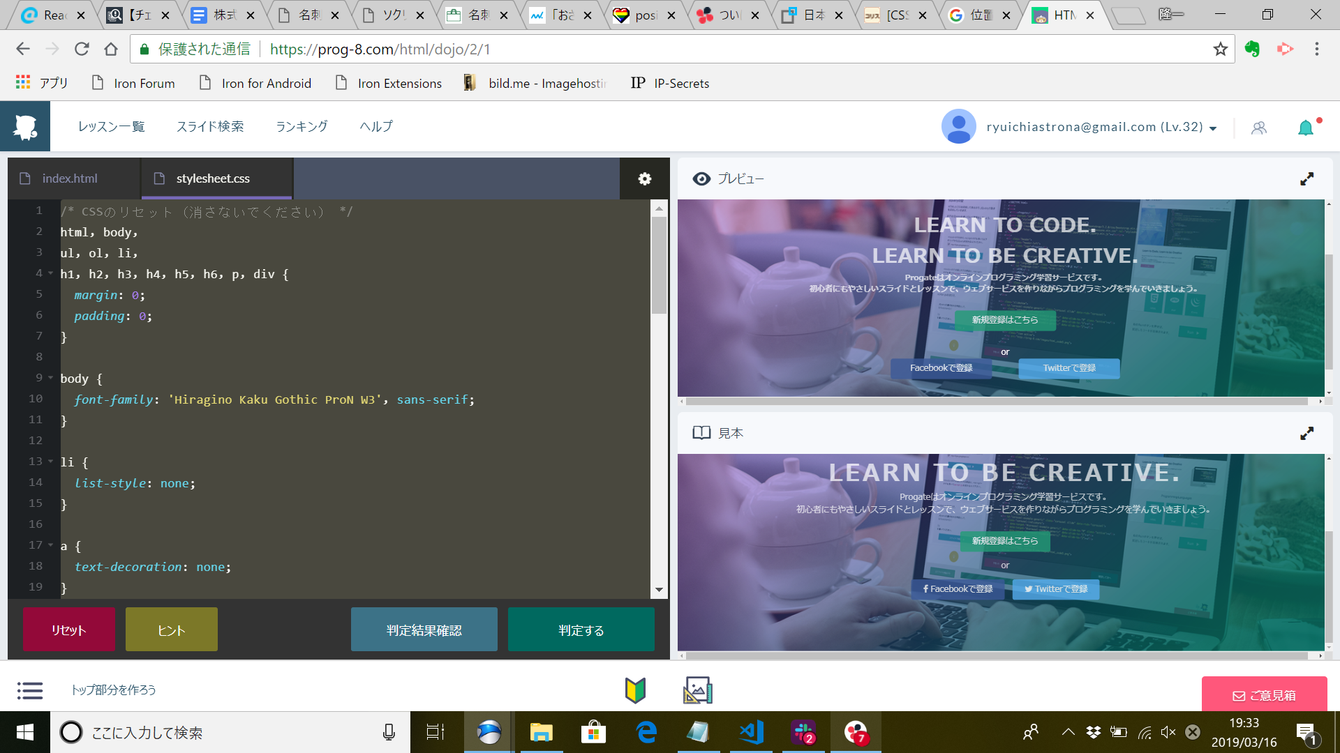
左上のプレビューが完成品です。ちゃんと横並びになっている!
ちなみに、上のコードでjustify-content:space-around;
と書いてあるのは横並びをどういう風に配置するかを表しています。
今回のは、要素を隙間を開けて並べる設定です。
https://www.webcreatorbox.com/tech/css-flexbox-cheat-sheet
にまとまっているので興味のある方はぜひご覧になってください。