はじめに
簡単なコロプレス図を作りたいと思ったときに、いろいろと調べたので備忘録代わりに記録しておく。コロプレス図のカラーバーをつけるのに少し工夫が必要だった。もしもっと簡単にできる方法をご存じの方が居ましたら是非コメント下さい。以下、参考サイト。
- cartopy の使い方
- コロプレス図の作成方法について
- カラーバーの作成方法について
- shapefile の使用方法について
- 使用したデータ
前準備
geopandas などの GIS ツールのインストールの前に
shapefile の操作方法はいろいろあるが pandas に慣れている自分としては geopandas がおススメである。そのインストール方法は以下の記事を参考にした。
conda-forgeのgeopandasをインストールするときは、チャネルプライオリティをstrictにする
上記の記事にある通り、チャンネルプライオリティを変更してインストールしないとエラーが出てインストールできない。
$ conda config --add channels conda-forge
$ conda config --set channel_priority strict

$ conda create -n myenv python=3.6
$ conda activate myenv
$ conda install geopandas
cartopy のインストール
Python で使用する地図プロット用のモジュール、cartopy を使用した。インストール方法はシンプルに、
- Anaconda の場合
$ conda install -c conda-forge cartopy
- pip の場合
$ pip install cartopy
となる。
プロットに必要なファイルのダウンロード
Covid-19 の感染者数と国境の shapefile をダウンロードしてくる。
-
CSSEGISandData/COVID-19(感染者数のデータ)
- 好きな日付の COVID-19/csse_covid_19_data/csse_covid_19_daily_reports/DD-MM-YYYY.csv をダウンロードする。
-
Admin 0 – Countries(国境のshapefile)
- リンク先の「Download countries(4.7 MB) version 5.0.0」をクリックしダウンロードする。zip ファイルがダウンロードされるので、解凍する。
前処理
国ごとの合算
Covid-19 の感染者数が地域ごとに記録されているので、これを国ごとのデータになるよう処理を行う。(以下、2022年2月17日のデータで行う。)
# データの取得
df = pd.read_csv("./02-17-2022.csv")

# 国ごとに合算しなおす
df_sum = df.groupby("Country_Region").sum()[["Confirmed", "Deaths"]].copy()
df_sum.reset_index(inplace=True)

# 致死率を計算
df_sum["CFR"] = df_sum["Deaths"] / df_sum["Confirmed"] * 100

# 結果の表示
print(df_sum.head())
出力は以下の通り。
| Country_Region | Confirmed | Deaths | CFR | |
|---|---|---|---|---|
| 0 | Afghanistan | 171673 | 7524 | 4.382751 |
| 1 | Albania | 269301 | 3430 | 1.273668 |
| 2 | Algeria | 263369 | 6772 | 2.571297 |
| 3 | Andorra | 37522 | 150 | 0.399765 |
| 4 | Angola | 98585 | 1899 | 1.926257 |
shapefile と国名の表記ゆれの確認
shapefile を geopandas を用いて中身を確認し、国名が一致するのかの確認と、一致しない場合の処理を行う。#ここが手作業で面倒なので、どなたか頭の良い方法が有ったら教えて下さい…。
# 必要なモジュールのインポート
import geopandas as gpd

# shapefile の読み込み
df_shp = gpd.read_file("./ne_10m_admin_0_countries/ne_10m_admin_0_countries.shp")

# 集合演算を使って Covid-19 データの一致しない国名を抜き出す
set_covid_19 = set(df_sum["Country_Region"])
set_shp = set(df_shp["NAME"])
set_diff = set_covid_19 - set_shp

# 結果の表示
print(set_diff)
{'Central African Republic', 'Sao Tome and Principe', 'Antigua and Barbuda', 'Dominican Republic', 'US', 'West Bank and Gaza', 'MS Zaandam', 'Diamond Princess', "Cote d'Ivoire", 'Taiwan*', 'Saint Vincent and the Grenadines', 'Eswatini', 'Burma', 'Winter Olympics 2022', 'Saint Kitts and Nevis', 'Solomon Islands', 'Marshall Islands', 'Holy See', 'Congo (Brazzaville)', 'South Sudan', 'Congo (Kinshasa)', 'Summer Olympics 2020', 'Bosnia and Herzegovina', 'Equatorial Guinea', 'Korea, South'}
国の名前の他に、地域やクラスターが発生したクルーズ船の名前なども含まれている。これらを手作業で修正。set_shp の名前になるよう修正していく。
# 元の国名を保存
df_sum["Country_Region_conv"] = df_sum["Country_Region"]

# 以下、手作業で修正
df_sum.loc[
    (df_sum["Country_Region"] == "Central African Republic"), "Country_Region_conv"
] = "Central African Rep."
df_sum.loc[
    (df_sum["Country_Region"] == "Sao Tome and Principe"), "Country_Region_conv"
] = "São Tomé and Principe"
df_sum.loc[
    (df_sum["Country_Region"] == "Antigua and Barbuda"), "Country_Region_conv"
] = "Antigua and Barb."
df_sum.loc[
    (df_sum["Country_Region"] == "Dominican Republic"), "Country_Region_conv"
] = "Dominican Rep."
df_sum.loc[
    (df_sum["Country_Region"] == "US"), "Country_Region_conv"
] = "United States of America"
df_sum.loc[
    (df_sum["Country_Region"] == "Cote d'Ivoire"), "Country_Region_conv"
] = "Côte d'Ivoire"
df_sum.loc[(df_sum["Country_Region"] == "Taiwan*"), "Country_Region_conv"] = "Taiwan"
df_sum.loc[
    (df_sum["Country_Region"] == "Saint Vincent and the Grenadines"),
    "Country_Region_conv",
] = "St. Vin. and Gren."
df_sum.loc[(df_sum["Country_Region"] == "Eswatini"), "Country_Region_conv"] = "eSwatini"
df_sum.loc[(df_sum["Country_Region"] == "Burma"), "Country_Region_conv"] = "Myanmar"
df_sum.loc[
    (df_sum["Country_Region"] == "Saint Kitts and Nevis"), "Country_Region_conv"
] = "St. Kitts and Nevis"
df_sum.loc[
    (df_sum["Country_Region"] == "Solomon Islands"), "Country_Region_conv"
] = "Solomon Is."
df_sum.loc[
    (df_sum["Country_Region"] == "Marshall Islands"), "Country_Region_conv"
] = "Marshall Is."
df_sum.loc[
    (df_sum["Country_Region"] == "Congo (Brazzaville)"), "Country_Region_conv"
] = "Congo"
df_sum.loc[
    (df_sum["Country_Region"] == "South Sudan"), "Country_Region_conv"
] = "S. Sudan"
df_sum.loc[
    (df_sum["Country_Region"] == "Congo (Kinshasa)"), "Country_Region_conv"
] = "Dem. Rep. Congo"
df_sum.loc[
    (df_sum["Country_Region"] == "Bosnia and Herzegovina"), "Country_Region_conv"
] = "Bosnia and Herz."
df_sum.loc[
    (df_sum["Country_Region"] == "Equatorial Guinea"), "Country_Region_conv"
] = "Eq. Guinea"
df_sum.loc[
    (df_sum["Country_Region"] == "Korea, South"), "Country_Region_conv"
] = "South Korea"

# 修正できてるかの確認
set_covid_19_conv = set(df_sum["Country_Region_conv"])
set_diff_conv = set_covid_19_conv - set_shp

print(set_diff_conv)
{'Diamond Princess', 'Holy See', 'Summer Olympics 2020', 'Winter Olympics 2022', 'West Bank and Gaza', 'MS Zaandam'}
国境ファイルのデータに該当しないものが残った。これらのプロットは諦める事とする。
コロプレス図(カラーバー無し)の作成
前準備としてプロットに必要なモジュールを一括で読み込む。
import cartopy.crs as ccrs
import cartopy.feature as cfea
import cartopy.io.shapereader as shpreader
import matplotlib as mpl
import matplotlib.pyplot as plt
from cartopy.feature import ShapelyFeature
from matplotlib import colorbar, gridspec
from matplotlib.colors import Normalize
コロプレス図を作図するための関数を定義する。データとしてはCovid-19 の 2022年2月17日時点での国ごとの致死率df_sum["CFR"]を使用する。
def choropleth(ax, crs, cmap_name, df, obj_col, country_col, shp):
    """
    コロプレス図を作成する

    Parameters
    ------------
    ax : cartopy.mpl.geoaxes.GeoAxesSubplot
        プロットを追加したい Axes オブジェクト
    crs : ex) cartopy.crs.PlateCarree
        プロットしたい地図の種類のオブジェクト
    cmap_name : str
        表示したいカラーマップの名前
    df : pandas.core.frame.DataFrame
        国名とプロットの値が入っているデータフレーム
    obj_col : str
        プロットしたい値の項目名
    country_col : str
        国名の項目名
    shp : cartopy.io.shapereader.FionaReader
        国境の shapefile
    """

    # 前準備
    ### shapefile から国ごとのリストを作る
    country = [c for c in shp.records()]

    ### 色の設定のための準備
    # norm = Normalize(vmin=0, vmax=100) # 割合なので 0%~100%で見たい時はこちら。
    norm = Normalize(vmin=min(df[obj_col]), vmax=max(df[obj_col]))
    cmap = plt.cm.get_cmap(cmap_name)

    # 国ごとに value を抜き出しプロットを作る
    for c in country:
        name = c.attributes["NAME"].upper()
        v = df.loc[df[country_col] == name, obj_col].values

        if v.size > 0:
            v = v[0]
        else:
            v = 0

        if c.geometry.geom_type == "MultiPolygon":
            sp = ShapelyFeature(c.geometry, crs, edgecolor="k", facecolor=cmap(norm(v)))
        elif c.geometry.geom_type == "Polygon":
            sp = ShapelyFeature(
                [c.geometry], crs, edgecolor="k", facecolor=cmap(norm(v))
            )
        else:
            pass

        ax.add_feature(sp)
上記関数を使ってコロプレス図をプロットする。
# shapefileの読み込み
shp = shpreader.Reader("./ne_10m_admin_0_countries/ne_10m_admin_0_countries.shp")

# 地図情報の読み込み
crs = ccrs.PlateCarree()
extent = [-180.0, 180.0, -90.0, 90.0]

# 世界地図の設定
fig, ax = plt.subplots(1, 1, figsize=(10, 10), subplot_kw=dict(projection=crs))
ax.set_extent(extent)  # プロット範囲
ax.coastlines()  # 海岸線の表示
ax.gridlines(draw_labels=True)  # グリッドの表示

# コロプレス図のプロット
choropleth(ax, crs, "Reds", df_sum, "CFR", "Country_Region_conv", shp)

# 図の保存
fig.savefig("./choropleth_CFR_no_cbar.png", bbox_inches="tight")

plt.show()
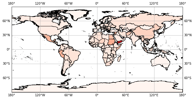
イエメンなどで致死率が高くなっているのが分かるが、カラーバーがないので絶対値が分からない。
カラーバー付きのコロプレス図の作成
matplotlib の自動カラーバー付与は使えなかったので、「自分でカラーバーを作り、同時にプロットとして表示させる」という方法を取った。
def plot_cbar(ax, label, cmap_name, v_min, v_max):
    """
    カラーバーを作成する

    Parameters
    ------------
    ax : matplotlib.axes._subplots.AxesSubplot
        カラーバーを表示させたいサブプロットオブジェクト
    label : str
        カラーバーのラベル
    cmap_name : str
        表示したいカラーマップの名前
    v_min : float
        カラーバーの最小値
    v_max : float
        カラーバーの最大値
    """

    # 前準備
    cmap = plt.cm.get_cmap(cmap_name)
    norm = Normalize(vmin=v_min, vmax=v_max)

    # カラーバーの作成
    cbar = colorbar.ColorbarBase(
        ax=ax,
        cmap=cmap,
        norm=norm,
        orientation="vertical",
        label=label,
    )
上記関数を使い、gridspec で領域を分け、カラーバー付きのプロットを作成した。
# プロットの設定
fig = plt.figure(figsize=(10, 5))
spec = gridspec.GridSpec(ncols=2, nrows=1, width_ratios=[50, 1])
ax = fig.add_subplot(spec[0], projection=crs)
cb = fig.add_subplot(spec[1])

# 世界地図の設定
ax.set_extent(extent)
ax.coastlines()
ax.gridlines(draw_labels=True)

# コロプレス図のプロット
choropleth(ax, crs, "Reds", df_sum, "CFR", "Country_Region_conv", shp)

# カラーバー
v_min = min(df_sum["CFR"])
v_max = max(df_sum["CFR"])
plot_cbar(cb, "CFR[%]", "Reds", v_min, v_max)

# 図の保存
fig.savefig("./choropleth_CFR_cbar.png", bbox_inches="tight")

plt.show()
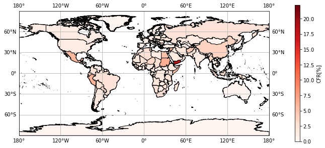
これでカラーバー付きのコロプレス図を作ることができた。
おわりに
今回はコロナウイルスの致死率を題材にコロプレス図を作成してみた。shapefile とデータさえあれば、国ごとだけでなく地域ごともプロットを作ることが可能である。改めて、記事中の処理でもっと楽に、シンプルに書く方法があれば、是非ご教示頂きたく思う。# 致死率 20%は非常に高くて驚いてしまった…。