こんにちは。データアナリストの@ry_4628です。
今回、Qiitaに初投稿ということでどうしようかと思ってましたが、こういうこともしているという紹介の意味も込めてサンキーダイアグラムの描画の実装について記述してみました。
サンキーダイアグラムとは
サンキーダイアグラムとは、工程間の流量を表現するのに用いる図表で太さで流れの量を示しております。
Wikipedia

アプリやソーシャルゲームなどの分析に用いることも多く、どのような順番で行動しているか?どこで離脱してるか?といったことによく使われております。
ただ、これらをBIツールで行うとなると費用が発生したり、機能に制限があったりすることが多くあります…
(実際、入社当初こちらのような結果を出す方法がありませんでした…)
なので、今回はPythonを用いてサンキーダイアグラムのほうを実装してみました。
環境
今回は、Googleが提供しているGoogle Colaboratoryを用いて実施していきます。
そのため、python3が実行できればいいため割愛させていただきます
使用するライブラリ
私が知っている限り、サポートしているライブラリはHoloViewsとPlotyの2種類でしたが、今回グラフをぐりぐり動かせたらいいかと思ったので、Plotyのほうを採用しました
インストール
Protyを描画するのにchart_studioを用いるため、pipコマンドでインストールします。
Google Colaboratoryの場合、pipコマンドの前に**「!」**をつける必要があります。
!pip install chart_studio
import
以下のライブラリをインポートします。
import numpy as np
import datetime
import pandas as pd
import plotly.graph_objects as go
import chart_studio.plotly as py
import plotly
変数定義
出力するのに必要な変数を定義します。カラムの定義次第ですが、ここを編集・実行すれば良いようにしておきます。
# グラフタイトル定義
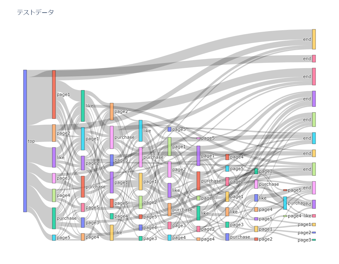
file_name = 'テストデータ'
start_action = 'top' # 最初に出現するアクション
action_length = 10 # 表示するアクション数
データ
作成するのに参考にしたサイトよりデータを活用させていただきました。 1
こちらより、以下のような行動ログをdataframeで参照します。
id	action_name	date
1	0	top	2018/4/18 20:08
2	0	page1	2018/4/18 20:08
3	1	top	2018/4/18 20:08
4	1	purchase	2018/4/18 20:08
5	1	page3	2018/4/18 20:08
行動ログの加工
Plotyで実行する場合、行動ログのfromとtoがデータに必要になるため、python側で加工するようにします。
各id毎にループし、終点になったら行動の終了を表す「end」を追加。
それをdatasに渡すようにし、最終的にdataframeに落とし込むようにしております。
datas = []

for id in ids:
    temp = df.loc[df['id'] == id, :].copy()
    end_idx = len(temp)
    action_names = temp['action_name'].values

    i = 0
    num_layer = 0

    # 行動がstart_actionかで場面分け
    if end_idx > 1:
        while i < end_idx:
            # 終端になったらaction_toをendにする
            if i == end_idx-1:
                list_ = [id, action_names[i], 'end', num_layer]
                num_layer += 1
            else:
                # 次の行動がstart_actionになっている場合、action_toをendにする
                if action_names[i+1] == start_action:
                    list_ = [id, action_names[i], 'end', num_layer]
                    num_layer = 0

                else:
                    list_ = [id, action_names[i], action_names[i+1], num_layer]
                    num_layer += 1

            i += 1
            datas.append(list_)

            if i == end_idx:
                list_ = [id, 'end', '', num_layer]
                datas.append(list_)

            if num_layer == action_length:
                break
    else:
        list_ = [id, action_names[0], 'end', 0]
        datas.append(list_)
        list_ = [id, 'end', '', 1]
        datas.append(list_)
        #id += 1
        id = str(int(id) + 1)
# df2に行動の順番の内容を追加します
df2 = pd.DataFrame(
    datas,
    columns = [
        'id',
        'action_from',    # 行動起点 linksに該当
        'action_to',      # action_fromにつながる行動 nodesに該当
        'num_layer',      # 行動遷移番号
    ]
)
これで、df2に各ユーザーの行動順の結果が入るようになります。
各行動の流入量(ノード)の処理
行動順の結果をdf2というdataframeに入れましたが、このままではどの行動の流入が多いか?というのがわかりません…
なので、次は行動の流入量(ノード)を設定してきます。
各ノードと登場順番の設定
df2に入っている行動ログ内には、同じアクションが別のタイミングに発生することがあります。
例えば、2回目と4回目のの行動時にpage1→page2という遷移といった場合が当たります。
これらに対応するためにそれぞれの行動時にどのような行動をしたかをまとめるのに、以下の処理を行います。
from_list = list(df2.action_from.unique())
to_list = list(df2.action_to.unique())
from_list.extend(to_list)

output = dict()
output.update({'nodes_dict': dict()})

i = 0
for rank_event in df2.num_layer.unique():
    output['nodes_dict'].update({
        rank_event: dict()
    })

    all_events_at_this_rank = df2[df2.num_layer == rank_event].action_from.unique()

    output['nodes_dict'][rank_event].update({
        'sources': list(all_events_at_this_rank),
        'sources_index': list(range(i, i+len(all_events_at_this_rank)))
    })

    i += len(output['nodes_dict'][rank_event]['sources_index'])

output.update({'links_dict': dict()})
grouped = df2.groupby(['id', 'num_layer'])
ノードの大きさ設定
行動順の設定が終わったら、次は各行動の遷移の回数をカウントしノードの大きさを設定します。
そのために以下の関数を用意します。(以下を参考に作成)2
def update_source_target(user):
    try:
        source_index = output['nodes_dict'][user.name[1]]['sources_index'][output['nodes_dict'][user.name[1]]['sources'].index(user['action_from'].values[0])]
        target_index = output['nodes_dict'][user.name[1] + 1]['sources_index'][output['nodes_dict'][user.name[1] + 1]['sources'].index(user['action_to'].values[0])]

        if source_index in output['links_dict']:
            if target_index in output['links_dict'][source_index]:
                output['links_dict'][source_index][target_index]['unique_users'] += 1
            else:
                output['links_dict'][source_index].update({
                    target_index:dict(
                        {
                            'unique_users': 1
                        }
                    )
                })
        else:
            output['links_dict'].update({
                    source_index: dict({
                        target_index: dict({
                            'unique_users': 1
                        })
                    })
                })
    except Exception as e:
        pass

grouped.apply(lambda user: update_source_target(user))
グラフに対応する変数を作成
各ノードのカウントは済んだので、次はライブラリに対応するように変数を作成します。
targets = []
sources = []
values = []
labels = []

for source_key, source_value in output['links_dict'].items():
    for target_key, target_value in output['links_dict'][source_key].items():
        sources.append(source_key)
        targets.append(target_key)
        values.append(target_value['unique_users'])

for key, value in output['nodes_dict'].items():
    labels = labels + list(output['nodes_dict'][key]['sources'])
描画
上記で処理したノードの結果をグラフに描画します。
thicknessで行動の表示数、title_textにグラフのタイトルを変数定義していた内容を参照します。
# グラフ描画
fig = go.Figure(data=[go.Sankey(
    node=dict(
        thickness=action_length+1,
        line=dict(color="black", width=0.5),
        label=labels,
    ),
    link=dict(
        source=sources,
        target=targets,
        value=values,
    ))])

fig.update_layout(
    autosize=True,
    title_text=file_name,
    font=dict(size=15),
    plot_bgcolor='white',
    height = 900
)
すべて実行されると以下のようなグラフが出力されました。
終わりに
長くなってしまいましたが、pytnonでサンキーダイアグラムの作成について今回まとめてみました。
離脱ポイントや行動の大きいものがわかりやすくなるので、今後の分析などにも役立てられそうです。
ただ、最後のendがばらけて表示されてしまっているのでここはひとまとめにできれば、よりスッキリするのでそこは改善していきたいです。
今後もこのように発信していき、貢献できるようになっていければと思ってます。