Vue(Vue-CLI)とTypeScriptでhighchartsのグラフを表示させます。
プロジェクトの作成
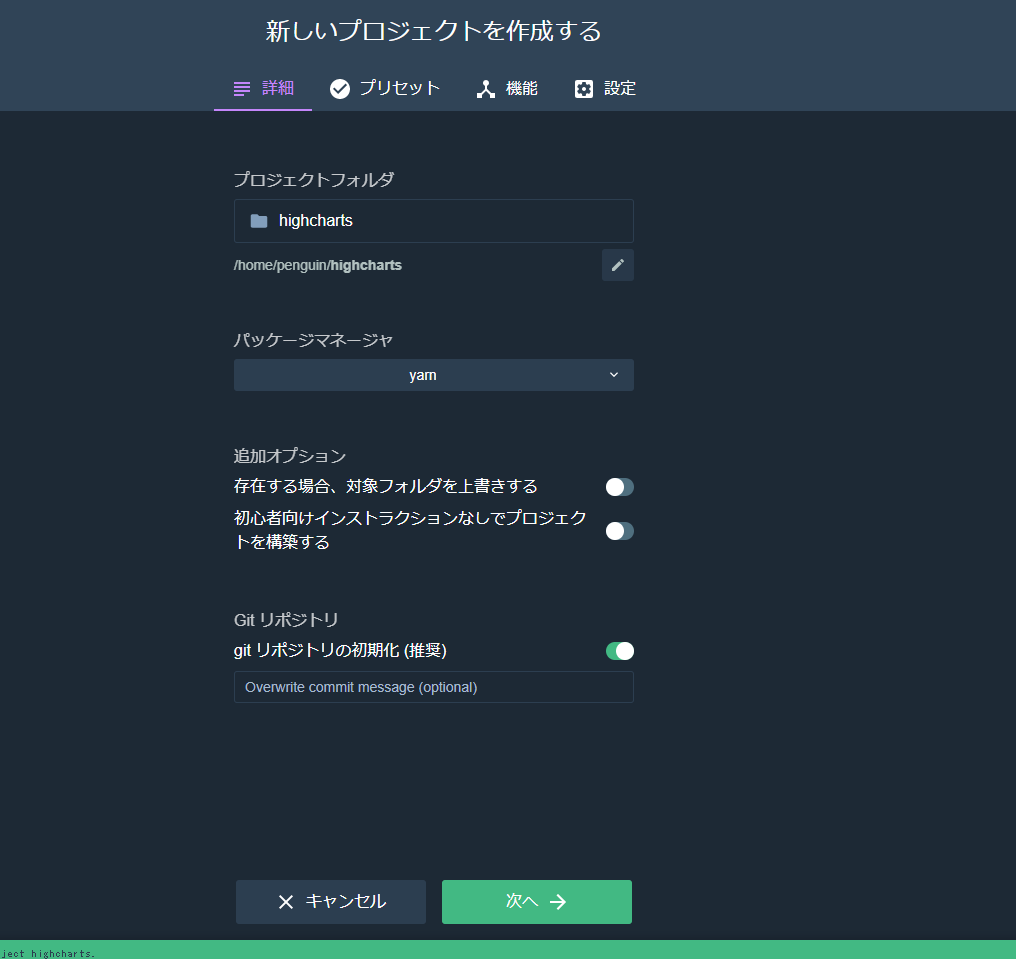
Vue CLI UIでプロジェクトを作成します。パッケージマネージャーとしてyarnを選択しています。
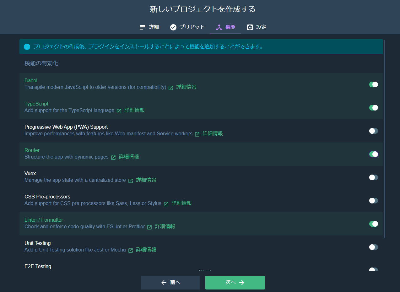
手動を選択し、TypeScriptを有効化します。
package.jsonにhighchartsの追加
package.jsonのdependenciesにhighchartsとhighcharts-vueを追加します。
package.json
  "dependencies": {
    "core-js": "^3.6.4",
    "highcharts": "^8.1.0",
    "highcharts-vue": "^1.3.5",
    "vue": "^2.6.11",
    "vue-class-component": "^7.2.3",
    "vue-property-decorator": "^8.4.1",
    "vue-router": "^3.1.6"
  }
追加後、yarnコマンドを実行し、追加します。
yarn
グラフの作成
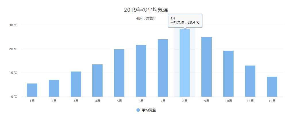
2019年の平均気温を表示するグラフを作成します。
./src/components/Graph.vue
<template>
	<div>
		<highcharts :options="graph"></highcharts>
	</div>
</template>

<script lang="ts">
	import { Component, Vue } from 'vue-property-decorator';
	import { Chart } from 'highcharts-vue';

	export type DataType = {
		graph: any;
	}

	@Component ({
		components: {
			highcharts: Chart
		},
	})
	export default class Graph extends Vue {
		data (): DataType {
			return {
				graph: {
					title: {
						text: '2019年の平均気温'
					},
					subtitle: {
						text: '引用:<a href="http://www.data.jma.go.jp/obd/stats/etrn/view/monthly_s1.php?prec_no=44&block_no=47662&year=2019&month=&day=&view=">気象庁</a>'
					},
					xAxis: {
						categories: ['1月', '2月', '3月', '4月', '5月', '6月', '7月', '8月', '9月', '10月', '11月', '12月'],
						crosshair: true
					},
					yAxis: {
						title: false,
						labels: {
							format: '{value} ℃'
						},
						opposite: false,
					},
					credits: {
						enabled: false
					},
					tooltip: {
						pointFormat: '{series.name}:{point.y:.1f} ℃'
					},
					series: [{
						name: '平均気温',
						type: 'column',
						data: [5.6, 7.2, 10.6, 13.6, 20.0, 21.8, 24.1, 28.4, 25.1, 19.4, 13.1, 8.5],
						marker: {
							enabled: true
						},
					}],
				}
			}
		}
	}
</script>
グラフの読み込み
App.vueに上記で作成したグラフを読み込ませます。
./src/App.vue
<template>
	<div id="app">
		<Graph></Graph>
	</div>
</template>

<script lang="ts">
	import { Component, Vue } from 'vue-property-decorator';
	import Graph from '@/components/Graph.vue';

	@Component ({
		components: {
			Graph,
		},
	})
	export default class App extends Vue {
	}
</script>

<style>
</style>
グラフの表示
グラフが表示されます。
追記
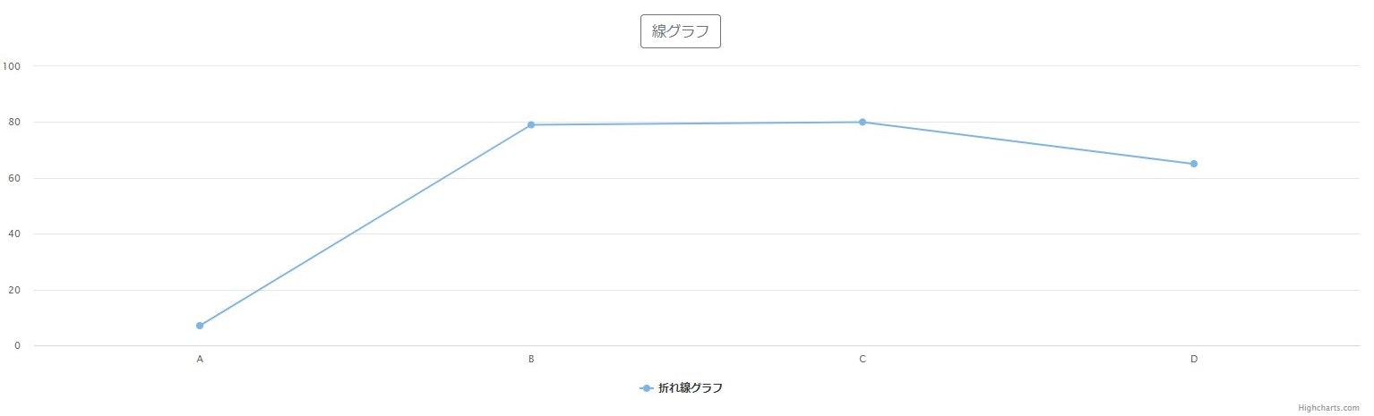
APIなどから、値を取得してグラフ表示する場合は、下記のようにします。
下記の例では、配列に乱数をセットし、乱数をhighchartsで描写します。
Graph.vue
<template>
  <div class="graph">
    <div class="buttons">
      <p>
        <b-button variant="outline-secondary" @click="viewGraph('line')">線グラフ</b-button>
      </p>
    </div>
    <div id="graph">表示したいグラフを選択してください。</div>
  </div>
</template>

<script lang="ts">
import { Component, Vue } from "vue-property-decorator";
import * as Highcharts from "highcharts";
import Datas from "@/store/index";

@Component
export default class Graph extends Vue {
  /** 乱数を入れる配列 */
  private array: number[] = [];
  /** 表示するグラフタイプ */
  private graphType: any = "";

  private categories: string[] = ["A", "B", "C", "D"];

  viewGraph(graphType: string) {
    this.graphType = graphType;
    // 配列の初期化
    this.array = [];
    for (let i = 0; i < 4; i++) {
      this.array.push(Math.round(Math.random() * 100));
    }
    this.graph();
  }

  graph() {
    Highcharts.chart({
      chart: {
        renderTo: "graph"
      },
      title: false as Highcharts.TitleOptions,
      xAxis: {
        categories: this.categories,
        crosshair: true
      } as Highcharts.XAxisOptions,
      yAxis: {
        title: false,
        labels: {
          format: "{value}"
        },
        opposite: false
      } as Highcharts.YAxisOptions,
      series: [
        {
          name: "折れ線グラフ",
          type: this.graphType,
          data: this.array,
          marker: {
            enabled: true
          }
        }
      ]
    });
  }
}
</script>
参考
こちらの記事を参考にさせていただきました。
Vue.js+TypeScript+Nuxt.js環境で、highcharts-vueを使うためのtips