何を言っているのか
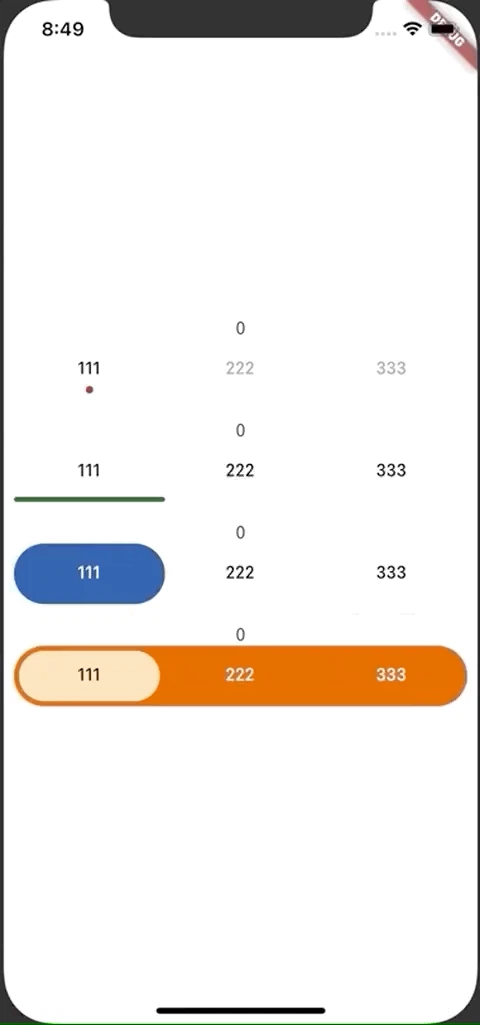
これを作ります。
このような 選択したときに移動するようなアニメーションが出るラジオボタン?(複数の選択肢から1つ選ばせるボタン)を作っていきます。
ラジオボタンで調べたときにあんまり出てこなかったので記録。
作り方
使用するパッケージ
tab_indicator_styler | Flutter Package
こちらのパッケージは、インジケーター(点とかアンダーラインとかの選択したときに移動するやつ)のよくあるスタイルが1つになったパッケージです。
使い方
-
TabControllerの初期化にTickerProviderStateMixinをMixinする必要があります。 - 選択中のインデックスをリアルタイムに表示したい場合などで、
setStateを用いて描画を更新しようとすると、選択中を示すエフェクトの移動アニメーションが打ち切られてしまうので、わざわざValueListenableBuilderを使ってインデックスを表示しています。(簡単なやり方がありそう。。。) - 描画はしないけどインデックスだけ欲しい場合は
_tabController.indexで取得できます -
TabBar.indicatorに指定しているDotIndicatorは、名前の通り 点のインジケーターです(gifの一番上のやつ)。 - 他にも2種類あります。(後述)
class MyHomePage extends StatefulWidget {
  @override
  _MyHomePageState createState() => _MyHomePageState();
}

//  with TickerProviderStateMixin を忘れずに!!
class _MyHomePageState extends State<MyHomePage> with TickerProviderStateMixin {
  TabController _tabController1;

  ValueNotifier<int> _currentIndex1 = ValueNotifier<int>(0);

  @override
  void initState() {
    super.initState();

    // TabControllerの初期化
    _tabController1 = TabController(length: _items.length, vsync: this);
  }

  final List<Widget> _items = [
    Tab(text: '111'),
    Tab(text: '222'),
    Tab(text: '333'),
  ];

  @override
  Widget build(BuildContext context) {
    return Scaffold(
      body: Padding(
        padding: const EdgeInsets.all(8.0),
        child: Column(
          mainAxisAlignment: MainAxisAlignment.center,
          children: [
            ValueListenableBuilder(
              valueListenable: _currentIndex1,
              builder: (BuildContext context, int index, Widget widget) {
                return Text('$index');
              },
            ),
            TabBar(
              controller: _tabController1,
              labelColor: Colors.black,
              unselectedLabelColor: Colors.grey,
              tabs: _items,
              indicator: DotIndicator(
                color: Colors.red[900],
                distanceFromCenter: 16,
                radius: 3,
                paintingStyle: PaintingStyle.fill,
              ),
              onTap: (int index) {
                _currentIndex1.value = index;
              },
            ),
          ],
        ),
      ),
    );
  }
}
他のインジケーター
点のインジケーターの他に、アンダーラインが動くインジケーターと、タブを四角で囲うインジケーターがあります。
また、TabBarを背景色をつけたContainerで囲い、四角のインジケーターと組み合わせることで、gifの一番下のような感じにすることができます。
  @override
  Widget build(BuildContext context) {
    return Scaffold(
      body: Padding(
        padding: const EdgeInsets.all(8.0),
        child: Column(
          mainAxisAlignment: MainAxisAlignment.center,
          children: [
            ValueListenableBuilder(
              valueListenable: _currentIndex1,
              builder: (BuildContext context, int index, Widget widget) {
                return Text('$index');
              },
            ),
            // 点のインジケーター
            TabBar(
              controller: _tabController1,
              labelColor: Colors.black,
              unselectedLabelColor: Colors.grey,
              tabs: _items,
              indicator: DotIndicator(
                color: Colors.red[900],
                distanceFromCenter: 16,
                radius: 3,
                paintingStyle: PaintingStyle.fill,
              ),
              onTap: (int index) {
                _currentIndex1.value = index;
              },
            ),
            Divider(),
            ValueListenableBuilder(
              valueListenable: _currentIndex2,
              builder: (BuildContext context, int index, Widget widget) {
                return Text('$index');
              },
            ),
            // アンダーラインのインジケーター
            TabBar(
              controller: _tabController2,
              labelColor: Colors.black,
              unselectedLabelColor: Colors.black,
              tabs: _items,
              indicator: MaterialIndicator(
                color: Colors.green[900],
                topLeftRadius: _radius,
                topRightRadius: _radius,
                bottomLeftRadius: _radius,
                bottomRightRadius: _radius,
              ),
              onTap: (int index) {
                _currentIndex2.value = index;
              },
            ),
            Divider(),
            ValueListenableBuilder(
              valueListenable: _currentIndex3,
              builder: (BuildContext context, int index, Widget widget) {
                return Text('$index');
              },
            ),
            // 矩形のインジケーター(角を丸くしたり、アウトラインにすることもできます)
            TabBar(
              controller: _tabController3,
              unselectedLabelColor: Colors.black,
              tabs: _items,
              indicator: RectangularIndicator(
                color: Colors.blue[900],
                topLeftRadius: _radius,
                topRightRadius: _radius,
                bottomLeftRadius: _radius,
                bottomRightRadius: _radius,
              ),
              onTap: (int index) {
                _currentIndex3.value = index;
              },
            ),
            Divider(),
            ValueListenableBuilder(
              valueListenable: _currentIndex4,
              builder: (BuildContext context, int index, Widget widget) {
                return Text('$index');
              },
            ),
            // 矩形インジケーターの応用
            Container(
              decoration: BoxDecoration(
                color: Colors.orange[900],
                borderRadius: BorderRadius.circular(_radius),
              ),
              child: TabBar(
                controller: _tabController4,
                labelColor: Colors.black,
                unselectedLabelColor: Colors.white,
                tabs: _items,
                indicator: RectangularIndicator(
                  color: Colors.orange[100],
                  topLeftRadius: _radius,
                  topRightRadius: _radius,
                  bottomLeftRadius: _radius,
                  bottomRightRadius: _radius,
                  horizontalPadding: 4,
                  verticalPadding: 4,
                ),
                onTap: (int index) {
                  _currentIndex4.value = index;
                },
              ),
            ),
          ],
        ),
      ),
    );
  }