Chord Diagram
Chord diagram はグループ間同士の結びつきや、関連性の大きさを図示するときに使う手法。生物学の分野では、よく環状ゲノムを有する生物(バクテリア等)に対して、ゲノム内の情報間の関連性を図示するときに利用される(専用のパッケージではCircosが有名)。Rにも専用のlibraryがある(https://qiita.com/uchim/items/f9eea0ef5caa10067b02) 。しかし、pythonでと思って探してみたが見つからない。ということで、無理やりmatplotlibでそれっぽいものを作成してみた。
利用データ
https://qiita.com/uchim/items/f9eea0ef5caa10067b02 でも使用されている山手線駅間の所要時間のデータを利用した。
スクリプト その1 (極座標系とlocus plot)
Chord diagram をするためには、まずpolar plot(極座標系)を扱う必要がある。
import os
import sys
import collections
import numpy as np
import matplotlib
matplotlib.use("Agg")
import matplotlib.pyplot  as plt
import matplotlib.path    as mpath
import matplotlib.patches as mpatches

class CD(object):
    def __init__(self,figsize=(10,10)):
        self.figure = plt.figure(figsize=figsize)
        self.ax     = plt.subplot(111, polar=True)
        self.ax.set_theta_zero_location("N") #北(12時)を起点にする
        self.ax.set_theta_direction(-1) #時計回り
        self.ax.set_ylim(0,1000)
        self.ax.spines['polar'].set_visible(False) #軸を隠す
        #とりあえず軸関連は全部隠す
        self.ax.xaxis.set_ticks([])
        self.ax.xaxis.set_ticklabels([])
        self.ax.yaxis.set_ticks([])
        self.ax.yaxis.set_ticklabels([])
        #グループに関する情報を保存するためのdict
        self.locus_dict = collections.OrderedDict()
これで、極座標系のテンプレートは完成。次に、各グループごとのlocusをプロットしてみる。これは、barplotをつかうと比較的簡単にできる。
    #matrixは利用するデータ(2次元配列)
    def locus_plot(self, matrix, interspace=0.002, features=True, bottom=900, height=50, color_list=[], edge_color_list=[]):
        #locusの色の設定
        if len(color_list) == 0:
            for i in range(len(matrix)):
                color_list.append("#E3E3E3")
        if len(edge_color_list) == 0:
             for i in range(len(matrix)):
                 edge_color_list.append("#000000")

        self.sum_length = 0
        for i, row in enumerate(matrix):
            self.locus_dict[i] = {}
            self.locus_dict[i]["length"] = sum(row) #各行の合計
            self.locus_dict[i]["data"]   = row
            self.sum_length += self.locus_dict[i]["length"]
        #sum_lengthはmatrix全体の合計値
        self.interspace = interspace * self.sum_length #interspaceはlocus間の距離
        self.sum_length += self.interspace * len(self.locus_dict.keys()) #sum_lengthの補正

        start = self.interspace
        end   = 0
        for i, Id in enumerate(self.locus_dict.keys()):
            self.locus_dict[Id]["start"] = int(start) #locusの開始位置
            end   = start + self.locus_dict[Id]["length"]
            self.locus_dict[Id]["end"] = int(end) #locusの終了位置
            pos   = (start+end) * 0.5 * 2 * np.pi / self.sum_length #極座標系におけるlocusの中心座標

            #中心座標を起点に、長さが 2.0*np.pi*(end-start)/self.sum_length の barplot。 bottom (0~1000) と height は適当に。
            self.locus_dict[Id]["bar"] = self.ax.bar([pos,pos], [0,height], bottom=bottom, width=2.0*np.pi*(end-start)/self.sum_length, color=color_list[i], linewidth=1, edgecolor=edge_color_list[i]
            start = end + self.interspace
ここまでできれば、以下のように各グループのlocusをプロットできる。
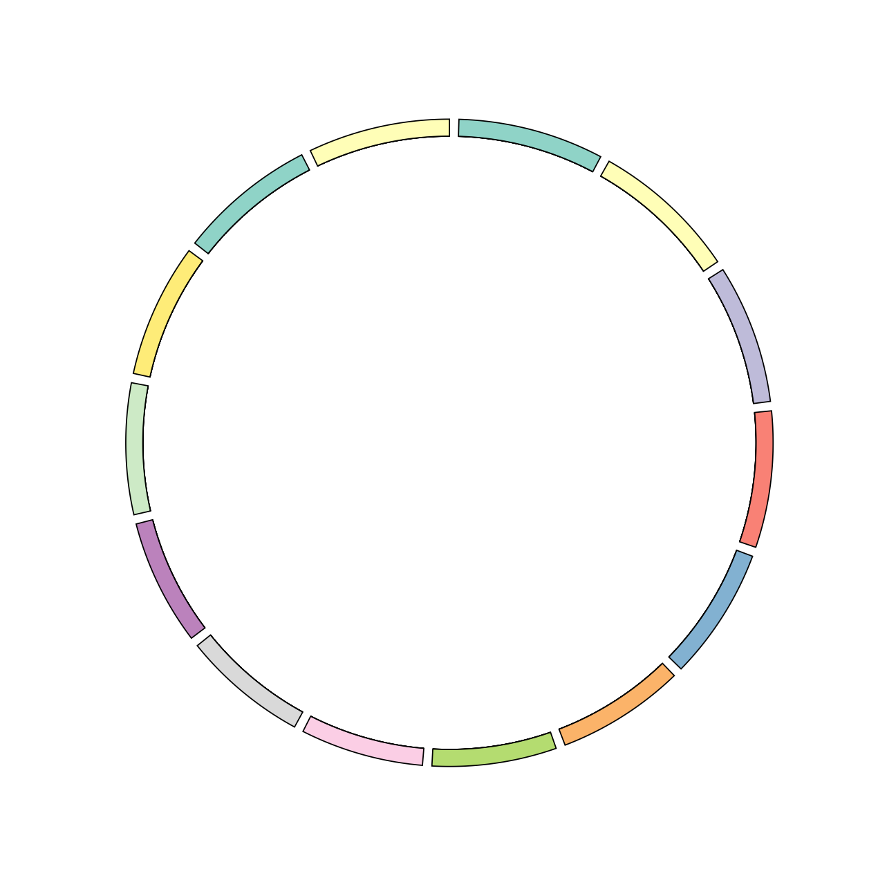
実行結果 その1 (locusのプロット)
if __name__ == "__main__":
    data    = [[0,7,12,14,18,22,25,28,24,21,17,14,10,7],
              [7,0,5,7,11,15,18,23,31,28,24,21,17,14],
              [12,5,0,2,6,10,13,18,22,25,29,26,22,19],
              [14,7,2,0,4,8,11,16,20,23,27,28,24,21],
              [18,11,6,4,0,4,7,12,16,19,23,26,28,25],
              [22,15,10,8,4,0,3,8,12,15,19,22,26,29],
              [25,18,13,11,7,3,0,5,9,12,16,19,23,26],
              [28,23,18,16,12,8,5,0,4,7,11,14,18,21],
              [24,31,22,20,16,12,9,4,0,3,7,10,14,17],
              [21,28,25,23,19,15,12,7,3,0,4,7,11,14],
              [17,24,29,27,23,19,16,11,7,4,0,3,7,10],
              [14,21,26,28,26,22,19,14,10,7,3,0,4,7],
              [10,17,22,24,28,26,23,18,14,11,7,4,0,3],
              [7,14,19,21,25,29,26,21,17,14,10,7,3,0]]
    colors = sns.color_palette("Set3", 12)
    colors = list(map(matplotlib.colors.rgb2hex,colors))
    colors = colors + colors
    cd = CD()
    cd.locus_plot(data,interspace=0.005,color_list=colors)
スクリプト その2 (Chord diagram)
Chord Diagramのカーブがどうなってるか詳細は知らないが、多分ベジェ曲線だろうということで話を進めます。あまりしられてなさそうだが、実は matplotlib ではベジェ曲線が描けるメソッドがちゃんと用意されている。(https://matplotlib.org/users/path_tutorial.html) 。なので、これを利用することで、それっぽいものを実装することができた (このメソッドを見つけるまではあきらめそうだった、、)。
    #ややこしいが、topの値はlocus_plotのbottomと同じにするといい
    def chord_plot(self, top=900, bottom=20, color_list=[]):
        for Id in sorted(self.locus_dict.keys()):
            locus_info = self.locus_dict[Id]
            send = locus_info["start"]
            for i, num in enumerate(self.locus_dict[Id]["data"]):
                sstart = send
                send   = send + num
                #chordの始点側の両端の座標
                sstart_pos = 2 * sstart * np.pi / self.sum_length
                send_pos   = 2 * send * np.pi / self.sum_length
                #chordの終点側の両端の座標
                ostart = self.locus_dict[i]["start"] + sum(self.locus_dict[i]["data"][:Id])
                oend   = ostart + self.locus_dict[i]["data"][Id]
                ostart_pos = 2 * ostart * np.pi / self.sum_length
                oend_pos   = 2 * oend * np.pi / self.sum_length
                if sstart_pos == ostart_pos:
                    pass
                else:
                    #chordのPathのプロット。しかし、改善の余地がある、、、LINETOで結んでるところはchordが大きいと直線であることがバレる。。。
                    Path      = mpath.Path
                    path_data = [(Path.MOVETO,  (sstart_pos, top)),
                                 (Path.CURVE3,  (sstart_pos, bottom)),
                                 (Path.CURVE3,  (oend_pos,   top)),
                                 (Path.LINETO,  (ostart_pos, top)),
                                 (Path.CURVE3,  (ostart_pos, bottom)),
                                 (Path.CURVE3,  (send_pos,   top)),
                                ]
                    codes, verts = list(zip(*path_data))
                    path  = mpath.Path(verts, codes)
                    patch = mpatches.PathPatch(path, facecolor=color_list[Id], alpha=1.0)
                    self.ax.add_patch(patch)
実行結果 その2 (Chord Diagram)
    cd = CD()
    cd.locus_plot(data,interspace=0.005,color_list=colors)
    cd.chord_plot(color_list=colors)
    plt.savefig("test.pdf")
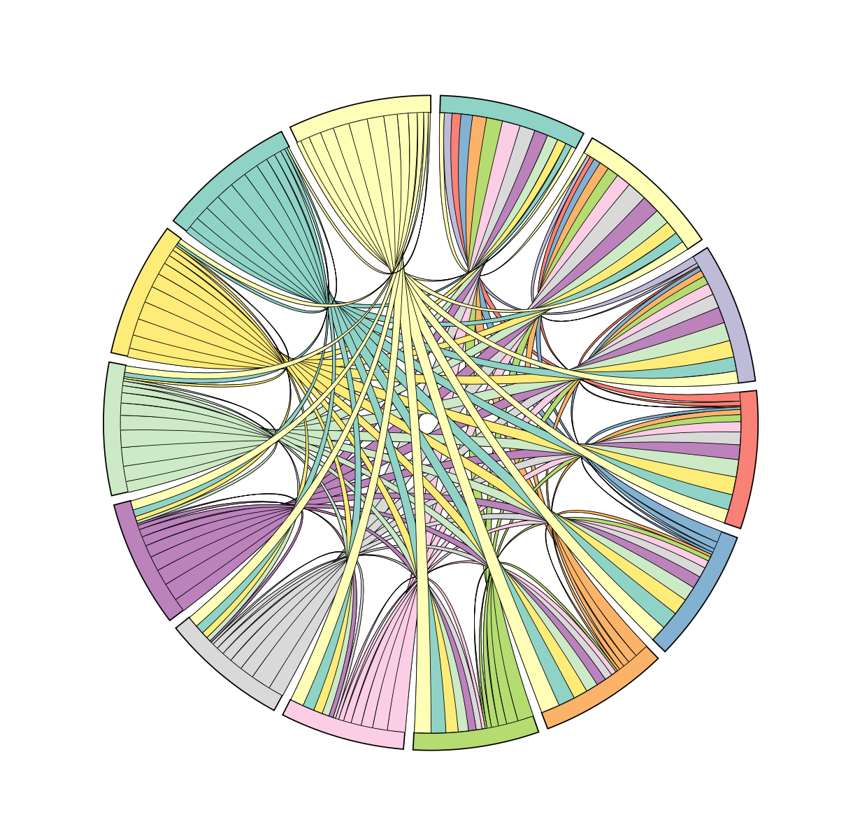
少し、 https://qiita.com/uchim/items/f9eea0ef5caa10067b02 の結果と違う気もするが、それっぽいものが実装できた。
スクリプト その3 (テキスト情報の追加)
加筆予定。
学んだこと
めちゃくちゃ面倒だった。。。思いつきで実装してはいけない。しかし、Matplotlibでもきれいな極座標系のプロットができることを学べたのは大きな収穫でした。