地味にハマることがあったので自分のCSS Tipsとして逐次更新していきます。
スマホサイトの右側に謎の余白
自分の所属しているサークルの公式サイトを運営しているんですが、パソコンだと綺麗に表示されるのに、何故かスマホでサイトを見ると右側に謎の余白が(´・ω・`)
解決策
1. viewport入れてみよう
<meta name="viewport" content="width=device-width, initial-scale=1, user-scalable=no">
2. box-sizing:border-boxで
width:100%とかにしてるとborderの太さとかpaddingではみ出しちゃったりするのでbox-sizingを使いましょう。これ使うとなんか勝手にborderの太さとかも考慮してくれるらしい。
* {
    -webkit-box-sizing: border-box;
    -moz-box-sizing: border-box;
    -o-box-sizing: border-box;
    -ms-box-sizing: border-box;
    box-sizing: border-box;
}
3. overflow:hiddenしよう
自分は最終的にこれで解決しました。
<html>
    <head>
    ...
    </head>

    <div class="wrap">
        <body>
            /* ここに何やら書きましょう */
        </body>
    </div>
</html>
bodyを適当にラッピングして
.wrap { overflow: hidden; }
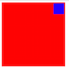
position: absoluteが上手くいかない

<div class="parent">
    <div class="child">
    </div>
</div>
.parent { background-color: red; width: 300px; height: 300px; }
.child { position: absolute; top: 5px; right: 5px; width: 50px; height: 50px; background-color: blue; }
カード型デザインとかで常に右上にあるボタンみたいな感じで表示したい!position:absolute;で親要素に対して絶対的な位置で配置したいのに...何故かbodyタグが親要素として認識されちゃう(´・ω・`)
解決策
1. 親要素をrelativeで明示する
上の場合だと親ボックスがどれかを明示していないので、bodyタグが親だと勘違いしてる感じなので、ちゃんと「これが親ボックスだよ〜」って明示してやればok
親ボックスを指定するには、指定したいボックスにposition: static以外のpositionを指定してやればいいが、たいていはrelative
なのでさっきの.parentに position: relative; をつけるだけ。
.parent { position: relative; background-color: red; width: 300px; height: 300px; }
.child { position: absolute; top: 5px; right: 5px; width: 50px; height: 50px; background-color: blue; }
bootstrapでcol使ってもなんかレイアウトが崩れちゃう
bootstrapの基本ごとを忘れていました。containerクラスで固定エリアを作成してからrowクラスを使うように徹底したら、変な感じにはならなくなりました。bootstrapの基本形忘れていました。
解決策
1. containerで囲む
ちゃんとrowクラスはcontainerクラスで囲みましょう。
<div class="container">
    <div class="row">
        <div class="col-md-4">col-md-4</div>
        <div class="col-md-8">col-md-8</div>
    </div>
</div>
レスポンシブなら
<div class="container-fluid">
    <div class="row-fluid">
        <div class="col-md-4">col-md-4</div>
        <div class="col-md-8">col-md-8</div>
    </div>
</div>