はじめに
以前にBottomSheetsのようなメニュー(以下ではBottomSheetsと呼んでいきます)を作成したのでそちらについて書いてみました。
メニューの概要
機能としては以下のような想定で作成しています。
- 複数の項目から1つだけ選択するメニュー
- 複数の項目から好きなものを複数個選択できるメニュー
- 選択したメニューの決定
- 選択したメニューの変更のキャンセル
BottomSheetsの作成
まずBottomSheets自体のコンポーネントについて作成しました。
以下が作成したコードです。
import React, { PureComponent } from 'react';
import { View, Modal, TouchableNativeFeedback, TouchableWithoutFeedback, Text, Image } from 'react-native';
import IconFA from 'react-native-vector-icons/FontAwesome';
import style from './style';

const checkCircle = require('../images/check_circle.png')
const radioChecked = require('../images/radio_button_checked.png');
const radioUnChecked = require('../images/radio_button_unchecked.png')

const RadioMenusList = ({ menu, onPress }) => (
  <TouchableNativeFeedback onPress={onPress}>
    <View style={[style.listContainer]}>
      <Text style={[style.menuText]}>{menu.title}</Text>
      {menu.isSelected && (
        <Image
          source={checkCircle}
          style={[style.image]}
        />
      )}
    </View>
  </TouchableNativeFeedback>
);

const CheckBoxMenusList = ({ menu, onPress }) => (
  <TouchableNativeFeedback onPress={onPress}>
    <View style={[style.listContainer]}>
      <Text style={[style.menuText]}>{menu.title}</Text>
      <Image
        source={menu.isSelected ? radioChecked : radioUnChecked}
        style={[style.image]}
      />
    </View>
  </TouchableNativeFeedback>
);

const CloseButton = ({ onPress }) => (
  <TouchableNativeFeedback onPress={onPress}>
    <View
      style={[style.listContainer, style.border, style.menuTextContainer]}
    >
      <Text style={[style.refineText]}>メニューを変更する</Text>
    </View>
  </TouchableNativeFeedback>
);

class BottomSheets extends PureComponent {
  constructor(prop) {
    super(prop);
    this.state = {
      radioMenuItems: [],
      checkBoxMenuItems: []
    };
  }

  componentDidMount() {
    this.initialize();
  }

  initialize() {
    this.setState({
      radioMenuItems: this.props.radioMenuItems || [],
      checkBoxMenuItems: this.props.checkBoxMenuItems || []
    });
  }

  changeRadioMenus(checkIndex) {
    const newRadioMenuItems = this.state.radioMenuItems.map((item, index) => {
      const menu = Object.assign({}, item);
      menu.isSelected = checkIndex === index;
      return menu;
    });
    this.setState({ radioMenuItems: newRadioMenuItems });
  }

  changeCheckBoxMenus(checkIndex) {
    const newCheckBoxMenuItems = this.state.checkBoxMenuItems.map((item, index) => {
      const menu = Object.assign({}, item);
      if (checkIndex === index) {
        menu.isSelected = !menu.isSelected;
      }
      return menu;
    });
    this.setState({ checkBoxMenuItems: newCheckBoxMenuItems });
  }

  /* メニューの変更をした時 */
  closeUpdateMenu() {
    const menus = {
      radioMenuItems: this.state.radioMenuItems,
      checkBoxMenuItems: this.state.checkBoxMenuItems
    };
    this.props.closeSheet(menus, false);
  }

  /* メニューの変更をキャンセルした時 */
  closeNonUpdateMenu() {
    this.setState({
      radioMenuItems: this.props.radioMenuItems,
      checkBoxMenuItems: this.props.checkBoxMenuItems
    });
    const menus = {
      radioMenuItems: this.props.radioMenuItems,
      checkBoxMenuItems: this.props.checkBoxMenuItems
    };
    this.props.closeSheet(menus, true);
  }

  render() {
    const { visible, closeSheet } = this.props;
    const { radioMenuItems, checkBoxMenuItems } = this.state;

    return (
      <View style={[visible && style.backView]}>
        <Modal
          animationType="slide"
          visible={this.props.visible}
          onRequestClose={closeSheet}
          transparent
        >
          <View style={[style.container, style.flexEnd]}>
            <TouchableWithoutFeedback onPress={() => this.closeNonUpdateMenu()}>
              <View style={[style.container]} />
            </TouchableWithoutFeedback>

            <View style={[style.bottomSheetContainer]}>
              {radioMenuItems &&
                radioMenuItems.length > 0 &&
                radioMenuItems.map((menu, index) => (
                  <RadioMenusList
                    key={index}
                    menu={menu}
                    onPress={() => this.changeRadioMenus(index)}
                  />
                ))}

              {radioMenuItems && radioMenuItems.length > 0 && (
                <View style={[style.border]} />
              )}

              {checkBoxMenuItems &&
                checkBoxMenuItems.length > 0 &&
                checkBoxMenuItems.map((menu, index) => (
                  <CheckBoxMenusList
                    key={index}
                    menu={menu}
                    onPress={() => this.changeCheckBoxMenus(index)}
                  />
                ))}
              <CloseButton onPress={() => this.closeUpdateMenu()} />
            </View>
          </View>
        </Modal>
      </View>
    );
  }
}

export default BottomSheets;
import { StyleSheet, Dimensions } from 'react-native';

const deviceWidth = Dimensions.get('window').width;
const deviceHeight = Dimensions.get('window').height;

export default StyleSheet.create({
  container: {
    flex: 1
  },
  backView: {
    position: 'absolute',
    width: deviceWidth,
    height: deviceHeight,
    backgroundColor: 'rgba(0,0,0,0.7)'
  },
  flexEnd: {
    justifyContent: 'flex-end'
  },
  bottomSheetContainer: {
    bottom: 0,
    backgroundColor: '#fff'
  },
  listContainer: {
    height: 64,
    flexDirection: 'row',
    alignItems: 'center',
    justifyContent: 'space-between',
    borderTopWidth: 0.5,
    borderColor: '#ccc',
    borderStyle: 'solid'
  },
  border: {
    borderTopWidth: 4.0,
    borderColor: '#ccc',
    borderStyle: 'solid'
  },
  menuText: {
    fontWeight: 'bold',
    fontSize: 20,
    paddingLeft: 12,
    marginTop: 10
  },
  menuTextContainer: {
    justifyContent: 'center',
    height: 50
  },
  refineText: {
    fontWeight: 'bold',
    fontSize: 14,
    color: '#333',
    marginVertical: 10
  },
  image: {
    marginHorizontal: 10,
    width: 28,
    height: 28,
    tintColor: '#32cd32'
  }
});
BottomSheetsの特徴の一つとして、下から出現して今の画面の上にかぶさるような挙動を行います。その動きを表現するためにModalを使用しています。
Modal内のViewにてjustifyContent: 'flex-end'を用いることで画面下部にメニューが表示されています。
メニューの項目
メニューの項目部分については別途コンポーネントを作成しています。
ViewとTextを用いてサクッと作っています。
メニューを開いた時の背景について
render関数のreturnの一番最初行にvisibleでスタイルを利用するのか判定しているのはメニュー出現時に背景を黒くしているためです。
ここはお好みでいいかと思います。
<View style={[visible && style.backView]}>
キャンセル用のView
キャンセルについては以下のViewが行なっています。
<TouchableWithoutFeedback onPress={() => this.closeNonUpdateMenu()}>
   <View style={[style.container]} />
</TouchableWithoutFeedback>
BottomSheetsの利用
作成したBottomSheetsの利用をします。
他の箇所は省略して表示させるために必要なものだけ載せています。
import BottomSheets from './BottomSheets'

constructor(props) {
  super(props);
  this.state = {
    visible: false,
    menus1: [
      {
        key: '1',
        title: 'メニュー1',
        isSelected: true,
      },
      {
        key: '2',
        title: 'メニュー2',
        isSelected: false,
      }
    ],
    menus2: [
      {
        key: '3',
        title: 'メニュー3',
        isSelected: false,
      },
      {
        key: '4',
        title: 'メニュー4',
        isSelected: false,
      }
    ],
  }
}

closeMenu = (menus, cancelled) => {
  if (cancelled) {
    this.setState({ visible: false });
    return;
  }

  this.setState({
    visible: false,
    menu1: menus.radioMenuItems,
    menu2: menus.checkBoxMenuItems
  })

};

render() {
  return(
    <BottomSheet
        visible={this.state.visible}
        radioMenuItems={this.state.menus1}
        checkBoxMenuItems={this.state.menus2}
        closeSheet={this.closeMenu}
      />
  )
}
パラメータ
BottomSheetsの必要なパラメータは以下の表にまとめてあります。
radioMenuItensとcheckBoxMenuItemsは渡さなかった時には表示されないようにしています。
| パラメータ | 説明 |
|---|---|
| visible | BottomSheetsを出現させるためのフラグとなる。真偽値。必須。 |
| radioMenuItems | 1個しか選択できないメニューとなる。オブジェクトを持つ配列。 |
| checkBoxMenuItems | 複数個選択できるメニューとなる。オブジェクトを持つ配列。 |
| closeSheet | メニューを閉じた時に起こる関数。引数は2種類のメニューを持つオブジェクトとキャンセルしたかを表す真偽値。必須。 |
closeMenu関数
cancelledがtrueのときはキャンセルされたことなので早期リターンするようにしています。
menusはオブジェクトとして取得しています。オブジェクトの中身はradioMenuItemsとcheckBoxMenuItemsになります。キャンセルしていた時は変更前のMenuItemsがそれぞれ返ってきます。
また、パラメータに渡さなかったMenuItemsに関しては空の配列がついています。
menusは以下のような感じです。
menus: {
  radioMenuItems: [],
  checkBoxMenuItems: []
}
動かしてみた
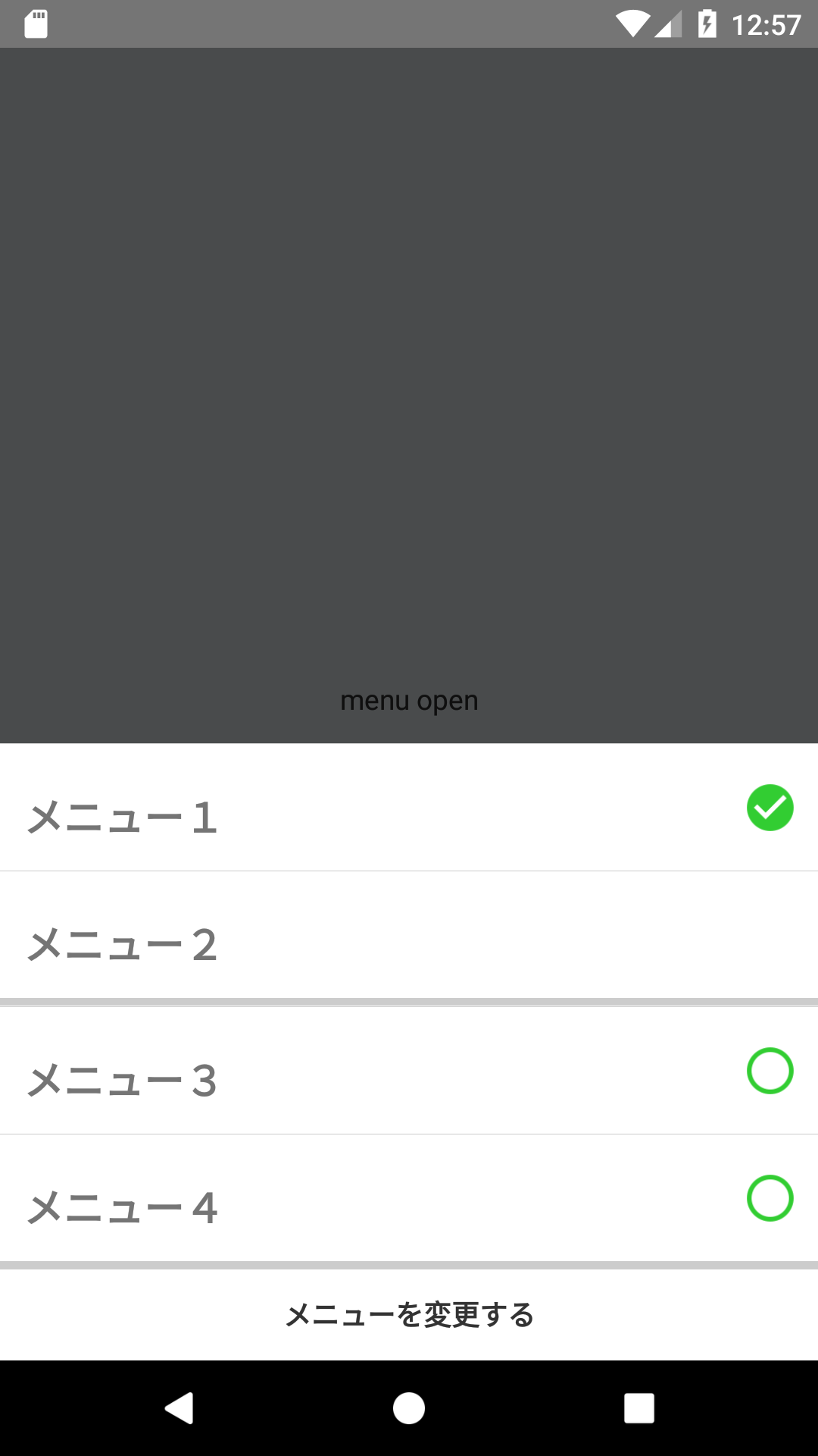
メニューを開いたとき
こちらがメニューを開いた状態です。
メニュー1とメニュー2は片方しか選択できないメニュー、
メニュー3とメニュー4は両方とも選択できるメニューになっています。
下の変更するを押すことでisSelectedが変更された状態のメニューが取得できます。
上の黒い部分を押すとキャンセルになります。
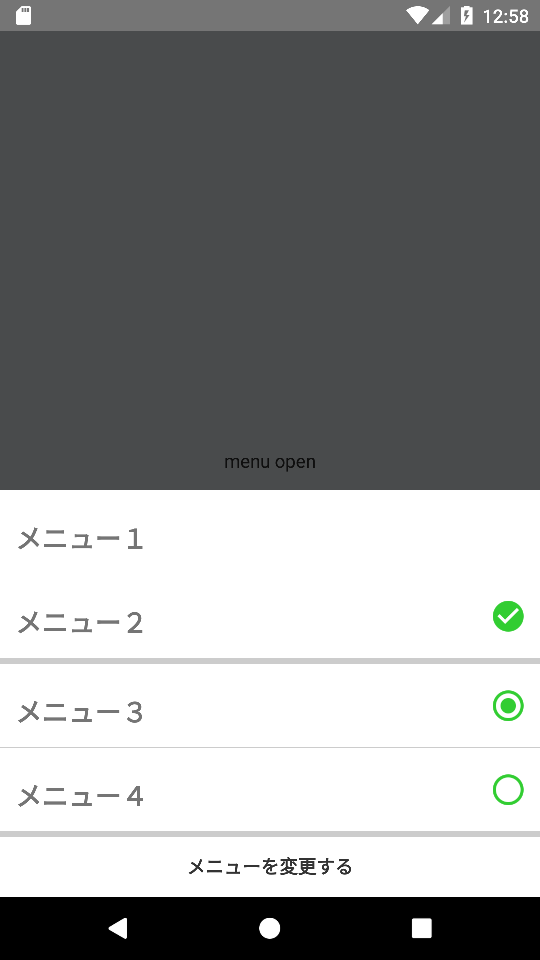
メニューをタップして変更
メニュー2とメニュー3をタップしてみたときです。
遊び程度にでも是非動かしてみてください!
今度GIFを用意しておきます。。。
おわりに
今回は自分が利用することを前提に作成していたためメニューの項目のstyleは固定にしていたけど、FlatListのように描画できる形にしても良かったのかなと思ったりもしました。