こちらはGoodpatch Advent Calendar 2020 12日の記事です。
Presentational and Container Componentパターンとは
Presentational and Container Componentパターンとは、@dan_abramovさんが提唱したコンポーネントの分割方法です。
大きく分類すると、Presentational ComponentはDOMやスタイルに対する関心を持ち、コンテンツはpropsによってのみ与えられます。一方でContainer Componentはデータや振る舞いを自身以外へ供給する役割を担う他、状態の参照や管理を行います。
主にPresentational ComponentはContainer Componentから参照して用います。また、稀にContainer Componentを別のContainer Componentからの参照によって用いるケースも存在します。逆に、Presentational ComponentがContainer Componenを参照することはありません。
これらを分割することによってインタフェースが共通のコンポーネントを複数種作成する際に、DOMとスタイル(Presentational Component)を何度も記述することを防ぎ、それぞれのコンポーネントのデータや振る舞い・状態の管理を各Container Componentに分離することができるようになります。
元記事はこちら: Presentational and Container Components - Dan Abramov | Medium
今回リファクタリングするコンポーネント
今回はComposition APIで記述したこちらのモーダルコンポーネントをPresentational ComponentとContainer Componentに分割します。
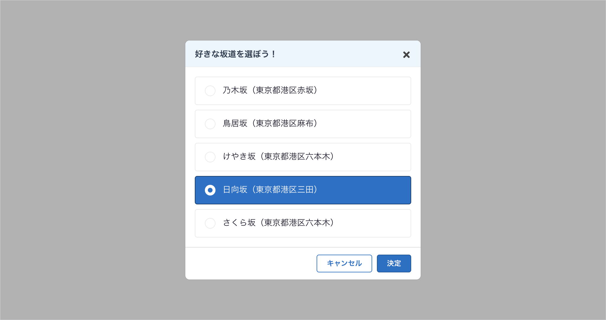
モーダルの機能⚙️
- モーダル展開時に、ラジオボタンの要素(valueとlabelのセット)をComputedでStoreから参照してラジオボタンに反映。
- 「バツアイコン」と「キャンセルボタン」を押下すると、Storeで管理しているモーダルの表示フラグを
falseにcommitしてモーダルを閉じる。 - 「決定」を押下すると、選択中のラジオ要素のvalueをStoreに格納した上で、上記同様にモーダルを閉じる。
ソースコード🖥
<template>
  <div class="overlay">
    <div class="modal">
      <div class="modal__header">
        <h2 class="modal__header__title">
          <Title>好きな坂道を選ぼう!</Title>
        </h2>
        <Icon
          name="times"
          @click="handleClickClose"
          aria-label="閉じる"
          class="modal__header__close"
        />
      </div>
      <div class="modal__main">
        <Radios
          :value="state.value"
          name="slope"
          :options="slopeOptions"
          :selectedValue="slopeValue"
          @input="handleUpdateValue($event)"
        />
      </div>
      <div class="modal__footer">
        <Button @click="handleClickCancel" class="modal__footer__button"
          >キャンセル</Button
        >
        <Button
          theme="primary"
          @click="handleClickSubmit"
          class="modal__footer__button"
          >決定</Button
        >
      </div>
    </div>
  </div>
</template>

<script lang="ts">
import { defineComponent, computed, reactive } from "vue";
import store from "@/store";

import Title from "@/components/Title.vue";
import Icon from "@/components/Icon.vue";
import Button from "@/components/Button.vue";
import Radios from "@/components/Radios.vue";

export default defineComponent({
  name: "SelectSlopeModal",
  components: {
    Title,
    Icon,
    Button,
    Radios
  },
  setup() {
    //data
    const state = reactive({
      value: ""
    });

    //methods
    const handleUpdateValue = (event: Event) => {
      if (event.target instanceof HTMLInputElement) {
        state.value = event.target.value;
      }
    };
    const handleClickClose = () => {
      store.commit("updateModalViewVisible", false);
    };
    const handleClickCancel = () => {
      handleClickClose();
    };
    const handleClickSubmit = () => {
      store.commit("updateSelectedSlope", state.value);
      handleClickClose();
    };

    //computed
    const slopeValue = computed(() => {
      return store.state.slope.value;
    });
    const slopeOptions = computed(() => {
      return store.state.slope.options;
    });
    return {
      state,
      handleUpdateValue,
      handleClickClose,
      handleClickCancel,
      handleClickSubmit,
      slopeValue,
      slopeOptions
    };
  }
});
</script>

<style lang="scss">
.overlay {
  position: fixed;
  top: 0;
  right: 0;
  bottom: 0;
  left: 0;
  display: flex;
  align-items: center;
  justify-content: center;
  width: 100vw;
  height: 100vh;
  background: rgba(#000, 0.3);
}

.modal {
  display: flex;
  flex-direction: column;
  max-width: 400px;
  width: 100%;
  max-height: 640px;
  border: solid 1px #aaa;
  border-radius: 8px;
  background-color: #fff;
  overflow: hidden;
  &__header {
    display: flex;
    align-items: center;
    justify-content: space-between;
    border-bottom: solid 1px #eee;
    background-color: #ebf5fe;
    padding: 16px 16px 12px;
    &__close {
      width: 16px;
      height: 16px;
    }
  }
  &__main {
    height: 100%;
    padding: 16px;
  }
  &__footer {
    display: flex;
    justify-content: flex-end;
    padding: 12px 16px 12px;
    border-top: solid 1px #ddd;
    &__button {
      &:not(:first-child) {
        margin-left: 8px;
      }
    }
  }
}
</style>
import { createStore } from "vuex";

export default createStore({
  state: {
    modalViewVisible: false,
    selectedSlope: "",
    slopeOptions: [
      {
        value: 0,
        label: "乃木坂(東京都港区赤坂)"
      },
      {
        value: 1,
        label: "鳥居坂(東京都港区麻布)"
      },
      {
        value: 2,
        label: "けやき坂(東京都港区六本木)"
      },
      {
        value: 3,
        label: "日向坂(東京都港区三田)"
      },
      {
        value: 4,
        label: "さくら坂(東京都港区六本木)"
      }
    ]
  },
  mutations: {
    updateModalViewVisible(state, payload) {
      state.modalViewVisible = payload;
    },
    updateSelectedSlope(state, payload) {
      state.selectedSlope = payload;
    }
  }
});
コンポーネントを分割する方法
方針🧭
Presentational and Container Componentパターンの方針と同様に、DOMやスタイルを管理する役割(Presentation)と、データや振る舞いを供給する役割(Container)の2種類にファイルを分割します。Containerから供給される値はPresentationのPropsにて受け取ります。
ソースコード(成果物)🖥
<template>
  <div class="overlay">
    <div class="modal">
      <div class="modal__header">
        <h2 class="modal__header__title">
          <Title>{{ title }}</Title>
        </h2>
        <Icon
          name="times"
          @click="handleClickClose"
          aria-label="閉じる"
          class="modal__header__close"
        />
      </div>
      <div class="modal__main">
        <Radios
          :value="value"
          :name="radioName"
          :options="options"
          :selectedValue="value"
          @input="handleUpdateValue($event)"
        />
      </div>
      <div class="modal__footer">
        <Button @click="handleClickCancel" class="modal__footer__button"
          >キャンセル</Button
        >
        <Button
          theme="primary"
          @click="handleClickSubmit"
          class="modal__footer__button"
          >決定</Button
        >
      </div>
    </div>
  </div>
</template>

<script lang="ts">
import { defineComponent, reactive } from "vue";

import Title from "@/components/Title.vue";
import Icon from "@/components/Icon.vue";
import Button from "@/components/Button.vue";
import Radios from "@/components/Radios.vue";

export default defineComponent({
  name: "ModalView",
  components: {
    Title,
    Icon,
    Button,
    Radios
  },
  props: {
    title: {
      type: String,
      required: false
    },
    radioName: {
      type: String,
      required: false
    },
    value: {
      type: String,
      requiired: false
    },
    options: {
      type: Array,
      required: false
    },
    cancel: {
      type: Function,
      required: true
    },
    close: {
      type: Function,
      required: true
    },
    submit: {
      type: Function,
      required: true
    }
  },
  setup(props) {
    const state = reactive({
      value: ""
    });

    const handleUpdateValue = (event: Event) => {
      if (event.target instanceof HTMLInputElement) {
        state.value = event.target.value;
      }
    };
    const handleClickClose = () => {
      props.close();
    };
    const handleClickCancel = () => {
      props.cancel();
    };
    const handleClickSubmit = () => {
      props.submit(state.value);
    };
    return {
      state,
      handleUpdateValue,
      handleClickClose,
      handleClickCancel,
      handleClickSubmit
    };
  }
});
</script>

<style lang="scss">
.overlay {
  position: fixed;
  top: 0;
  right: 0;
  bottom: 0;
  left: 0;
  display: flex;
  align-items: center;
  justify-content: center;
  width: 100vw;
  height: 100vh;
  background: rgba(#000, 0.3);
}

.modal {
  display: flex;
  flex-direction: column;
  max-width: 400px;
  width: 100%;
  max-height: 640px;
  border: solid 1px #aaa;
  border-radius: 8px;
  background-color: #fff;
  overflow: hidden;
  &__header {
    display: flex;
    align-items: center;
    justify-content: space-between;
    border-bottom: solid 1px #eee;
    background-color: #ebf5fe;
    padding: 16px 16px 12px;
    &__close {
      width: 16px;
      height: 16px;
    }
  }
  &__main {
    height: 100%;
    padding: 16px;
  }
  &__footer {
    display: flex;
    justify-content: flex-end;
    padding: 12px 16px 12px;
    border-top: solid 1px #ddd;
    &__button {
      &:not(:first-child) {
        margin-left: 8px;
      }
    }
  }
}
</style>
import { defineComponent, computed, reactive, h } from "vue";
import store from "@/store";

import ModalView from "@/components/ModalView.vue";

export default defineComponent({
  name: "SelectSlopeModal",
  setup() {
    const state = reactive({
      title: "好きな坂道を選ぼう!",
      radioName: "slope"
    });

    const close = () => {
      store.commit("updateModalViewVisible", false);
    };
    const cancel = () => {
      close();
    };
    const submit = (value: string) => {
      store.commit("updateSelectedSlope", value);
      close();
    };
    const slopeValue = computed(() => {
      return store.state.slope.value;
    });
    const slopeOptions = computed(() => {
      return store.state.slope.options;
    });

    return {
      state,
      close,
      cancel,
      submit,
      slopeValue,
      slopeOptions
    };
  },
  render() {
    return h(ModalView, {
      title: this.state.title,
      radioName: this.state.radioName,
      options: this.slopeOptions,
      value: this.slopeValue,
      cancel: this.cancel,
      onCancel: this.cancel,
      close: this.close,
      submit: this.submit
    });
  }
});
ポイント💡
Vue v2で用意されていた仮想DOM構築用の関数createNodeDescription()(createElement())は、v3からはcreateVNode()(h())にリプレイスされました。
createElement()ではstyleやprops、slot、on(イベントハンドラ)などをオブジェクトで与えることができたのですが、h()ではpropsとslotのみを与えられるという仕様に変わりました。
この変更によって、2系ではPresentational Componentで発火したクリックイベントをemitで透過させてCointainer Componentのイベントハンドラを実行するように記述していたのですが、3系ではCointainer Componenからイベントハンドラをpropsで渡した上でPresentational Componentに渡ってきたpropsを実行するように修正しました。
当初はemitでイベントを透過させる記法に慣れていたので思考を切り替える作業に苦労しましたが、emitよりもpropsの方がハンドラ名の厳密性が保たれるので、3系の仕様は妥当性があるのではないかと感じています。
createElement()とh()の詳細仕様は以下のドキュメントからどうぞ!
- 仮想DOM - 描画関数とJSX - Vue.js (v2.x)
- 仮想DOMツリー - Reder関数 | Vue.js (v3.x)
まとめ
コンポーネントを2つの役割に分割することで、モーダルのDOMとスタイルの再利用性を高め、特定のオプションに依存しないコンポーネントにリファクタリングすることができました。
今後、新たなモーダルを追加したい場合はPrensentational Componentは今回分割した物を流用し、Container Componentのみを新規作成するだけで完結するようになります。
また、今回リファクタリングしたコンポーネントはラジオボタンで特定の要素を選択するという役割に限定した物ですが、モーダルの中身をSlot化することで、様々なエレメントの表示やアクションを実現することも可能です。
もちろんモーダルだけではなく、様々なコンポーネントにおいてこのパターンを適用することができます。
この記事が皆様のコンポーネントを適切に分割し、再利用性を高めるためのお役に立てたら嬉しいです。
最後までお付き合いいただき、ありがとうございました!