Qtとは
Qtとはクロスプラットフォームフレームワークです。
様々なライブラリが用意され、プラットフォームに依存しない形でアプリケーションを作成できます。対応しているプラットフォームは豊富で、デスクトップアプリケーションだけでなく、組み込みでも利用がされています。C++とPythonでのアプリケーション開発が行えます。
採用事例
- Photoshop Elements
- Skype
- Google Earth
※Qtで作られたアプリケーションを調べてみるも参照ください。
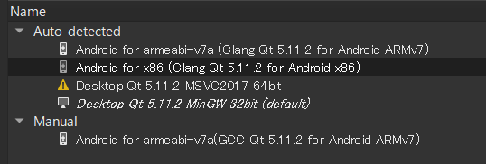
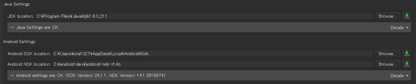
Qtのバージョン
-
Qt 5.11.2
-
MinGW 32bit(コンパイラにはMSVCも使用できますが、MSVC2017をインストールしていないため使用不可)
-
JDK1.8.0
-
SDK26.1.1
-
NDKr14.1
Qtの開発で重要な要素
以降の内容のソースコードはこちらからCloneできます。
https://github.com/ora1027/QiitaApplication.git

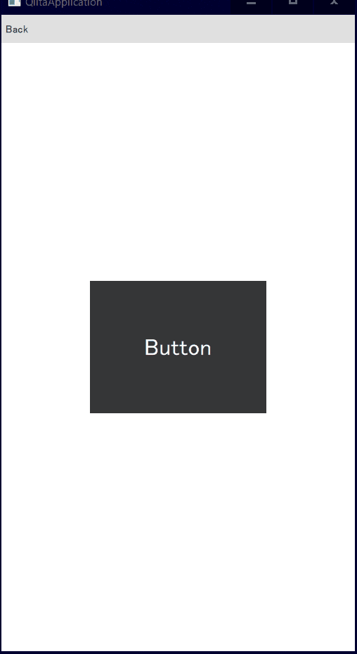
プロパティバインディング
プロパティバインディングとは、プロパティを別のプロパティと連動させる時に使用します。
例えば、ボタンの幅を、ボタンをクリックするごとに1.2倍にする時には下記のように書けます。
    Button {
        id: button
        width: root.width / 2
        height: button.width * 0.75

        anchors.centerIn: parent
        highlighted: true

        Text {
            id: button_text
            anchors.centerIn: parent
            text: qsTr("Button")
            font.pointSize: 20
        }

        onClicked: {
            if (button.font.pointSize <= 20 * 1.2 * 1.2)
                button.font.pointSize *= 1.2
            else
                button.font.pointSize = 20
        }
    }
StackView
先程作成したPropertyBidingの要素をPropertyBinding.qmlファイルに移します。
MainPage.qmlを作成し、MainPageからPropertyBindingページに画面遷移するようにしましょう。
ApplicationWindow {
    id: root

    visible: true
    width: 540
    height: 960

    StackView {
        id: stackView
        anchors.fill: parent
        initialItem: MainPage {}
    }

}
anchors.fill: parentに設定することを忘れがちになります。
MainPage.qmlも作成します。
Page {
    id: root

    header: ToolBar {
        ToolButton {
            id: menuButton
            anchors.left: parent.left
            anchors.verticalCenter: parent.verticalCenter
        }
        Label {
            anchors.centerIn: parent
            text: qsTr("Qiita Application")
            font.pixelSize: 16
            elide: Label.ElideRight
        }
    }

    Column {
        spacing: 10

        Button {
            text: qsTr("Property Binding")
            onClicked: root.StackView.view.push("PropertyBindingPage.qml")
        }
        // ページが増えるとボタンを追加していく。
    }
}
レイアウト
LayoutPage.qmlファイルを作成します。
import QtQuick 2.9
import QtQuick.Controls 2.3
import QtQuick.Layouts 1.3

Page {
    id: root

    header: MyHeader{
        toolButtonIcon: "qrc:/images/arrow_back-24px.svg"
        onToolButtonClicked: root.StackView.view.pop()
    }

    GridLayout {
        id: grid
        anchors.fill: parent
        columns: 2
        rowSpacing: 5
        columnSpacing: 5
        anchors.margins: 5
        // example models
        property var titles: [ "title1", "title2", "title3", "title4", "title5" ]
        property var values: [ "value1", "value2", "value3", "value4", "value5" ]

        Repeater {
            model: grid.titles
            Label {
                Layout.row: index
                Layout.column: 0
                Layout.fillWidth: true
                Layout.fillHeight: true
                text: modelData
            }
        }

        Repeater {
            model: grid.values
            TextArea {
                Layout.row: index
                Layout.column: 1
                Layout.fillWidth: true
                Layout.fillHeight: true
                text: modelData
            }
        }
    }
}
カスタムコンポーネント
このアプリで使用するボタンとヘッダーを共通のコンポーネントとして作成しましょう。
MyButton.qml
import QtQuick 2.9
import QtQuick.Controls 1.2
import QtQuick.Controls.Styles 1.2

Button {
    id: control
    width: 270
    height:  100

    text: qsTr("Button")

    property color buttonColor: "lightblue"

    style: ButtonStyle {
        background: Rectangle {
            border.width: control.activeFocus ? 2 : 1
            border.color: "#888"
            radius: 4
            gradient: Gradient {
                GradientStop { position: 0 ; color: control.pressed ? Qt.darker(buttonColor, 1.5) : buttonColor }
                GradientStop { position: 1 ; color: control.pressed ? Qt.darker(buttonColor, 3.0) : Qt.darker(buttonColor, 1.0) }
            }
        }
        label: Text {
            renderType: Text.NativeRendering
            verticalAlignment: Text.AlignVCenter
            horizontalAlignment: Text.AlignHCenter
            font.family: "Helvetica"
            font.pointSize: 20
            color: "blue"
            text: control.text
        }
    }

}
MyHeader.qml
signal toolButtonClickedを登録することで、各ページごとにToolButtonが押された時の処理を切り替えることができます。
import QtQuick 2.9
import QtQuick.Controls 2.3

ToolBar {
    property string toolButtonIcon: toolButton.icon.source

    signal toolButtonClicked

    ToolButton {
        id: toolButton
        icon.source: toolButtonIcon
        anchors.left: parent.left
        anchors.verticalCenter: parent.verticalCenter
        onClicked: toolButtonClicked()
    }
    Label {
        anchors.centerIn: parent
        text: qsTr("Qiita Application")
        font.pixelSize: 16
        elide: Label.ElideRight
    }
}
これによって全てのページにヘッダーの詳細を書くことが必要なくなる。共通部分はまとめてMyHeader.qmlに書きます。
アイコンやクリックされた時の処理はページごとに切り替えることができます。
//    header: ToolBar {
//        ToolButton {
//            id: menuButton
//            anchors.left: parent.left
//            anchors.verticalCenter: parent.verticalCenter
//        }
//        Label {
//            anchors.centerIn: parent
//            text: qsTr("Qiita Application")
//            font.pixelSize: 16
//            elide: Label.ElideRight
//        }
//    }

    header: MyHeader{
        toolButtonIcon: "qrc:/images/arrow_back-24px.svg"
        onToolButtonClicked: root.StackView.view.pop()
    }
リソースファイル
Resources上で右クリックを押す。Add Newを選択肢、Resourceファイルを追加します。
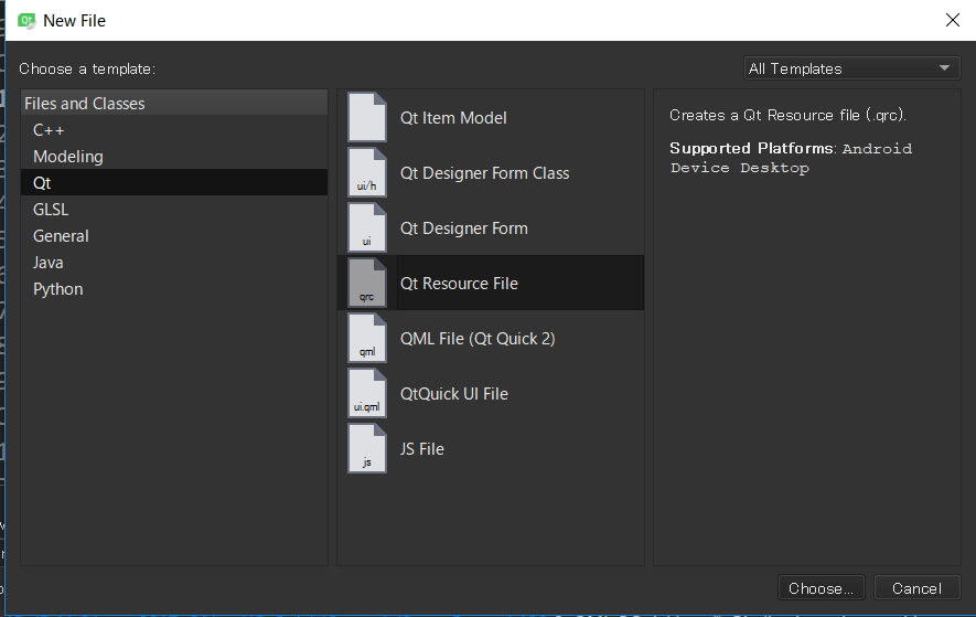
image.qrcファイルが作成されます。
① プロジェクトフォルダにimagesフォルダを作成し、その中に必要なファイルを追加します。
② Add > Add prefix => /
③ Add > Add Files
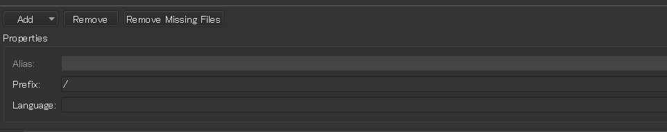
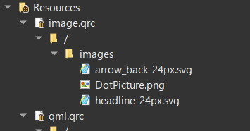
リソースファイルにアイコンなどの画像を追加しないとアプリケーション内で使用できません。
アニメーション
AnimationPage.qmlを作成します。
import QtQuick 2.9
import QtQuick.Controls 2.3

Page {
    id: root

    header: MyHeader{
        toolButtonIcon: "qrc:/images/arrow_back-24px.svg"
        onToolButtonClicked: root.StackView.view.pop()
    }


    property string text: "This is Animation Page !!"
    property bool animated: true

    focus: true

    Keys.onPressed: {
        if (event.key == Qt.Key_Delete || event.key == Qt.Key_Backspace)
            root.remove()
        else if (event.text != "") {
            root.append(event.text)
        }
    }

    function append(text) {
        root.animated = false
        var lastLetter = root.children[root.children.length - 1]
        var newLetter = letterComponent.createObject(root)
        newLetter.text = text
        newLetter.follow = lastLetter
        root.animated = true
    }

    function remove() {
        if (root.children.length)
            root.children[root.children.length - 1].destroy()
    }

    function doLayout() {
        var follow = null
        for (var i = 0; i < root.text.length; ++i) {
            var newLetter = letterComponent.createObject(root)
            newLetter.text = root.text[i]
            newLetter.follow = follow
            follow = newLetter
        }
    }

    Component {
        id: letterComponent
        Text {
            id: letter
            property variant follow

            x: follow ? follow.x + follow.width : root.width / 6
            y: follow ? follow.y : root.height / 2

            font.pixelSize: 40;
            font.bold: true
            color: "grey";
            styleColor: "#222222";
            style: Text.Outline

            MouseArea {
                anchors.fill: parent
                drag.target: letter; drag.axis: Drag.XAndYAxis
                onPressed: letter.color = "#dddddd"
                onReleased: letter.color = "#999999"
            }

            Behavior on x { enabled: root.animated; SpringAnimation { spring: 3; damping: 0.3; mass: 1.0 } }
            Behavior on y { enabled: root.animated; SpringAnimation { spring: 3; damping: 0.3; mass: 1.0 } }
        }
    }

    Component.onCompleted: doLayout()
}
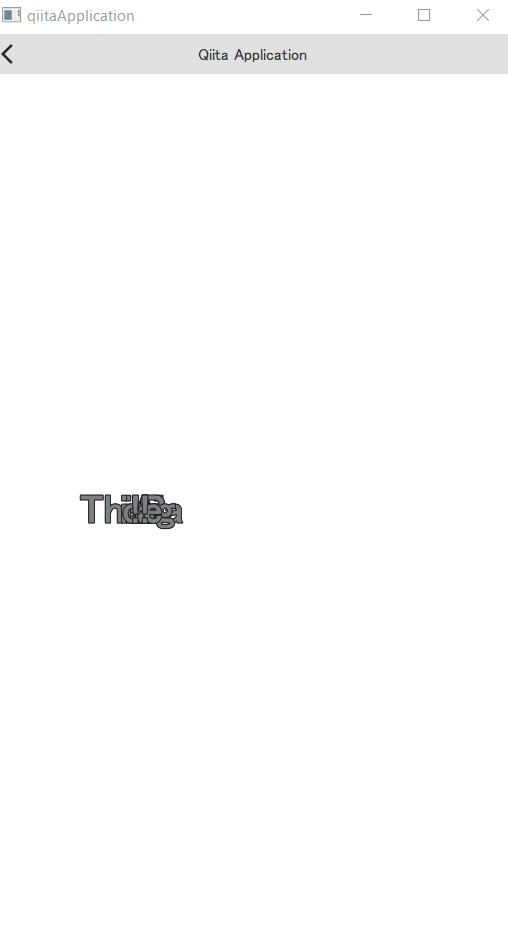
スプラッシュ
SplashShowクラスを作成します。
ヘッダーファイル
# ifndef SPLASHSHOW_H
# define SPLASHSHOW_H

# include <QObject>
# include <QQuickView>

class SplashShow : public QObject
{
    Q_OBJECT
public:
    SplashShow(QQuickView* viewer);
    void start();
    Q_INVOKABLE end();

public slots:
    void init();

private:
    QQuickView* viewer_;
};

# endif // SPLASHSHOW_H
ソースファイル
# include "SplashShow.h"

# include <QCoreApplication>
# include <QtQml/QQmlContext>
# include <QQmlApplicationEngine>
# include <QDir>
# include <QThread>

# include <QDebug>

SplashShow::SplashShow(QQuickView* viewer)
    : viewer_(viewer)
{}

void SplashShow::start()
{
    qDebug() << "SplashShow::start() is called";
    QDir directory(QCoreApplication::applicationDirPath());

    QString path = directory.absoluteFilePath("../../SplashPage.qml");
    qDebug() << "SplashShow::init() path = " << path;
    viewer_->engine()->rootContext()->setContextProperty("SplashShow", this);
    viewer_->setSource(QUrl::fromLocalFile(path));
    viewer_->show();
}

void SplashShow::init()
{
    qDebug() << "SplashShow::init() is called";
    QThread::msleep(1000);
}

void SplashShow::end()
{
    qDebug() << "SplashShow::end() is called";
    viewer_->close();
}
import QtQuick 2.0


Item {
    id: root
    width: 540
    height: 960

    /*
    スプラッシュ時に表示する画像などを記述する
    :
    :
    */

    Loader {
        id: main
        anchors.fill: parent
        asynchronous: true
        visible: status == Loader.Ready
    }

    PauseAnimation {
        id: fakeLoadingDelay
        duration: 50
        onRunningChanged: {
            if ( !running ) {
                // Call the init() function of SplashShow
                SplashShow.init();

                console.log("Inside Puase Animation")

                // When the init() returns, load main.qml
                main.source = "main.qml"
            }
        }
    }

    Component.onCompleted: fakeLoadingDelay.start()
}

Model
MainPageから遷移するページが増える度にButtonのコンポーネントを追加したくないです。
そこで、ModelとRepeaterの機能を使用して、ModelからLabelとqmlファイルを取得し、Repeaterで表示するように変更しましょう。
現状
        Button {
            text: qsTr("Property Binding")
            onClicked: root.StackView.view.push("PropertyBindingPage.qml")
        }
        Button {
            text: qsTr("Layout")
            onClicked: root.StackView.view.push("LayoutPage.qml")
        }
        Button {
            text: qsTr("Animation")
            onClicked: root.StackView.view.push("AnimationPage.qml")
        }
ScreenTransitionModel.qmlを作成します。
import QtQuick 2.9

ListModel {
    ListElement {label: "Property Binding"; path: "PropertyBindingPage.qml"}
    ListElement {label: "Layout"; path: "LayoutPage.qml"}
    ListElement {label: "Animation"; path: "AnimationPage.qml"}
    ListElement {label: "End"; path: ""}
}
最終的なMainPage.qml
import QtQuick 2.9
import QtQuick.Controls 2.3
import QtQuick.Layouts 1.3

Page {
    id: root

    header: MyHeader {
        id: header
        toolButtonIcon: "qrc:/images/headline-24px.svg"
        onToolButtonClicked: drawer.open()
    }

    Drawer {
        id: drawer

        width: Math.min(root.width, root.height) / 3
        height: root.height

        ListView {
            focus: true
            currentIndex: -1
            anchors.fill: parent

            delegate: ItemDelegate {
                width: parent.width
                text: model.text
                highlighted: ListView.isCurrentItem
                onClicked: {
                    drawer.close()
                    model.triggered()
                }
            }

            model: ListModel {
                ListElement {
                    text: qsTr("Open...")
                }
                ListElement {
                    text: qsTr("About...")
                }
            }

            ScrollIndicator.vertical: ScrollIndicator { }
        }
    }

    ColumnLayout {
        anchors.fill: parent
        spacing: 10

        Image {
            width: 400
            height: 400
            Layout.alignment: Qt.AlignHCenter
            fillMode: Image.PreserveAspectFit
            clip: true
            source: "qrc:/images/DotPicture.png"
        }

        Repeater {
            model: ScreenTransitionModel {}
            Component.onCompleted: console.log("inside Repeater delegate. model = ", model)

            delegate: MyButton {
                text: model.label
                Layout.alignment: Qt.AlignHCenter
                onClicked: model.label === "End" ? SplashShow.end() : root.StackView.view.push(model.path)
                Component.onCompleted: console.log("MyButton width = ", width + ", MyButton height = ",  height)
            }
        }

    }
}
参考
QtのExample
Qtのサンプルは豊富で実はいい情報がたくさん詰まっています。慣れてくると非常に勉強になります。
- Chat Tutorial
- animation
下のページからQMLについて豊富な情報がたくさん仕入れられます。
Qt5 Cadaques
最後まで読んで下さりありがとうございました。
今後もWebView, SQL, Bluetooth接続, Camera, OpenGLなどの機能を追加していきます。