言葉にするとわかりづらいけど、よくある、
↑ こういうやつじゃなくて、
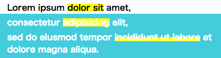
↓ こういうやつをやりたい。
em で囲って :after 擬似要素で何とかする。
HTML
<p>Lorem ipsum <em>dolor sit</em> amet,</p>
CSS
em {
  position: relative;
  display: inline-block;
}

/* 幅 100%にするとき */
em:after {
  content: "";
  background: rgba(255, 255, 0, 0.5);
  mix-blend-mode: multiply;
  width: 100%;
  height :100%;
  position: absolute;
  left: 0;
}

/* 幅 50%にするとき */
em:after {
  content: "";
  background: linear-gradient(transparent 50%, rgba(255, 255, 0, 0.5) 50%);
  mix-blend-mode: multiply;
  width: 100%;
  height: 100%;
  position: absolute;
  left: 0;
}
mix-blend-mode と背景色の透過がキモかな。
ちなみに mix-blend-mode なしだとこうなって ↓ 上から塗った感がなくなってしまう。
デモ:https://jsfiddle.net/uywb9cdp/3/
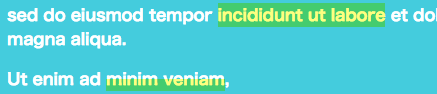
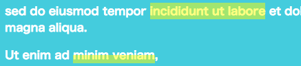
注意点は、折り返しにかかったときだけ上手くいかないです。
→ 追記:とりあえずの対応として、em の CSS に display: inline-block も追加しました。
もっとスマートな方法があったら教えてください。