パターンの先頭のクラスにwidth:100%; と書くと、特定の条件(※)で右端に3remの余白ができます。これを避けるにはそもそもwidthを書かないか、autoにします。
※特定の条件
- ブロックタイプ「グループ」で、幅は「全幅」
- ブロックはすべて box-sizing:border-box;
- TT4の時の話なので他のテーマでは違うかもしれません。試してません。すいません。
- そもそも、セクションのトップに縦横を書くものではない、という意見もあるかと思いますが、過去に深手を負い、傷が癒えるまでは書きたい人もいるとお考え下さい。あと、意地になって100svwなどと書くとfirefoxは無事ですが、chrome系は横スクロールーバーが出てしまいます。100svwは縦スクロールバーの幅を除外していないようです。
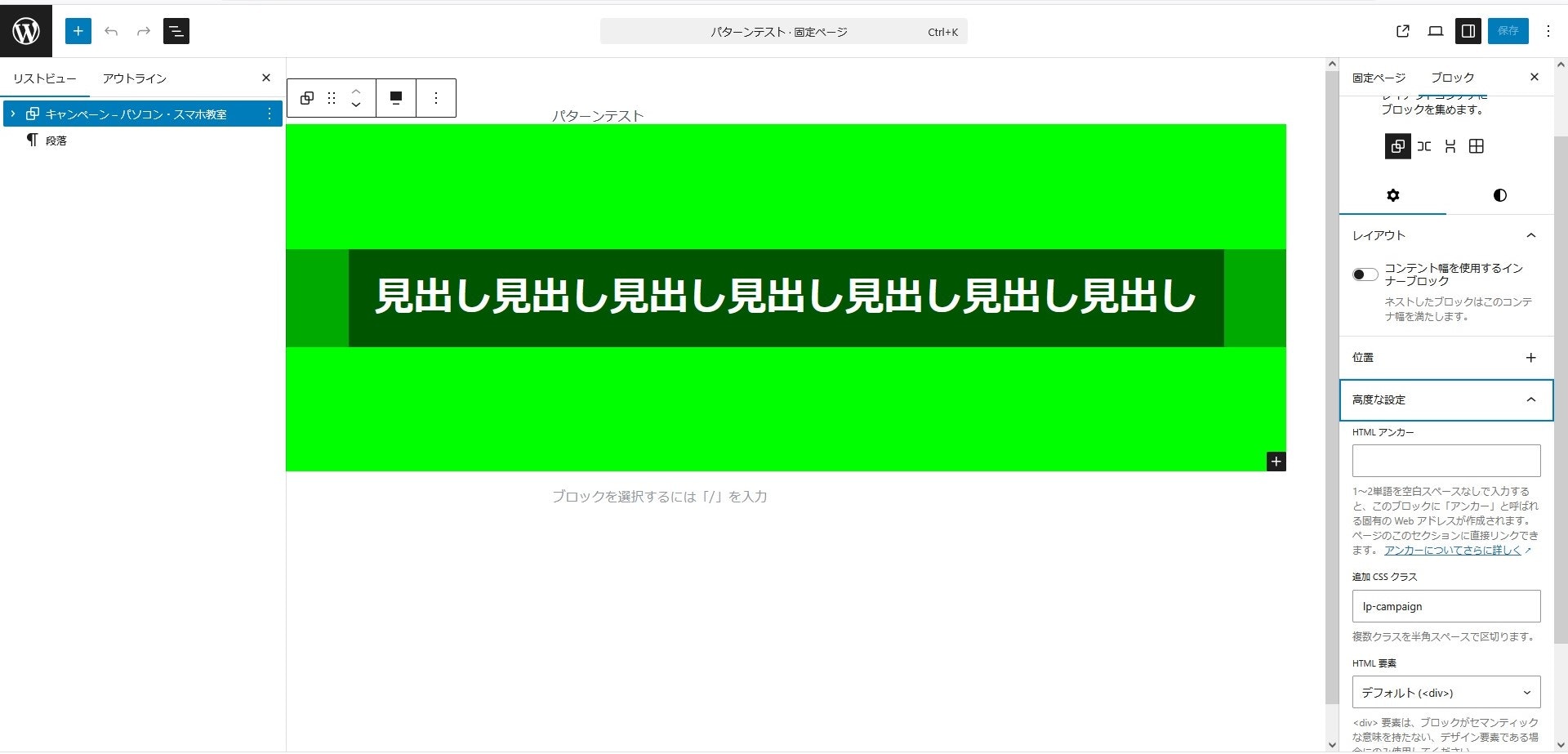
以下実例です。
画像
このパターンのcss(検証用にざっくり作ったのでお見苦しいところはご容赦ください💦)
/*          ↓ここ  */
.lp-campaign { width: 100%; height: 50svh; background: #00ff00;
               display: flex; flex-direction: column; justify-content: center; align-items: center; }
  .campaign-inner { width: 100%; height: auto; background: #00aa00;
                    display: flex; flex-direction: column; justify-content: center; align-items: center; }
    .campaign-inner h1 { font-size: 3rem; font-weight: 800; color: white; background: #005500; padding: 2rem; }
ご参考で、この時の、cssの構造が以下のようになっています。
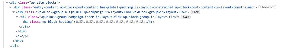
- トップ:wp-site-blocks ⇒wpが作ったクラス。幅はviewpointサイズ。
- 2階層目:entry-contentなど ⇒wpが作った複数のクラス。この中の .has-global-padding が以下のようなことをする。

※--wp--style--root--padding-○○ は1.5rem。(他の環境では違うかもしれません)
- 3階層目:自分の設定したクラスなど ⇒全幅にすると、ここに、 .alignfull(全幅) ができるが、これが以下のようなことをする。
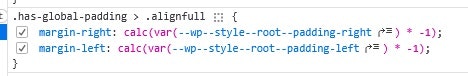
2階層めでつけたpaddingを、3階層めでwpがマイナスmarginをつけて全幅に変換しています。この3階層目に自分が作ったパターンの先頭があります。それで、この現象が起きるわけですが、この原理を表現すると次のようになるのでは、と思っています。「100%とすると、親のcontent-boxを採るので縮む。autoはmarginを適用する前の自分のboder-boxを採るので広がる。」(すいません。ここは自信ないです💦)
★★★付録★★★
このせいで一日溶けたので、怒りのあまり投稿しました。ってか、「あ、autoにしたら治ったわ」で、終わりでもよかったのですが「こうなったら徹底的にやってやる」と、検証用のコードまで作ってしまいました。ご興味があれば、いろいろ遊んでみてください。
<!doctype html>
<html lang="ja">
<head>
  <meta charset="utf-8" />
  <meta name="viewport" content="width=device-width,initial-scale=1" />
  <title>alignfull: width 100% vs auto 再現 12/21④回目</title>
  <style>
    :root{
      --padL: 24px;
      --padR: 24px;
    }
    body{
      margin:0;
      font-family: system-ui, -apple-system, "Segoe UI", sans-serif;
      background:#f7f7f7;
    }

    /* 親(WPの entry-content + has-global-padding 相当) */
    .entry{
      padding-left: var(--padL);
      padding-right: var(--padR);
      background:#e9ffe9;
      border:4px solid #0a8f00;
      width: 90svw;
      margin-inline: auto;
    }

    /* 比較対象 */
    .w100{ width:100%; }
    .wauto{ width:auto; }

    /* 子(WPの .has-global-padding > .alignfull 相当) */
    .alignfull{
      margin-left:  calc(var(--padL) * -1);
      margin-right: calc(var(--padR) * -1);
      background:#00ff00;
      border:4px solid #006400;
      /* padding:32px 0; */
      margin-block: 3rem;
    }

    .box{
      background:#0b4d0b;
      color:#fff;
      border:4px solid #022b02;
      width: 100%;
      margin-block: 3rem;
      text-align:center;
      font-weight:700;
    }

    /* 見た目で差が分かるように */
    .hint{
      margin: 0 auto;
      padding: 12px 24px;
      color:#063f06;
      font-size:14px;
    }
  </style>
</head>
<body>

  <div class="entry">
    <div class="hint">
      親(.entry)は左右 padding 24px。子(.alignfull)は左右 margin -24px(WPの alignfull っぽい挙動)。実験4回目。ちょい修正
    </div>

    <div class="alignfull w100">
      <div class="box">子(alignfull) + <b>width:100%</b>(← 48px 足りなくなる)</div>
    </div>

    <div class="alignfull wauto">
      <div class="box">子(alignfull) + <b>width:auto</b>(← margin が計算に効いてフルに見える)</div>
    </div>
  </div>

</body>
</html>