はじめに
本記事はサムザップAdvent Calendar 2017の14日目の記事です。昨日は、@mmm_hiroさんのRxPYをひたすら素振りするでした!
最近、Windows Presentation Foundation (WPF)に触れる機会があったので、そこで得た、こうすればスムーズにWPFの開発が(特に共同開発で)進むのではないかという知見を書いていきたい。なお、この知見とはあくまで個人的に行き着いたもので、ベストなものではないかもしれないので、もっとこうすればみんながハッピーになるという案があれば、ご教授していただきたいと思っている。
WPFとは
Windows Presentation Foundation (WPF)とは、デスクトップ向けのWindowsアプリケーションを作るための.NETが提供するUIフレームワークである。System.Window名前空間にあるWPFのためのクラス群を用いて全てをC#やVisual Basicで書いていくこともできるが、WPFには、レイアウトとロジックを切り離して開発を進められる仕組みが用意されている。
ウィンドウのレイアウトやそこに配置するコントロールと呼ばれるUI部品に関する情報は、XAML (eXtensible Application Markup Language)と呼ばれるXMLベースの言語を使ってxamlファイル (拡張子.xaml)に記述していくことができるのだ。
In this time, このXAMLについての話になるかと思う。
WPFアプリケーションを開発するときに決めておくべきこと
個人で使うためだけに作るのであれば、それほど注意する必要はないが、他の人に使ってもらったり共同開発をしたりする場合は、UI部品であるコントロールの取り扱いに気を遣わなければならない。
ここでは、WPFアプリケーションのレイアウトが端末によって崩れてしまわないように、さらには、一貫性のあるものにするために、開発をする際に(できれば開発前に)決めておきたいことについて、書いていきたいと思う。
Fontを決めよう
WPFで使うコントロールのFontプロパティは、デフォルトでOSのシステムフォントが設定されている。
| Windows OS | システムフォント |
|---|---|
| Windows XP | MS UI Gothic |
| Windows 7 | Meiryo |
| WIndows 8.X | Meiryo UI |
| Windows 10 | Yu Gothic UI |
WindowsのOSによってシステムフォントは異なるため、フォントサイズは同じであるのに、端末によっては大きさが違って見えてしまうことも出てくる。その結果、コントロールから文字が見切れてしまったり溢れてしまったりするなどの表示崩れが起こってしまう場合もあるのだ。
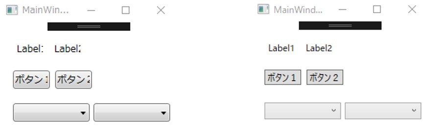
フォントの違いによる表示崩れ(左:Windows7 右:Windows10 ※フォントサイズはどちらも12px)
これを解決するためには、使用するフォントを明示的に指定してしまえばよい。
コントロールのフォントは、FontFamilyプロパティで設定する。
<!-- 省略 -->
<Grid>
    <Button Content="Button1" HorizontalAlignment="Left" Margin="218,157,0,0" VerticalAlignment="Top" Height="24" Width="119" FontFamily="Meiryo UI"/>
</Grid>
<!-- 省略 -->
これによって、OSが異なるマシンで開発しても、同じ見た目のものに対して編集を加えることができる。
これで解決といいたいところだが、コントロールを増やすごとにフォントをちまちまと設定するのは手間であろう。
Fontを賢く設定する
フォントの設定は、アプリ単位,ウィンドウ単位,ButtonやTextBoxなどのコントロール単位で行うことができる。フォントは、Styleオブジェクトが持つSetterで設定する。
Styleについては、次のセクションで触れるつもりだ。
例えば、アプリケーション全体でMeiryoというフォントを使いたい場合は、App.xamlファイルに
<Application>
    <Application.Resources>
        <Style TargetType="{x:Type Window}">
            <Setter Property="FontFamily" Value="Meiryo" />
        </Style>
    </Application.Resources>
</Application>
というように、<Application.Resources>タグの<Style>タグの中に書いていく。TargetTypeプロパティには、Windowを指定する。
特定のウィンドウでのみ使う場合は、<Window>タグをルートに持つxamlファイルで、
<Window>
    <Window.Resources>
        <Style TargetType="{x:Type Window}">
            <Setter Property="FontFamily" Value="Meiryo" />
        </Style>
    </Window.Resources>
    <Grid>
        <!-- 省略 -->
    </Grid>
</Window>
とすれば良い。適用される優先度は、下の階層のものほど高くなる。
Themeを決めよう
Themeとは、コントロールのデザインを決めるものであり、後述するStyleやデザインに必要な素材を寄せ集めたものである。
こちらもOSによって採用されているものが異なる。
| Windows OS | theme |
|---|---|
| Windows XP | presentationframework.Aero |
| Windows 7 | presentationframework.Aero |
| WIndows 8.X | presentationframework.Aero2 |
| Windows 10 | presentationframework.Aero2 |
| 次の図を見ると、Aeroが立体的なデザインになっているのに対して、Aero2はフラットデザインとなっているのが分かる。 |
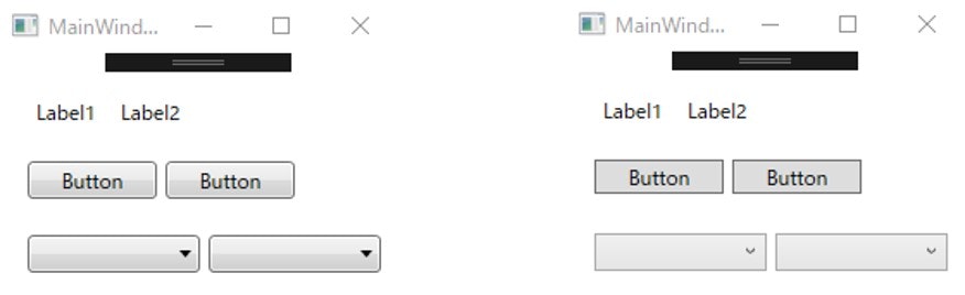
Themeの違い(左:Aero 右:Aero2)
Themeの設定は絶対やった方がいいという訳ではないが、違うOS間で同じ見た目にしたければ、Themeも明示的に指定してあげればよい。
Themeの追加
すでに用意されているThemeを使うには、プロジェクトの参照にThemeを追加しなければならない。
ここでは、.NET Frameworkが用意しているPresentationFramework.AeroというThemeを追加する仕方を見ていく。
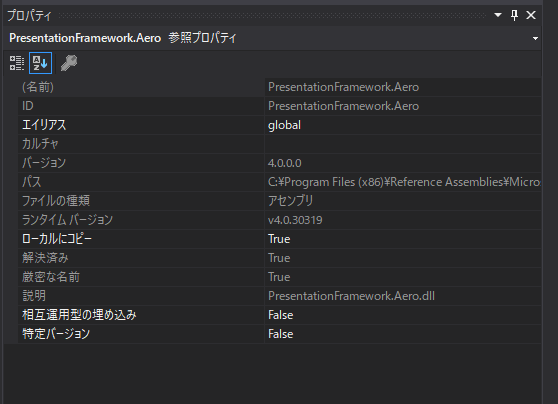
Solution Explorer -> 参照を右クリック -> 参照の追加 と進んでいくと、参照マネージャーが開くので、
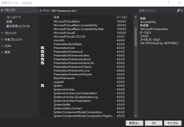
Assemblyタブを開いて、PresentationFramework.Aeroの項目にチェックを入れてOKボタンを押すと参照に追加される。
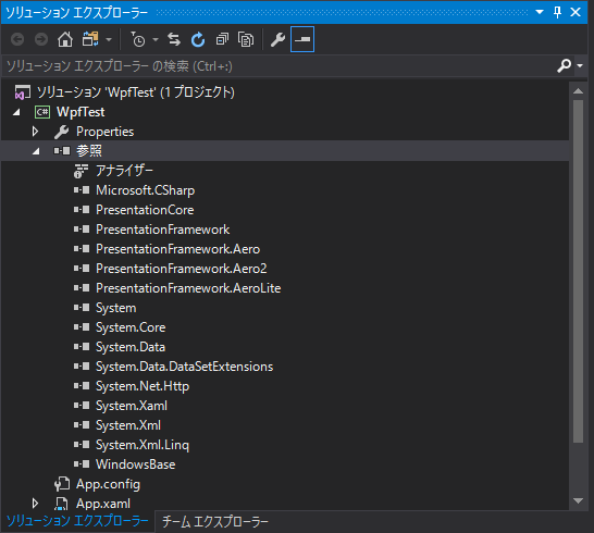
Then, 参照 -> PresentationFramework.Aeroを選択した状態でプロパティウィンドウを開き、ローカルにコピーという項目をTrueにすればよい。
Themeの設定
アプリ全体で使うThemeの設定は、App.xamlファイルで行っていく。
<Application x:Class="WpfTest.App"
             xmlns="http://schemas.microsoft.com/winfx/2006/xaml/presentation"
             xmlns:x="http://schemas.microsoft.com/winfx/2006/xaml"
             xmlns:local="clr-namespace:WpfTest"
             StartupUri="MainWindow.xaml">
    <Application.Resources>
        <ResourceDictionary Source="/PresentationFramework.Aero2;component/themes/aero2.normalcolor.xaml" />
    </Application.Resources>
</Application>
Fontの時と同様に、Themeの設定はApplicationクラスのResourceDictionary型であるResourcesプロパティに対して行う。
XAMLでは、<Application.Resources>タグ内で、<ResourceDictionary>オブジェクト要素のSource属性(Sourceプロパティ)に使用したいThemeのURIを持たせる形で指定してあげればよい。
特定のWindowに対してThemeを設定する場合は、<Window>タグをルートに持つxamlファイルに書いていく。
<Window x:Class="WpfTest.TestWindow"
        xmlns="http://schemas.microsoft.com/winfx/2006/xaml/presentation"
        xmlns:x="http://schemas.microsoft.com/winfx/2006/xaml"
        xmlns:d="http://schemas.microsoft.com/expression/blend/2008"
        xmlns:mc="http://schemas.openxmlformats.org/markup-compatibility/2006"
        xmlns:local="clr-namespace:WpfTest"
        mc:Ignorable="d"
        Title="TestWindow" Height="300" Width="300">
    <Window.Resources>
        <ResourceDictionary Source="/PresentationFramework.Aero;component/themes/aero.normalcolor.xaml" />
    </Window.Resources>
    <Grid>
        <Button Content="Button" HorizontalAlignment="Left" Margin="38,38,0,0" VerticalAlignment="Top" Width="75"/>
        <ComboBox HorizontalAlignment="Left" Margin="38,131,0,0" VerticalAlignment="Top" Width="120"/>
    </Grid>
</Window>
Windowの場合は、WindowクラスのResourceDictionary型であるResourcesプロパティに対して設定を行う。
Styleを定義しよう
Styleとは、コントロールのサイズや文字フォント,マージンなどの様々なプロパティを定義するためのものである。
どのコントロールに対するStyleなのかをStyleオブジェクトのTargetTypeプロパティで指定し、その中でSetterオブジェクトを列挙する形でコントロールの各種プロパティの設定をしていく。
<Style TargetType="Button">
    <Setter Property="Width" Value="70" />
    <Setter Property="Height" Value="20" />
</Style>
さらに、1つのコントロールに対して複数のStyleを定義したい場合は、x:Keyプロパティを使ってStyleを特定するためのキーを指定すればよい。
<Style x:Key="LongButton" TargetType="Button">
    <Setter Property="Width" Value="100" />
    <Setter Property="Height" Value="20" />
</Style>
コントロールごとに数種類ほどサイズが違うStyleを用意しておいて、その中から適したものを選んで使っていくという方針で作っていくと、見た目の統一感が出て、より洗練されたデザインのアプリケーションに仕上がるのではないかと思う。
定義する場所
Styleはリソースとして扱われるので、WindowやApplicationのResourcesプロパティに定義していく。
これまでと同様、Styleをアプリケーション全体で定義する場合は、App.xamlの<Application.Resource>タグ内で、特定のWindowで定義する場合は、<Window>タグをルートとして持つウィンドウのxamlファイルの<Window.Resource>タグ内で定義する。
ここでは、特定のWindowにStyleを定義する例を見てみよう。
<Window x:Class="WpfTest.TestWindow"
        xmlns="http://schemas.microsoft.com/winfx/2006/xaml/presentation"
        xmlns:x="http://schemas.microsoft.com/winfx/2006/xaml"
        xmlns:d="http://schemas.microsoft.com/expression/blend/2008"
        xmlns:mc="http://schemas.openxmlformats.org/markup-compatibility/2006"
        xmlns:local="clr-namespace:WpfTest"
        mc:Ignorable="d"
        Title="TestWindow" Height="300" Width="300">
    <Window.Resources>
        <!-- ButtonのStyle定義 -->
        <Style TargetType="Button">
            <Setter Property="Width" Value="70"/>
            <Setter Property="Height" Value="20"/>
        </Style>
        <!-- ComboBoxのStyle定義 -->
        <Style TargetType="ComboBox">
            <Setter Property="Width" Value="70"/>
            <Setter Property="Height" Value="20"/>
        </Style>
    </Window.Resources>
    <!-- コントロールの配置 -->
    <Grid>
        <Button Content="Button" HorizontalAlignment="Left" Margin="38,38,0,0" VerticalAlignment="Top" Width="75"/>
        <ComboBox HorizontalAlignment="Left" Margin="38,131,0,0" VerticalAlignment="Top" Width="120"/>
    </Grid>
</Window>
適用方法
定義したStyleをコントロールに適用するには、
<!-- 省略 -->
<Grid>
    <!-- キー無しのButtonのStyleが適用される -->
    <Button Content="Button" HorizontalAlignment="Left" Margin="104,56,0,0" VerticalAlignment="Top"/>
    <!-- LongButtonというキーを持つButtonのStyleが適用される -->
    <Button Content="Button" Style ="{StaticResource LongButton}" HorizontalAlignment="Left" Margin="104,110,0,0" VerticalAlignment="Top"/>
</Grid>
<!-- 省略 -->
とすればよい。キー無しのStyleは特に何も書かなくても適用されるが、キーを定義したStyleはコントロールのStyleプロパティでStaticResourceのマークアップ拡張機能を使って指定する。
Styleで定義されたプロパティを上書きしたい場合は、そのプロパティを改めて設定すればそちらの方が採用される。
もっとスマートに定義する
<ResourceDictionary>タグがルートのxamlファイルを別に用意して、そこにStyleの定義を切り出してやることもできる。
<ResourceDictionary xmlns="http://schemas.microsoft.com/winfx/2006/xaml/presentation"
                    xmlns:x="http://schemas.microsoft.com/winfx/2006/xaml">
    <!-- Fontの定義 -->
    <Style TargetType="{x:Type Window}">
        <Setter Property="FontFamily" Value="Meiryo" />
    </Style>
    <!-- LabelのStyle定義 -->
    <Style TargetType="Label" >
        <Setter Property="HorizontalAlignment" Value="Left" />
        <Setter Property="HorizontalContentAlignment" Value="Left" />
        <Setter Property="VerticalAlignment" Value="Center" />
        <Setter Property="VerticalContentAlignment" Value="Center" />
        <Setter Property="FontSize" Value="12"/>
    </Style>
    <!-- ButtonのStyle定義 -->
    <Style TargetType="Button"  >
        <Setter Property="HorizontalAlignment" Value="Center" />
        <Setter Property="HorizontalContentAlignment" Value="Center" />
        <Setter Property="VerticalAlignment" Value="Center" />
        <Setter Property="VerticalContentAlignment" Value="Center" />
    </Style>
</ResourceDictionary>
このTestStyle.xamlファイルて定義したStyleを適用するには、
<Window x:Class="WpfTest.TestWindow"
        xmlns="http://schemas.microsoft.com/winfx/2006/xaml/presentation"
        xmlns:x="http://schemas.microsoft.com/winfx/2006/xaml"
        xmlns:d="http://schemas.microsoft.com/expression/blend/2008"
        xmlns:mc="http://schemas.openxmlformats.org/markup-compatibility/2006"
        xmlns:local="clr-namespace:WpfTest"
        mc:Ignorable="d"
        Title="TestWindow" Height="300" Width="300">
    <!-- Styleの設定 -->
    <Window.Resources>
        <ResourceDictionary Source="TestStyle.xaml" />
    </Window.Resources>
    <!-- コントロールの配置 -->
    <Grid>
    </Grid>
</Window>
と、ResourceDictionaryオブジェクトのSourceプロパティにファイル名を指定すればよい。
メリットとしては、
・コントロールの配置とスタイルの定義を別ファイルに記述するので、コードがすっきりする
・複数のStyle定義ファイルを用意することで、柔軟にStyleの適用ができる
などであろう。
ThemeとStyleのマージ
ResourceDictionaryクラスのMergedDictionariesプロパティを使うと、自分で定義したStyleを様々なThemeに衣替えすることができるので、最後にそれについて書いていきたい。
for example, TestStyle.xamlで定義したStyleを使いつつAeroLiteのThemeにする場合は、
<Application.Resources>
    <ResourceDictionary>
        <ResourceDictionary.MergedDictionaries>
            <ResourceDictionary Source="TestStyle.xaml" />
            <ResourceDictionary Source="/PresentationFramework.AeroLite;component/themes/aerolite.normalcolor.xaml" />
        </ResourceDictionary.MergedDictionaries>
   </ResourceDictionary>
</Application.Resources>
と、<ResourceDictionary.MergedDictionaries>タグの中に統合したい<ResourceDictionary>タグを列挙していけばよい。
ここで、注意が必要なのは、Styleが設定したThemeベースで定義されるように、StyleオブジェクトのBasedOnプロパティでThemeの中で定義されているStyleを継承しないといけない点である。
<ResourceDictionary xmlns="http://schemas.microsoft.com/winfx/2006/xaml/presentation"
                    xmlns:x="http://schemas.microsoft.com/winfx/2006/xaml">
    <!-- Fontの定義 -->
    <Style TargetType="{x:Type Window}">
        <Setter Property="FontFamily" Value="Meiryo" />
    </Style>
    <!-- LabelのStyle定義 -->
    <Style TargetType="Label" BasedOn="{StaticResource {x:Type Label}}">
        <Setter Property="HorizontalAlignment" Value="Left" />
        <Setter Property="HorizontalContentAlignment" Value="Left" />
        <Setter Property="VerticalAlignment" Value="Center" />
        <Setter Property="VerticalContentAlignment" Value="Center" />
        <Setter Property="FontSize" Value="12"/>
    </Style>
    <!-- ButtonのStyle定義 -->
    <Style TargetType="Button"  BasedOn="{StaticResource {x:Type Button}}">
        <Setter Property="HorizontalAlignment" Value="Center" />
        <Setter Property="HorizontalContentAlignment" Value="Center" />
        <Setter Property="VerticalAlignment" Value="Center" />
        <Setter Property="VerticalContentAlignment" Value="Center" />
    </Style>
</ResourceDictionary>
まとめ
ここまで、長々長々と書いてきたが、結局何をすればいいのかといえば、
・Fontはしっかり設定する
・Styleは見た目の一貫性を持たせるために定義した方がいい
・Themeはこだわるなら設定する
ということである。これら(特にStyle)は、後から定義するのでは、プロパティ値のリセットをしたりで面倒なことになるので、できれば開発の最初の段階で決めておきたい。
明日は、@ddorangeさんのUnityのTimelineについての話です!
参考文献
XAML Introduction https://docs.microsoft.com/en-us/visualstudio/designers/introduction-to-wpf
XAML Syntax In Detail https://docs.microsoft.com/en-us/dotnet/framework/wpf/advanced/xaml-syntax-in-detail
StyleとBasedOnによる拡張 http://blogs.itmedia.co.jp/mohno/2013/12/xaml07-basedon-480f.html