概要
アコーディオン風に飛び出す3Dリンクボタンを実装します。
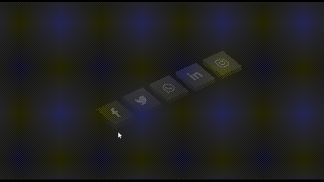
本記事は、以下の動画をReactで実装したものです。
スタイリングには、emotion/css(CSS in JS)を使用しています。
アイコンは、react-iconsを使用しています。
実装
.tsx
import React, { useRef, VFC } from 'react';
import { FaFacebookF, FaInstagram, FaLinkedinIn, FaTwitter, FaWhatsapp } from 'react-icons/fa';
import { IconType } from 'react-icons/lib';
import { css } from '@emotion/css';

export const IsometricSocialMediaIcon: VFC = () => {
	const items: { href: string; icon: IconType; themeColor: string }[] = [
		{ href: '#facebook', icon: FaFacebookF, themeColor: '#3b5999' },
		{ href: '#twitter', icon: FaTwitter, themeColor: '#55acee' },
		{ href: '#whatsapp', icon: FaWhatsapp, themeColor: '#25d366' },
		{ href: '#linkedin', icon: FaLinkedinIn, themeColor: '#0077b5' },
		{ href: '#instagram', icon: FaInstagram, themeColor: '#e4405f' }
	]

	return (
		<div className={styles.container}>
			<ul className={styles.list}>
				{items.map((item, i) => (
					<ListItem key={i} href={item.href} icon={<item.icon />} themeColor={item.themeColor} />
				))}
			</ul>
		</div>
	)
}

// ==============================================

type ListItemProps = {
	href: string
	icon: React.ReactNode
	themeColor: string
}

const ListItem: VFC<ListItemProps> = props => {
	const { href, icon, themeColor } = props

	const layer1Ref = useRef<HTMLSpanElement>(null)
	const layer2Ref = useRef<HTMLSpanElement>(null)
	const layer3Ref = useRef<HTMLSpanElement>(null)
	const layer4Ref = useRef<HTMLSpanElement>(null)

	const hoverHandler = () => {
		layer1Ref.current!.classList.toggle('hover')
		layer2Ref.current!.classList.toggle('hover')
		layer3Ref.current!.classList.toggle('hover')
		layer4Ref.current!.classList.toggle('hover')
	}

	return (
		<li className={styles.item(themeColor)} onMouseEnter={hoverHandler} onMouseLeave={hoverHandler}>
			<a href={href}>
				<span ref={layer1Ref} className={styles.layer(themeColor)}></span>
				<span ref={layer2Ref} className={styles.layer(themeColor)}></span>
				<span ref={layer3Ref} className={styles.layer(themeColor)}></span>
				<span ref={layer4Ref} className={styles.layer(themeColor)}>
					{icon}
				</span>
			</a>
		</li>
	)
}

// ==============================================
// styles

const styles = {
	container: css`
		position: relative;
		width: 100%;
		height: 100%;
		display: flex;
		justify-content: center;
		align-items: center;
		background-color: #222;
	`,
	list: css`
		position: relative;
		display: flex;
		transform-style: preserve-3d;
		transform: rotate(-25deg) skew(25deg);
	`,
	item: (themeColor: string) => css`
		position: relative;
		list-style: none;
		width: 60px;
		height: 60px;
		margin: 0 10px;

		&::before {
			content: '';
			position: absolute;
			bottom: -10px;
			left: 0;
			width: 100%;
			height: 10px;
			background-color: #2a2a2a;
			transform-origin: top;
			transform: skewX(-41deg);
			transition: 0.5s;
		}
		&::after {
			content: '';
			position: absolute;
			top: 0;
			left: -9px;
			width: 9px;
			height: 100%;
			background-color: #2a2a2a;
			transform-origin: right;
			transform: skewY(-49deg);
			transition: 0.5s;
		}

		&:hover::before,
		&:hover::after {
			opacity: 0.2;
			background-color: ${themeColor};
		}
	`,
	layer: (hoveredColor: string) => css`
		position: absolute;
		top: 0;
		left: 0;
		width: 100%;
		height: 100%;
		display: flex;
		justify-content: center;
		align-items: center;
		background-color: #333;
		color: rgba(255, 255, 255, 0.2);
		font-size: 30px;
		transition: 0.2s;

		&.hover {
			z-index: 1000;
			transition: 0.5s;
			color: #fff;
			box-shadow: -1px 1px 1px rgba(0, 0, 0, 0.05);
			background-color: ${hoveredColor};

			&:nth-child(5) {
				transform: translate(40px, -40px);
				opacity: 1;
			}
			&:nth-child(4) {
				transform: translate(30px, -30px);
				opacity: 0.8;
			}
			&:nth-child(3) {
				transform: translate(20px, -20px);
				opacity: 0.6;
			}
			&:nth-child(2) {
				transform: translate(10px, -10px);
				opacity: 0.4;
			}
			&:nth-child(1) {
				transform: translate(0px, 0px);
				opacity: 0.2;
			}
		}
	`
}
- CSSでの3Dは、
transform-styleにpreserve-3dを指定することで表現できます。
.tsx
list: css`
	position: relative;
	display: flex;
	transform-style: preserve-3d;
	transform: rotate(-25deg) skew(25deg);
`
- 親要素のhoverについて
親要素がhoverされたときに、子要素に特定のスタイルを割り当てようとする場合、バニラのCSSだと以下のように記述できます。
.css
li:hover span {
...
}
CSS in JSでは、タグごとにスタイルを割り当てるため、他のタグの状態を知ることはできません。(私が記述方法を知らないだけかもしれませんが...)
なので、親要素がhoverされたタイミングで、アクションを起こしたい要素にクラスを割り当てる必要があります。
.tsx
const hoverHandler = () => {
	layer1Ref.current!.classList.toggle('hover')
	layer2Ref.current!.classList.toggle('hover')
	layer3Ref.current!.classList.toggle('hover')
	layer4Ref.current!.classList.toggle('hover')
}
これをスタイル内で呼びだして、親要素(li tag)がhoverされたときの子要素(span tag)の動作を記述します。
.tsx
layer: (hoveredColor: string) => css`
	・・・
	&.hover {
		・・・
	}
`
もしくは、hover時のスタイルを用意して、親要素がhoverされたときに、子要素にhover時のスタイルを割り当てるようにします。
この処理は、以下を参考にしてください。
【React】emotion/css の使い方メモ/classの動的な追加による遷移(transition)/スタイルの統合(cx)を使った書き方