#対象者
- アプリにグラフを実装したい方
#目的
- グラフ表示をして、数値をわかりやすくする
- 完成イメージは下記の通り(グラフが更新できていないのでイメージ湧きにくいかもしれません、、、)
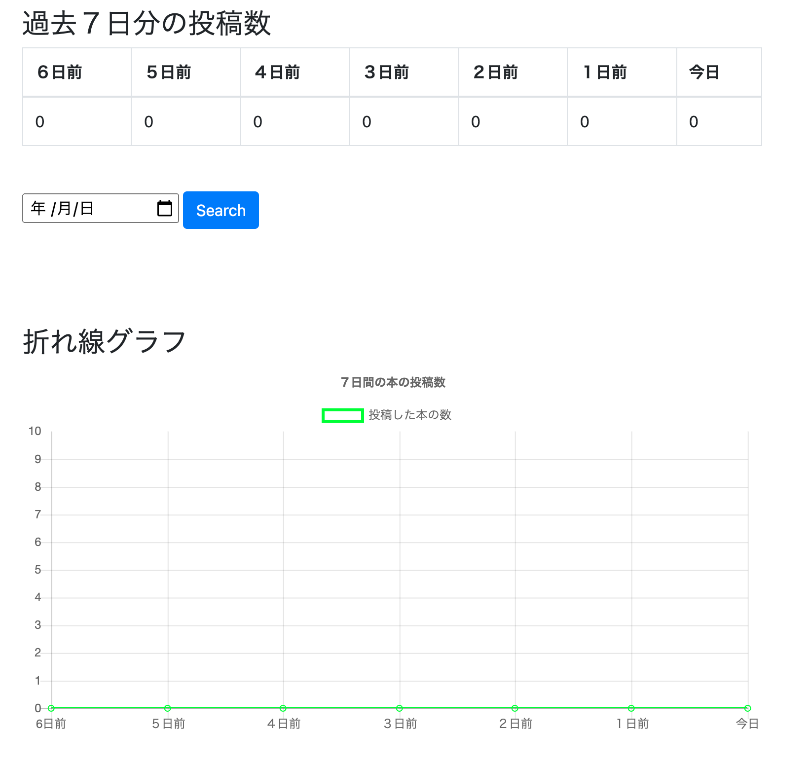
※画像の真ん中の検索機能に関しては下記記事で書いています。
#実際の手順と実例
###1.前提
* 本の投稿数をユーザーのマイページ(詳細画面)で集計しており、その数値を折れ線グラフ化します。集計の仕方は下記の記事から
- 公式ホームページ
###2.過去7日間の投稿数を取得
ユーザーマイページに投稿数を表示していきます。
book.rb
  scope :created_today, -> { where(created_at: Time.zone.now.all_day) } # 今日
  scope :created_yesterday, -> { where(created_at: 1.day.ago.all_day) } # 前日
  scope :created_two_days_ago, -> { where(created_at: 2.day.ago.all_day) } #2日前
  scope :created_three_days_ago, -> { where(created_at: 3.day.ago.all_day) } #3日前
  scope :created_four_days_ago, -> { where(created_at: 4.day.ago.all_day) } #4日前
  scope :created_five_days_ago, -> { where(created_at: 5.day.ago.all_day) } #5日前
  scope :created_six_days_ago, -> { where(created_at: 6.day.ago.all_day) } #6日前
本の投稿数なので、bookモデルに定義付けしています。
users_controller.rb
 def show
    @user = User.find(params[:id])
    @books = @user.books
    #過去7日分
    @today_book = @books.created_today
    @yesterday_book = @books.created_yesterday
    @two_days_ago_book = @books.created_two_days_ago
    @three_days_ago_book = @books.created_three_days_ago
    @four_days_ago_book = @books.created_four_days_ago
    @five_days_ago_book = @books.created_five_days_ago
    @six_days_ago_book = @books.created_six_days_ago
end
bookモデルに定義したアクションをUserコントローラーで使用します(アソシエーションを組んでいるから)
views/users/show.html.erb
<!--過去7日間の投稿-->
  <div class="user_show_margin">
   <h3>過去7日分の投稿数</h3>
   <table class="table table-bordered table_width">
     <thead>
       <tr>
         <th>6日前</th>
         <th>5日前</th>
         <th>4日前</th>
         <th>3日前</th>
         <th>2日前</th>
         <th>1日前</th>
         <th>今日</th>
       </tr>
     </thead>
     <tbody>
       <tr>
        <td><%=@six_days_ago_book.count %></td>
        <td><%=@five_days_ago_book.count %></td>
        <td><%=@four_days_ago_book.count %></td>
        <td><%=@three_days_ago_book.count %></td>
        <td><%=@two_days_ago_book.count %></td>
        <td><%=@yesterday_book.count %></td>
        <td><%=@today_book.count %></td>
       </tr>
     </tbody>
   </table>

   <!--折れ線グラフ-->
     <div class="user_show_margin">
       <%= render "users/graph" %>
     </div>
これで過去7日間分の本の投稿数が表示されるようになりました。
また、view下部にグラフ表示できるように部分テンプレート化したコードを書いています。
3. 折れ線グラフの設定
グラフは下記の通り
views/users/_graph.html.erb
<!DOCTYPE html>
<html lang="ja">

<head>
  <meta charset="utf-8">
 <title>グラフ</title>
</head>

<body>
  <h3>折れ線グラフ</h3>
  <canvas id="myLineChart"></canvas>
    <script src="https://cdnjs.cloudflare.com/ajax/libs/Chart.js/2.7.2/Chart.bundle.js"></script>

  <script>
  var ctx = document.getElementById("myLineChart");
  var myLineChart = new Chart(ctx, {
    // グラフタイプを設定する項目
    type: 'line',

    // データをセットする項目
    data: {
      labels: ['6日前', '5日前', '4日前', '3日前', '2日前', '1日前', '今日'],
      datasets: [
        {
          label: '投稿した本の数',
          data:
          [<%=@six_days_ago_book.count %>,
          <%=@five_days_ago_book.count %> ,
          <%=@four_days_ago_book.count %>,
          <%=@three_days_ago_book.count %>,
          <%=@two_days_ago_book.count %>,
          <%=@yesterday_book.count %>,
          <%=@today_book.count %>
          ],
          borderColor: "rgba(50,255,0,1",
          backgroundColor: "rgba(0,0,0,0)"
        },
      ],
    },

    // グラフのオプションをつける設定
    options: {
      title: {
        display: true,
        text: '7日間の本の投稿数'
      },
      scales: {
        yAxes: [{
          ticks: {
            suggestedMax: 10,
            suggestedMin: 0,
            stepSize: 1,
            callback: function(value, index, values){
              return  value
            }
          }
        }]
      },
    }
  });
  </script>
</body>

</html>
解説
どんなタイプのグラフか設定します。
下記では”line”をすることで折れ線グラフを表しています。
type: 'line',
次にグラフに表示するデータを設定していきます。
    data: {
      labels: ['6日前', '5日前', '4日前', '3日前', '2日前', '1日前', '今日'],
      datasets: [
        {
          label: '投稿した本の数',
          data:
          [<%=@six_days_ago_book.count %>,
          <%=@five_days_ago_book.count %> ,
          <%=@four_days_ago_book.count %>,
          <%=@three_days_ago_book.count %>,
          <%=@two_days_ago_book.count %>,
          <%=@yesterday_book.count %>,
          <%=@today_book.count %>
          ],
                     #線の色
          borderColor: "rgba(50,255,0,1",
                     #線の下の塗りつぶしの色
          backgroundColor: "rgba(0,0,0,0)"
        },
      ],
    },
- labelはデータの軸ラベルを表示するものです。
- datasetsはデータをそれぞれ表しており、数値や背景色を設定しています。
最後はデータのオプション設定です。
    options: {
      #グラフのタイトル
      title: {
        display: true, #タイトル表示するかどうか
        text: '7日間の本の投稿数' #タイトル名
      },
      #グラフの軸にかんして
      scales: {
        #Y軸
        yAxes: [{
          ticks: {
            suggestedMax: 10, #軸の最大値
            suggestedMin: 0, #軸の最小値
            stepSize: 1, #軸の刻み幅
            callback: function(value, index, values){
              return  value #軸のラベル
            }
          }
        }]
      },
    }
  });
これで実装完了です!!
参照
投稿者コメント
少し前に実装してみたのですが、
思ったよりも簡単にできたので、記事にして分解して考えてみました。
My Profile
プログラミング学習歴3ヶ月目のアカウントです!
プログラミングスクールで学んだ内容や自分が躓いた箇所等のアウトプットの為に発信しています。
また、プログラミング初学者の方にわかりやすく、簡潔にまとめて情報共有できればと考えています。
もし、投稿した記事の中に誤り等ございましたら、コメント欄でご教授いただけると幸いです。