TextInputLayoutのスタイル設定についてまとめようとしましたが途中で力尽きました。
https://github.com/material-components/material-components-android/blob/master/docs/components/TextField.md を読めばやろうとしていたことがだいたいまとまっていました。
やる気が出たら追記します。
TextInputLayoutを表示するためのレイアウト
| 未入力 | 入力後 |
|---|---|
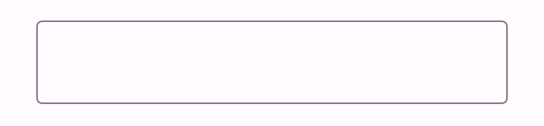 |
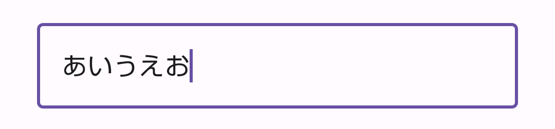 |
    <com.google.android.material.textfield.TextInputLayout
        android:layout_width="match_parent"
        android:layout_height="wrap_content">

        <com.google.android.material.textfield.TextInputEditText
            android:layout_width="match_parent"
            android:layout_height="wrap_content" />

    </com.google.android.material.textfield.TextInputLayout>
hint(placeHolder)・helperTextの表示
| 未入力かつ非フォーカス | フォーカス中または入力後 |
|---|---|
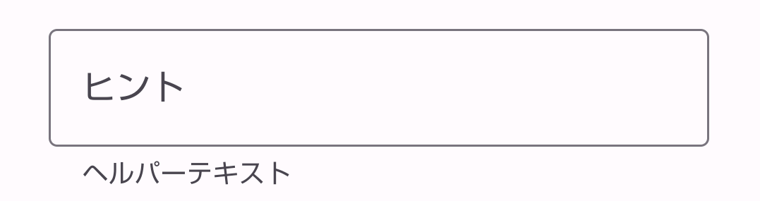 |
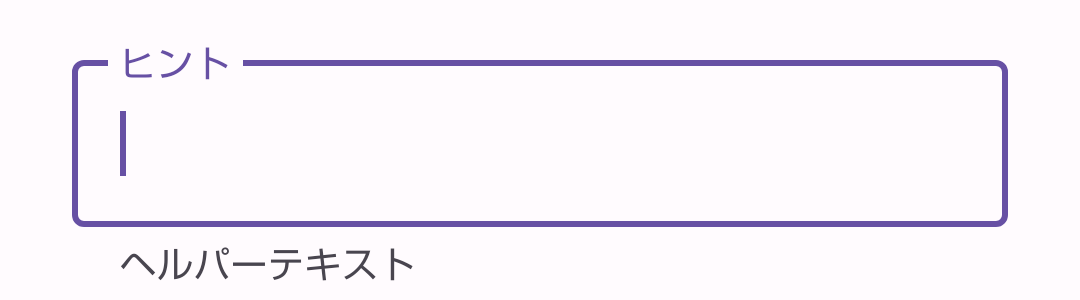 |
レイアウトファイルで設定
    <com.google.android.material.textfield.TextInputLayout
        android:layout_width="match_parent"
        android:layout_height="wrap_content"
        app:helperText="ヘルパーテキスト">

        <com.google.android.material.textfield.TextInputEditText
            android:layout_width="match_parent"
            android:layout_height="wrap_content"
            android:hint="ヒント"/>

    </com.google.android.material.textfield.TextInputLayout>
コードで設定
val textInputLayout = findViewById<TextInputLayout>(R.id.text_input_layout)
textInputLayout.helperText = "ヘルパーテキスト"
textInputLayout.hint = "ヒント"
スタイル
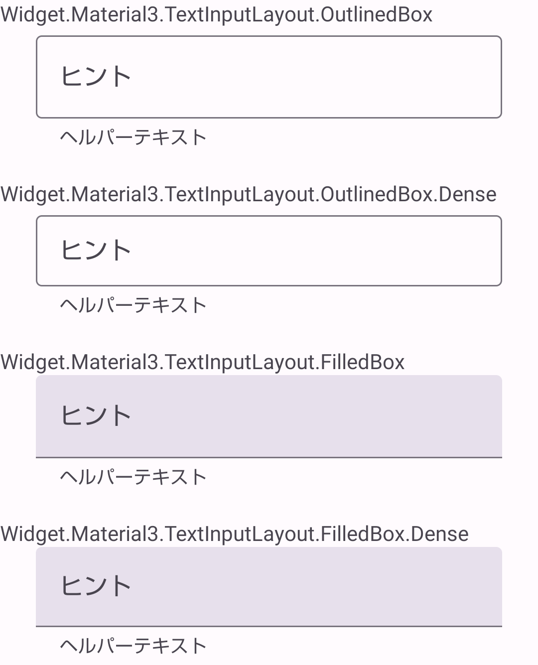
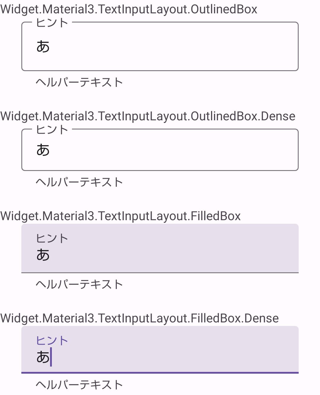
スタイルは標準で次のようなスタイルが用意されています。
Widget.Material3.TextInputLayout.OutlinedBoxWidget.Material3.TextInputLayout.OutlinedBox.DenseWidget.Material3.TextInputLayout.FilledBoxWidget.Material3.TextInputLayout.FilledBox.Dense
適用すると以下のような見た目になります。
| 未入力かつ非フォーカス | フォーカス中または入力後 |
|---|---|
 |
 |
レイアウトファイルで設定
    <com.google.android.material.textfield.TextInputLayout
        android:layout_width="match_parent"
        android:layout_height="wrap_content"
        style="@style/Widget.Material3.TextInputLayout.OutlinedBox">

        <com.google.android.material.textfield.TextInputEditText
            android:layout_width="match_parent"
            android:layout_height="wrap_content" />

    </com.google.android.material.textfield.TextInputLayout>
themes.xmlで設定
    <style name="Base.Theme.MyApplication" parent="Theme.Material3.DayNight.NoActionBar">
        <item name="textInputStyle">@style/Widget.Material3.TextInputLayout.OutlinedBox</item>
    </style>
アプリ内でデザインが異なるTextInputLayoutを使い分ける場合、attributeを指定する方法もあります。
レイアウトファイルで設定
    <com.google.android.material.textfield.TextInputLayout
        android:layout_width="match_parent"
        android:layout_height="wrap_content"
        style="?textInputFilledStyle">

        <com.google.android.material.textfield.TextInputEditText
            android:layout_width="match_parent"
            android:layout_height="wrap_content" />

    </com.google.android.material.textfield.TextInputLayout>

    <com.google.android.material.textfield.TextInputLayout
        android:layout_width="match_parent"
        android:layout_height="wrap_content"
        style="?textInputOutlinedStyle">

        <com.google.android.material.textfield.TextInputEditText
            android:layout_width="match_parent"
            android:layout_height="wrap_content" />

    </com.google.android.material.textfield.TextInputLayout>
色
枠線
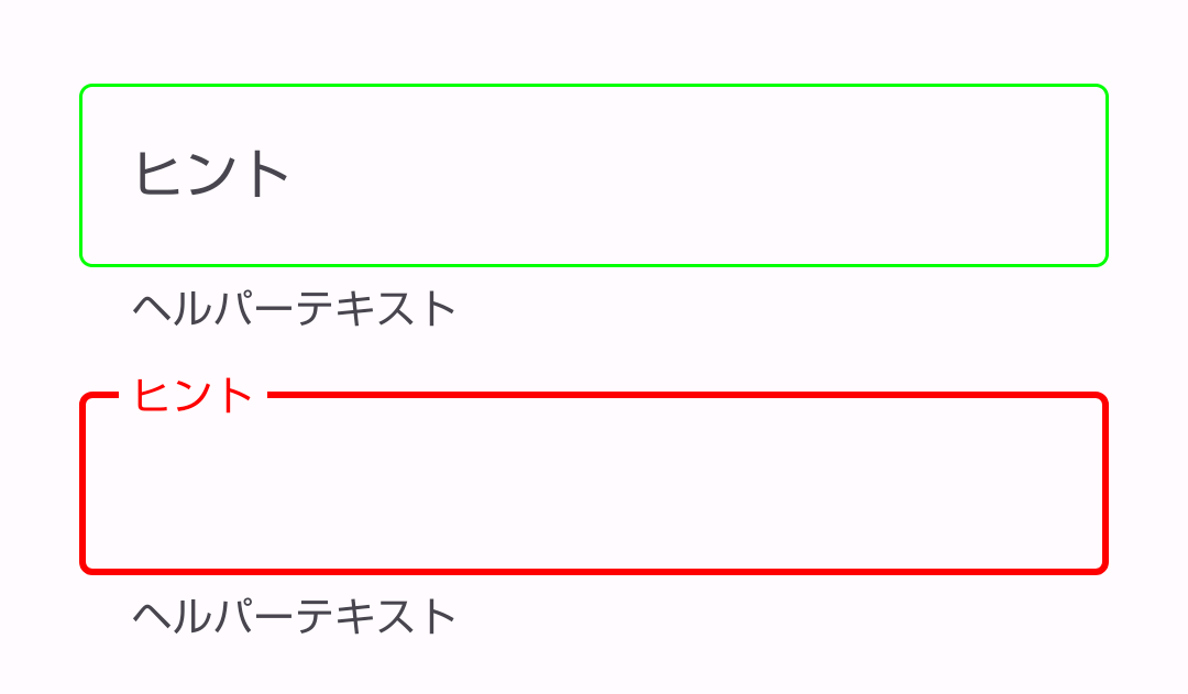
-
@style/Widget.Material3.TextInputLayout.OutlinedBoxで設定
theme.xml
    <style name="Base.Theme.MyApplication" parent="Theme.Material3.DayNight.NoActionBar">
        <item name="colorPrimary">#FF0000</item>
        <item name="colorOutline">#00FF00</item>
    </style>
- 独自スタイルで設定
theme.xml
    <style name="Base.Theme.MyApplication" parent="Theme.Material3.DayNight.NoActionBar">
        <item name="textInputStyle">@style/Widget.TextInputLayout.OutlinedBox</item>
    </style>

    <style name="Widget.TextInputLayout.OutlinedBox" parent="@style/Widget.Material3.TextInputLayout.OutlinedBox">
        <item name="boxStrokeColor">@color/text_input_layout_stroke_color</item>
    </style>
text_input_layout_stroke_color.xml
<selector xmlns:android="http://schemas.android.com/apk/res/android">
  <!-- Focused -->
  <item android:color="#FF0000" android:state_focused="true"/>
  <!-- Normal -->
  <item android:color="#00FF00"/>
</selector>
- レイアウトファイルで直接設定
    <com.google.android.material.textfield.TextInputLayout
        android:id="@+id/text_input_layout"
        android:layout_width="match_parent"
        android:layout_height="wrap_content"
        app:boxStrokeColor="@color/text_input_layout_stroke_color">

        <com.google.android.material.textfield.TextInputEditText
            android:layout_width="match_parent"
            android:layout_height="wrap_content"/>

    </com.google.android.material.textfield.TextInputLayout>