2022/10/05:最終更新
はじめに
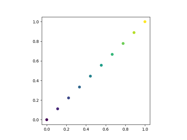
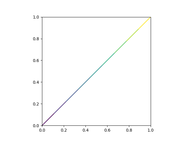
scatterのようにカラーマップを用いた描画を直線(plot)で行いたい.
今回はfor文を用いてそれを実現する.
scatterバージョン
直線バージョン(これを実現したい)
開発環境
Mac OS Montery v.12.6
Python 3.9.11
numpy = 1.23.3
matplotlib = 3.6.0
目次
- for文を使う方法
Chapter1
plot.py
import matplotlib.pyplot as plt
import numpy as np

#定数の宣言
DATA_RANGE=[0,1]
DATA_NUM=10
X=np.linspace(DATA_RANGE[0],DATA_RANGE[1],DATA_NUM)[:,None]
X=np.tile(X,(2))

#描画の宣言
fig=plt.figure()
gs=fig.add_gridspec(1,1)
ax1=fig.add_subplot(gs[0,0],aspect='equal')
cmap=plt.get_cmap('viridis')

#描画開始
for index in range(X.shape[0]-1):
    ax1.plot([X[index,0],X[index+1,0]],[X[index,1],X[index+1,1]],color=cmap(index/(X.shape[0]-2)))
plt.show()