はじめに
Pythonでデータを可視化する際によく使われるのが matplotlib です。
シンプルな折れ線グラフから、棒グラフ、散布図、複数グラフまで、幅広く対応できます。
本記事では、matplotlibの基本的な使い方を解説しながら、
折れ線・棒・散布図・複数グラフ・サイン波などの描画例を紹介します。
1. ライブラリのインストール
まずは必要なライブラリをインストールします。
pip install matplotlib japanize-matplotlib numpy
- matplotlib → データ可視化のためのライブラリ
- japanize_matplotlib → 日本語ラベルを使いたいときに便利
- numpy → サイン波・コサイン波の計算で使用
2. サンプルプログラム全体
以下のプログラムでは、5種類のグラフをまとめて学習できます。
import matplotlib.pyplot as plt
import japanize_matplotlib # 日本語表示用(補助的に使用)
import numpy as np
import random
# ==========================================================
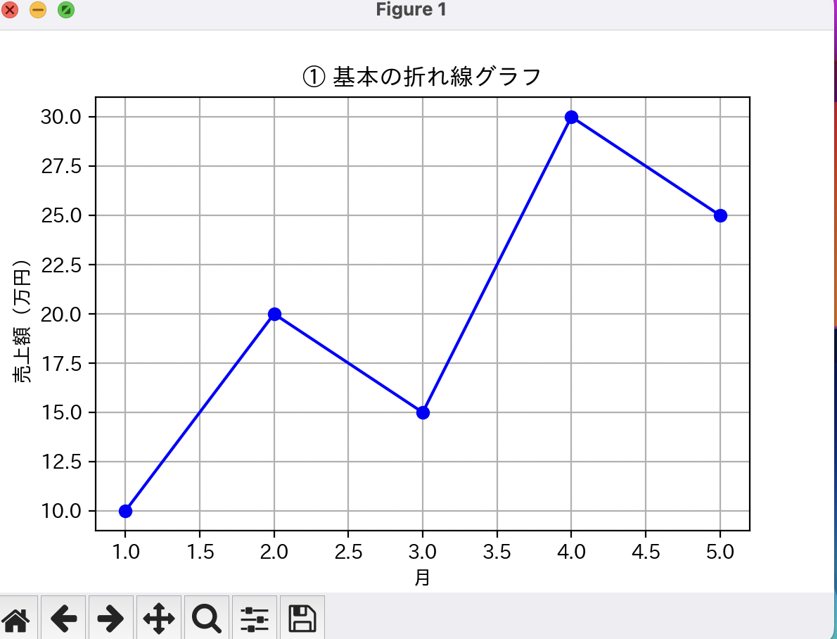
# ① 基本の折れ線グラフ
# ==========================================================
def plot_line_chart():
x = [1, 2, 3, 4, 5]
y = [10, 20, 15, 30, 25]
plt.figure(figsize=(6, 4))
plt.plot(x, y, marker="o", color="blue")
plt.title("① 基本の折れ線グラフ")
plt.xlabel("月")
plt.ylabel("売上額(万円)")
plt.grid()
plt.show()
# ==========================================================
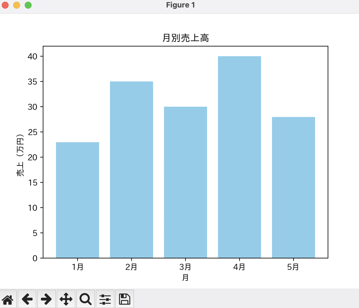
# ② 棒グラフ(Bar Chart)
# ==========================================================
def plot_bar_chart():
labels = ["1月", "2月", "3月", "4月", "5月"]
sales = [23, 35, 30, 40, 28]
plt.figure(figsize=(6, 4))
plt.bar(labels, sales, color="skyblue")
plt.title("② 月別売上高(棒グラフ)")
plt.xlabel("月")
plt.ylabel("売上(万円)")
plt.show()
# ==========================================================
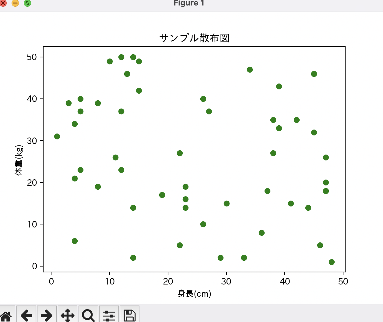
# ③ 散布図(Scatter Plot)
# ==========================================================
def plot_scatter_chart():
x = [random.randint(0, 50) for _ in range(50)]
y = [random.randint(0, 50) for _ in range(50)]
plt.figure(figsize=(6, 4))
plt.scatter(x, y, color="green")
plt.title("③ サンプル散布図")
plt.xlabel("身長(cm)")
plt.ylabel("体重(kg)")
plt.show()
# ==========================================================
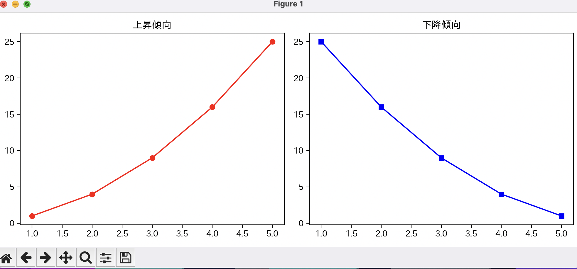
# ④ 複数グラフの描画(サブプロット)
# ==========================================================
def plot_multiple_charts():
x = [1, 2, 3, 4, 5]
y1 = [1, 4, 9, 16, 25]
y2 = [25, 16, 9, 4, 1]
fig, axs = plt.subplots(1, 2, figsize=(10, 4))
# 左のグラフ
axs[0].plot(x, y1, color="red", marker="o")
axs[0].set_title("上昇傾向")
# 右のグラフ
axs[1].plot(x, y2, color="blue", marker="s")
axs[1].set_title("下降傾向")
fig.suptitle("④ 複数グラフの描画")
plt.tight_layout()
plt.show()
# ==========================================================
# ⑤ 実践例:サイン波とコサイン波
# ==========================================================
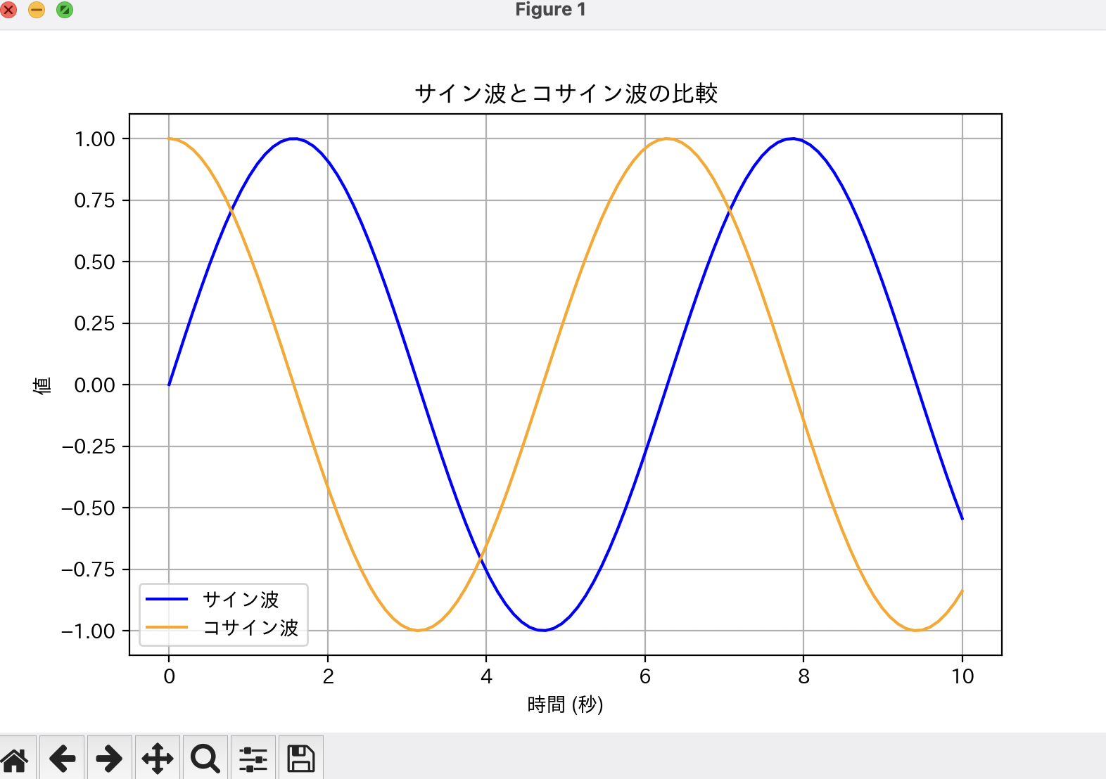
def plot_sin_cos():
x = np.linspace(0, 10, 100)
y1 = np.sin(x)
y2 = np.cos(x)
plt.figure(figsize=(8, 5))
plt.plot(x, y1, label="サイン波", color="blue")
plt.plot(x, y2, label="コサイン波", color="orange")
plt.title("⑤ サイン波とコサイン波の比較")
plt.xlabel("時間 (秒)")
plt.ylabel("値")
plt.legend()
plt.grid()
plt.show()
# ==========================================================
# メイン関数
# ==========================================================
def main():
print("=== matplotlib 学習プログラム ===")
print("1: 折れ線グラフ")
print("2: 棒グラフ")
print("3: 散布図")
print("4: 複数グラフ")
print("5: サイン波とコサイン波")
print("6: 全部まとめて表示")
choice = input("見たいグラフの番号を入力してください: ")
if choice == "1":
plot_line_chart()
elif choice == "2":
plot_bar_chart()
elif choice == "3":
plot_scatter_chart()
elif choice == "4":
plot_multiple_charts()
elif choice == "5":
plot_sin_cos()
elif choice == "6":
plot_line_chart()
plot_bar_chart()
plot_scatter_chart()
plot_multiple_charts()
plot_sin_cos()
else:
print("無効な入力です。1〜6を入力してください。")
if __name__ == "__main__":
main()
3. プログラムの解説
① 折れ線グラフ
plt.plot(x, y, marker="o", color="blue")
-
plt.plot()… 折れ線グラフを描画 -
marker="o"… データ点に丸を付ける -
color="blue"… 線の色を青に設定
② 棒グラフ
plt.bar(labels, sales, color="skyblue")
-
plt.bar()… 棒グラフを描画 - ラベルに 日本語(1月, 2月…) を直接指定可能
③ 散布図
plt.scatter(x, y, color="green")
- 点の分布を可視化するのに便利
-
random.randint()でランダムなサンプルデータを生成
④ 複数グラフ(サブプロット)
fig, axs = plt.subplots(1, 2, figsize=(10, 4))
- 1行2列 のレイアウトで2つのグラフを並べて表示
-
axs[0]→ 左側、axs[1]→ 右側
⑤ サイン波とコサイン波
x = np.linspace(0, 10, 100)
y1 = np.sin(x)
y2 = np.cos(x)
-
np.linspace(0, 10, 100)→ 0〜10を100分割したデータ -
plt.legend()→ 凡例を表示
まとめ
-
matplotlibはPythonで最も使われるデータ可視化ライブラリ - 折れ線・棒・散布図・複数グラフ・サイン波をまとめて学習可能
-
japanize_matplotlibを使えば、日本語ラベルも簡単に対応できる - このプログラムで基本を押さえれば、データ分析にも応用できる
おわりに
本記事では、matplotlibの基礎を学びながら、
日本語対応したグラフ描画を行う方法も紹介しました。
次回はさらに発展して、以下の内容も記事にしたいと思います:
- matplotlibのデザインカスタマイズ
- pandasとの連携によるデータ可視化
- 実データを使ったグラフ分析
ぜひ参考にしてみてください!