全体の色を変えたりラベルの内容を変えて見た目を自分好みにしてみる。
17/10/06 すいません。少し古い内容を書いておりました。
変更箇所は主にグラフ同士の隙間とかのあたりです。
事前準備
Matplotlibのグラフに日本語が含まれていると、標準では文字化けします。
そこで、下記URLからIPAex明朝かIPAexゴシックをダウンロードして解凍後、解凍フォルダ内のipaexg.ttfファイルをPythonファイルと同じディレクトリに保存します。

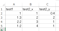
今回は、このような内容のエクセルファイルを読み込ませました。
必要なパッケージをインストール
conda install numpy
conda install matplotlib
conda install xlrd
画像全体の設定
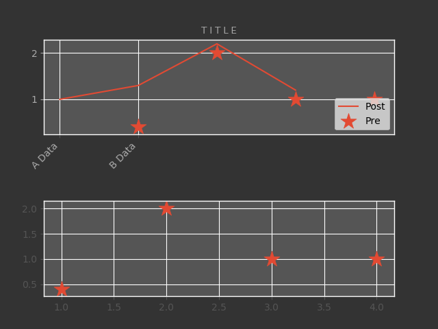
example
# ! env python
# -*- coding: utf-8 -*-

import os
import sys
import matplotlib

matplotlib.use
import matplotlib.pyplot as plt
import numpy as np
import xlrd


class TestClass(object):
    def __init__(self):
        # ggplotをバックエンドで使用する
        plt.style.use('ggplot')
        # ダウンロードしておいたフォントのパスを入力
        self.__FONT_PATH = 'ipaexg.ttf'
        return

    def run(self):
        # データを取り込み(エクセルファイル)
        book = xlrd.open_workbook("Book1.xlsx")
        # 最初のシートを読み込み
        sheet_1 = book.sheet_by_index(0)
        # Numpyで0行、エクセルの列数分の列生成
        data = np.empty((0, sheet_1.ncols), float)
        # numpyにデータを入れる
        for row in range(1, sheet_1.nrows):
            arr = []
            for col in range(sheet_1.ncols):
                arr.append(sheet_1.cell_value(rowx=row, colx=col))
            data = np.append(data, np.array([arr]), axis=0)

        # キャンパスを作成
        fig = plt.figure()
        # キャンパスの下0.1、左0.1、横のグラフ同士の幅0.1、縦のグラフ同士の幅0.7
        fig.subplots_adjust(bottom=0.1, left=0.1, wspace=0.1, hspace=0.7)
        # 画像の枠あたりの色を変更
        fig.patch.set_facecolor('#333333')
        # フォントの指定
        prop = matplotlib.font_manager.FontProperties(fname=self.__FONT_PATH)

        # 枠
        # 2行1列の1番目のグラフという形で作成
        ax = fig.add_subplot(2, 1, 1)
        # サブプロットにグラフ作成
        ax.plot(data[:, 0])
        # 作ったグラフの上に点グラフを重ねる(marker="*"で星型, s=300はマーカーのサイズ)
        ax.scatter(data[:, 1], data[:, 2], marker="*", s=300)
        # 凡例を追加して、右下に表示させる
        ax.legend(["Post", "Pre"], loc='lower right')
        # 表の中身の色を指定
        ax.patch.set_facecolor('#555555')
        # タイトル
        ax.set_title('T I T L E', color='#AAAAAA', fontproperties=prop)
        # 行列のラベル設定(数が一致していなくてもエラーは出ない)
        tmp_column_names = ["A Data", "B Data"]
        ticks = ax.set_xticks(range(len(tmp_column_names)))
        # X軸のラベルの色、角度、右端で揃えることを指定
        ax.set_xticklabels(tmp_column_names, color="#AAAAAA", rotation=45, horizontalalignment="right")
        # Y軸のラベルの色を指定
        ax.tick_params(axis='y', colors='#AAAAAA')

        # 2行1列の2番目のグラフという形で作成
        ax2 = fig.add_subplot(2, 1, 2)
        ax2.scatter(data[:, 1], data[:, 2], marker="*", s=300, label="SCATTER")
        ax2.patch.set_facecolor('#555555')

        # 画像として保存
        fig.savefig("graph.png", facecolor=fig.get_facecolor(), edgecolor='none', color="#AAAAAA")
        # 画面表示
        plt.show()


if __name__ == '__main__':
    tmp = TestClass()
    tmp.run()