今回新規事業のサービス立ち上げに伴い、下記webサイトを作成しました。
子供向けプログラミングスクール スタートプログラミング
このサイトにはfloatプロパティを一切使用していません。
Flexboxプロパティのみを使用し実装しました。
今回はこのFlexboxについて簡単にまとめてみました。
Flexboxとは?
Flexbox(可変ボックス)とはCSS3から登場したレイアウトモジュールになります。
横並びを実現するだけではなく、上下中央揃えやレスポンシブ化も簡単に実装できます。
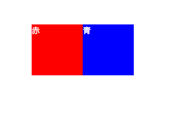
boxを並べてみる
実際にこの2つのボックスを並べてみました。
ソースコード
<div>
    <ul class="parent">
        <li class="children">赤</li>
        <li class="children">青</li>
    </ul>
</div>

<style>
    /* 親要素にflexを指定 */
    .parent{
        display: flex;
    }
    /* 子要素は基本スタイルのみ */
    .children{
        color: #fff;
        width: 100px;
        height: 100px;
    }
    .children:nth-child(1){
        background-color: red;
    }
    .children:nth-child(2){
        background-color: blue;
    }
</style>
親要素にdisplay:flexを指定しただけになります。
これで、子要素が可変ボックス(正確にはwidthを指定しているので可変ではないです)になりました!
floatでは回りこみなども考えないといけないので、楽ですね。
boxを均等に並べてみる
親要素にwidth:300pxを指定し、子要素を300pxの中で均等に配置しました。

ソースコード
<div>
    <ul class="parent">
        <li class="children">赤</li>
        <li class="children">青</li>
    </ul>
</div>

<style>
    /* 親要素にflexを指定 */
    .parent{
        width: 300px;
        display: flex;
        justify-content: space-between;
    }
    /* 子要素は基本スタイルのみ */
    .children{
        color: #fff;
        width: 100px;
        height: 100px;
    }
    .children:nth-child(1){
        background-color: red;
    }
    .children:nth-child(2){
        background-color: blue;
    }
</style>
親要素にwidth:300pxを指定し、幅を指定。
そのあとに、親要素にjustify-content: space-between;を指定し、均等に配置しました。
このjustify-contentプロパティは非常に優秀で、以下の指定ができます。
justify-content: space-between
均等に配置justify-content: space-around
均等に配置し、先端・終端には余白を設けるjustify-content: flex-start
左詰めで配置justify-content: justify-content: flex-end
右詰めで配置justify-content: center
中央に配置
boxの中の文字を上下揃えにする
position: absoluteを使わずに、上下揃えを実装しました。

ソースコード
<div>
    <ul class="parent">
        <li class="children">赤</li>
        <li class="children">青</li>
    </ul>
</div>

<style>
    /* 親要素にflexを指定 */
    .parent{
        width: 300px;
        display: flex;
        justify-content: space-between;
    }
    .children{
        color: #fff;
        width: 100px;
        height: 100px;
        display: flex;
        align-items: center;
    }
    .children:nth-child(1){
        background-color: red;
    }
    .children:nth-child(2){
        background-color: blue;
    }
</style>
今まで子要素だったchildrenが文字の親要素になるためdisplay: flex;スタイルを付与しました。(クラス名がchildrenなのに親要素になったのは華麗にスルーしてくださいw)
このchildrenにもう一つalign-items: center;を実装するだけで、上下揃えが実装できます。
position: absoluteを使うと色々面倒なことになりますが、簡単に実装できました。
このalign-itemsプロパティは他にも以下の指定ができます。
align-items: center
上下中央に配置align-items: stretch
親要素内いっぱいに表示align-items: flex-start
上揃えに配置align-items: flex-end
下揃えで配置align-items: baseline
ベースラインで配置
boxの中の文字を上下左右中央揃えにする
align-items と justify-contentを同時に使用して、文字を上下中央揃えにしました。

ソースコード
<div>
    <ul class="parent">
        <li class="children">赤</li>
        <li class="children">青</li>
    </ul>
</div>

<style>
    /* 親要素にflexを指定 */
    .parent{
        width: 300px;
        display: flex;
        justify-content: space-between;
    }
    .children{
        color: #fff;
        width: 100px;
        height: 100px;
        display: flex;
        align-items: center;
        justify-content: center;
    }
    .children:nth-child(1){
        background-color: red;
    }
    .children:nth-child(2){
        background-color: blue;
    }
</style>
上下揃えに使用したalign-items: center;と左右中央揃えができるjustify-content: centerを同時に使用しました。
これでわずか数行で簡単に上下左右揃えができました!!
ブラウザのサポート状況
ブラウザのサポートが確認できるCan I Useではこのようになっています。
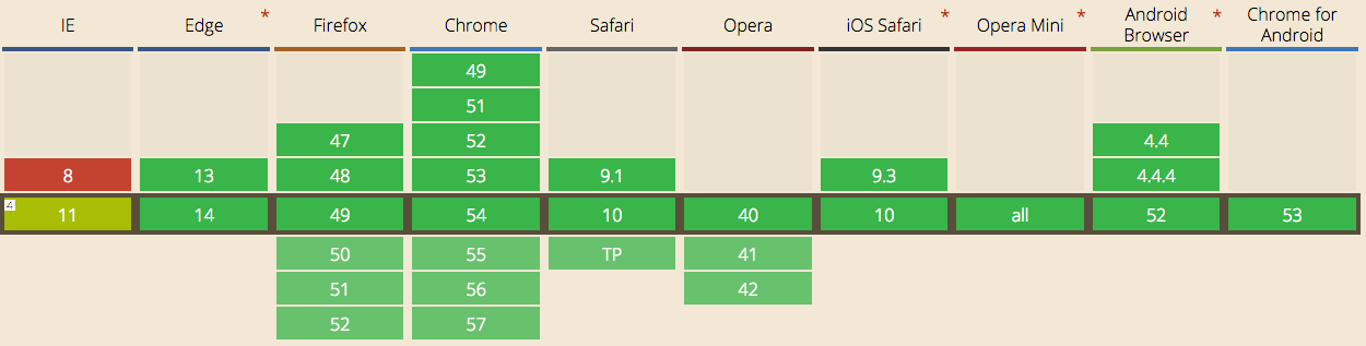
IEが・・・となる方も中にはいらっしゃるかもしれませんが、一応flexibilityを使用すれば動作します。
しかし、念をおしてIEの8,9に対応しないといけない場合は、諦めましょう。
正常なブラウザなら、ちゃんと動作しますが、念のためにベンダープレフィックスを付与するのが、懸命です。gulpなどを使用すれば、ベンダープレフィックスの実装が自動化できるので便利なものはどんどん使いましょう!!
参考記事:CSSベンダープレフィックス-webkit-を今この瞬間に辞める為のAutoprefixerの導入とお薦め設定
Flexboxを学ぶのにオススメのサイト
今回はFlexboxについて簡単に、説明させていただきました。
ですが、まだまだ便利な機能やプロパティがあり、きちんと勉強することで、バグの無い便利な実装ができます。
以下のサイトがオススメなので是非ご覧ください。
CSSレイアウトにfloatはもう古い! Webデザイナー初心者でも始められるFlexbox入門 - ICS MEDIA
CSS Flexboxの勉強に最適!コピペですぐに使えるレイアウトやコンポーネントを実装するコードのまとめ - coliss
Flecbox以外にも便利な物はたくさん出てきています。
フロントエンドの流行の流れはとても早いですが、便利ならどんどん採用して、開発効率をあげていくべきなので、是非今回Flexboxを初めて知った方は使用してみてください!