x軸が日付のとき、グラフの推移に曜日が関係していることがあります。
土曜日と日曜日がどの辺りなのか分かりやすいように色をつける方法を考えました。
ライブラリのインポートと、サンプルデータの用意をします。
import numpy as np
import pandas as pd
import matplotlib.pyplot as plt
import datetime
%matplotlib inline

df = pd.DataFrame()
for day in (datetime.date(2018, 9, 1) + datetime.timedelta(x) for x in range(30)):
    df = df.append(pd.DataFrame([[day, np.random.rand()]],
                                columns = ['date','value']), ignore_index=True, sort=True)
df.head()
| date | value |
|---|---|
| 0 | 2018-09-01 |
| 1 | 2018-09-02 |
| 2 | 2018-09-03 |
| 3 | 2018-09-04 |
| 4 | 2018-09-05 |
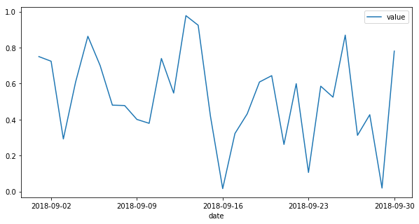
そのままプロットするとこんな感じです。
df.plot('date', 'value', figsize=(10,5))
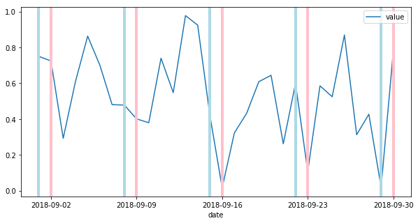
x軸が土曜日か日曜日の時だけ線を入れるように関数を作ります。
def weekend_marker(start, end):
    num = (end - start).days + 1
    for day in (start + datetime.timedelta(x) for x in range(num)):
        if day.weekday() == 5:
            plt.axvline(x=day, linewidth=4, color='lightblue')
        elif day.weekday() == 6:
            plt.axvline(x=day, linewidth=4, color='pink')
開始日と終了日を渡せば線が表示されるようになりました。
df.plot('date', 'value', figsize=(10,5))
weekend_marker(datetime.date(2018, 9, 1), datetime.date(2018,9,30))