はじめに
Day 3 で確定したトークンを今回は Figma の Tokens Studio プラグインを使って登録し、自動的に CSS/JSON に出力させます。
前回はこちら。
| 日程 | テーマ | 内容 |
|---|---|---|
| Day 1 | 環境構築 | Next.js + TypeScript セットアップ |
| Day 2 | Cursor × Figma MCP 連携設定 | Cursor で Figma デザインを読み込めるようにする |
| Day 3 | デザイン分析・精査 | AI がトークン/コンポーネント提案 → 人間が精査 |
| ☆ Day 4 | Tokens Studio登録 | AI の提案をトークンとして登録 |
| Day 5 | シンプルなコンポーネント実装 | Button, Input, Card など基本部品を実装 |
| Day 6 | ダッシュボード完成 | 全コンポーネント統合・完成 |
| Day 7 | 完結・まとめ | 6日間の体験総括 |
Tokens Studio とは
Tokens Studio とは、Figma上でデザイントークンを管理できるプラグインです。
これを使うことで以下のように自動化することを目指します。
トークン定義(JSON)
  ↓ (Tokens Studio が読む)
CSS/JSON に自動エクスポート
  ↓
tailwind.config.ts で読み込み可能
セットアップ
- Figma を開く
- メニューから「Plugins」 → 「Search plugins」を選択
- 「Tokens Studio」を検索
- 「Install」をクリック
- インストール完了後、「New Empty file」をクリック
トークンを登録
Day3で精査したデザイントークンを登録していきます。登録する意図としては、今後新しいデザイントークンを増やすという想定のためです。
今回は勉強目的のため、次の作業で行うエクスポートされる JSON ファイルとインポートする¥ JSON ファイルの中身は変わりません。
登録は Cursor に Figma のデザインを読み取らせ、Token Studio でインポートできるようにトークンを JSON ファイルに出力してもらいます。
トークンのJSONファイル
{
  "color": {
    "background": {
      "primary": {
        "$value": "#FFFFFF",
        "$type": "color",
        "$description": "カード背景、メインコンテンツ背景"
      },
      "secondary": {
        "$value": "#F9FAFB",
        "$type": "color",
        "$description": "ページ背景"
      },
      "tertiary": {
        "$value": "#F1F2F4",
        "$type": "color",
        "$description": "チャートエリア背景、ユーザーアイコン背景"
      },
      "sidebar": {
        "$value": "#1F2937",
        "$type": "color",
        "$description": "サイドバー背景"
      }
    },
    "text": {
      "primary": {
        "$value": "#1E1E1E",
        "$type": "color",
        "$description": "メインテキスト(KPI 値、タイトルなど)"
      },
      "secondary": {
        "$value": "#4B5563",
        "$type": "color",
        "$description": "サブテキスト(カードタイトル、説明など)"
      },
      "white": {
        "$value": "#FFFFFF",
        "$type": "color",
        "$description": "反転テキスト(サイドバー、ボタン)"
      },
      "link": {
        "$value": "#6439FF",
        "$type": "color",
        "$description": "リンクテキスト(View →)"
      }
    },
    "status": {
      "success": {
        "background": {
          "$value": "#DCFCE7",
          "$type": "color",
          "$description": "Completed ステータス背景"
        },
        "text": {
          "$value": "#27894D",
          "$type": "color",
          "$description": "Completed ステータステキスト、変化率(増加)"
        }
      },
      "warning": {
        "background": {
          "$value": "#FEF9C3",
          "$type": "color",
          "$description": "Pending ステータス背景"
        },
        "text": {
          "$value": "#864D0F",
          "$type": "color",
          "$description": "Pending ステータステキスト"
        }
      },
      "error": {
        "background": {
          "$value": "#FFE2E2",
          "$type": "color",
          "$description": "Failed ステータス背景"
        },
        "text": {
          "$value": "#E74343",
          "$type": "color",
          "$description": "Failed ステータステキスト、変化率(減少)"
        }
      }
    },
    "accent": {
      "indigo": {
        "$value": "#6366F1",
        "$type": "color",
        "$description": "KPI カードボーダー(Total Revenue)、ナビゲーションアクティブ"
      },
      "indigoDark": {
        "$value": "#6439FF",
        "$type": "color",
        "$description": "ボタン背景、リンクテキスト"
      },
      "orange": {
        "$value": "#F17663",
        "$type": "color",
        "$description": "KPI カードボーダー(Active Users)"
      },
      "green": {
        "$value": "#16A349",
        "$type": "color",
        "$description": "KPI カードボーダー(Conversion Rate)"
      },
      "red": {
        "$value": "#991B1B",
        "$type": "color",
        "$description": "KPI カードボーダー(Monthly Recurring)"
      }
    },
    "icon": {
      "background": {
        "indigo": {
          "$value": "#DFE7FF",
          "$type": "color",
          "$description": "KPI カードアイコン背景(Total Revenue)"
        },
        "orange": {
          "$value": "#FFF2DC",
          "$type": "color",
          "$description": "KPI カードアイコン背景(Active Users)"
        },
        "green": {
          "$value": "#DCFCE7",
          "$type": "color",
          "$description": "KPI カードアイコン背景(Conversion Rate)"
        },
        "red": {
          "$value": "#FFCECE",
          "$type": "color",
          "$description": "KPI カードアイコン背景(Monthly Recurring)"
        }
      }
    },
    "border": {
      "default": {
        "$value": "#B2B2B2",
        "$type": "color",
        "$description": "ボーダー、区切り線、ドロップダウン"
      }
    }
  },
  "dimension": {
    "spacing": {
      "0": {
        "$value": "0px",
        "$type": "dimension"
      },
      "4": {
        "$value": "4px",
        "$type": "dimension"
      },
      "8": {
        "$value": "8px",
        "$type": "dimension"
      },
      "10": {
        "$value": "10px",
        "$type": "dimension"
      },
      "16": {
        "$value": "16px",
        "$type": "dimension"
      },
      "24": {
        "$value": "24px",
        "$type": "dimension"
      },
      "32": {
        "$value": "32px",
        "$type": "dimension"
      },
      "40": {
        "$value": "40px",
        "$type": "dimension"
      },
      "48": {
        "$value": "48px",
        "$type": "dimension"
      },
      "60": {
        "$value": "60px",
        "$type": "dimension"
      },
      "xs": {
        "$value": "8px",
        "$type": "dimension",
        "$description": "Extra small spacing"
      },
      "sm": {
        "$value": "10px",
        "$type": "dimension",
        "$description": "Small spacing"
      },
      "md": {
        "$value": "16px",
        "$type": "dimension",
        "$description": "Medium spacing"
      },
      "lg": {
        "$value": "24px",
        "$type": "dimension",
        "$description": "Large spacing"
      },
      "xl": {
        "$value": "32px",
        "$type": "dimension",
        "$description": "Extra large spacing"
      },
      "2xl": {
        "$value": "40px",
        "$type": "dimension",
        "$description": "2X large spacing"
      },
      "3xl": {
        "$value": "48px",
        "$type": "dimension",
        "$description": "3X large spacing"
      },
      "4xl": {
        "$value": "60px",
        "$type": "dimension",
        "$description": "4X large spacing"
      }
    },
    "borderRadius": {
      "none": {
        "$value": "0px",
        "$type": "dimension"
      },
      "sm": {
        "$value": "4px",
        "$type": "dimension"
      },
      "md": {
        "$value": "8px",
        "$type": "dimension"
      },
      "lg": {
        "$value": "10px",
        "$type": "dimension"
      },
      "xl": {
        "$value": "12px",
        "$type": "dimension"
      },
      "2xl": {
        "$value": "20px",
        "$type": "dimension"
      },
      "full": {
        "$value": "50px",
        "$type": "dimension"
      },
      "card": {
        "$value": "10px",
        "$type": "dimension",
        "$description": "カードの角丸"
      },
      "button": {
        "$value": "10px",
        "$type": "dimension",
        "$description": "ボタンの角丸"
      },
      "dropdown": {
        "$value": "4px",
        "$type": "dimension",
        "$description": "ドロップダウンの角丸"
      },
      "statusTag": {
        "$value": "50px",
        "$type": "dimension",
        "$description": "ステータスバッジの角丸"
      },
      "iconArea": {
        "$value": "10px",
        "$type": "dimension",
        "$description": "アイコンエリアの角丸"
      }
    },
    "size": {
      "userIcon": {
        "width": {
          "$value": "48px",
          "$type": "dimension"
        },
        "height": {
          "$value": "48px",
          "$type": "dimension"
        }
      },
      "kpiCard": {
        "contentWidth": {
          "$value": "195px",
          "$type": "dimension"
        },
        "iconSize": {
          "$value": "48px",
          "$type": "dimension"
        }
      },
      "dropdown": {
        "iconSize": {
          "$value": "16px",
          "$type": "dimension"
        }
      },
      "frame": {
        "width": {
          "$value": "1440px",
          "$type": "dimension"
        },
        "height": {
          "$value": "1140px",
          "$type": "dimension"
        }
      }
    }
  },
  "fontFamily": {
    "sans": {
      "$value": ["Inter", "system-ui", "sans-serif"],
      "$type": "fontFamily"
    }
  },
  "fontSize": {
    "xs": {
      "$value": "12px",
      "$type": "dimension"
    },
    "sm": {
      "$value": "14px",
      "$type": "dimension"
    },
    "base": {
      "$value": "16px",
      "$type": "dimension"
    },
    "lg": {
      "$value": "18px",
      "$type": "dimension"
    },
    "xl": {
      "$value": "20px",
      "$type": "dimension"
    },
    "2xl": {
      "$value": "24px",
      "$type": "dimension"
    },
    "3xl": {
      "$value": "28px",
      "$type": "dimension"
    },
    "4xl": {
      "$value": "36px",
      "$type": "dimension"
    },
    "5xl": {
      "$value": "40px",
      "$type": "dimension"
    },
    "6xl": {
      "$value": "60px",
      "$type": "dimension"
    }
  },
  "fontWeight": {
    "normal": {
      "$value": 400,
      "$type": "fontWeight"
    },
    "medium": {
      "$value": 500,
      "$type": "fontWeight"
    },
    "semibold": {
      "$value": 600,
      "$type": "fontWeight"
    },
    "bold": {
      "$value": 700,
      "$type": "fontWeight"
    }
  },
  "lineHeight": {
    "tight": {
      "$value": 1.21,
      "$type": "number"
    },
    "normal": {
      "$value": 1.5,
      "$type": "number"
    },
    "relaxed": {
      "$value": 1.75,
      "$type": "number"
    },
    "headingH1": {
      "$value": 1.2102272851126534,
      "$type": "number",
      "$description": "Heading/H1 の行間"
    },
    "headingH2": {
      "$value": 1.2102272510528564,
      "$type": "number",
      "$description": "Heading/H2 の行間"
    },
    "body": {
      "$value": 1.2102272510528564,
      "$type": "number",
      "$description": "Body の行間"
    }
  }
}
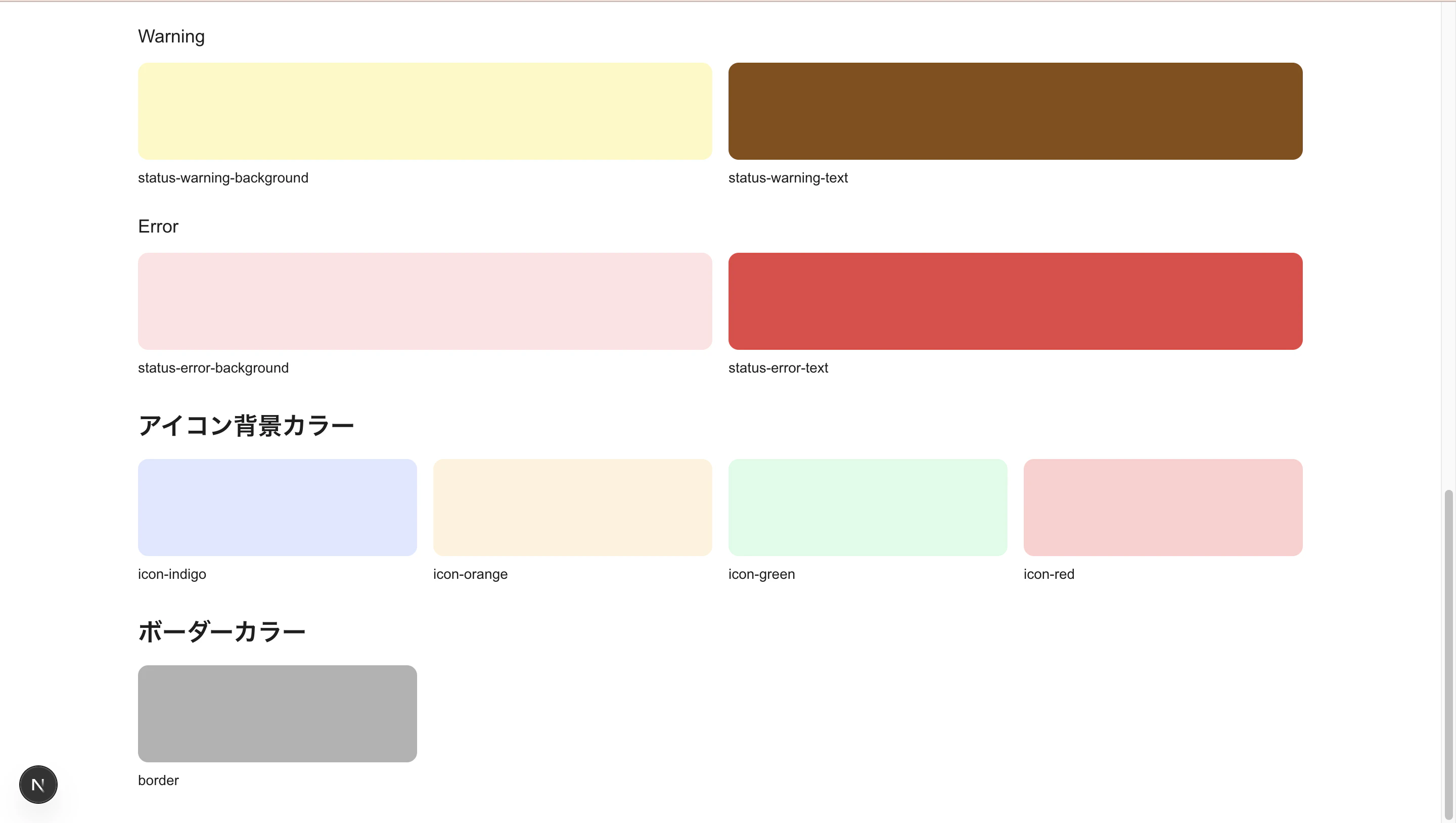
インポートされるとこのようにトークンが表示されます。

トークンをエクスポート
Tokens Studio のメニューから「Export」を選択します。
「Multiple files」を選択後、すべてのスタイルを JSON ファイルとしてエクスポートし、src/tokens 配下に設置します。
Tailwind CSS と統合
tailwind にスタイルを適用します。
tailwind.config.ts
import { tokens } from "./src/lib/tokens";

const config = {
  content: ["./src/pages/**/*.{js,ts,jsx,tsx,mdx}", "./src/components/**/*.{js,ts,jsx,tsx,mdx}", "./src/app/**/*.{js,ts,jsx,tsx,mdx}"],
  theme: {
    extend: {
      colors: {
        primary: tokens.colors.primary?.value || tokens.colors.primary,
        background: {
          DEFAULT: tokens.colors.background?.value || tokens.colors.background,
          primary: tokens.colors.background?.primary?.value,
          secondary: tokens.colors.background?.secondary?.value,
          tertiary: tokens.colors.background?.tertiary?.value,
          sidebar: tokens.colors.background?.sidebar?.value,
        },
        text: {
          DEFAULT: tokens.colors.text?.value || tokens.colors.text,
          primary: tokens.colors.text?.primary?.value,
          secondary: tokens.colors.text?.secondary?.value,
          white: tokens.colors.text?.white?.value,
          link: tokens.colors.text?.link?.value,
        },
        status: {
          success: {
            background: tokens.colors.status?.success?.background?.value,
            text: tokens.colors.status?.success?.text?.value,
          },
          warning: {
            background: tokens.colors.status?.warning?.background?.value,
            text: tokens.colors.status?.warning?.text?.value,
          },
          error: {
            background: tokens.colors.status?.error?.background?.value,
            text: tokens.colors.status?.error?.text?.value,
          },
        },
        accent: {
          DEFAULT: tokens.colors.accent?.value || tokens.colors.accent,
          indigo: tokens.colors.accent?.indigo?.value,
          indigoDark: tokens.colors.accent?.indigoDark?.value,
          orange: tokens.colors.accent?.orange?.value,
          green: tokens.colors.accent?.green?.value,
          red: tokens.colors.accent?.red?.value,
        },
        icon: {
          indigo: tokens.colors.icon?.background?.indigo?.value,
          orange: tokens.colors.icon?.background?.orange?.value,
          green: tokens.colors.icon?.background?.green?.value,
          red: tokens.colors.icon?.background?.red?.value,
        },
        border: {
          default: tokens.colors.border?.default?.value,
        },
      },
      spacing: {
        xs: tokens.spacing.xs?.value,
        sm: tokens.spacing.sm?.value,
        md: tokens.spacing.md?.value,
        lg: tokens.spacing.lg?.value,
      },
      fontSize: {
        xs: tokens.fontSize.xs?.value,
        sm: tokens.fontSize.sm?.value,
        base: tokens.fontSize.base?.value,
        lg: tokens.fontSize.lg?.value,
        xl: tokens.fontSize.xl?.value,
        "2xl": tokens.fontSize["2xl"]?.value,
        "3xl": tokens.fontSize["3xl"]?.value,
        "4xl": tokens.fontSize["4xl"]?.value,
        "5xl": tokens.fontSize["5xl"]?.value,
        "6xl": tokens.fontSize["6xl"]?.value,
      },
      fontFamily: {
        sans: tokens.fontFamily.sans?.value,
      },
      fontWeight: {
        normal: tokens.fontWeight.normal?.value,
        medium: tokens.fontWeight.medium?.value,
        semibold: tokens.fontWeight.semibold?.value,
        bold: tokens.fontWeight.bold?.value,
      },
      lineHeight: {
        tight: tokens.lineHeight.tight?.value,
        normal: tokens.lineHeight.normal?.value,
        relaxed: tokens.lineHeight.relaxed?.value,
        headingH1: tokens.lineHeight.headingH1?.value,
        headingH2: tokens.lineHeight.headingH2?.value,
        body: tokens.lineHeight.body?.value,
      },
      borderRadius: {
        none: tokens.borderRadius.none?.value,
        sm: tokens.borderRadius.sm?.value,
        md: tokens.borderRadius.md?.value,
        lg: tokens.borderRadius.lg?.value,
        xl: tokens.borderRadius.xl?.value,
        "2xl": tokens.borderRadius["2xl"]?.value,
        full: tokens.borderRadius.full?.value,
        card: tokens.borderRadius.card?.value,
        button: tokens.borderRadius.button?.value,
        dropdown: tokens.borderRadius.dropdown?.value,
        statusTag: tokens.borderRadius.statusTag?.value,
        iconArea: tokens.borderRadius.iconArea?.value,
      },
    },
  },
  plugins: [],
};

export default config;
global.css
@config "../../tailwind.config.ts";
tokens.ts
import colorData from "../tokens/color.json";
import dimensionData from "../tokens/dimension.json";
import fontFamilyData from "../tokens/fontFamily.json";
import fontSizeData from "../tokens/fontSize.json";
import fontWeightData from "../tokens/fontWeight.json";
import lineHeightData from "../tokens/lineHeight.json";

// $valueをvalueに変換する再帰関数
function transformTokens(obj: any): any {
  if (obj === null || typeof obj !== "object") {
    return obj;
  }

  if (Array.isArray(obj)) {
    return obj.map(transformTokens);
  }

  // $valueをvalueに変換
  if ("$value" in obj) {
    return {
      ...Object.fromEntries(Object.entries(obj).filter(([key]) => key !== "$value")),
      value: obj.$value,
    };
  }

  // 再帰的に変換
  return Object.fromEntries(Object.entries(obj).map(([key, value]) => [key, transformTokens(value)]));
}

// 各トークンファイルを変換
const color = transformTokens(colorData);
const dimension = transformTokens(dimensionData);
const fontFamily = transformTokens(fontFamilyData);
const fontSize = transformTokens(fontSizeData);
const fontWeight = transformTokens(fontWeightData);
const lineHeight = transformTokens(lineHeightData);

export const tokens = {
  colors: {
    ...color,
    primary: color?.accent?.indigoDark || color?.accent?.indigo,
    accent: color?.accent,
    background: color?.background,
    text: color?.text,
  },
  spacing: dimension?.spacing || {},
  borderRadius: dimension?.borderRadius || {},
  size: dimension?.size || {},
  fontSize: fontSize || {},
  fontFamily: fontFamily || {},
  fontWeight: fontWeight || {},
  lineHeight: lineHeight || {},
  typography: {
    sm: fontSize?.sm,
    base: fontSize?.base,
    lg: fontSize?.lg,
  },
} as const;
動作確認
以下のコマンドを実行し、登録したスタイルを呼び出したところ色が正しく表示されたのでOKです。
pnpm dev
最後に
次回は実際にコンポーネントを実装していきます。