はじめに
Day 4 でトークンの登録が完了しました。今回はカードやボタンなどのコンポーネントを実装していきます。
前回はこちら。
| 日程 | テーマ | 内容 |
|---|---|---|
| Day 1 | 環境構築 | Next.js + TypeScript セットアップ |
| Day 2 | Cursor × Figma MCP 連携設定 | Cursor で Figma デザインを読み込めるようにする |
| Day 3 | デザイン分析・精査 | AI がトークン/コンポーネント提案 → 人間が精査 |
| Day 4 | Tokens Studio登録 | AI の提案をトークンとして登録 |
| ☆ Day 5 | シンプルなコンポーネント実装 | Button, Input, Card など基本部品を実装 |
| Day 6 | ダッシュボード完成 | 全コンポーネント統合・完成 |
| Day 7 | 完結・まとめ | 6日間の体験総括 |
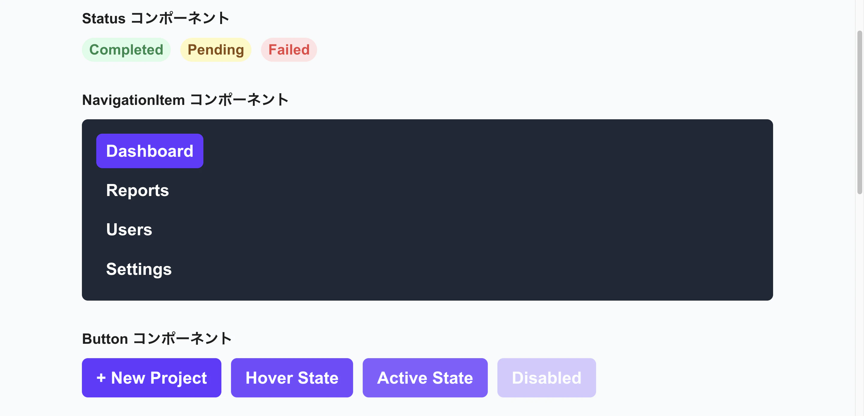
実装するコンポーネント
- NavigationItem
- Button
- KpiCard
- ChartCard
- ActivityTableRow
- Status
ファイル構成
以下のような構成でコンポーネントを作ります。
src/
├── components/
│   └── ui/
│       ├── Button.tsx
│       ├── Input.tsx
│       ├── Card.tsx
│       ├── Badge.tsx
│       ├── Alert.tsx
│       ├── Select.tsx
│       ├── Checkbox.tsx
│       └── index.ts // 全コンポーネントをエクスポート
Cursor に実装指示
最初に Figma に存在しているコンポーネントを読み取らせます。
Figmaに定義されているコンポーネントを読み取ってください。
以下の要件でコンポーネントを実装してください:

## 要件

- TypeScript で厳密に型定義
- Tailwind CSS で全てスタイリング
- トークン(primary, accent など)を使用
- React 18 + の機能を使用
- arrow function で実装
- default export ではなく named export

## ファイル保存先

各コンポーネントを `src/components/ui/[ComponentName].tsx` に保存してください。

その後、`src/components/ui/index.ts` で全コンポーネントをまとめてエクスポートしてください。
AI の実装結果
実装したものが以下になります。ファイル数が多いため一部抜粋しています。
上記プロンプトでは一発で完全に実装できなかったため、何回か修正を入れています。
次回の画面実装時にまた微修正は入れていきます。
Button.tsx
"use client";

import { type FC, type ReactNode } from "react";
import { cn } from "@/lib/utils";

export type ButtonSize = "medium";
export type ButtonState = "Default" | "Hover" | "Active" | "Disabled";

export interface ButtonProps {
  size?: ButtonSize;
  state?: ButtonState;
  children: ReactNode;
  onClick?: () => void;
  disabled?: boolean;
  className?: string;
  type?: "button" | "submit" | "reset";
}

export const Button: FC<ButtonProps> = ({ size = "medium", state = "Default", children, onClick, disabled = false, className, type = "button" }) => {
  const isDisabled = disabled || state === "Disabled";

  return (
    <button
      type={type}
      onClick={onClick}
      disabled={isDisabled}
      className={cn(
        "inline-flex items-center justify-center rounded-button font-bold text-text-white transition-colors",
        size === "medium" && "px-6 py-4 text-3xl",
        state === "Default" && "bg-accent-indigoDark hover:bg-accent-indigoDark/90",
        state === "Hover" && "bg-accent-indigoDark/90",
        state === "Active" && "bg-accent-indigoDark/80",
        state === "Disabled" && "bg-accent-indigoDark/50 cursor-not-allowed",
        isDisabled && "cursor-not-allowed opacity-50",
        className,
      )}
    >
      {children}
    </button>
  );
};
KpiCard.tsx
import { type FC, type ReactNode } from "react";
import { cn } from "@/lib/utils";
import { tokens } from "@/lib/tokens";

export type KpiCardVariant = "indigo" | "orange" | "green" | "red";

export interface KpiCardProps {
  variant: KpiCardVariant;
  title: string;
  value: string;
  delta: string;
  deltaType: "increase" | "decrease";
  icon?: ReactNode;
  className?: string;
}

export const KpiCard: FC<KpiCardProps> = ({ variant, title, value, delta, deltaType, icon, className }) => {
  const borderColor = tokens.colors.accent?.[variant]?.value;
  const iconBgColor = tokens.colors.icon?.background?.[variant]?.value;
  const deltaColor = deltaType === "increase" ? "text-status-success-text" : "text-status-error-text";

  return (
    <div className={cn("flex flex-col gap-4 p-6 rounded-card bg-background-primary border-l-[6px]", className)} style={{ borderLeftColor: borderColor }}>
      <div className="flex items-start justify-between">
        <h3 className="text-3xl font-bold text-text-secondary">{title}</h3>
        {icon && (
          <div className="flex items-center justify-center w-24 h-24 rounded-iconArea" style={{ backgroundColor: iconBgColor }}>
            <span className="text-5xl">{icon}</span>
          </div>
        )}
      </div>

      <div className="text-6xl font-bold text-text-primary">{value}</div>

      <div className={cn("text-2xl font-normal", deltaColor)}>{delta}</div>
    </div>
  );
};
index.ts
export { Status, type StatusProps, type StatusVariant } from "./Status";
export { NavigationItem, type NavigationItemProps, type NavigationItemVariant } from "./NavigationItem";
export { Button, type ButtonProps, type ButtonSize, type ButtonState } from "./Button";
export { KpiCard, type KpiCardProps, type KpiCardVariant } from "./KpiCard";
export { ChartCard, type ChartCardProps } from "./ChartCard";
export { ActivityTableRow, type ActivityTableRowProps, type ActivityTableRowStatus } from "./ActivityTableRow";
コンポーネントの検証
src/app/page.tsx にコンポーネントを呼び出し、動作確認をします。
ブラウザで pnpm dev を実行してください。
最後に
次回はダッシュボードを完成させていきます。