人のソースを見て勉強しようシリーズ第4弾
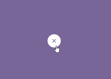
Material Action Button
今回の参考ソースはここ
ソースをそのままコピペしたらjsdoitの方でちゃんと動作しなかったので、
少し書き直した。
html
<div class="icon">
  <i></i>
  <span class="tap"></span>
</div>
触れたときの波紋は.tapでほか3つの円や閉じるアイコン等については全部iでbefore/after要素作ったりして再現してる。
CSS
/* アイコンを中央に配置 */
.icon {
  width: 40px;
  height: 40px;
  border-radius: 100%;
  position: absolute;
  top: 50%;
  left: 50%;
  margin: -20px;
  cursor: pointer;
}

/* ×の閉じるアイコンの実装(右斜め線) */
.icon i {
  width: 2px;
  height: 14px;
  display: block;
  background: #786699;
  position: absolute;
  top: 13px;
  left: 19px;
  opacity: 0;
  transform: rotate(45deg);
  transition: all 0.8s ease;
}

/* ×の閉じるアイコンの実装(左斜め線) */
.icon i:after {
  content: '';
  width: 14px;
  height: 2px;
  display: block;
  background: #786699;
  position: absolute;
  top: 6px;
  left: -6px;
}

/*左右の円生成 */
.icon:after {
  content: '';
  display: block;
  width: 10px;
  height: 10px;
  -webkit-border-radius: 100%;
  border-radius: 100%;
  position: absolute;
  top: 15px;
  left: 15px;
  box-shadow: 14px 0px 0px #fff, -14px 0px 0px #fff; //ここで左右の円表示
  transition: all 0.4s ease;
  z-index: -1;
}

/* 中央の円生成 */
.icon:before {
  content: '';
  display: block;
  width: 40px;
  height: 40px;
  background: #fff;
  position: absolute;
  border-radius: 100%;
  transform: scale(0.25);
  transition: all 0.6s ease;
}

/* 触れたら中央の円を大きく */
.icon.active:before {
  transform: scale(1);
}

/* 左右の円を消す */
.icon.active:after {
  -webkit-box-shadow: 0px 0px 0px #fff, 0px 0px 0px #fff;
  box-shadow: 0px 0px 0px #fff, 0px 0px 0px #fff;
}
.icon.active i {
  opacity: 1;
  filter: none;
}

/* 触れたときの波紋 */
.tap {
  width: 80px;
  height: 80px;
  display: block;
  position: absolute;
  top: -20px;
  left: -20px;
  opacity: 1;
  filter: none;
  transform: scale(0);
  border-radius: 100%;
  background-color: rgba(255,255,255,0.6);
}
.tap.active {
  transition: all 400ms cubic-bezier(0, 0.7, 0.5, 1);
  opacity: 0;
  transform: scale(1);
}
i で閉じるアイコンの×を再現(iで右斜め線、i:afterで左斜め線)
box-shadow: 14px 0px 0px #fff, -14px 0px 0px #fff; で両脇の円をまとめて生成してる。
JS
(function() {

  $(".icon").click(function () {
     $(this).toggleClass('active');
     $('.tap').addClass('active');
  });

  $(".icon").bind('transitionend webkitTransitionEnd oTransitionEnd MSTransitionEnd', function() {
    return $('.tap').removeClass('active');
  });

}).call(this);
触れたら .active を付ける処理。
CSS3のTransition終了時にJavaScriptで処理を走らせる場合は TransitionEnd を使う。
(クロスブラウザ対応はなくてもいけるかもだけど念のため。)