Matplotlib
Matplotliの概要
2次元のグラフを描画するためのライブラリ
JupyterNotebookと親和性が高い
グラフを描画するためのスタイルが2つ
- MATLABスタイル
- オブジェクト指向スタイル
インポートは以下
matplotlib.py
import matplotlib.pyplot as plt
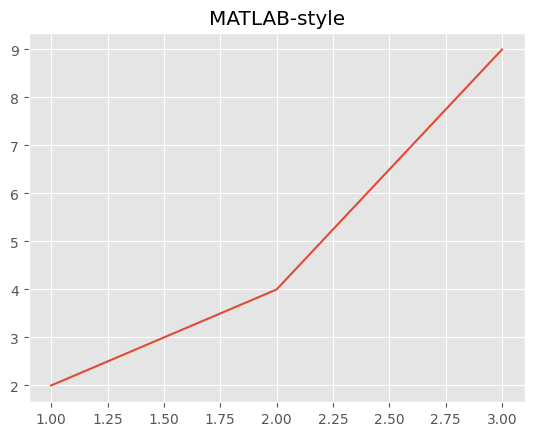
MATLABスタイル
matlab.py
# データ準備
x = [1, 2, 3]
y = [2, 4, 9]

plt.plot(x,y)
plt.title('MATLAB=style')
plt.show()
オブジェクト指向スタイル
描画オブジェクトに対して、サブプロットを追加してサブプロットに対してグラフを描画する。
描画オブジェクト1つに対して複数のサブプロットを指定できる。
描画オブジェクトとサブプロット
subplots関数の引数に数値を指定することにより複数のサブプロットを配置できる。
- 1つのサブプロットを作成
subplots1.py
import matplotlib.pyplot as plt
fig, axes = plt.subplots() # 1つのサブプロットを配置
plt.show()
- 2つのサブプロットを作成
subplots2.py
import matplotlib.pyplot as plt
fig, axes = plt.subplots(2) # 2つのサブプロットを配置
plt.show()
- 2行2列のサブプロットを作成1
subplots3.py
import matplotlib.pyplot as plt
fig, axes = plt.subplots(2, 2) # 2行2列のサブプロットを配置
plt.show()

- 2行2列のサブプロットを作成2
subplots4.py
import matplotlib.pyplot as plt
fig, axes = plt.subplots(nrows = 2,ncols = 2) # 2行2列のサブプロットを配置
plt.show()

グラフのスタイル
style.py
import matplotlib.style
# スタイルの一覧を取得
print(matplotlib.style.available)
>>>['Solarize_Light2', '_classic_test_patch', '_mpl-gallery', '_mpl-gallery-nogrid',
'bmh', 'classic', 'dark_background', 'fast', 'fivethirtyeight', 'ggplot',
'grayscale', 'seaborn-v0_8', 'seaborn-v0_8-bright', 'seaborn-v0_8-colorblind',
'seaborn-v0_8-dark', 'seaborn-v0_8-dark-palette', 'seaborn-v0_8-darkgrid',
'seaborn-v0_8-deep', 'seaborn-v0_8-muted', 'seaborn-v0_8-notebook',
'seaborn-v0_8-paper', 'seaborn-v0_8-pastel', 'seaborn-v0_8-poster',
'seaborn-v0_8-talk', 'seaborn-v0_8-ticks', 'seaborn-v0_8-white',
'seaborn-v0_8-whitegrid', 'tableau-colorblind10']

# グラフのスタイルのclassicを指定
matplotlib.style.use('classic')

fig,ax = plt.subplots()
ax.plot([1,2])
plt.show()

タイトルと軸ラベル
- 描画オブジェクト(flg)に対しては.suptitleメソッド
- サブプロット(axes)に対しては.set_titleメソッド
title.py
# 複数のサブプロットの作成
fig ,axes = plt.subplots(ncols = 2)

# 描画オブジェクトに.suptitleメソッドでタイトルを指定
fig.suptitle('figure title')

# サブプロットに.set_titleメソッドでタイトルを指定
axes[0].set_title('subplot title 0')
axes[1].set_title('subplot title 1')

# サブプロットに.set_xlabel,.set_ylabelメソッドでタイトルを指定
axes[0].set_xlabel('x label')
axes[0].set_ylabel('y_label')
axes[1].set_xlabel('x label')
axes[1].set_ylabel('y_label')

plt.savefig('label.png', bbox_inches='tight')
plt.show()

凡例
グラフ内に凡例を表示
legendのlocのオプション
- best :最適な位置(デフォルト)
- upper right :右上
- upper left :左上
- lower left :左下
- lower right :右下
- right :右側
- center left :左側中央
- center right :右側中央
- lower center :下側中央
- upper center :上側中央
- center :中央
loc.py
fig, ax = plt.subplots()
# 凡例ラベルの表示
ax.plt([1,2,3],[2,4,9],label='legend label')
ax.legend(loc = 'best')
plt.show()

ファイル出力
save.py
fig ,ax = plt.subplots()
ax.set_title('subplot title')
# png形式
fig.savefig('C:/Users/~sample-figure.png')
# svg形式
fig.savefig('C:/Users/~sample-figure.svg')
グラフの種類と出力方法
- 折れ線グラフ
- 棒グラフ
- 散布図
- ヒストグラム
- 箱ひげ図
- 円グラフ
折れ線グラフ
plotで描画、引数にx軸y軸の座標を表す配列を渡す
plot.py
fig ,ax = plt.subplots()
x = [1, 2, 3]
y1 = [1, 2, 3]
y2 = [3, 1, 2]

ax.plot(x, y1, label = 'Green line')
ax.plot(x, y2, label = 'Brue line')
ax.legend()
plt.show()

x軸y軸の間隔によっては疑似的に曲線を描画することも可能
.sincos.py
import numpy as np
x = np.range(0.0, 10.0, 0.1)
y1 = np.sin(x)
y2 = np.cos(x)

fig, ax = plt.subplots()
ax.plot(x ,y1, label = 'sin')
ax.plot(x, y2, label = 'cos')
ax.legend(loc= 'best')
plt.show()

棒グラフ
- 通常の棒グラフ
bar.py
fig, ax = plt.subplots()

x= [1,2,3]
y = [10, 2, 3]
labels = ['spam','ham','egg']

ax.bar(x,y, tick_label = labels) # 棒グラフを描画
plt.show()

- 横向き棒グラフ
barh.py
fig, ax = plt.subplots()

x= [1,2,3]
y = [10, 2, 3]
labels = ['spam','ham','egg']

ax.barh(x,y, tick_label = labels) # 棒グラフを描画
plt.show()

- 複数の棒グラフ
bar2.py
fig, ax = plt.subplots()
x = [1, 2, 3]
y1 = [10, 2, 3]
y2 = [5, 3, 6]
labels = ['spam','ham','egg']

width = 0.4
ax.bar(x, y1, width=width, tick_label=labels, label = 'y1')

x2 = [num + width for num in x]
ax.bar(x2, y2, label = 'y2')

ax.legend()
plt.show()

- 積み上げ棒グラフ
bar3.py
fig ,ax = plt.subplots()

x = [1, 2, 3]
y1 = [10, 2, 3]
y2 = [5, 3, 6]
labels = ['spam','ham','egg']

y_total = [num1 + num2 for num1, num2 in zip(y1,y2)]
ax.bar(x, y_total, tick_label = labels, label = 'y1')
ax.bar(x, y2, label= 'y2')
ax.legend()

plt.show()

散布図
散布図の描画とマーカーの各種
scatter.py
import numpy as np
fig, ax  = plt.subplots()

np.random.seed(123)
# 0以上1未満のランダムな浮動小数点数50個
x = np.random.rand(50)
y = np.random.rand(50)
ax.scatter(x[0:10], y[0:10], marker='v', label ='triangle down') # 下向き三角形
ax.scatter(x[10:20], y[10:20], marker='^', label = 'riangle up') # 上向き三角形
ax.scatter(x[20:30], y[20:30], marker= 's', label = 'square') # 正方形
ax.scatter(x[30:40],y[30:40], marker = '*', label= 'star')  # 星形
ax.scatter(x[40:50], y[40:50], marker= 'x', label = 'x') # X

ax.legend()

plt.show()

ヒストグラム
hist.py
# データを生成
np.random.seed(123)
mu = 100 #平均値
sigma = 15 # 標準偏差
# 平均値muと標準偏差sigmaを持つ正規分布に従う乱数を1000個生成
x = np.random.normal(mu, sigma, 1000)

fig, ax = plt.subplots()

# ヒストグラムを描画
# デフォルトは縦向き
# orientationに'holizontal'を指定しているため横向き
n, bins, patches = ax.hist(x,bins = 25, orientation= 'horizontal')
plt.show()

積み上げヒストグラム
host2.py
np.random.seed(123)
x0 = np.random.normal(mu, 20, 1000)
x1 = np.random.normal(mu, 15, 1000)
x2 = np.random.normal(mu, 10, 1000)

flg, ax = plt.subplots()

labels = ['x0','x1','x2']
# 積み上げヒストグラムを描画
# stacked でバーを積み上げるかのオプション
ax.hist((x0,x1,x2), label= labels, stacked = True)
ax.legend()

plt.show()

箱ひげ図
boxplot.py
np.random.seed(123)

x0 = np.random.normal(0, 10, 500)
x1 = np.random.normal(0, 15, 500)
x2 = np.random.normal(0, 20, 500)

fig, ax = plt.subplots()
labels = ['x0','x1','x2']

# 横向き箱ひげ図を描画
# デフォルトは縦
# vertをfalseにすることで横向きになる。
ax.boxplot((x0, x1, x2), label = labels, vert = False)

plt.show()

円グラフ
pie.py
labels = ['spam', 'ham', 'egg']

# 円グラフの割合をリストで示す[10:3:1]
x = [10, 3, 1

fig, ax = plt.subplots()

ax.pie(x, labels = labels, startangle=90,
       counterclock=False,# 上から時計回り
       shadow=True,       # 影の描写
       autopct='%1.2f%%') # 円グラフの各セクションに表示する%を設定 %%はエスケープシーケンス
ax.axis('equal')  # 真円を設定 楕円にもともとなってないが…
plt.savefig('pie.png',bbox_inches= 'tight')
plt.show()

一部を目立たせる
explodeパラメータは、円グラフの各セクションを「切り出す」ために使用されます。explodeはリストであり、各要素は対応するセクションが円の中心からどれだけ離れるかを制御します。
この場合、explode = [0, 0.2, 0]と指定されていますので、‘ham’(ラベルリストの2番目の要素)が0.2単位だけ円の中心から切り出され、他の2つのセクション(‘spam’と’egg’)は円の中心から切り出されません。
pie2.py
explode = [0, 0.2, 0] #1番目の要素(ham)を0.2切り出す

fig, ax = plt.subplots()
ax.pie(x, labels= labels, startangle= 90,
       counterclock=False,
       shadow=True, autopct='%1.2f%%',
       explode=explode) # explodeを指定する
ax.axis('equal')

plt.show()

複数のグラフの組み合わせ
matplot.py
import matplotlib.pyplot as plt
fig, ax = plt.subplots()

x1 = [1, 2, 3]
y1 = [5, 2, 3]
x2 = [1, 2, 3, 4]
y2 = [8, 5, 4, 6]

ax.bar(x1, y1, label='y1') # 棒グラフを描画
ax.plot(x2, y2, label='y2')
ax.legend()

plt.show()

スタイル
指定方法は以下の3つ
- 線の色を名前で指定
- 16進数のRGBで指定
- RGBAをfloatで指定
style.py
fig, ax = plt.subplots()

# 線の色を名前で指定
ax.plot([1,3],[3,1], label = 'aqua', color='aqua')
# 16進数のRGBで指定
ax.plot([1,3],[1,3], label= '0000FF', color= '#0000FF')
# RGBAをfloatで指定
ax.plot([1,3],[2,2], label = '(0.1, 0.2, 0.5, 0.3)', color = (0.1, 0.2, 0.5, 0.3))
ax.legend() # 凡例の表示
plt.show()

色
- color引数 塗りつぶしの色
- edgecolor引数 枠線の色
ccolor.py
fig,ax = plt.subplots()

ax.bar([1], [3], color = 'aqua') # 塗りつぶしの色を指定
ax.bar([2], [4], color = 'aqua', edgecolor = 'black') # グラフの線の色を指定
plt.show()

線のスタイル
- linewidth引数 線の幅
- linestyle引数
- 破線
- 一点鎖線
- 点線
style.py
import matplotlib.pyplot as plt
fig, ax = plt.subplots()

# 5.5ポイントの幅の線で描画
ax.plot([1,3], [3,1], linewidth= 5.5 , label= '5.5')
# 10ポイントの幅の線で描画
ax.plot([1,3],[1,3], linewidth= 10, label = '10')
ax.legend()

plt.show()

- family関数
family.py
fig, ax =plt.subplots()
ax.plot([1,3],[3,1], linestyle= '--', label = 'dashed')
ax.plot([1,3],[1,3], linestyle= '-.', label = 'dashdot')
ax.plot([1,3],[2,2], linestyle= ':', label = 'dotted')
ax.legend()

plt.show()

フォント
fpnt.py
fig, ax = plt.subplots()

ax.set_xlabel('xlabel', family= 'fantasy', size=20, weight='bold')
ax.set_ylabel('ylabel', family= 'cursive', size=40, weight='light')
ax.set_title('graph tytle', family='monospace',size=25, weight= 'heavy')
plt.show()

辞書で定義してす要する場合
font2.py
#フォントのスタイルを辞書で定義
fontdict = {
    'family': 'fantasy',
    'size' : 20,
    'weight' : 'normal'
}

fig, ax = plt.subplots()

# 辞書形式でフォントのスタイルを指定
ax.set_xlabel('xlabel', fontdict= fontdict)
ax.set_ylabel('ylabel', fontdict= fontdict)
# 個別で指定したサイズで上書き可能
ax.set_title('graph title', fontdict= fontdict, size = 40)

plt.show()

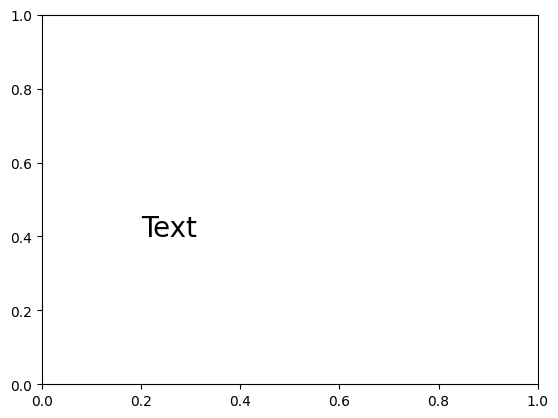
テキスト描画
任意の文字を描画できる、第一引数第二引数は開始するx,y座標の座標位置
text.py
fig ,ax = plt.subplots()
ax.text(0.2, 0.4, 'Text', size= 20)
plt.show()
pandasのオブジェクトから描画
PandasのDataframe、Seriesからグラフを描画できる
object.py
import pandas as pd
import matplotlib.style
import matplotlib.pyplot as plt

matplotlib.style.use('ggplot') # スタイル指定

# Dataframeを作成
df = pd.DataFrame({'A': [1, 2, 3],'B': [3, 1, 2]})
df.plot()
plt.show()

DataFrameから棒グラフを描画
dataframebar.py
import numpy as np
# ランダムに3行2列のデータを生成してDataFrameを生成
np.random.seed(1234)
df2 = pd.DataFrame(np.random.rand(3,2),columns=['y1','y2'])

df2.plot.bar()
plt.show()
