はじめに
Tailwind CSSで要素の高さを揃える際に少し迷ったので、備忘録としてまとめます。特に、要素の内容量が異なる場合の高さ揃えに焦点を当てています。
この記事は個人的なアウトプットを目的として作成したものです。そのため、誤った情報や不足している内容が含まれている可能性があります。もし間違いや気になる点がございましたら、ぜひご指摘いただけますと幸いです。
実装方法
下記のように、文章量が異なる複数のカードを並べる場面を想定しています。
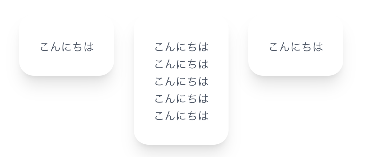
以下は最初に試したコードです。
<div className="flex gap-8 p-20">
  <div>
    <div className="bg-white rounded-3xl p-8 shadow-xl text-center">
      <p className="text-gray-600 md:text-lg">こんにちは</p>
    </div>
  </div>
  <div>
    <div className="bg-white rounded-3xl p-8 shadow-xl text-center">
      <p className="text-gray-600 md:text-lg">こんにちは</p>
      <p className="text-gray-600 md:text-lg">こんにちは</p>
      <p className="text-gray-600 md:text-lg">こんにちは</p>
      <p className="text-gray-600 md:text-lg">こんにちは</p>
      <p className="text-gray-600 md:text-lg">こんにちは</p>
    <div>
  </div>
  <div>
    <div className="bg-white rounded-3xl p-8 shadow-xl text-center">
      <p className="text-gray-600 md:text-lg">こんにちは</p>
    <div>
  </div>
</div>
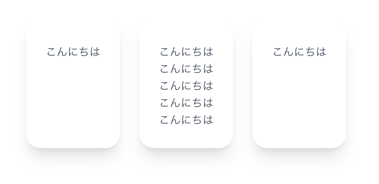
方法①:ラッパーをなくしてflexを直下に使う
カード要素(bg-white ...)をflexの直下に配置することで、高さが自動で揃います。
<div className="flex gap-8 p-20">
  <div className="bg-white rounded-3xl p-8 shadow-xl text-center">
    <p className="text-gray-600 md:text-lg">こんにちは</p>
  </div>
  <div className="bg-white rounded-3xl p-8 shadow-xl text-center">
    <p className="text-gray-600 md:text-lg">こんにちは</p>
    <p className="text-gray-600 md:text-lg">こんにちは</p>
    <p className="text-gray-600 md:text-lg">こんにちは</p>
    <p className="text-gray-600 md:text-lg">こんにちは</p>
    <p className="text-gray-600 md:text-lg">こんにちは</p>
  <div>
  <div className="bg-white rounded-3xl p-8 shadow-xl text-center">
    <p className="text-gray-600 md:text-lg">こんにちは</p>
  <div>
</div>
方法②:h-fullを使用して高さを合わせる
ラッパーの<div>を残したい場合は、高さを揃えたい要素にh-fullを指定することで対応可能です。
<div className="flex gap-8 p-20">
  <div>
    <div className="bg-white rounded-3xl p-8 shadow-xl text-center h-full">
      <p className="text-gray-600 md:text-lg">こんにちは</p>
    </div>
  </div>
  <div>
    <div className="bg-white rounded-3xl p-8 shadow-xl text-center h-full">
      <p className="text-gray-600 md:text-lg">こんにちは</p>
      <p className="text-gray-600 md:text-lg">こんにちは</p>
      <p className="text-gray-600 md:text-lg">こんにちは</p>
      <p className="text-gray-600 md:text-lg">こんにちは</p>
      <p className="text-gray-600 md:text-lg">こんにちは</p>
    <div>
  </div>
  <div>
    <div className="bg-white rounded-3xl p-8 shadow-xl text-center h-full">
      <p className="text-gray-600 md:text-lg">こんにちは</p>
    <div>
  </div>
</div>
方法③:gridレイアウトとh-fullの組み合わせ
Flexの代わりにgridを使って列を定義し、各要素にh-fullを指定して高さを揃えることもできます。
<div className="grid grid-cols-3 gap-8 p-20">
  <div>
    <div className="bg-white rounded-3xl p-8 shadow-xl text-center h-full">
      <p className="text-gray-600 md:text-lg">こんにちは</p>
    </div>
  </div>
  <div>
    <div className="bg-white rounded-3xl p-8 shadow-xl text-center h-full">
      <p className="text-gray-600 md:text-lg">こんにちは</p>
      <p className="text-gray-600 md:text-lg">こんにちは</p>
      <p className="text-gray-600 md:text-lg">こんにちは</p>
      <p className="text-gray-600 md:text-lg">こんにちは</p>
      <p className="text-gray-600 md:text-lg">こんにちは</p>
    <div>
  </div>
  <div>
    <div className="bg-white rounded-3xl p-8 shadow-xl text-center h-full">
      <p className="text-gray-600 md:text-lg">こんにちは</p>
    <div>
  </div>
</div>
終わりに
Tailwind CSSというよりはCSSのスタイリングの問題でしたが、Flex、Gridどちらにも対応できると、実装の幅が広がると思いました。
参考