
概要
新たに実装された機能であるカスタマイザブル・セレクトを使って、Pinterest風というか、メイソンリーレイアウトのセレクトボックスを作成する方法を解説をします。
サンプル
2025/12現在でChrome限定です。
See the Pen カスタマイザブル・セレクトで、Pinterest風のセレクトボックスを作る by lhankor_mhy (@lhankor_mhy) on CodePen.
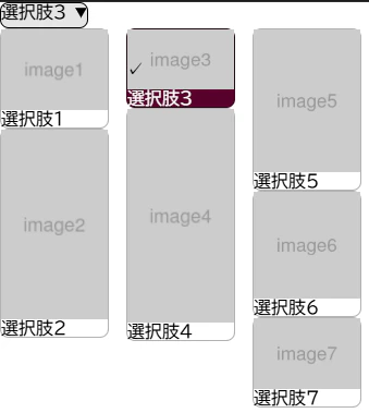
サンプルコード
*,
::before,
::after {
    padding: 0;
    margin: 0;
    box-sizing: border-box;
}

select,
::picker(select) {
    appearance: base-select;
}

::picker(select) {
    columns: 3;
    border: none;

    filter: blur(.5em);
    opacity: 0;

    transition: all .3s allow-discrete;
}

::picker(select):popover-open {
    filter: blur(0);
    opacity: 1;

    @starting-style {
        filter: blur(.5em);
        opacity: 0;
    }
}


option {
    figure {
        display: grid;
        width: 100px;
        grid: auto-flow / auto;
        border: solid 1px oklch(0 0 0 / .3);
        border-radius: .5em;
        background-color: white;
        color: black;

        break-inside: avoid-column;

        img {
            width: 100%;
        }
    }

    &:checked {
        figure {
            background-color: oklch(30% 30% 0);
            color: white;
        }
    }

    &::checkmark {
        position: absolute;
    }

}

selectedcontent {
    img {
        display: none;
    }
}
<select id="customizable">
    <button>
        <selectedcontent></selectedcontent>
    </button>
    <option value="">
        <figure>
            <img src="http://placehold.jp/400x300.png?text=image1" alt="">
            <figcaption>
                選択肢1
            </figcaption>
        </figure>
    </option>
    <option value="">
        <figure>
            <img src="http://placehold.jp/90x160.png?text=image2" alt="">
            <figcaption>
                選択肢2
            </figcaption>
        </figure>
    </option>
    <option value="">
        <figure>
            <img src="http://placehold.jp/160x90.png?text=image3" alt="">
            <figcaption>
                選択肢3
            </figcaption>
        </figure>
    </option>
    <option value="">
        <figure>
            <img src="http://placehold.jp/90x180.png?text=image4" alt="">
            <figcaption>
                選択肢4
            </figcaption>
        </figure>
    </option>
    <option value="">
        <figure>
            <img src="http://placehold.jp/300x400.png?text=image5" alt="">
            <figcaption>
                選択肢5
            </figcaption>
        </figure>
    </option>
    <option value="">
        <figure>
            <img src="http://placehold.jp/150x150.png?text=image6" alt="">
            <figcaption>
                選択肢6
            </figcaption>
        </figure>
    </option>
    <option value="">
        <figure>
            <img src="http://placehold.jp/300x200.png?text=image7" alt="">
            <figcaption>
                選択肢7
            </figcaption>
        </figure>
    </option>
</select>
解説
カスタマイザブル・セレクトは、select要素をカスタマイズしてもっとリッチなセレクトボックスを作る新機能です。
HTMLを書く
まず、HTMLを書いていきましょう。
<select id="customizable">
    <button>
        <selectedcontent></selectedcontent>
    </button>
    <option value="">
        <figure>
            <img src="http://placehold.jp/400x300.png?text=image1" alt="">
            <figcaption>
                選択肢1
            </figcaption>
        </figure>
    </option>
あまり難しいことはなく、新しい点は2つです。
-
option要素の中になんでも入れられる -
<button><selectedcontent></selectedcontent></button>が選んだ項目のクローンを持つ
<selectedcontent>
<selectedcontent>は前述の通り、セレクトボックスを選択して閉じた時に表示される選択したオプションです。この要素にCSSを適用することができます。
CSSで appearance を変更する
これは必須です。
select,
::picker(select) {
    appearance: base-select;
}
appearance: base-select
特殊なアピアランスbase-selectを指定することによってカスタイマイズ可能になります。
::picker(select)
::picker(select)疑似要素は、セレクトボックスを開いたときの選択UI、ピッカーを指します。セレクト要素に併せてこちらのアピアランスも変更します。
ピッカーをスタイルする
columns: 3でなんちゃってメイソンリーレイアウトに。
::picker(select) {
    columns: 3;
    border: none;
}
オプションをレイアウトする
カードデザインにします。
option {
    figure {
        display: grid;
        width: 100px;
        grid: auto-flow / auto;
        border: solid 1px oklch(0 0 0 / .3);
        border-radius: .5em;
        background-color: white;
        color: black;

        break-inside: avoid-column;

        img {
            width: 100%;
        }
    }
特に説明することはないかと思います。break-inside: avoid-columnはカラムレイアウトでカードの途中で別カラムに分断されないように指定しています。
選択されたオプションをスタイルする
option {
...
    &:checked {
        figure {
            background-color: oklch(30% 30% 0);
            color: white;
        }
    }
特に新機能はないです。
チェックマークをスタイルする
チェックマークは、選択したオプションに表示されるチェックマークです。
option {
...
    &::checkmark {
        position: absolute;
    }
::checkmark
::checkmark疑似要素はチェックマークを指します。contentプロパティを使用することによってマークを変えることができますが、今回は位置指定だけ。
selectedcontentをスタイルする
このままだと画像も表示されてウザめなので非表示に
selectedcontent {
    img {
        display: none;
    }
}
ピッカーの開閉をスタイルする
ピッカーの開閉時のトランジションを設定します。
::picker(select) {
...
    filter: blur(.5em);
    opacity: 0;

    transition: all .3s allow-discrete;
}

::picker(select):popover-open {
    filter: blur(0);
    opacity: 1;

    @starting-style {
        filter: blur(.5em);
        opacity: 0;
    }
}
ピッカーはポップオーバーとして扱われるので、::picker(select):popover-openでトランジションを付けられます。
詳しくはこっちで書いたのでご参照ください。
それにしても、::picker(select):popover-openって革命的な文法の変更ですよねえ……
あとで別記事にしようかなあ……
おしまい
ちょーお手軽ですよねー
ブラウザ対応
2025/12現在、Chrome系のみです。