はじめに
WebサイトやWebアプリを開いた際、最初に表示される「ローディング画面」を見たことはありませんか?
この記事では、ローディング画面の役割や実装方法、おしゃれな演出のコツまで解説します。
フロントエンド初心者の方もすぐに取り入れられる内容です。
ローディング画面の役割
-
ユーザー体験の向上
ページの読み込みが遅い場合、その間に何も表示されないとユーザーは「本当に表示されるのか?」と不安になってしまいます。ローディング画面があれば「待っていれば表示される」という安心感を与えられます。 -
ブランドイメージの強化
サイト独自のアニメーションやロゴを使うことで、第一印象を良くし、ブランドの認知にも繋がります。 -
読み込み完了までの情報提供
読み込み進捗をバーや数値で表示することで、あとどれくらい待てばよいかを伝えられます。
おしゃれなローディング画面を作成する
ここでは、シンプルかつおしゃれなローディングアニメーションをHTMLとCSSだけで実装する例を紹介します。
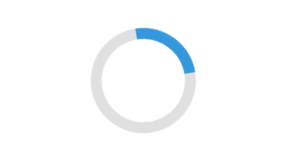
シンプルバージョン
index.html
<!-- ローディング画面 -->
<div id="loading">
  <div class="loader"></div>
</div>
<!-- サイト本体(ここにコンテンツが入る) -->
<div id="main-content" style="display:none;">
  <!-- 本文など -->
</div>
style.css
#loading {
  position: fixed;
  z-index: 9999;
  background: #fff;
  width: 100vw;
  height: 100vh;
  top: 0; left: 0;
  display: flex;
  justify-content: center;
  align-items: center;
}
.loader {
  border: 8px solid #e0e0e0;
  border-top: 8px solid #3498db;
  border-radius: 50%;
  width: 60px;
  height: 60px;
  animation: spin 1s linear infinite;
}
@keyframes spin {
  0%   { transform: rotate(0deg);}
  100% { transform: rotate(360deg);}
}
script.js
// ロード開始時刻を取得
const loadingStart = Date.now();

window.addEventListener('load', function(){
  const elapsed = Date.now() - loadingStart;
  const minTime = 3000; // 3秒(3000ミリ秒)

  if (elapsed < minTime) {
    setTimeout(() => {
      document.getElementById('loading').style.display = 'none';
      document.getElementById('main-content').style.display = 'block';
    }, minTime - elapsed);
  } else {
    document.getElementById('loading').style.display = 'none';
    document.getElementById('main-content').style.display = 'block';
  }
});
ローディング画面が一瞬すぎるとつまらないので、最低でも3秒は表示させるようにしています。
画像を使用するバージョン
index.html
<div id="loading">
  <p class="loading-message">Loading</p>
  <img src="flower.png" alt="ローディング花" class="flower-img rotating">
</div>
<div id="main-content" style="display:none;">
  <!-- サイト本体 -->
</div>
style.css
.loading-message {
  margin-bottom: 2rem;
}
#loading {
  position: fixed;
  z-index: 9999;
  background: #fff;
  width: 100vw;
  height: 100vh;
  top: 0; left: 0;
  display: flex;
  flex-direction: column;
  justify-content: center;
  align-items: center;
  transition: opacity 0.5s;
}
.flower-img {
  width: 120px;
  height: 120px;
  object-fit: contain;
  display: block;
}
.rotating {
  animation: spin 1s linear infinite;
}
@keyframes spin {
  0%   { transform: rotate(0deg);}
  100% { transform: rotate(360deg);}
}
/* ローディング後に表示されるメインコンテンツ */
#main-content {
  display: none;
  padding: 40px;
  text-align: center;
}
script.js
const loadingStart = Date.now();
window.addEventListener('load', function(){
  const elapsed = Date.now() - loadingStart;
  const minTime = 3000;
  if (elapsed < minTime) {
    setTimeout(hideLoading, minTime - elapsed);
  } else {
    hideLoading();
  }
});
function hideLoading() {
  const loading = document.getElementById('loading');
  loading.style.opacity = 0;
  setTimeout(() => {
    loading.style.display = 'none';
    document.getElementById('main-content').style.display = 'block';
  }, 500); // フェードアウト0.5秒
}

CSSアニメーションを使用するバージョン1
index.html
<div id="loading">
  <div class="flower-loader">
    <div class="petal petal1"></div>
    <div class="petal petal2"></div>
    <div class="petal petal3"></div>
    <div class="petal petal4"></div>
    <div class="petal petal5"></div>
    <div class="petal petal6"></div>
    <div class="center"></div>
  </div>
</div>
style.css
#loading {
  position: fixed;
  z-index: 9999;
  background: #fff;
  width: 100vw;
  height: 100vh;
  top: 0; left: 0;
  display: flex;
  justify-content: center;
  align-items: center;
}

.flower-loader {
  position: relative;
  width: 80px;
  height: 80px;
  animation: rotate 1.2s linear infinite;
}
.petal {
  position: absolute;
  width: 32px;
  height: 32px;
  background: #ffb7c5;
  border-radius: 50% 50% 50% 50%/60% 60% 40% 40%;
  opacity: 0.8;
}
.petal1 { top: 0; left: 24px; }
.petal2 { top: 10px; right: 0; transform: rotate(60deg);}
.petal3 { bottom: 10px; right: 0; transform: rotate(120deg);}
.petal4 { bottom: 0; left: 24px; transform: rotate(180deg);}
.petal5 { bottom: 10px; left: 0; transform: rotate(240deg);}
.petal6 { top: 10px; left: 0; transform: rotate(300deg);}
.center {
  position: absolute;
  top: 24px; left: 24px;
  width: 32px; height: 32px;
  background: #ffc300;
  border-radius: 50%;
  box-shadow: 0 0 10px #ffe066;
}
@keyframes rotate {
  0%   { transform: rotate(0deg);}
  100% { transform: rotate(360deg);}
}
script.js
// JavaScriptは上のサンプルと同じです

CSSアニメーションを使用するバージョン2
index.html
<div id="loading">
  <div class="dot-flower">
    <div class="dot dot1"></div>
    <div class="dot dot2"></div>
    <div class="dot dot3"></div>
    <div class="dot dot4"></div>
    <div class="dot dot5"></div>
    <div class="dot dot6"></div>
  </div>
</div>
style.css
#loading {
  position: fixed;
  z-index: 9999;
  background: #fff;
  width: 100vw;
  height: 100vh;
  top: 0; left: 0;
  display: flex;
  justify-content: center;
  align-items: center;
}
.dot-flower {
  position: relative;
  width: 60px; height: 60px;
  animation: spin 1.2s linear infinite;
}
.dot {
  position: absolute;
  width: 14px; height: 14px;
  border-radius: 50%;
  background: #FF80AB;
  top: 23px; left: 23px;
  opacity: 0.9;
}
.dot1 { transform: rotate(0deg)   translateY(-22px);}
.dot2 { transform: rotate(60deg)  translateY(-22px);}
.dot3 { transform: rotate(120deg) translateY(-22px);}
.dot4 { transform: rotate(180deg) translateY(-22px);}
.dot5 { transform: rotate(240deg) translateY(-22px);}
.dot6 { transform: rotate(300deg) translateY(-22px);}
@keyframes spin {
  0% { transform: rotate(0deg);}
  100% { transform: rotate(360deg);}
}
script.js
// JavaScriptは上のサンプルと同じです

CSSアニメーションを使用するバージョン3
index.html
<div class="progress-bar">
  <div class="bar"></div>
</div>
style.css
.progress-bar {
  width: 200px; height: 8px;
  background: #eee;
  border: 1px solid black;
  border-radius: 4px;
  overflow: hidden;
  position: fixed;
  z-index: 9999;
  background: #fff;
  top: 50%; left: 50%;
  transform: translate(-50%, -50%);
}
.bar {
  width: 0; height: 100%;
  background: #4fc3f7;
  animation: loading 3s infinite;
}
@keyframes loading {
  0%   { width: 0;}
  100%  { width: 100%;}
}
script.js
const loadingStart = Date.now();
window.addEventListener('load', function(){
  const elapsed = Date.now() - loadingStart;
  const minTime = 3000;
  if (elapsed < minTime) {
    setTimeout(() => {
      hideLoading();
    }, minTime - elapsed);
  } else {
    hideLoading();
  }
});
function hideLoading() {
  const loading = document.querySelector('.progress-bar');
  loading.style.opacity = 0;
  setTimeout(() => {
    loading.style.display = 'none';
  }, 500); // フェードアウト0.5秒
}

Tips
-
SVGやGIFを使ったカスタムアニメーション
CSSだけでなく、SVGアニメやGIFも活用できます。 -
ブランドカラーを活かす
サイトのテーマカラーに合わせると統一感UP。 -
ロゴやメッセージを入れる
「Loading...」やロゴ画像を組み合わせると、より印象的な画面に。 -
時間が短ければフェードアウトで消すと自然
CSSでopacityを使ったフェードアウトを加えると違和感が減ります。 -
SPAの場合はページ遷移ごとにローディングを制御
React/VueなどSPAなら、ルーティング時にローディング制御を加えることで体感速度UP。
最後に
ローディング画面は、ただの「待機画面」ではなく、ユーザーの安心感やサイトの第一印象を左右する重要なパーツです。
この記事を参考に、ぜひ自分だけの「おしゃれローディング画面」にチャレンジしてみてください!